
×

Ionic List

Ionic List

The ionic list is created of several rows of items that can contain text, buttons, thumbnails, keys, icons, and more. Lists are one of the essential components in any web or mobile app. It usually contains items with similar data content, such as images and text. Both the list that contains the items and the list items can be any HTML component.

Ionic lists support different interactions, such as the swiping item to reveal options, drag to rearrange items within the list, and delete items. We can access the lists using the standard <ion-list> element.

Creating Ionic List

Each list is created with two items. When you want to create the main list, the <ul> tag must contain the assigned list class, and the <li> tag will use the item class. Another interesting thing is that you don't even need to use <ul>, <ol> and <li> tags for your lists. You can use any other component, but the important thing is to add lists and classes of items correctly. In Basic usage, it is by default, all lists will be designed with divider lines.

The given syntax shows how to create a list in the ionic framework.


 item1 
 item2 


Output: After executing this code, you will get the output, as shown below.
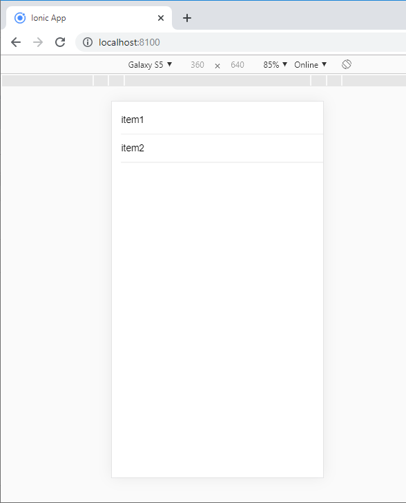
Creating Ionic List

In the Ionic framework, there are different types of lists.

  • List Header
  • List Icon
  • List Dividers
  • Basic Lists
  • Inset Lists
  • Multi-Line List
  • Avatar List
  • Thumbnail List
  • Sliding List

List Header: Every ionic list can add a header at the top of the list. By using the <ion-list-header> component, you can add a list header.

Example: The below example shows how you can use the list header in the ionic application.


  Lists 


  Header
  A  
  B 
  C 
   

Output: After executing this code, you will get the output, as shown below.
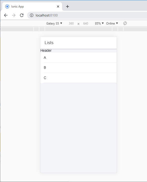
List Header

List Icon: Include icons to the list provides a guide to the content of every item. We can also adjust the icon size, small or large. By default, the icon is small but can be enlarged using the large property. There is a <ion-note> component, which is a text component used as subheadings that provide more information.

Example: The below example shows how to add the icons in the ionic application.


  Lists 


Output: After executing this code, you will get the output, as shown below.
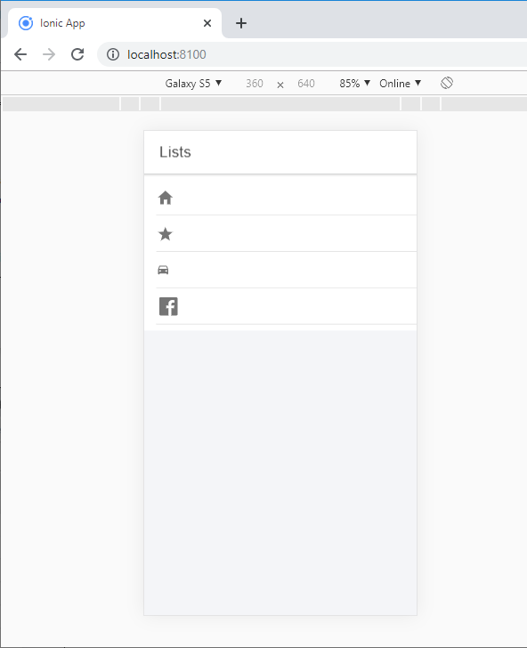
List Icon

List Dividers: To divide groups of items, use <ion-item-group> in place of <ion-list>. Use the <ion-item-divider> elements to divide the group into several sections.

Example: The below example shows how you can use the list dividers in the ionic application.


  Lists 


  A
  Apple
  Anaconda
  Acid
  B
  Banana 
  Bread
  Bank
  C
  Chart
  Character
  Court


Output: After executing this code, you will get the output, as shown below.
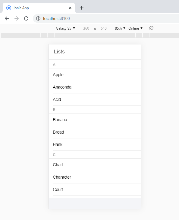
List Dividers

Inset Lists: By default, the list does not have an external margin. If you need a list to fill a set, you can add the inset property to the <ion-list> component.

Example: The below example shows how can you use inset with <ion-list-header> and <ion-list> component.


  Games 
  Pubg 
  Militia 
  Temple Run 
  Ludo
  Chess


  Games 
  Pubg 
  Militia 
  Temple Run 
  Ludo
  Chess 


Output: After executing this code, you will get the output, as shown below.
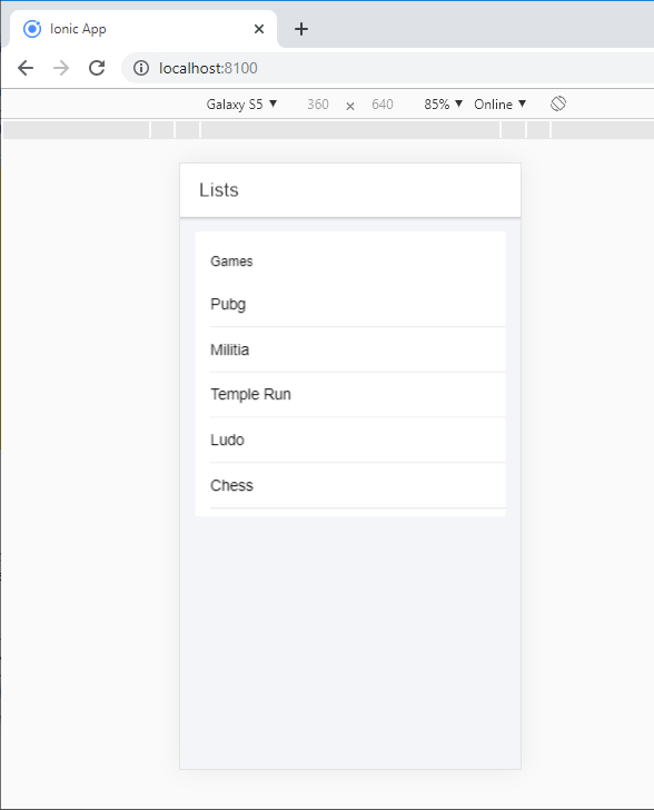
Inset Lists

Multi-line list: Multi-line lists are the same as regular lists, but that items contain multiple lines of text. When the <ion-item> component contains multiple headers or paragraph elements, its height will automatically expand to fit new lines of text.

Avatar List: Item avatars show a larger image than an icon, but smaller than a thumbnail. To use an avatar, add a <ion-avatar> element within an item. The avatar position can be set using the item-start and item-end property.

Example: The below example shows how you can use the avatar list in the ionic application.


  Avtar


  Avatar 


  Avatar 


Output: After executing this code, you will get the output, as shown below.
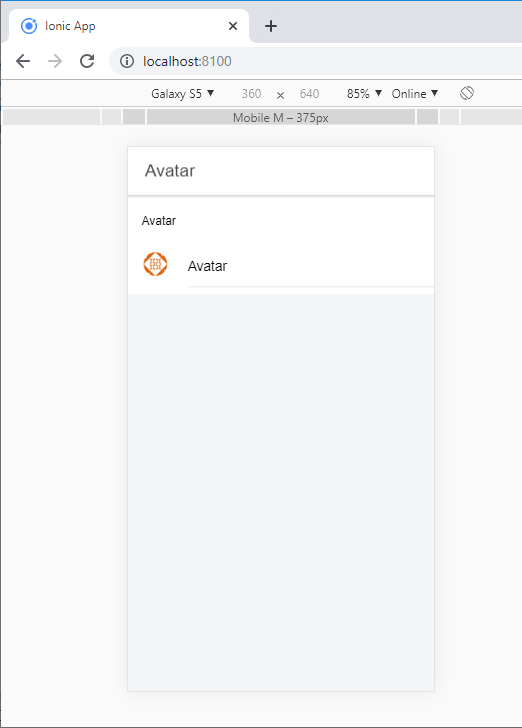
Multi-line list

Thumbnail List: Item thumbnails show an image that occupies the entire height of the item. To use a thumbnail, add a <ion- thumbnail> component within an element. Thumbnail position can be set using the item-start and item-end properties of the item.

Example: The below example shows how you can use the thumbnail list in the ionic application.


        Thumbnail


         Thumbnail  


           Thumbnail  


Output: After executing this code, you will get the output, as shown below.
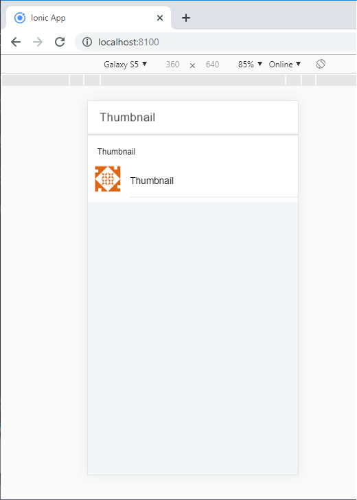
Thumbnail List

Sliding List: Sliding elements can swipe left or right to reveal a set of hidden buttons. To use a sliding item, add a <ion-item-sliding> element inside of an <ion-list> element. Next, add a <ion-item-options> element within the slider to accommodate the buttons.

By default, the buttons are on the right side. It means when the sliding item is swiped from right to left, and the options are displayed. Set the side attribute to "start" on the < ion-item-options > element if you need to swipe the option from left to right side.

Example: This example shows how you can use the sliding list in the ionic application.


  Sliding List 


  Item 1
  
  
  Unread
  success


  Item 2
  
  
  Unread
  read


Output: After executing this code, you will get the output, as shown below.
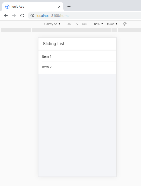
Sliding List

When you swipe the item 1 from left to right, the following output shows in your browser.
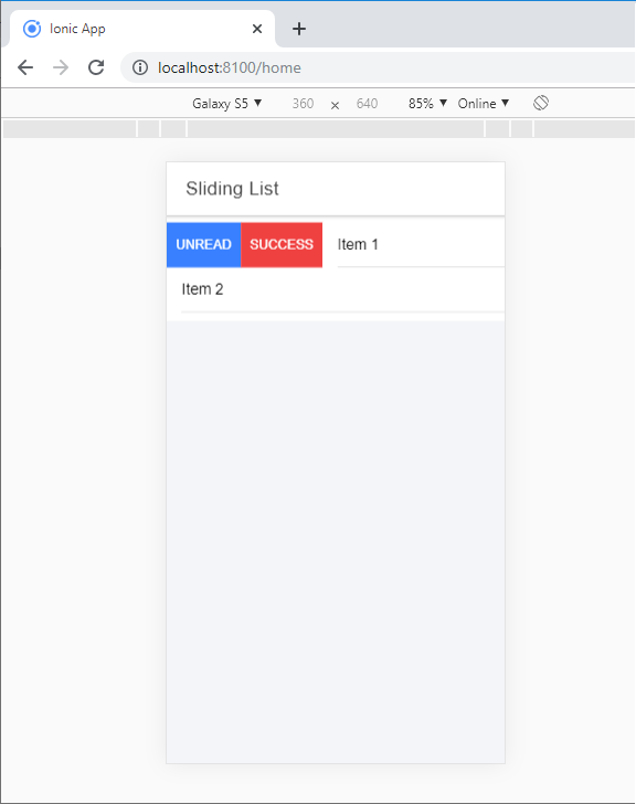
When you swipe the item 1 from left to right

Related Topics

Ionic vs PhoneGap

Ionic Vs PhoneGap Ionic and PhoneGap are both used to develop the mobile application. Both Frameworks are used in large enterprises by the developers. Here, we are going to compare the important differences between ionic...

3 minutes read.

Ionic Grid

The Ionic grid is a very powerful mobile-first flexbox system for building the custom layouts. It is a CSS feature supported by all devices that ionic supports. The Ionic grid is composed of...

11 minutes read.

Ionic Range

The Range slider lets users choose from a range of values by moving the slider knob. You can accept two knobs, but by default, one-knob controls the range value. Range labels You can put down on...

2 minutes read.

Ionic vs React Native

Ionic Vs React Native Ionic and React Native are both common framework which is used to develop mobile applications. Here, you will know about the popular differences between the ionic and the React Native. Ionic Ionic...

3 minutes read.

Ionic Popover

The Ionic popover is a small dialog box that displays at the top of the screen. It can be used for anything, but it is usually used for a button, an action,...

4 minutes read.

Ionic Infinite Scroll

The infinite scroll permits you to perform an action when the user scrolls a particular content from the bottom or top of the page. When you display the large collection of data...

3 minutes read.

Ionic Tabs

The ionic tabs mostly used for mobile navigation. It means that tabs are placed at the top of the display on android devices, while at the bottom on IOS. It does not provide...

2 minutes read.

Ionic-fab Button

Ionic-fab Button The Ionic FABs (Floating Action Buttons) are standard material design compounds. It is a container element that contains one or more fab buttons. They are required to be placed in a fixed position,...

2 minutes read.

Ionic progress bar

The ionic progress bar element is a horizontal progress bar used to visualize the progression of operation and activity. You can use the <ion-progress-bar> component to create a progress bar in the ionic...

4 minutes read.

Ionic Select

The Ion Selection component is similar to the HTML <select> element. However, the Ionic Selection component makes it easy for users to categorize and choose the preferred option or other options. You must...

3 minutes read.

Ionic Colors

Ionic Colors Before we start with the actual elements available in the Ionic frame, let's understand a little bit how Ionic uses colors for different elements. Ionic Color Classes Ionic framework is a set of nine predefined...

3 minutes read.

Ionic Geolocation

In today’s time, the mobile location plays an essential role in the mobile application. The Ionic Cordova geolocation plugin provides information about the location of the device, like as latitude and longitude. The...

5 minutes read.

Ionic Actionsheet

Ionic Actionsheet The Action sheet is a dialog box that displays a group of options. It is shown on the top of the application content and must be dismissed manually before the user can resume...

3 minutes read.

Ionic Toggle

The toggle is the same as the HTML checkbox entry, but it looks different and easier to use on a touchscreen device. It is an input component that holds the boolean value. Toggle...

2 minutes read.

Ionic Refresher

Refresher means updating the currently showing page so that the user can see the latest view. It is also known as re-loading in web technology. It provides a pull- to-refresh feature on a...

4 minutes read.

Ionic vs Apache Cordova

Ionic Vs Apache Cordova Ionic and Cordova are two popular technology going on in the market for mobile application development. The combination of these two technologies creates a development platform that is known as...

3 minutes read.

Ionic Camera

Hybrid mobile applications can make very quickly, but sometimes it becomes a challenge to get the features that access the hardware such as GPS, storage, file storage, cameras, and networks. Cordova offers plugins...

4 minutes read.

Ionic Cards

Ionic Cards: Ionic cards are a standard part of the user interface that acts as an entry point for more specific information. These are the best components for displaying information...

4 minutes read.

Ionic Slides

The ionic slides component is the multi-section container. You can swipe or drag any segment between them. This contains any number of slides components. Slides help it easy to make galleries, tutorials, and...

2 minutes read.

Ionic Chip

Ionic chip displays the complex entities in small entities in small blocks, such as the contacts. Ionic chip has several types of elements like avatars, thumbnails, text, and icons. It is a bubble-like...

3 minutes read.