Ionic Spinner
The ionic spinner component provides the various SVG (Scalable Vector Graphic) spinners. Ionic spinners are the visual indicators that display the app which is loading content or performing another process that the user needs to wait on.
The default spinner is different for every platform. Such as, the android application has the default spinner “lines”, while the default spinner “crescent” for the iOS application. If the platform neither iOS nor android, then the default spinner will be “crescent”. If the name property is set, then that spinner will be used instead of the platform particular spinner. You can use the <ion-spinner> component to create the spinner in the ionic application.
Example: This example explains how you can use the default spinner in the ionic application.
Home.page.html
<ion-header>
   <ion-toolbar color="primary">
     <ion-title>Ionic Spinner Example</ion-title>
   </ion-toolbar>
 </ion-header>
 <ion-content class="ion-padding" color="light">
   <ion-spinner></ion-spinner>
 </ion-content>
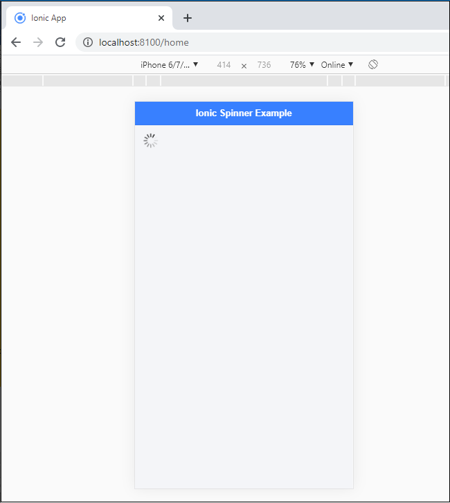
Output: After executing this code, you will get the output, which is shown below. Here you can see the default spinner in the ionic application. The default spinner is line.
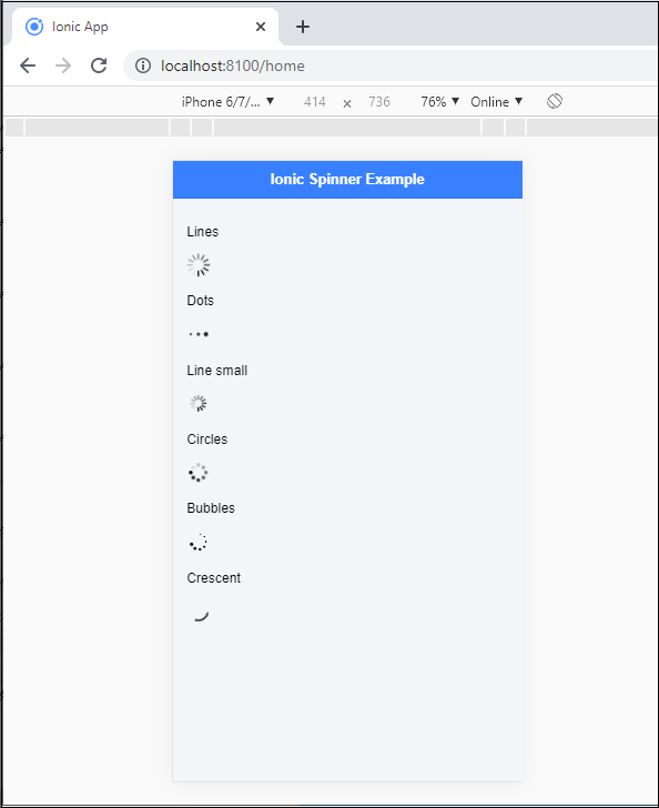
By using the name property, you can set several types of spinner in the <ion-spinner> component. Such types of the spinner are lines, circles, dots, bubbles, crescent, etc.
Example: This example explains how you can use the different types of the spinner in the ionic application.
Home.page.html
 <ion-header>
   <ion-toolbar color="primary">
     <ion-title>Ionic Spinner Example</ion-title>
   </ion-toolbar>
 </ion-header>
 <ion-content fullscreen class="ion-padding" color="light">
  <p>Lines</p>
  <ion-spinner name="lines"></ion-spinner>
  <p>Dots</p>
  <ion-spinner name="dots"></ion-spinner>
  <p>Line small</p>
  <ion-spinner name="lines-small"></ion-spinner>
  <p>Circles</p>
  <ion-spinner name="circles"></ion-spinner>
  <p>Bubbles</p>
 <ion-spinner name="bubbles"></ion-spinner>
 <p>Crescent</p>
 <ion-spinner name="crescent"></ion-spinner>
 </ion-content>
Output: After executing this code, you will get the output, which is shown below. Here can you see the different types of the spinners in the ionic application.
Setting Time
The Ionic permits the user to set the time duration to the spinner component. It means that when the time you specified is reached, the visual loading indications of the Spinner component will be disappeared.
Example: This example explains how you can set the time in the spinner.
Home.page.html
<ion-header>
   <ion-toolbar color="primary">
     <ion-title>Ionic Spinner Example</ion-title>
   </ion-toolbar>
 </ion-header>
 <ion-content class="ion-padding" color="light">
  <p>Dots</p>
   <ion-toolbar color="primary">
     <ion-title>Ionic Spinner Example</ion-title>
   </ion-toolbar>
 </ion-header>
 <ion-content class="ion-padding" color="light">
  <p>Dots</p>
  <ion-spinner name="dots"></ion-spinner>
  <p >Line small</p>
  <ion-spinner name="lines-small"></ion-spinner>
  <p>Bubbles</p>
 <ion-spinner *ngIf="show" name="bubbles" ></ion-spinner>
 <p>Crescent</p>
 <ion-spinner name="crescent"></ion-spinner>
 </ion-content>
In the home.page.ts file, you have to set the time duration to the spinner component.
import { Component } from
'@angular/core';
 import { AlertController } from '@ionic/angular';
 @Component({
   selector: 'app-home',
   templateUrl: 'home.page.html',
   styleUrls: ['home.page.scss'],
 })
 export class HomePage {
  show = true;
  constructor(){
    setTimeout(() => {
      this.show = false;
    }, 1500 );
    }
  }
Output: After executing this code, you will get the output, which is shown below.
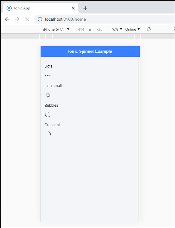
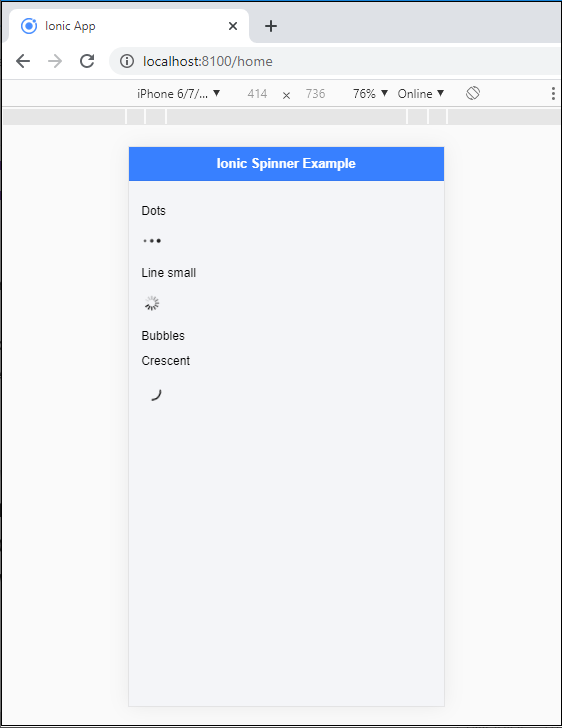
When the time limit is reached which you have set, then the bubbles loading spinner will be disappeared, as shown below:
Pause Spinner
It provides an attribute to the user to pause the animation of the spinner component. By default, the paused attribute is false. If the pause attribute is true, then the spinner animation will be paused. You can set the paused attribute in the <ion-spinner> component.
Example: This example explains how you can set the paused attribute in the spinner component. Here, we have set the paused attribute in the bubble’s spinner.
Home.page.html
<ion-header>
   <ion-toolbar color="primary">
     <ion-title>Ionic Spinner Example</ion-title>
   </ion-toolbar>
 </ion-header>
 <ion-content class="ion-padding" color="light">
   <p>Dots</p>
  <ion-spinner name="dots"></ion-spinner>
  <p >Line small</p>
  <ion-spinner name="lines-small"></ion-spinner>
  <p>Bubbles</p>
 <ion-spinner name="bubbles" paused></ion-spinner>
 <p>Crescent</p>
 <ion-spinner name="crescent"></ion-spinner>
 </ion-content>
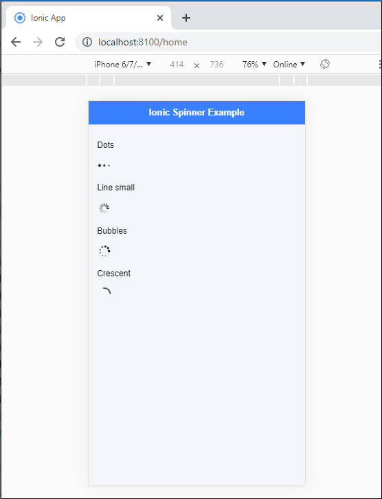
Output: After executing this code, you will get the output, which is shown below. Here, you can see that the bubble’s spinner is paused in the application.
Styling the Spinner
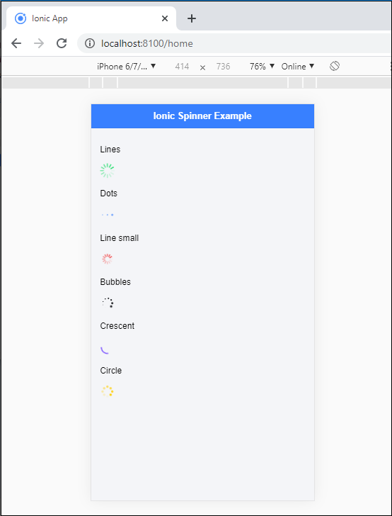
It allows the user to set the different styling or color for the spinner component. You can set the color property in the <ion-spinner> component.
Example: This example explains how you can use the styling or color in the spinner component.
Home.page.html
<ion-header>
   <ion-toolbar color="primary">
     <ion-title>Ionic Spinner Example</ion-title>
   </ion-toolbar>
 </ion-header>
 <ion-content class="ion-padding" color="light">
   <p>Lines</p>
   <ion-spinner name="lines" color="success"></ion-spinner>
   <p>Dots</p>
  <ion-spinner name="dots" color="primary"></ion-spinner>
  <p>Line small</p>
  <ion-spinner name="lines-small" color="danger"></ion-spinner>
  <p>Bubbles</p>
 <ion-spinner name="bubbles" color="dark"></ion-spinner>
 <p>Crescent</p>
 <ion-spinner name="crescent" color="tertiary"></ion-spinner>
 <p>Circle</p>
 <ion-spinner name="circles" color="warning"></ion-spinner>
 </ion-content>
Output: After executing this code, you will get the output, which is shown below. Here, you can see the different colors and styles of the spinners.