
×

Ionic Chip

Ionic chip displays the complex entities in small entities in small blocks, such as the contacts. Ionic chip has several types of elements like avatars, thumbnails, text, and icons. It is a bubble-like container that holds the text and icons.

Example: This example explains how you can use the ionic chip in the ionic application.

Home.page.html

<ion-header>  
 <ion-toolbar color="primary">  
     <ion-title>Ionic Chip Example</ion-title>  
   </ion-toolbar>  
 </ion-header>  
 <ion-content class="ion-padding" color="light">   
   <h1>Ionic Chip</h1>  
   <ion-chip>  
     <ion-label>Default Chip</ion-label>  
   </ion-chip>  
 </ion-content>   

Output: After executing this code, you will get the output, shown below:
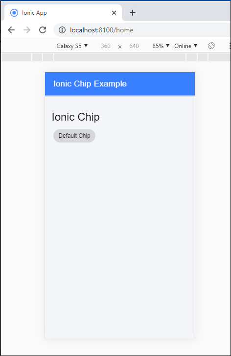
Ionic Chip

Adding Avatar and Icons

The Ionic application permits you to add the avatar and icons in the chip component. To add the icons and avatar in the <ion-chip> component, you are required to insert <ion-icon> and <ion-avatar> component inside the <ion-chip> component.

Example: This example explains how you can add the icons and avatars in the ionic chip component. 

Home.page.html

<ion-header>  
   <ion-toolbar color="primary">  
     <ion-title>Ionic Chip</ion-title>  
   </ion-toolbar>  
 </ion-header>  
 <ion-content class="ion-padding" color="light">   
   <h1>Avatars and Icons</h1>  
   <ion-chip>  
     <ion-icon name="settings"></ion-icon>  
     <ion-label>Default Chip</ion-label>
     <ion-icon name="close-circle"></ion-icon>   
   </ion-chip>  
   <ion-chip>  
     <ion-icon name="share" color="primary"></ion-icon>  
     <ion-label>Icon Chip</ion-label>  
     <ion-icon name="close-circle"></ion-icon>   
   </ion-chip> 
   <ion-chip>  
     <ion-icon name="add" color="danger"></ion-icon>
     <ion-label>Button Chip</ion-label>  
     <ion-icon name="close"></ion-icon>  
   </ion-chip>   
   <ion-chip>  
     <ion-avatar>  
       <img src="assets\icon\avatar.png">  
     </ion-avatar>  
     <ion-label>Avatar Chip</ion-label>  
     <ion-icon name="close"></ion-icon>  
   </ion-chip>  
 </ion-content>   

Output: After executing this code, you will get the output, as shown below:
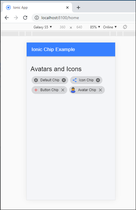
Ionic Chip2

Outline Chip

By default, the shape of the ionic is solid. However, it can be changed using the outline property. You can set the outline chip by using the <ion-chip> component.

Example: This example explains how you can use the outline chip in the ionic application.

Home.page.html

<ion-header>  
 <ion-toolbar color="primary">  
     <ion-title>Ionic Chip Example</ion-title>  
   </ion-toolbar>  
 </ion-header>   
 <ion-content class="ion-padding" color="light">  
   <h1>Ionic Chip</h1>  
   <ion-chip>   
     <ion-label>Default Chip</ion-label>  
   </ion-chip>
   <ion-chip outline>Outline Chip</ion-chip>
 </ion-content>   

Output: After executing this code, you will get the output, as shown below:
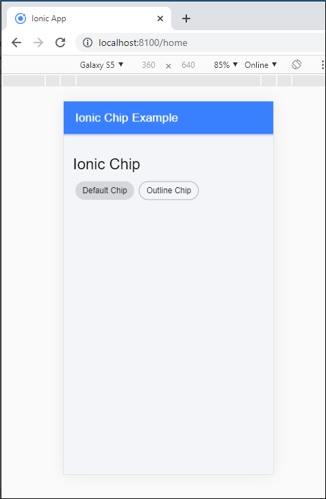
Ionic Chip3

Chip Styling

It is used to colorize the chip component in the different styles. By using the color attribute, you can change the styling of the ionic chip.

Example: This example explains how you can use the color attribute inside the chip component.

Home.page.html

<ion-header>  
   <ion-toolbar color="primary">  
     <ion-title>Ionic Chip Example</ion-title>  
   </ion-toolbar>  
 </ion-header>   
 <ion-content class="ion-padding" color="light">  
   <h1>Avatars and Icons</h1>  
   <ion-chip color="danger">  
     <ion-icon name="settings"></ion-icon>  
     <ion-label>Default Chip</ion-label>
     <ion-icon name="close-circle"></ion-icon>   
   </ion-chip>  
   <ion-chip color="warning">  
     <ion-icon name="share" color="primary"></ion-icon>  
     <ion-label>Icon Chip</ion-label>  
     <ion-icon name="close-circle"></ion-icon>  
   </ion-chip> 
   <ion-chip color="primary">
     <ion-icon name="add" color="danger"></ion-icon>
     <ion-label>Button Chip</ion-label>   
     <ion-icon name="close"></ion-icon>  
   </ion-chip>  
   <ion-chip color="success">  
     <ion-avatar>   
       <img src="assets\icon\avatar.png">  
     </ion-avatar>  
     <ion-label>Avatar Chip</ion-label>  
     <ion-icon name="close"></ion-icon>  
   </ion-chip>  
 </ion-content>   

Output: After executing this code, you will get the output, as shown below:
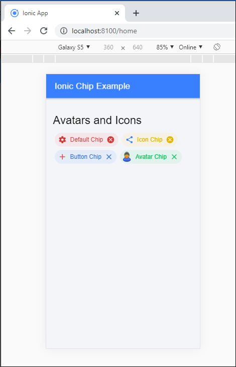
Ionic Chip4

Related Topics

Ionic Reorder

The Ionic offers the <ion-reorder> component to reordering features. Ionic reorder component adds the Drag and Drop feature to list items, in which the user can change the order of the items. Reorder...

3 minutes read.

Ionic Editors

Editors are software programs that permit the users to create and edit the text files. In the development field, editors are usually used to create the source code editors that includes many specific...

3 minutes read.

Ionic Slides

The ionic slides component is the multi-section container. You can swipe or drag any segment between them. This contains any number of slides components. Slides help it easy to make galleries, tutorials, and...

2 minutes read.

Ionic Radio

Ionic Radio The radio button is the type of input component that has a Boolean value. The Ionic radio button has a different pattern on every platform, as well as other Ionic components....

2 minutes read.

Ionic Toggle

The toggle is the same as the HTML checkbox entry, but it looks different and easier to use on a touchscreen device. It is an input component that holds the boolean value. Toggle...

2 minutes read.

Ionic Popover

The Ionic popover is a small dialog box that displays at the top of the screen. It can be used for anything, but it is usually used for a button, an action,...

4 minutes read.

Ionic Cards

Ionic Cards: Ionic cards are a standard part of the user interface that acts as an entry point for more specific information. These are the best components for displaying information...

4 minutes read.

Ionic Select

The Ion Selection component is similar to the HTML <select> element. However, the Ionic Selection component makes it easy for users to categorize and choose the preferred option or other options. You must...

3 minutes read.

Ionic Geolocation

In today’s time, the mobile location plays an essential role in the mobile application. The Ionic Cordova geolocation plugin provides information about the location of the device, like as latitude and longitude. The...

5 minutes read.

Ionic vs PhoneGap

Ionic Vs PhoneGap Ionic and PhoneGap are both used to develop the mobile application. Both Frameworks are used in large enterprises by the developers. Here, we are going to compare the important differences between ionic...

3 minutes read.

Ionic Modal

Ionic modal is displayed as a temporary UI that slides into the screen. The ionic modal is a dialog box that is displayed at the top of the app’s content, and it...

5 minutes read.

Ionic Toolbar

A toolbar is a general toolbar that can be used in an application such as a header, sub-header, footer, or even a sub-footer. Because the ion-toolbar is flexbox-dependent, no matter how many toolbars...

3 minutes read.

History of Ionic

It is a complete open-source platform for hybrid mobile application development created by Ben Sperry, Max Lynch, and Adam Bradley of Drifty Co. in 2013. The first alpha version of the framework was...

2 minutes read.

Ionic Tutorial for Beginners

What is Ionic? Ionic is an open-source framework that is used for the development of mobile applications. It is also used to build android applications, iOS, applications, desktop applications, and web applications using web...

4 minutes read.

Ionic List

Ionic List The ionic list is created of several rows of items that can contain text, buttons, thumbnails, keys, icons, and more. Lists are one of the essential components in any web or...

4 minutes read.

Ionic Colors

Ionic Colors Before we start with the actual elements available in the Ionic frame, let's understand a little bit how Ionic uses colors for different elements. Ionic Color Classes Ionic framework is a set of nine predefined...

3 minutes read.

Ionic Actionsheet

Ionic Actionsheet The Action sheet is a dialog box that displays a group of options. It is shown on the top of the application content and must be dismissed manually before the user can resume...

3 minutes read.

Ionic Range

The Range slider lets users choose from a range of values by moving the slider knob. You can accept two knobs, but by default, one-knob controls the range value. Range labels You can put down on...

2 minutes read.

Ionic framework Installation

Installation of Ionic Before proceeding with the ionic application, you'll need to install node.js and NPM (Node Package Manager), the code editor, and Ionic CLI. Installation of node.js and NPM These are the primary...

5 minutes read.

Ionic Loading

The ionic loader is an overlay that can be used to indicate activity, the user interaction while blocking. The ionic loader shows on the top of the app content, and it can...

5 minutes read.