Tailwind CSS Align Content
In Tailwind CSS, this class accepts a wide range of values. It's a replacement for the CSS Align Content feature. This class is used to modify the flex-wrap property's behavior. Flex lines are aligned. It's used to describe how the lines inside a flexible container should be aligned. This parameter determines how each flex line within a flexbox is aligned and is only applicable if flex-wrap: wrap is used, i.e. if several lines of flexbox items are present.
Align Content Classes
- content-center
- content-start
- content-end
- content-between
- content-around
- content-evenly
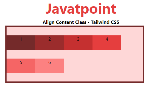
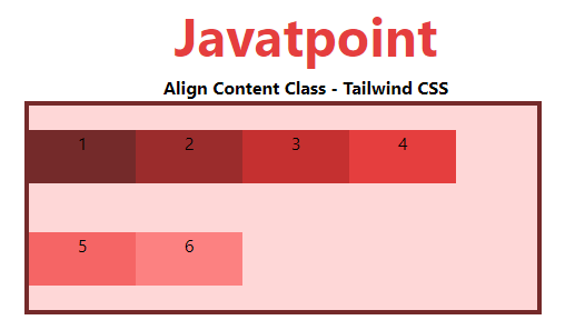
content-center
This class is used to position lines in the flex container's center.
Syntax:
<element class="content-center">...</element>
Example:
<!DOCTYPE html>

<head>

    <link href=

"https://unpkg.com/tailwindcss@^1.0/dist/tailwind.min.css"

          rel="stylesheet">

</head>

<body class="text-center">

    <h1 class="text-red-600 text-5xl font-bold">

        Javatpoint

    </h1>

    <b>Align Content Class - Tailwind CSS </b>

    <div id="main" class="ml-24 h-48 w-2/3 flex flex-wrap

                          content-center

                          bg-red-200 border-solid border-4

                          border-red-900">

        <div class="bg-red-900 w-24 h-12">1</div>

        <div class="bg-red-800 w-24 h-12">2</div>

        <div class="bg-red-700 w-24 h-12">3</div>

        <div class="bg-red-600 w-24 h-12">4</div>

        <div class="bg-red-500 w-24 h-12">5</div>

        <div class="bg-red-400 w-24 h-12">6</div>

    </div>

</body>

</html>
Output:
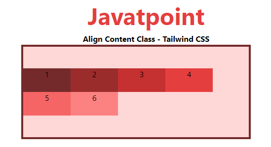
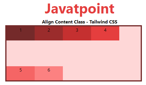
content-start
This class is used to place lines at the beginning of the flex container.
Syntax:
<element class="content-start">...</element>
Example:
<!DOCTYPE html>

<head>

    <link href=

"https://unpkg.com/tailwindcss@^1.0/dist/tailwind.min.css"

          rel="stylesheet">

</head>

<body class="text-center">

    <h1 class="text-red-600 text-5xl font-bold">

        Javatpoint

    </h1>

    <b>Align Content Class - Tailwind CSS </b>

    <div id="main" class="ml-24 h-48 w-2/3 flex flex-wrap

                          content-start

                          bg-red-200 border-solid border-4

                          border-red-900">

        <div class="bg-red-900 w-24 h-12">1</div>

        <div class="bg-red-800 w-24 h-12">2</div>

        <div class="bg-red-700 w-24 h-12">3</div>

        <div class="bg-red-600 w-24 h-12">4</div>

        <div class="bg-red-500 w-24 h-12">5</div>

        <div class="bg-red-400 w-24 h-12">6</div>

    </div>

</body>

</html>
Output:
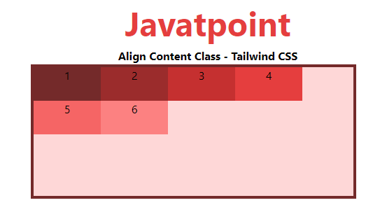
content-end
The content-end class is used to place lines at the flex container's end.
Syntax:
<element class="content-end">...</element>
Example:
<!DOCTYPE html>

<head>

    <link href=

"https://unpkg.com/tailwindcss@^1.0/dist/tailwind.min.css"

          rel="stylesheet">

</head>

<body class="text-center">

    <h1 class="text-red-600 text-5xl font-bold">

        Javatpoint

    </h1>

    <b>Align Content Class - Tailwind CSS </b>

    <div id="main" class="ml-24 h-48 w-2/3 flex flex-wrap

                          content-end

                          bg-red-200 border-solid border-4

                          border-red-900">

        <div class="bg-red-900 w-24 h-12">1</div>

        <div class="bg-red-800 w-24 h-12">2</div>

        <div class="bg-red-700 w-24 h-12">3</div>

        <div class="bg-red-600 w-24 h-12">4</div>

        <div class="bg-red-500 w-24 h-12">5</div>

        <div class="bg-red-400 w-24 h-12">6</div>

    </div>

</body>

</html>
Output:
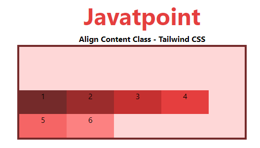
content-between
This class is used to evenly distribute rows in a container such that each line has the same amount of space.
Syntax:
<element class="content-between">...</element>
Example:
<!DOCTYPE html>

<head>

    <link href=

"https://unpkg.com/tailwindcss@^1.0/dist/tailwind.min.css"

          rel="stylesheet">

</head>

<body class="text-center">

    <h1 class="text-red-600 text-5xl font-bold">

        Javatpoint

    </h1>

    <b>Align Content Class - Tailwind CSS </b>

    <div id="main" class="ml-24 h-48 w-2/3 flex flex-wrap

                          content-between

                          bg-red-200 border-solid border-4

                          border-red-900">

        <div class="bg-red-900 w-24 h-12">1</div>

        <div class="bg-red-800 w-24 h-12">2</div>

        <div class="bg-red-700 w-24 h-12">3</div>

        <div class="bg-red-600 w-24 h-12">4</div>

        <div class="bg-red-500 w-24 h-12">5</div>

        <div class="bg-red-400 w-24 h-12">6</div>

    </div>

</body>

</html>
Output:
content-around
This class is used to evenly distribute rows in a container so that each line has the same amount of space around it.
Syntax:
<element class="content-around">...</element>
Example:
<!DOCTYPE html>

<head>

    <link href=

"https://unpkg.com/tailwindcss@^1.0/dist/tailwind.min.css"

          rel="stylesheet">

</head>

<body class="text-center">

    <h1 class="text-red-600 text-5xl font-bold">

        Javatpoint

    </h1>

    <b>Align Content Class - Tailwind CSS </b>

    <div id="main" class="ml-24 h-48 w-2/3 flex flex-wrap

                          content-around

                          bg-red-200 border-solid border-4

                          border-red-900">

        <div class="bg-red-900 w-24 h-12">1</div>

        <div class="bg-red-800 w-24 h-12">2</div>

        <div class="bg-red-700 w-24 h-12">3</div>

        <div class="bg-red-600 w-24 h-12">4</div>

        <div class="bg-red-500 w-24 h-12">5</div>

        <div class="bg-red-400 w-24 h-12">6</div>

    </div>

</body>

</html>
Output:
content-evenly
This class is used to arrange rows in a container so that there is an equal amount of space around each item, while also accounting for the doubling of space between each item that you would see if you used the content-around class.
Syntax:
<element class="content-evenly">...</element>
Example:
<!DOCTYPE html>

<head>

    <link href=

"https://unpkg.com/tailwindcss@^1.0/dist/tailwind.min.css"

          rel="stylesheet">

</head>

<body class="text-center">

    <h1 class="text-red-600 text-5xl font-bold">

        Javatpoint

    </h1>

    <b>Align Content Class - Tailwind CSS </b>

    <div id="main" class="ml-24 h-48 w-2/3 flex flex-wrap

                          content-evenly

                          bg-red-200 border-solid border-4

                          border-red-900">

        <div class="bg-red-900 w-24 h-12">1</div>

        <div class="bg-red-800 w-24 h-12">2</div>

        <div class="bg-red-700 w-24 h-12">3</div>

        <div class="bg-red-600 w-24 h-12">4</div>

        <div class="bg-red-500 w-24 h-12">5</div>

        <div class="bg-red-400 w-24 h-12">6</div>

    </div>

</body>

</html>
Output: