Tailwind CSS Place Content
This class accepts a wide range of values. It's a replacement for the CSS Place Content property. This class is used to manage how information is justified while still being aligned. To change the values of several properties in a single class, the align-content and justify-content class values can be stored in the place-content class.
Place Content Classes
The classes are as follows:
- place-content-center
- place-content-start
- place-content-end
- place-content-between
- place-content-around
- place-content-evenly
- place-content-stretch
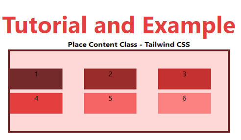
place-content-center
The place-content-center class aligns flex elements in the container's centre.
Syntax:
<element class="place-content-center">...</element>
Example:
<!DOCTYPE html>
<head>
    <link href=
"https://unpkg.com/tailwindcss@^1.0/dist/tailwind.min.css"
          rel="stylesheet">
</head>
<body class="text-center">
    <h1 class="text-red-600 text-5xl font-bold">
        Tutorial and Example
    </h1>
    <b>Place Content Class - Tailwind CSS </b>
    <div id="main" class="ml-24 h-48 w-2/3 grid grid-cols-3 gap-2
                          place-content-center
                          h-48 bg-red-200 border-solid border-4
                          border-red-900">
        <div class="bg-red-900 w-3/4 h-12">1</div>
        <div class="bg-red-800 w-3/4 h-12">2</div>
        <div class="bg-red-700 w-3/4 h-12">3</div>
        <div class="bg-red-600 w-3/4 h-12">4</div>
        <div class="bg-red-500 w-3/4 h-12">5</div>
        <div class="bg-red-400 w-3/4 h-12">6</div>
    </div>
</body>
</html>
Output:
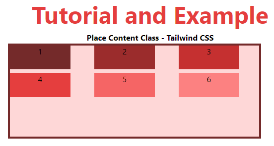
place-content-start
The place-content-start class aligns flex items at the container's start.
Syntax:
<element class="place-content-start">...</element>
Example:
<!DOCTYPE html>
<head>
    <link href=
"https://unpkg.com/tailwindcss@^1.0/dist/tailwind.min.css"
          rel="stylesheet">
</head>
<body class="text-center">
    <h1 class="text-red-600 text-5xl font-bold">
       Tutorial and Example
    </h1>
    <b>Place Content Class - Tailwind CSS </b>
    <div id="main" class="ml-24 h-48 w-2/3 grid grid-cols-3 gap-2
                          place-content-start
                          h-48 bg-red-200 border-solid border-4
                          border-red-900">
        <div class="bg-red-900 w-3/4 h-12">1</div>
        <div class="bg-red-800 w-3/4 h-12">2</div>
        <div class="bg-red-700 w-3/4 h-12">3</div>
        <div class="bg-red-600 w-3/4 h-12">4</div>
        <div class="bg-red-500 w-3/4 h-12">5</div>
        <div class="bg-red-400 w-3/4 h-12">6</div>
    </div>
</body>
</html>
Output:
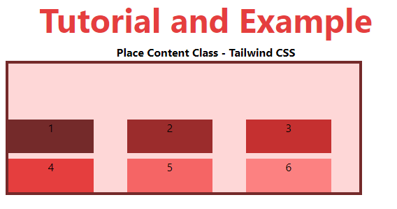
place-content-end
The place-content-end class aligns flex items at the container's end.
Syntax:
<element class="place-content-end">...</element>
Example:
<!DOCTYPE html>
<head>
    <link href=
"https://unpkg.com/tailwindcss@^1.0/dist/tailwind.min.css"
          rel="stylesheet">
</head>
<body class="text-center">
    <h1 class="text-red-600 text-5xl font-bold">
       Tutorial and Example
    </h1>
    <b>Place Content Class - Tailwind CSS </b>
    <div id="main" class="ml-24 h-48 w-2/3 grid grid-cols-3 gap-2
                          place-content-end
                          h-48 bg-red-200 border-solid border-4
                          border-red-900">
        <div class="bg-red-900 w-3/4 h-12">1</div>
        <div class="bg-red-800 w-3/4 h-12">2</div>
        <div class="bg-red-700 w-3/4 h-12">3</div>
        <div class="bg-red-600 w-3/4 h-12">4</div>
        <div class="bg-red-500 w-3/4 h-12">5</div>
        <div class="bg-red-400 w-3/4 h-12">6</div>
    </div>
</body>
</html>
Output:
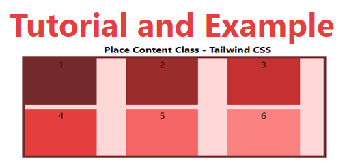
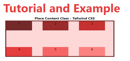
place-content-between
This class spreads the space between flex lines evenly.
Syntax:
<element class="place-content-between">...</element>
Example:
<!DOCTYPE html>
<head>
    <link href=
"https://unpkg.com/tailwindcss@^1.0/dist/tailwind.min.css"
          rel="stylesheet">
</head>
<body class="text-center">
    <h1 class="text-red-600 text-5xl font-bold">
       Tutorial and Example
    </h1>
    <b>Place Content Class - Tailwind CSS </b>
    <div id="main" class="ml-24 h-48 w-2/3 grid grid-cols-3 gap-2
                          place-content-between
                          h-48 bg-red-200 border-solid border-4
                          border-red-900">
        <div class="bg-red-900 w-3/4 h-12">1</div>
        <div class="bg-red-800 w-3/4 h-12">2</div>
        <div class="bg-red-700 w-3/4 h-12">3</div>
        <div class="bg-red-600 w-3/4 h-12">4</div>
        <div class="bg-red-500 w-3/4 h-12">5</div>
        <div class="bg-red-400 w-3/4 h-12">6</div>
    </div>
</body>
</html>
Output:
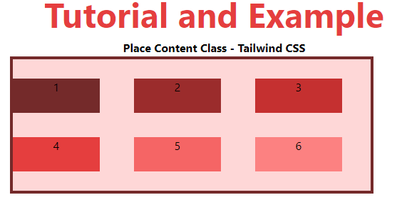
place-content-around
The place-content-around class evenly distributes space around the flex lines.
Syntax:
<element class="place-content-around">...</element>
Example:
<!DOCTYPE html>
<head>
    <link href=
"https://unpkg.com/tailwindcss@^1.0/dist/tailwind.min.css"
          rel="stylesheet">
</head>
<body class="text-center">
    <h1 class="text-red-600 text-5xl font-bold">
       Tutorial and Example
    </h1>
    <b>Place Content Class - Tailwind CSS </b>
    <div id="main" class="ml-24 h-48 w-2/3 grid grid-cols-3 gap-2
                          place-content-around
                          h-48 bg-red-200 border-solid border-4
                          border-red-900">
        <div class="bg-red-900 w-3/4 h-12">1</div>
        <div class="bg-red-800 w-3/4 h-12">2</div>
        <div class="bg-red-700 w-3/4 h-12">3</div>
        <div class="bg-red-600 w-3/4 h-12">4</div>
        <div class="bg-red-500 w-3/4 h-12">5</div>
        <div class="bg-red-400 w-3/4 h-12">6</div>
    </div>
</body>
</html>
Output:
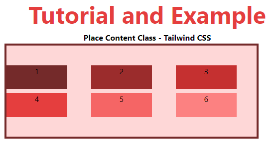
place-content-evenly
This class specifies a position with equal spacing between them, but with different spacing from the corners.
Syntax:
<element class="place-content-evenly">...</element>
Example:
<!DOCTYPE html>
<head>
    <link href=
"https://unpkg.com/tailwindcss@^1.0/dist/tailwind.min.css"
          rel="stylesheet">
</head>
<body class="text-center">
    <h1 class="text-red-600 text-5xl font-bold">
       Tutorial and Example
    </h1>
    <b>Place Content Class - Tailwind CSS </b>
    <div id="main" class="ml-24 h-48 w-2/3 grid grid-cols-3 gap-2
                          place-content-evenly
                          h-48 bg-red-200 border-solid border-4
                          border-red-900">
        <div class="bg-red-900 w-3/4 h-12">1</div>
        <div class="bg-red-800 w-3/4 h-12">2</div>
        <div class="bg-red-700 w-3/4 h-12">3</div>
        <div class="bg-red-600 w-3/4 h-12">4</div>
        <div class="bg-red-500 w-3/4 h-12">5</div>
        <div class="bg-red-400 w-3/4 h-12">6</div>
    </div>
</body>
</html>
Output:
place-content-stretch
This class defines a line that is stretched to fill the flex container's remaining space. It's the default setting.
Syntax:
<element class="place-content-evenly">...</element>
Example:
<!DOCTYPE html>
<head>
    <link href=
"https://unpkg.com/tailwindcss@^1.0/dist/tailwind.min.css"
          rel="stylesheet">
</head>
<body class="text-center">
    <h1 class="text-red-600 text-5xl font-bold">
       Tutorial and Example
    </h1>
    <b>Place Content Class - Tailwind CSS </b>
    <div id="main" class="ml-24 h-48 w-2/3 grid grid-cols-3 gap-2
                          place-content-stretch
                          h-48 bg-red-200 border-solid border-4
                          border-red-900">
        <div class="bg-red-900 w-3/4">1</div>
        <div class="bg-red-800 w-3/4">2</div>
        <div class="bg-red-700 w-3/4">3</div>
        <div class="bg-red-600 w-3/4">4</div>
        <div class="bg-red-500 w-3/4">5</div>
        <div class="bg-red-400 w-3/4">6</div>
    </div>
</body>
</html>
Output: