Tailwind CSS Flex Direction
CSS flexbox is an important element for frontend development. CSS has four directions, therefore in tailwind CSS, all of the properties are covered in class form. It's a front-end development alternative to the CSS flex-direction Property.
Note: You must include the flex class in your element before the flex-direction class to activate the flex-direction.
Flex Direction
The various flex direction are as follows:
- flex-row
- flex-row-reverse
- flex-col
- flex-col-reverse
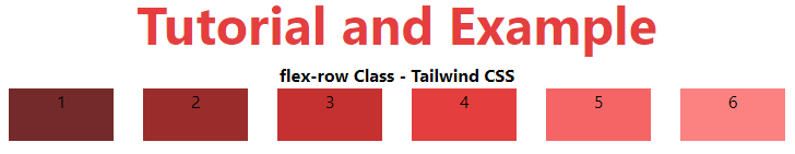
flex-row
It aligns the row in the same direction as the text. Flex-direction is set to a row by default. It's used to indicate that the item's text direction is normal. It causes the item to follow the standard text line direction.
Syntax:
<element class="flex flex-row"> Contents... </element>
Example
The code is as follows:
<!DOCTYPE html>
<head>
    <title>flex-row Class in Tailwind</title>
    <link href=
"https://unpkg.com/tailwindcss@^1.0/dist/tailwind.min.css"
          rel="stylesheet">
</head>
<body class="text-center">
    <h1 class="text-red-600 text-5xl font-bold">
        Tutorial and Example
    </h1>
    <b>flex-row Class - Tailwind CSS </b>
    <div id="main" class="flex flex-row justify-evenly">
        <div class="bg-red-900 w-24 h-12">1</div>
        <div class="bg-red-800 w-24 h-12">2</div>
        <div class="bg-red-700 w-24 h-12">3</div>
        <div class="bg-red-600 w-24 h-12">4</div>
        <div class="bg-red-500 w-24 h-12">5</div>
        <div class="bg-red-400 w-24 h-12">6</div>
    </div>
</body>
</html>
Output:
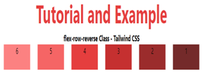
flex-row-reverse
The flex-row-reverse class is used to follow the text oppositely. As can be seen in the Output, it creates flex pieces in reverse order, exactly the opposite of text orientation.
Syntax
<element class="flex flex-row-reverse"> Contents... </element>
Example
The code is as follows:
<!DOCTYPE html>
<head>
    <title>flex-row-reverse Class of Tailwind </title>
    <link href=
"https://unpkg.com/tailwindcss@^1.0/dist/tailwind.min.css"
          rel="stylesheet">
</head>
<body class="text-center">
    <h1 class="text-red-600 text-5xl font-bold">
        Tutorial and Example
    </h1>
    <b>flex-row-reverse Class - Tailwind CSS </b>
    <div id="main" class="flex flex-row-reverse justify-evenly">
        <div class="bg-red-900 w-24 h-12">1</div>
        <div class="bg-red-800 w-24 h-12">2</div>
        <div class="bg-red-700 w-24 h-12">3</div>
        <div class="bg-red-600 w-24 h-12">4</div>
        <div class="bg-red-500 w-24 h-12">5</div>
        <div class="bg-red-400 w-24 h-12">6</div>
    </div>
</body>
</html>
Output:
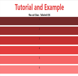
flex-col
This option arranges the row as a column in the same way that text does, but from top to bottom. It is used to indicate that the item's top to bottom direction is typical. As we can see in the result, it causes the object to follow the regular top to bottom orientation.
Syntax:
<element class="flex flex-col"> Contents... </element>
Example
The code is as follows:
<!DOCTYPE html>
<head>
    <title>flex-col Class of Tailwind </title>
    <link href=
"https://unpkg.com/tailwindcss@^1.0/dist/tailwind.min.css"
          rel="stylesheet">
</head>
<body class="text-center">
    <h1 class="text-red-600 text-5xl font-bold">
        Tutorial and Example
    </h1>
    <b>flex-col Class - Tailwind CSS </b>
    <div id="main" class="flex flex-col gap-y-2">
        <div class="bg-red-900 w-30 h-12">1</div>
        <div class="bg-red-800 w-30 h-12">2</div>
        <div class="bg-red-700 w-30 h-12">3</div>
        <div class="bg-red-600 w-30 h-12">4</div>
        <div class="bg-red-500 w-30 h-12">5</div>
        <div class="bg-red-400 w-30 h-12">6</div>
    </div>
</body>
</html>
Output:
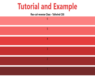
flex-col-reverse
It makes the row into a column in the same way as row-reverse bottom to top does. It's used to indicate that the item's bottom to top direction is typical. It causes the item to follow the regular bottom to top orientation.
Syntax:
<element class="flex flex-col-reverse"> Contents... </element>
Example
The code is as follows:
<!DOCTYPE html>
<head>
    <title>flex-col-reverse Class of Tailwind </title>
    <link href=
"https://unpkg.com/tailwindcss@^1.0/dist/tailwind.min.css"
          rel="stylesheet">
</head>
<body class="text-center">
    <h1 class="text-red-600 text-5xl font-bold">
        Tutorial and Example
    </h1>
    <b>flex-col-reverse Class - Tailwind CSS </b>
    <div id="main" class="flex flex-col-reverse gap-y-2">
        <div class="bg-red-900 w-30 h-12">1</div>
        <div class="bg-red-800 w-30 h-12">2</div>
        <div class="bg-red-700 w-30 h-12">3</div>
        <div class="bg-red-600 w-30 h-12">4</div>
        <div class="bg-red-500 w-30 h-12">5</div>
        <div class="bg-red-400 w-30 h-12">6</div>
    </div>
</body>
</html>
Output: