Tailwind CSS Flex Shrink
CSS flexbox is an important element for frontend development. There are two flex-shrink options in Tailwind CSS, and all properties are covered in class form. For quick front-end development, it's an alternative to the CSS flex-shrink Property. This class determines how much the item shrinks in comparison to other items in the container. It describes an element's ability to shrink in contrast to other items contained within the same container.
Flex shrink
The Flex shrink classes are as follows:
- flex-shrink-0
- flex-shrink
flex-shrink-0
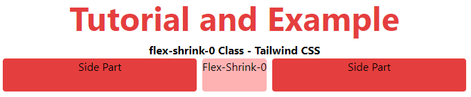
This class disables the shrinking feature, which allows an item to shrink in comparison to other content in the same container.
Syntax:
<element class="flex-shrink-0"> Contents... </element>
Example:
The example for flex-shrink-0 is as follows:
<!DOCTYPE html>
<html>
<head>
    <title>flex-shrink-0 Class of Tailwind </title>
    <link href=
"https://unpkg.com/tailwindcss@^1.0/dist/tailwind.min.css"
          rel="stylesheet">
</head>
<body class="text-center">
    <h1 class="text-red-600 text-5xl font-bold">
        Tutorial and Example
    </h1>
    <b>flex-shrink-0 Class - Tailwind CSS </b>
    <div id="main" class="flex justify-evenly space-x-2 ml-12 mr-12">
        <div class="rounded bg-red-600 flex-1 h-12 ">
            Side Part</div>
        <div class="rounded bg-red-300 flex-shrink-0 h-12">
            Flex-Shrink-0
        </div>
        <div class="rounded bg-red-600 flex-1 h-12 mr-12">
            Side Part</div>
    </div>
</body>
</html>
Output:
flex-shrink
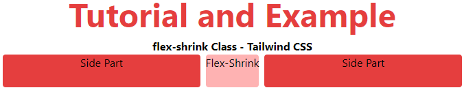
The shrinking functionality is unrestricted by this class. It allows an item to reduce in size in comparison to the available screen space and fit into that space.
Syntax:
<element class="flex-shrink">..</element>
Example
The example for flex-shrink is as follows:
<!DOCTYPE html>
<html>

<head>
    <title>flex-shrink Class of Tailwind </title>
    <link href=
"https://unpkg.com/tailwindcss@^1.0/dist/tailwind.min.css"
          rel="stylesheet">
</head>
<body class="text-center">
    <h1 class="text-red-600 text-5xl font-bold">
        Tutorial and Example
    </h1>
    <b>flex-shrink Class - Tailwind CSS </b>
    <div id="main" class="flex justify-evenly space-x-2 ml-12 mr-12">
        <div class="rounded bg-red-600 flex-grow w-16 h-12 ">
            Side Part</div>
        <div class="rounded bg-red-300 flex-shrink h-12">
            Flex-Shrink
        </div>
        <div class="rounded bg-red-600 flex-grow w-16 h-12">
            Side Part</div>
    </div>
</body>
</html>
Output: