Tailwind CSS Max-Width
In tailwind CSS, this class accepts a large number of values, and all of the properties are covered in class form. It's a replacement for the CSS max-width property. This class is used to specify an element's maximum width. The width value must be less than or equal to the max-width value. Max-width preserves the set maximum width of the content supplied within the element is larger.
The Prose class, a new CSS property presentation, will be demonstrated in this class. It was utilized to achieve the best possible reading width. If you're familiar with the "typography plugin," you'll understand how this class works.
Max-Width Classes
The various max-width classes are as follows:
- max-w-0: This class's max-width: 0rem property is used to specify the screen width.
- max-w-none: The screen width is configured using the max-width: none class.
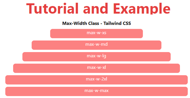
- max-w-xs: The screen width is configured with the max-width: 20rem class.
- max-w-sm: The screen width is set using the max-width: 24rem class.
- max-w-md: The maximum screen width is set to 28 pixels with this class.
- max-w-lg: This class specifies a 32-pixel maximum screen width.
- max-w-xl: To specify the screen width, use the max-width: 36rem class.
- max-w-2xl: The screen width is configured using the max-width: 42rem class.
- max-w-3xl: The screen width is set using the max-width: 48rem class.
- max-w-4xl: The maximum screen width is set to 56 pixels with this class.
- max-w-5xl: This class specifies a 64-pixel maximum screen width.
- The max-width: 72rem class is used to set the screen width for max-w-6xl.
- max-w-7xl: The screen width is set using the max-width: 80rem class.
- max-w-full: The screen width is set using the max-width: 100 percent class.
- max-w-min: The screen width is set using the max-width: min-content class.
- max-w-max: The maximum width is: The screen width is controlled by the max-content class.
- max-w-prose: The screen width is configured using the max-width: 65ch class.
- max-w-screen-sm: The screen width is set using the max-width: 640px class.
- max-w-screen-md: The screen width is set using the max-width: 768px class.
- max-w-screen-lg: The max-width: 1024px class is used to set the screen width.
- max-w-screen-xl: The max-width: 1280px class is used to set the screen width.
- max-w-screen-2xl: The max-width: 1536px class is used to set the screen width.
Syntax:
<element class="max-w-0">...</element>
Code:
<!DOCTYPE html>
<head>
    <link href=
"https://unpkg.com/tailwindcss@^1.0/dist/tailwind.min.css"
          rel="stylesheet">
</head>
<body class="text-center mx-4 space-y-2">
    <h1 class="text-red-600 text-5xl font-bold">
       Tutorial and Example
    </h1>
    <b>Max-Width Class - Tailwind CSS </b>
    <div class="h-8 max-w-xs mx-auto bg-red-400 rounded-lg text-white">
        max-w-xs
    </div>
    <div class="h-8 max-w-md mx-auto bg-red-400 rounded-lg text-white">
        max-w-md
    </div>
    <div class="h-8 max-w-lg mx-auto bg-red-400 rounded-lg text-white">
        max-w-lg
    </div>
    <div class="h-8 max-w-xl mx-auto bg-red-400 rounded-lg text-white">
        max-w-xl
    </div>
    <div class="h-8 max-w-2xl mx-auto bg-red-400 rounded-lg text-white">
        max-w-2xl
    </div>
    <div class="h-8 max-w-max mx-auto bg-red-400 rounded-lg text-white">
        max-w-max
    </div>
</body>
</html>
Output: