
Tailwind CSS Float
The float class acknowledges more than one worth (value) in tailwind CSS. It is an option in contrast to the CSS float property. The float class characterizes the progression of content for controlling the wrapping of content around an element.
Float Classes
There are three types of float classes, which are as follows:
- float-right
- float-left
- float-none
-
float-right
This class is utilized to make the element float on the right half (right-side) of the container.
Syntax:
<element class="float-right">...</element>
Example:
Code is as follows:
<!DOCTYPE html>
<head>
<link href=
"https://unpkg.com/tailwindcss@^1.0/dist/tailwind.min.css"
rel="stylesheet">
</head>
<body class="text-center">
<center>
<h1 class="text-red-600 text-5xl font-bold">
Tutorial and Example
</h1>
<b>float Class - Tailwind CSS </b>
<div class="mx-10">
<img class="float-right p-2"
src=
“javatpoint logo_image.png">
<p class="text-justify ">How often were you disappointed while watching out
for a decent assortment of programming/calculation/interview
questions ? What did you expect and what did you get?
This entry has been made to give elegantly composed,
all around thought and very much clarified answers for chose
questions. An IIT Roorkee former student and originator of
Javatpoint. He loves to take care of programming issues
in most productive ways. Aside from Javatpoint, he
has worked with DE Shaw and Co. as a product designer
what's more JIIT Noida as an associate professor.It is a decent
stage to pick up programming. It is an instructive
site. Get ready for the Recruitment drive of item
based organizations like Microsoft, Amazon, Adobe and so on with
a free internet based arrangement readiness course. </p>
</center>
</body>
</html>
The output for the above code is:
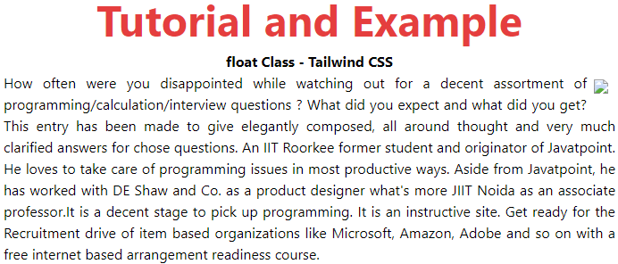
In the above output, the image which is circled is following the float right command.
-
float-left
This class is utilized to make the element float on the left half (side) of the container.
Syntax:
<element class="float-left"">...</element>
Example:
Code is as follows:
<!DOCTYPE html>
<head>
<link href=
"https://unpkg.com/tailwindcss@^1.0/dist/tailwind.min.css"
rel="stylesheet">
</head>
<body class="text-center">
<center>
<h1 class="text-red-600 text-5xl font-bold">
Tutorial and Example
</h1>
<b>float Class - Tailwind CSS </b>
<div class="mx-10">
<img class="float-left p-2"
src=
"javatpoint logo_image.png">
<p class="text-justify ">How often were you disappointed while watching out
for a decent assortment of programming/calculation/interview
questions? What did you expect and what did you get?
This entry has been made to give elegantly composed,
all around thought and very much clarified answers for chose
questions. An IIT Roorkee former student and originator of
Javatpoint. He loves to take care of programming issues
in most productive ways. Aside from Javatpoint, he
has worked with DE Shaw and Co. as a product designer
what's more JIIT Noida as an associate professor.It is a decent
stage to pick up programming. It is an instructive
site. Get ready for the Recruitment drive of item
based organizations like Microsoft, Amazon, Adobe and so on with
a free internet based arrangement readiness course.</p>
</center>
</body>
</html>
The output for the above code is:
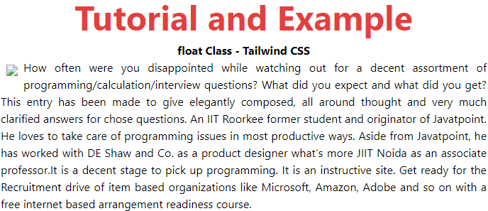
In the above output, the image which is (at left corner) circled is following the float left command.
-
float-none
This class is utilized to make the element float at the default place. We are utilizing the center tag so the picture is put in the middle (center).
Syntax:
<element class="float-none"">...</element>
Example:
Code is as follows:
<!DOCTYPE html>
<head>
<link href=
"https://unpkg.com/tailwindcss@^1.0/dist/tailwind.min.css"
rel="stylesheet">
</head>
<body class="text-center">
<center>
<h1 class="text-red-600 text-5xl font-bold">
Tutorial and Example
</h1>
<b>float Class - Tailwind CSS </b>
<div class="mx-10">
<img class="float-none p-2"
src=
"javatpoint logo_image.png">
<p class="text-justify ">How often were you disappointed while watching out
for a decent assortment of programming/calculation/interview
questions? What did you expect and what did you get?
This entry has been made to give elegantly composed,
all around thought and very much clarified answers for chose
questions. An IIT Roorkee former student and originator of
Javatpoint. He loves to take care of programming issues
in most productive ways. Aside from Javatpoint, he
has worked with DE Shaw and Co. as a product designer
what's more JIIT Noida as an associate professor.It is a decent
stage to pick up programming. It is an instructive
site. Get ready for the Recruitment drive of item
based organizations like Microsoft, Amazon, Adobe and so on with
a free internet based arrangement readiness course.</p>
</center>
</body>
</html>
The output for the above code is:
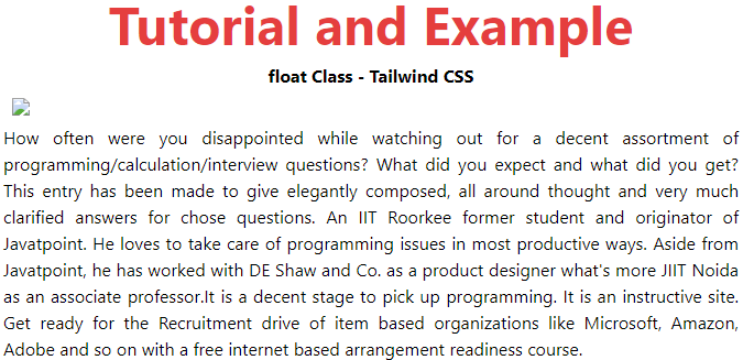
In the above output, the image which is circled (at left corner) is following the float none command.