Tailwind CSS Flex
CSS flexbox is an important component for frontend development. There are four flex options in Tailwind CSS, and all of the attributes are covered in class form. It's a front-end development alternative to the CSS flex property. It's used to determine how long flexible goods should be. The flex class is considerably more mobile-friendly and responsive. The positioning of child items and the main container is simple. The content margins do not collapse with the margins of the margin. Any element's order can be simply modified without having to edit the HTML section.
Flex
The Flex classes are classified as:
- flex-1
- flex-initial
- flex-auto
- flex-none
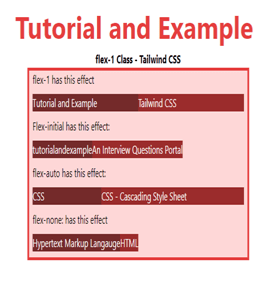
flex-1
A ratio indicating how much an item will grow in comparison to the rest of the flexible objects. It's been used to let a flex item grow and shrink as needed, regardless of its original size.
Syntax
<element class="flex-1"> Contents... </element>
Example
The code is as follows:
<!DOCTYPE html>
<html>

<head>
<title>flex-1 Class of Tailwind </title>

<link href=
"https://unpkg.com/tailwindcss@^1.0/dist/tailwind.min.css"
rel="stylesheet">
</head>

<body>
<h1 class="text-center text-red-600 text-5xl font-bold">
Tutorial and Example
</h1>

<p class="text-center font-bold">flex-1 Class - Tailwind CSS </p>

<div id="main" class="bg-red-200 border-4
border-red-600 w-2/3 ml-32">
<p class="ml-2">flex-1 has this effect</p>

<div class="flex m-2 text-white">
<div class="bg-red-900 flex-1">
Tutorial and Example
</div>
<div class="bg-red-800 flex-1">
Tailwind CSS
</div>
</div>
<p class="ml-2">
Flex-initial has this effect:
</p>

<div class="flex m-2 text-white">
<div class="bg-red-900 flex-initial">
tutorialandexample
</div>
<div class="bg-red-800 flex-initial">
An Interview Questions Portal
</div>
</div>
<p class="ml-2">
flex-auto has this effect:
</p>

<div class="flex m-2 text-white">
<div class="bg-red-900 flex-auto">
CSS
</div>
<div class="bg-red-800 flex-auto">
CSS - Cascading Style Sheet
</div>
</div>
<p class="ml-2">
flex-none: has this effect
</p>

<div class="flex m-2 text-white">
<div class="bg-red-900 flex-none">
Hypertext Markup Langauge
</div>
<div class="bg-red-800 flex-none">
HTML
</div>
</div>
</div>
</body>
</html>
Output:
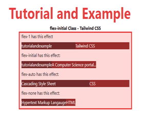
flex-initial
This class specifies how much that item will expand in comparison to the other flexible things. It's been utilized to allow a flex object to shrink but not grow while keeping its original size in mind.
Syntax
<element class="flex-initial">..</element>
Example
The code is as follows:
<!DOCTYPE html>
<html>

<head>
<title>flex-initial Class of Tailwind </title>

<link href=
"https://unpkg.com/tailwindcss@^1.0/dist/tailwind.min.css"
rel="stylesheet">
</head>

<body>
<h1 class="text-center text-red-600 text-5xl font-bold">
Tutorial and Example
</h1>

<p class="text-center font-bold">flex-initial Class - Tailwind CSS </p>

<div id="main" class="bg-red-200 border-4
border-red-600 w-2/3 ml-32">
<p class="ml-2">flex-1 has this effect</p>

<div class="flex m-2 text-white">
<div class="bg-red-900 flex-1">
tutorialandexample
</div>
<div class="bg-red-800 flex-1">
Tailwind CSS
</div>
</div>
<p class="ml-2">
flex-initial has this effect:
</p>

<div class="flex m-2 text-white">
<div class="bg-red-900 flex-initial">
tutorialandexample
</div>
<div class="bg-red-800 flex-initial">
A Computer Science portal...
</div>
</div>
<p class="ml-2">
flex-auto has this effect:
</p>

<div class="flex m-2 text-white">
<div class="bg-red-900 flex-auto">
Cascading Style Sheet
</div>
<div class="bg-red-800 flex-auto">
CSS
</div>
</div>
<p class="ml-2">
flex-none has this effect:
</p>

<div class="flex m-2 text-white">
<div class="bg-red-900 flex-none">
Hypertext Markup Langauge
</div>
<div class="bg-red-800 flex-none">
HTML
</div>
</div>
</div>
</body>
</html>
Output:
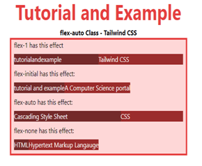
flex-auto
This class indicates how much the item will expand about the flexible items' content. It's been used to let a flex item grow and shrink as needed, regardless of its original size.
Syntax
<element class="flex-auto"> Contents... </element>
Example
The code is as follows:
<!DOCTYPE html>
<html>

<head>
<title>flex-auto Class of Tailwind </title>

<link href=
"https://unpkg.com/tailwindcss@^1.0/dist/tailwind.min.css"
rel="stylesheet">
</head>

<body>
<h1 class="text-center text-red-600 text-5xl font-bold">
Tutorial and Example
</h1>

<p class="text-center font-bold">flex-auto Class - Tailwind CSS </p>

<div id="main" class="bg-red-200 border-4
border-red-600 w-2/3 ml-32">
<p class="ml-2">flex-1 has this effect</p>

<div class="flex m-2 text-white">
<div class="bg-red-900 flex-1">
tutorialandexample
</div>
<div class="bg-red-800 flex-1">
Tailwind CSS
</div>
</div>
<p class="ml-2">
flex-initial has this effect:
</p>

<div class="flex m-2 text-white">
<div class="bg-red-900 flex-initial">
tutorial and example
</div>
<div class="bg-red-800 flex-initial">
A Computer Science portal
</div>
</div>
<p class="ml-2">
flex-auto has this effect:
</p>

<div class="flex m-2 text-white">
<div class="bg-red-900 flex-auto">
Cascading Style Sheet
</div>
<div class="bg-red-800 flex-auto">
CSS
</div>
</div>
<p class="ml-2">
flex-none has this effect:
</p>

<div class="flex m-2 text-white">
<div class="bg-red-900 flex-none">
HTML
</div>
<div class="bg-red-800 flex-none">
Hypertext Markup Langauge
</div>
</div>
</div>
</body>
</html>
Output:
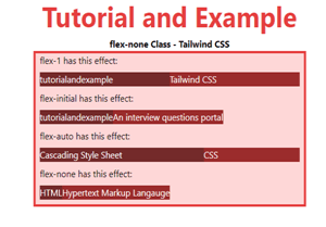
flex-none
This class prevents the element from growing or shrinking regardless of whether extra space is available. This prevents a flex item from expanding or contracting; instead, it just takes up space proportional to the size of the content.
Syntax
<element class="flex-none">..</element>
Example
The code is as follows:
<!DOCTYPE html>
<html>

<head>
<title>flex-none Class of Tailwind </title>

<link href=
"https://unpkg.com/tailwindcss@^1.0/dist/tailwind.min.css"
rel="stylesheet">
</head>

<body>
<h1 class="text-center text-red-600 text-5xl font-bold">
Tutorial and Example
</h1>

<p class="text-center font-bold">flex-none Class - Tailwind CSS </p>

<div id="main" class="bg-red-200 border-4
border-red-600 w-2/3 ml-32">
<p class="ml-2">flex-1 has this effect:</p>

<div class="flex m-2 text-white">
<div class="bg-red-900 flex-1">
tutorialandexample
</div>
<div class="bg-red-800 flex-1">
Tailwind CSS
</div>
</div>
<p class="ml-2">
flex-initial has this effect:
</p>

<div class="flex m-2 text-white">
<div class="bg-red-900 flex-initial">
tutorialandexample
</div>
<div class="bg-red-800 flex-initial">
An interview questions portal
</div>
</div>
<p class="ml-2">
flex-auto has this effect:
</p>

<div class="flex m-2 text-white">
<div class="bg-red-900 flex-auto">
Cascading Style Sheet
</div>
<div class="bg-red-800 flex-auto">
CSS
</div>
</div>
<p class="ml-2">
flex-none has this effect:
</p>

<div class="flex m-2 text-white">
<div class="bg-red-900 flex-none">
HTML
</div>
<div class="bg-red-800 flex-none">
Hypertext Markup Langauge
</div>
</div>
</div>
</body>
</html>
Output: