Tailwind CSS Gap
In tailwind CSS, this class accepts multiple values, and all of the properties are covered in class form. It's a replacement for the CSS gap attribute. This class is used to set the spacing between the rows and columns, commonly known as the gutter. As with column-gap and row-gap, they are used separately so that the gap property can be used to specify both a column and a row gap.
Gap
There are 105 classes in all for gap, with the x and y axes listed separately.
- gap-0
- gap-x-0
- gap-y-0
- gap-0.5
- gap-x-0.5
- gap-y-0.5
- gap-1
- gap-x-1
- gap-y-1
- gap-1.5
- gap-x-1.5
- gap-y-1.5
- gap-2
- gap-x-2
- gap-y-2
- gap-2.5
- gap-x-2.5
- gap-y-2.5
- gap-3
- gap-x-3
- gap-y-3
- gap-3.5
- gap-x-3.5
- gap-y-3.5
- gap-4
- gap-x-4
- gap-y-4
- gap-5
- gap-x-5
- gap-y-5
- gap-6
- gap-x-6
- gap-y-6
- gap-7
- gap-x-7
- gap-y-7
- gap-8
- gap-x-8
- gap-y-8
- gap-9
- gap-x-9
- gap-y-9
- gap-10
- gap-x-10
- gap-y-10
- gap-11
- gap-x-11
- gap-y-11
- gap-12
- gap-x-12
- gap-y-12
- gap-14
- gap-x-14
- gap-y-14
- gap-16
- gap-x-16
- gap-y-16
- gap-20
- gap-x-20
- gap-y-20
- gap-24
- gap-x-24
- gap-y-24
- gap-28
- gap-x-28
- gap-y-28
- gap-32
- gap-x-32
- gap-y-32
- gap-36
- gap-x-36
- gap-y-36
- gap-40
- gap-x-40
- gap-y-40
- gap-44
- gap-x-44
- gap-y-44
- gap-48
- gap-x-48
- gap-y-48
- gap-52
- gap-x-52
- gap-y-52
- gap-56
- gap-x-56
- gap-y-56
- gap-60
- gap-x-60
- gap-y-60
- gap-64
- gap-x-64
- gap-y-64
- gap-72
- gap-x-72
- gap-y-72
- gap-80
- gap-x-80
- gap-y-80
- gap-96
- gap-x-96
- gap-y-96
- gap-px
- gap-x-px
- gap-y-px
gap-number: Using simply the gap class and not mentioning the axis will retain the in both axes according to the number mentioned:
Syntax
<element class="gap-number"> Contents... </element>
Parameter: As noted above and as described below, this class accepts only one value:
number: The element's gap size is stored here.
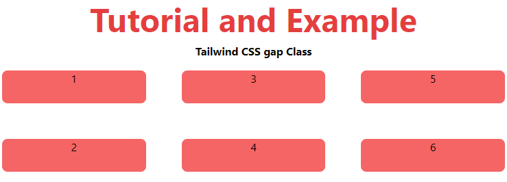
Example:
<!DOCTYPE html>
<html>
<head>
    <title>Tailwind gap Class</title>
    <link href=
"https://unpkg.com/tailwindcss@^1.0/dist/tailwind.min.css"
          rel="stylesheet">
</head>
<body class="text-center">
    <h1 class="text-red-600 text-5xl font-bold">
        Tutorial and Example
    </h1>
    <b>Tailwind CSS gap Class</b>
    <div id="main" class="grid grid-rows-2
                          grid-flow-col gap-5">
        <div class="bg-red-500 rounded-lg m-4 h-12">1</div>
        <div class="bg-red-500 rounded-lg m-4 h-12">2</div>
        <div class="bg-red-500 rounded-lg m-4 h-12">3</div>
        <div class="bg-red-500 rounded-lg m-4 h-12">4</div>
        <div class="bg-red-500 rounded-lg m-4 h-12">5</div>
        <div class="bg-red-500 rounded-lg m-4 h-12">6</div>
    </div>
</body>
</html>
Output:
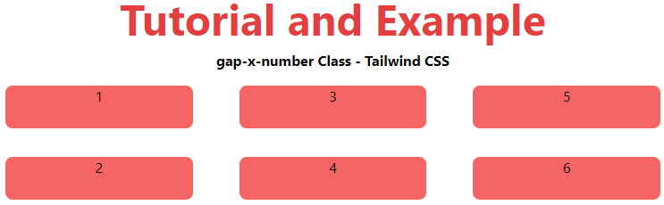
gap-x-number: The gap-x class maintains the x-axis gap according to the specified number:
Syntax
<element class="gap-x-number"> Contents... </element>
Example:
<!DOCTYPE html>
<html>
<head>
    <title>Tailwind gap-x-number Class</title>
    <link href=
"https://unpkg.com/tailwindcss@^1.0/dist/tailwind.min.css"
          rel="stylesheet">
</head>
<body class="text-center">
    <h1 class="text-red-600 text-5xl font-bold">
        Tutorial and Example
    </h1>
    <b>gap-x-number Class - Tailwind CSS </b>
    <div id="main" class="grid grid-rows-2
                          grid-flow-col gap-x-5">
        <div class="bg-red-500 rounded-lg m-4 h-12">1</div>
        <div class="bg-red-500 rounded-lg m-4 h-12">2</div>
        <div class="bg-red-500 rounded-lg m-4 h-12">3</div>
        <div class="bg-red-500 rounded-lg m-4 h-12">4</div>
        <div class="bg-red-500 rounded-lg m-4 h-12">5</div>
        <div class="bg-red-500 rounded-lg m-4 h-12">6</div>
    </div>
</body>
</html>
Output:
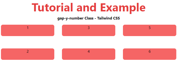
gap-y-number: The gap-y class maintains the x-axis gap according to the specified number:
Syntax
<element class="gap-y-number"> Contents... </element>
Example:
<!DOCTYPE html>
<html>
<head>
    <title>Tailwind gap-y-number Class</title>
    <link href=
"https://unpkg.com/tailwindcss@^1.0/dist/tailwind.min.css"
          rel="stylesheet">
</head>
<body class="text-center">
    <h1 class="text-red-600 text-5xl font-bold">
        Tutorial and Example
    </h1>
    <b>gap-y-number Class - Tailwind CSS </b>
    <div id="main" class="grid grid-rows-2
                          grid-flow-col gap-y-5">
        <div class="bg-red-500 rounded-lg m-4 h-12">1</div>
        <div class="bg-red-500 rounded-lg m-4 h-12">2</div>
        <div class="bg-red-500 rounded-lg m-4 h-12">3</div>
        <div class="bg-red-500 rounded-lg m-4 h-12">4</div>
        <div class="bg-red-500 rounded-lg m-4 h-12">5</div>
        <div class="bg-red-500 rounded-lg m-4 h-12">6</div>
    </div>
</body>
</html>
Output: