
×

Tailwind CSS Grid Column Start / End

This class accepts multiple values, and all of the properties are covered in class form. It was used as a replacement to the CSS grid-column property in CSS to express the number of properties that enable the building of grid structures and management of grid item placement using Tailwind CSS. It can change the layout of grid items regardless of their source order, allowing you to move grid items around to suit these different contexts without having to update the underlying HTML, but for quick front-end development. The number of columns is determined by how many values are assigned to this class.

Grid Column Start / End

  • col-auto
  • col-span-1
  • col-span-2
  • col-span-3
  • col-span-4
  • col-span-5
  • col-span-6
  • col-span-7
  • col-span-8
  • col-span-9
  • col-span-10
  • col-span-11
  • col-span-12
  • col-span-full 
  • col-start-1
  • col-start-2
  • col-start-3
  • col-start-4
  • col-start-5
  • col-start-6
  • col-start-7
  • col-start-8
  • col-start-9
  • col-start-10
  • col-start-11
  • col-start-12
  • col-start-13
  • col-start-auto
  • col-end-1
  • col-end-2
  • col-end-3
  • col-end-4
  • col-end-5
  • col-end-6
  • col-end-7
  • col-end-8
  • col-end-9
  • col-end-10
  • col-end-11
  • col-end-12
  • col-end-13
  • col-end-auto

Spanning columns (col-span): This class will cover the span area, the number after the class will hold the area of a span; we all know that there are 12 grid columns or 12 grid spans.

Syntax:

<element class="col-span-number"> Contents... </element>

Class Grid Value: As previously stated and defined below, this class accepts only one value:

number: It keeps track of how many spans a grid column will require.

Example:

<!DOCTYPE html>
<head>
<title>col-span class of Tailwind </title>
<link href=
"https://unpkg.com/tailwindcss@^1.0/dist/tailwind.min.css"
rel="stylesheet">
</head>
<body class="text-center">
<h1 class="text-red-600 text-5xl font-bold">
Tutorial and Example
</h1>
<b>col-span Class - Tailwind CSS </b>
<div id="main" class="m-8 grid grid-cols-3 gap-1 justify-evenly">
<div class="bg-red-300 rounded-lg h-12">1</div>
<div class="bg-red-300 rounded-lg h-12">2</div>
<div class="bg-red-300 rounded-lg h-12">3</div>
<div class="bg-red-500 col-span-2 rounded-lg h-12">4</div>
<div class="bg-red-300 rounded-lg h-12">5</div>
<div class="bg-red-500 col-span-3 rounded-lg h-12">6</div>
</div>
</body>
</html>

Output:
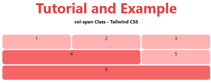
Tailwind CSS Grid Column Start End

Starting and Ending Lines (col-start | end): This class specifies whether an element should begin or end on the nth grid line. To span, a certain number of columns, combine these with the col-span-number utilities.

This class can be combined with the above-mentioned class (Spanning columns (col-span)), the example below will show you how to do so.

Syntax:

<element class="col-start|end-number">..</element>

Parameter: This class has only one parameter, as noted before and defined below:

number: The start or end position of the grid column or normal column is defined by this parameter.

Example:

<!DOCTYPE html>
<head>
<title>col-start|end Class of Tailwind </title>
<link href=
"https://unpkg.com/tailwindcss@^1.0/dist/tailwind.min.css"
rel="stylesheet">
</head>
<body class="text-center">
<h1 class="text-red-600 text-5xl font-bold">
Tutorial and Example
</h1>
<b>col-start|end Class - Tailwind CSS </b>
<div id="main" class="m-8 grid grid-cols-4 gap-1 justify-evenly">
<div class="bg-red-500 col-start-2 col-span-2
rounded-lg h-12">1</div>
<div class="bg-red-300 rounded-lg h-12">2</div>
<div class="bg-red-300 rounded-lg h-12">3</div>
<div class="bg-red-500 col-start-2 col-end-4
rounded-lg h-12">4</div>
<div class="bg-red-300 rounded-lg h-12">5</div>
<div class="bg-red-300 rounded-lg h-12">6</div>
<div class="bg-red-300 rounded-lg h-12">7</div>
<div class="bg-red-500 col-start-2 col-span-3
rounded-lg h-12">8</div>
</div>
</body>
</html>

Output:
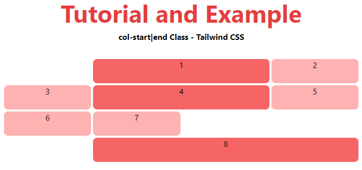
Tailwind CSS Grid Column Start End

Related Topics

Tailwind CSS Box Sizing

Tailwind CSS Box sizing class acknowledges more than one worth in tailwind CSS. Each property is shrouded as a class structure. It is an option in contrast to the CSS...

2 minutes read.

Tailwind CSS Min-Height

In tailwind CSS, this class accepts a large number of values, and all of the properties are covered in class form. It's a replacement for the CSS Min-Height Property. It...

2 minutes read.

Tailwind CSS Order

One of the best features of Tailwind CSS is the Order class, which allows us to order flex and grid objects according to our needs. There are several different order...

2 minutes read.

Tailwind CSS tutorial

Tailwind CSS can be utilized to make sites in the quickest and the least demanding way. Tailwind CSS is the most famous utility-first CSS structure on the planet for quickly...

4 minutes read.

Tailwind CSS Width

The tailwind CSS width class accepts a large number of values, and all of the properties are covered in class form. It's a replacement for the CSS Width Property. This...

3 minutes read.

Tailwind CSS Flex

CSS flexbox is an important component for frontend development. There are four flex options in Tailwind CSS, and all of the attributes are covered in class form. It's a front-end...

6 minutes read.

Tailwind CSS Top / Right / Bottom / Left

In tailwind CSS, these classes take a variety of values and cover all of the characteristics in the class form. These are the CSS Top/Right/Bottom/Left properties' replacements. These classes are...

4 minutes read.

Tailwind CSS Object Position

It acknowledges more than one value in tailwind CSS. Every one of the properties is covered as in class form. It is the option in contrast to the CSS object-position...

2 minutes read.

Tailwind CSS Flex Direction

CSS flexbox is an important element for frontend development. CSS has four directions, therefore in tailwind CSS, all of the properties are covered in class form. It's a front-end development...

5 minutes read.

Tailwind CSS Justify Items

It is a replacement for the CSS justify-items attribute. This class is used to regulate the alignment of grid objects along their inline axis. Justify Item It is classified as: justify-items-auto justify-items-start justify-items-end justify-items-center justify-items-stretch justify-items-auto The justify-items-auto class...

4 minutes read.

Tailwind CSS Place Self

The tailwind CSS Place self class accepts a wide range of values. It's a replacement for the CSS Place Items property. This class is used to manage how a single...

4 minutes read.

Tailwind CSS Justify Self

The class form goes over the various properties. It's a replacement for the CSS justify-self attribute. This class is used to describe the alignment of content’s position in a CSS...

4 minutes read.

Tailwind CSS Grid Row Start / End

In tailwind CSS, this class takes several values. All of the attributes are covered in the form of a class. In CSS, it's an alternative to the grid-row attribute. It's...

4 minutes read.

Tailwind CSS Fill

The CSS Fill class accepts a lot of value, and all of the properties are covered in class form. It is a presentation attribute that controls how an SVG shape's...

1 minute read.

Tailwind CSS Align Content

In Tailwind CSS, this class accepts a wide range of values. It's a replacement for the CSS Align Content feature. This class is used to modify the flex-wrap property's behavior....

5 minutes read.

Tailwind CSS Box Shadow

The Tailwind CSS Box Shadow class accepts a lot of value, and all of the properties are covered in class form. We may control the box-shadow of an element by...

2 minutes read.

Tailwind CSS Stroke Width

In tailwind CSS, this class takes a large number of values and all of the properties are covered in the form. It is used to specify the width of an...

1 minute read.

Tailwind CSS Float

The float class acknowledges more than one worth (value) in tailwind CSS. It is an option in contrast to the CSS float property. The float class characterizes the progression of...

4 minutes read.

Tailwind CSS Max-Width

In tailwind CSS, this class accepts a large number of values, and all of the properties are covered in class form. It's a replacement for the CSS max-width property. This...

3 minutes read.

Tailwind CSS Installation

Here, we will discuss the installation method of Tailwind CSS using two strategies discussed as follows: Strategy 1: Install Tailwind through npm Step 1: npm init - y Step 2: npm install tailwindcss Step...

2 minutes read.