
×

Tailwind CSS Grid Row Start / End

In tailwind CSS, this class takes several values. All of the attributes are covered in the form of a class. In CSS, it's an alternative to the grid-row attribute. It's a term that refers to the number of properties that Tailwind CSS provides for designing grid structures and controlling grid item placement. It can change the layout of grid items regardless of their source order, allowing you to move grid items around to fit different contexts without having to edit the underlying markup. The number of values assigned to this class determines the number of rows.

Grid Rows Start / End

  • row-auto
  • row-span-1
  • row-span-2
  • row-span-3
  • row-span-4
  • row-span-5
  • row-span-6
  • row-span-7
  • row-span-8
  • row-span-9
  • row-span-10
  • row-span-11
  • row-span-12
  • row-span-full
  • row-start-1
  • row-start-2
  • row-start-3
  • row-start-4
  • row-start-5
  • row-start-6
  • row-start-7
  • row-start-8
  • row-start-9
  • row-start-10
  • row-start-11
  • row-start-12
  • row-start-13
  • row-start-auto
  • row-end-1
  • row-end-2
  • row-end-3
  • row-end-4
  • row-end-5
  • row-end-6
  • row-end-7
  • row-end-8
  • row-end-9
  • row-end-10
  • row-end-11
  • row-end-12
  • row-end-13
  • row-end-auto

Spanning rows (row-span): This class will cover the span area; the number after the class will hold the area of a span; we all know that there are 12 grid rows or 12 grid spans.

Syntax:

<element class="row-span-number"> Contents... </element>

Parameter: As noted before and as described below, this class accepts only one parameter:-

Number: It keeps track of how many spans a grid row will require.

Example:

<!DOCTYPE html>
   
<head> 
    <title>row-span Class of Tailwind </title> 
  
    <link href=
"https://unpkg.com/tailwindcss@^1.0/dist/tailwind.min.css" 
          rel="stylesheet"> 
</head> 
  
<body class="text-center"> 
    <h1 class="text-red-600 text-5xl font-bold">
        Tutorial And Example
    </h1> 
  
    <b>row-span Class - Tailwind CSS </b> 
  
    <div id="main" class="m-8 grid grid-row-3 grid-flow-col gap-1"> 
        <div class="bg-red-300 rounded-lg">1</div> 
        <div class="bg-red-300 rounded-lg">2</div> 
        <div class="bg-red-300 rounded-lg">3</div> 
        <div class="bg-red-500 row-span-2 rounded-lg">4</div> 
        <div class="bg-red-300 rounded-lg">5</div> 
        <div class="bg-red-500 row-span-3 rounded-lg">6</div> 
    </div> 
</body> 
  
</html>

Output:
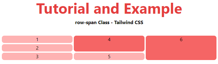
Tailwind CSS Grid Row Start End

Starting and ending lines (Row-start|end): This class is used to make an element start or end at the nth grid line. To span, a specified number of columns, combine these with the row-span-number utilities.

This class can be combined with the above-mentioned class (Spanning columns (row-span)).

Syntax

<element class="row-start|end-number">..</element>

Parameter: This class also has only one parameter, as noted before and defined below:

Number: The start or end position of the grid row or normal row is defined by this parameter.

Example:

<!DOCTYPE html> 
  
<head> 
    <title>row-start|end Class of Tailwind </title> 
  
    <link href=
"https://unpkg.com/tailwindcss@^1.0/dist/tailwind.min.css" 
          rel="stylesheet"> 
</head> 
  
<body class="text-center"> 
    <h1 class="text-red-600 text-5xl font-bold">
        Tutorial And Example
    </h1> 
  
    <b>row-start|end Class - Tailwind CSS </b> 
  
    <div id="main" class="m-8 grid grid-row-4 
                          grid-flow-col gap-1 "> 
        <div class="bg-red-500 row-start-2 row-span-2 
                    rounded-lg">1</div> 
        <div class="bg-red-300 rounded-lg">2</div> 
        <div class="bg-red-300 rounded-lg">3</div> 
        <div class="bg-red-500 row-start-2 col-end-4 
                    rounded-lg">4</div> 
        <div class="bg-red-300 rounded-lg">5</div> 
        <div class="bg-red-300 rounded-lg">6</div> 
        <div class="bg-red-300 rounded-lg">7</div> 
        <div class="bg-red-500 row-start-2 row-span-3 
                    rounded-lg">8</div>
    </div> 
</body> 
  
</html>

Output:
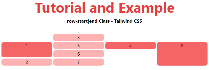
Tailwind CSS Grid Row Start End

Related Topics

Tailwind CSS Stroke Width

In tailwind CSS, this class takes a large number of values and all of the properties are covered in the form. It is used to specify the width of an...

1 minute read.

Tailwind CSS Grid Auto Columns

The Grid Auto Columns class accepts multiple values, and all of the properties are covered in class form. It's a replacement for the CSS grid-auto-columns property. The size of the...

5 minutes read.

Tailwind CSS Grid Column Start / End

This class accepts multiple values, and all of the properties are covered in class form. It was used as a replacement to the CSS grid-column property in CSS to express...

3 minutes read.

Tailwind CSS Place Self

The tailwind CSS Place self class accepts a wide range of values. It's a replacement for the CSS Place Items property. This class is used to manage how a single...

4 minutes read.

Tailwind CSS Align Items

In tailwind CSS, this class accepts a wide range of values. It's a replacement for the CSS Align Items attribute. This class is used to align things within the flexible...

5 minutes read.

Tailwind CSS Space Between

In tailwind CSS, this class accepts a large number of values, and all of the properties are covered in class form. It's a replacement for the CSS Space Between property....

4 minutes read.

Tailwind CSS Object Position

It acknowledges more than one value in tailwind CSS. Every one of the properties is covered as in class form. It is the option in contrast to the CSS object-position...

2 minutes read.

Tailwind CSS Min-Width

In tailwind CSS, this class accepts a large number of values, and all of the properties are covered in class form. It's a replacement for the CSS min-width property. This...

1 minute read.

Tailwind CSS Justify Self

The class form goes over the various properties. It's a replacement for the CSS justify-self attribute. This class is used to describe the alignment of content’s position in a CSS...

4 minutes read.

Tailwind CSS Flex Shrink

CSS flexbox is an important element for frontend development. There are two flex-shrink options in Tailwind CSS, and all properties are covered in class form. For quick front-end development, it's...

3 minutes read.

Tailwind CSS Box Sizing

Tailwind CSS Box sizing class acknowledges more than one worth in tailwind CSS. Each property is shrouded as a class structure. It is an option in contrast to the CSS...

2 minutes read.

Tailwind CSS Height

This class accepts a large number of values, and all of the properties are covered in class form. It's a replacement for the CSS height property. This class is used...

4 minutes read.

Tailwind CSS Gap

In tailwind CSS, this class accepts multiple values, and all of the properties are covered in class form. It's a replacement for the CSS gap attribute. This class is used...

4 minutes read.

Tailwind CSS Place Content

This class accepts a wide range of values. It's a replacement for the CSS Place Content property. This class is used to manage how information is justified while still being...

5 minutes read.

Tailwind CSS Margin

The margin class accepts a large number of values, and all of the properties are covered in the same way they are in the class form. It's a replacement for...

6 minutes read.

Tailwind CSS Min-Height

In tailwind CSS, this class accepts a large number of values, and all of the properties are covered in class form. It's a replacement for the CSS Min-Height Property. It...

2 minutes read.

Tailwind CSS Width

The tailwind CSS width class accepts a large number of values, and all of the properties are covered in class form. It's a replacement for the CSS Width Property. This...

3 minutes read.

Tailwind CSS Place Items

This class accepts a wide range of values. It's a replacement for the CSS Place Items property. This class is used to manage how things are justified while still being...

4 minutes read.

Tailwind CSS Float

The float class acknowledges more than one worth (value) in tailwind CSS. It is an option in contrast to the CSS float property. The float class characterizes the progression of...

4 minutes read.

Tailwind CSS Order

One of the best features of Tailwind CSS is the Order class, which allows us to order flex and grid objects according to our needs. There are several different order...

2 minutes read.