
×

Tailwind CSS Box Sizing

Tailwind CSS Box sizing class acknowledges more than one worth in tailwind CSS. Each property is shrouded as a class structure. It is an option in contrast to the CSS box-sizing property. This class is utilized to characterize how the client(user) ought to work out the all-out width and tallness(height) of a component for example padding and borders, are to be incorporated or not.

There are two categorizes of box sizing, which includes:

  • box-border
  • box-content

box-border

In this mode, the width and height properties incorporate content, padding, and borders. For example, assuming that we set a component's/elements width to 200 pixels, that 200 pixels will incorporate any border or padding we add, and the content box will retain that additional width. This regularly makes it a lot simpler to measure components (elements).

Syntax:

<element class="box-border">..</element>

Code Example

Code is as follows:

<!DOCTYPE html> 


<head> 


    <title>Tailwind box-border Class of CSS</title> 


    <link href=


"https://unpkg.com/tailwindcss@^1.0/dist/tailwind.min.css" 


          rel="stylesheet"> 


</head> 


<body class="text-center"> 


<center>


    <h1 class="text-red-600 text-5xl font-bold">


        Tutorial and Example


    </h1> 


    <b>box-border Class of Tailwind CSS</b> 


    <div class="box-border h-28 w-32 p-4 


                border-4 bg-red-500 m4">


        An Interview Qns Portal


    </div> 


</center>


</body> 


 </html>

Output

The output for the above code is:
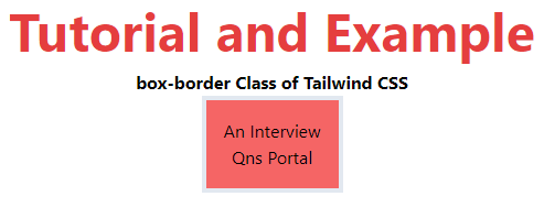
Tailwind CSS Box Sizing

box-content

This is the default value of the box-sizing class. In this mode, the width and height class incorporate the content. Border and padding are excluded from it i.e. if we set an element's width to 200 pixels, the component's content-box will be 200 pixels wide, and the width of any border or padding will be added to the last delivered width.

Syntax:

<element class="box-content">..</element>

Code Example

Code is as follows:

<!DOCTYPE html> 


<head> 


    <title>Tailwind box-content Class</title> 


    <link href=


"https://unpkg.com/tailwindcss@^1.0/dist/tailwind.min.css" 


          rel="stylesheet"> 


</head> 


<body class="text-center"> 


<center>


    <h1 class="text-red-600 text-5xl font-bold">


        Tutorial and Example


    </h1> 


    <b>box-content Class Tailwind CSS</b> 


    <div class="box-content h-28 w-32 p-4 


                border-4 bg-red-500 m4">


        An Interview Questions Portal


    </div> 


</center>


</body> 


</html>

Output

The output for the above code is:
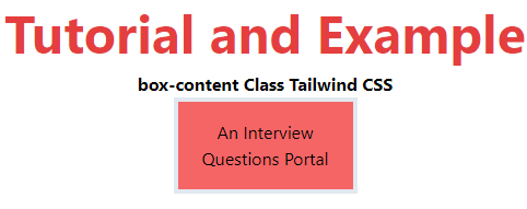
Tailwind CSS Box Sizing


Related Topics

Tailwind CSS Float

The float class acknowledges more than one worth (value) in tailwind CSS. It is an option in contrast to the CSS float property. The float class characterizes the progression of...

4 minutes read.

Tailwind CSS Justify Items

It is a replacement for the CSS justify-items attribute. This class is used to regulate the alignment of grid objects along their inline axis. Justify Item It is classified as: justify-items-auto justify-items-start justify-items-end justify-items-center justify-items-stretch justify-items-auto The justify-items-auto class...

4 minutes read.

Tailwind CSS Container

In Tailwind CSS, a compartment is utilized to fix the maximum width (max-width) of a component to match the min-width of the breakpoint. It comes exceptionally convenient when content must...

2 minutes read.

Tailwind CSS Display

It acknowledges more than one worth in tailwind CSS. Every one of the properties is shrouded as in class structure. It is an option in contrast to the CSS display...

5 minutes read.

Tailwind CSS Space Between

In tailwind CSS, this class accepts a large number of values, and all of the properties are covered in class form. It's a replacement for the CSS Space Between property....

4 minutes read.

Tailwind CSS Place Self

The tailwind CSS Place self class accepts a wide range of values. It's a replacement for the CSS Place Items property. This class is used to manage how a single...

4 minutes read.

Tailwind CSS Grid Row Start / End

In tailwind CSS, this class takes several values. All of the attributes are covered in the form of a class. In CSS, it's an alternative to the grid-row attribute. It's...

4 minutes read.

Tailwind CSS Installation

Here, we will discuss the installation method of Tailwind CSS using two strategies discussed as follows: Strategy 1: Install Tailwind through npm Step 1: npm init - y Step 2: npm install tailwindcss Step...

2 minutes read.

Tailwind CSS Grid Auto Flow

In tailwind CSS, this class accepts multiple values, and all of the properties are covered in class form. It is a CSS alternative. The grid-auto-flow property is used in Tailwind...

4 minutes read.

Tailwind CSS Position

The position class acknowledges more than one value in tailwind CSS. It is an option in contrast to the CSS Position property. This class is utilized for controlling how an...

5 minutes read.

Tailwind CSS Padding

This class accepts a large number of values, and all of the properties are covered in class form. It's a replacement for the CSS Padding Property. This class is used...

4 minutes read.

Tailwind CSS Object Position

It acknowledges more than one value in tailwind CSS. Every one of the properties is covered as in class form. It is the option in contrast to the CSS object-position...

2 minutes read.

Tailwind CSS Grid Auto Rows

In tailwind CSS, this class takes multiple values and covers all of the properties in class form. It's a replacement for the grid-auto-rows CSS attribute. The size of the rows...

6 minutes read.

Tailwind CSS tutorial

Tailwind CSS can be utilized to make sites in the quickest and the least demanding way. Tailwind CSS is the most famous utility-first CSS structure on the planet for quickly...

4 minutes read.

Tailwind CSS Opacity

This class accepts a lot of value, and all of the properties are covered in class form. We can change the opacity of any element by using this class. The...

1 minute read.

Tailwind CSS Box Sizing

Tailwind CSS Box sizing class acknowledges more than one worth in tailwind CSS. Each property is shrouded as a class structure. It is an option in contrast to the CSS...

2 minutes read.

Tailwind CSS Visibility

In tailwind CSS, this class accepts two values. It's a replacement for the CSS visibility property. This class specifies whether an element in a web document is visible or not,...

2 minutes read.

Tailwind CSS Flex Grow

CSS flexbox is an important element for frontend development; there are two flex-grow options in Tailwind CSS, and all attributes are covered in class form. It is an alternative to...

3 minutes read.

Tailwind CSS Justify Content

In tailwind CSS, this class accepts two values. It's a replacement for CSS's justify-content attribute. This class is used to describe the flexible box container's alignment. Along the main axis...

4 minutes read.

Tailwind CSS Flex

CSS flexbox is an important component for frontend development. There are four flex options in Tailwind CSS, and all of the attributes are covered in class form. It's a front-end...

6 minutes read.