Tailwind CSS Grid Template Columns
In tailwind CSS, this class accepts multiple values, and all of the properties are covered in class form. It's the CSS grid-template-columns property's replacement. It's used to specify the number of columns and column sizes in a grid. We’ll do the same here, but for front-end development. The number of columns is determined by how many values are assigned to this class.
Grid Template Columns
The Grid Template Columns are classified as:
- grid-cols-1: Only one column is allowed in each row.
- grid-cols-2: Only two columns are allowed in each row.
- grid-cols-3: Only three columns are allowed in each row.
- grid-cols-4: Only four columns are allowed in each row.
- grid-cols-5: Only five columns are allowed in each row.
- grid-cols-6: Six columns are allowed in each row.
- grid-cols-7: Seven columns are allowed in each row.
- grid-cols-8: Eight columns are allowed in each row.
- grid-cols-9: Nine columns are allowed in each row.
- grid-cols-10: Ten columns are allowed in each row.
- grid-cols-11: Eleven columns are allowed in each row.
- grid-cols-12: Twelve columns are allowed in each row.
- grid-cols-none: The grid-column attribute is ignored (does not follow).
Syntax:
<element class="grid grid-cols-number"> Contents... </element>
Example:
<!DOCTYPE html>
<html>
<head>
<title>Tailwind grid-cols Class</title>
<link href=
"https://unpkg.com/tailwindcss@^1.0/dist/tailwind.min.css"
rel="stylesheet">
</head>
<body class="text-center">
<h1 class="text-red-600 text-5xl font-bold">
Tutorial and Example
</h1>
<b>grid-cols Class - Tailwind CSS </b>
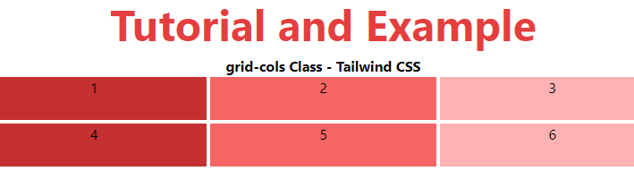
<div id="main" class="grid grid-cols-3 gap-1 justify-evenly">
<div class="bg-red-700 w-26 h-12">1</div>
<div class="bg-red-500 w-26 h-12">2</div>
<div class="bg-red-300 w-26 h-12">3</div>
<div class="bg-red-700 w-26 h-12">4</div>
<div class="bg-red-500 w-26 h-12">5</div>
<div class="bg-red-300 w-26 h-12">6</div>
</div>
</body>
</html>
Output: