
×

Tailwind CSS Height

This class accepts a large number of values, and all of the properties are covered in class form. It's a replacement for the CSS height property. This class is used to specify an element's height. Padding, margin, and element borders are not included in the height class.

CSS Height Classes

The classes based on height are as follows:

  • h-0: The height is set to zero using this class.
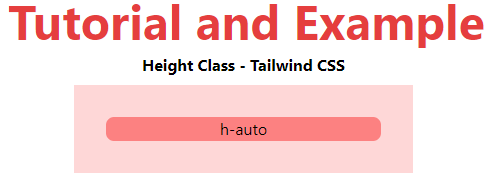
  • h-auto: This class automatically adjusts the height based on the content.
  • h-px: This class is used to specify the height in one-pixel increments.
  • h-1/2: This class reduces the window's height to half its original size.
  • h-1/3: This class reduces the window's height to one-third of its original size.
  • h-1/4: This class reduces the window's height to one-fourth of its original size.
  • h-1/5: This class reduces the window's height to one-fifth of its original size.
  • h-1/6: This class reduces the window's height to one-sixth of its original size.
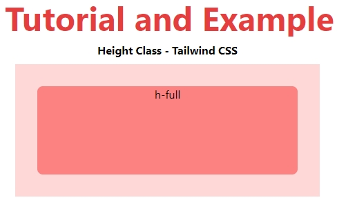
  • h-full: As long as the parent has a defined height, this class sets an element's height to 100% of its parent.
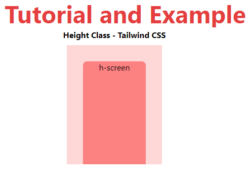
  • h-screen: This class is used to make an element fill the viewport's entire height.

Note: You can adjust the number or set the percentage value by using the valid "rem" values.

h-0

This class is used to specify the height of any element. You can replace the number with a correct number of rem units to fix the element's height.

Syntax is:

<element class="h-0">...</element>

Example

Example is as follows:

<!DOCTYPE html>
<head>
    <link href=
"https://unpkg.com/tailwindcss@^1.0/dist/tailwind.min.css"
          rel="stylesheet">
</head>
<body class="text-center mx-4 space-y-2">
    <h1 class="text-red-600 text-5xl font-bold">
        Tutorial and Example
    </h1>
    <b>Height Class - Tailwind CSS</b>
    <div class="flex flex-wrap-reverse p-4 mx-12
                space-x-4 h-64 bg-red-200">
        <div class="h-8 w-12 bg-red-400
                    rounded-lg">h-8</div>
        <div class="h-12 w-12 bg-red-400
                    rounded-lg">h-12</div>
        <div class="h-16 w-12 bg-red-400
                    rounded-lg">h-16</div>
        <div class="h-20 w-12 bg-red-400
                    rounded-lg">h-20</div>
        <div class="h-24 w-12 bg-red-400
                    rounded-lg">h-24</div>
        <div class="h-32 w-12 bg-red-400
                    rounded-lg">h-32</div>
        <div class="h-40 w-12 bg-red-400
                    rounded-lg">h-40</div>
        <div class="h-48 w-12 bg-red-400
                    rounded-lg">h-48</div>
        <div class="h-52 w-12 bg-red-400
                    rounded-lg">h-52</div>
    </div>
</body>
</html>

Output:
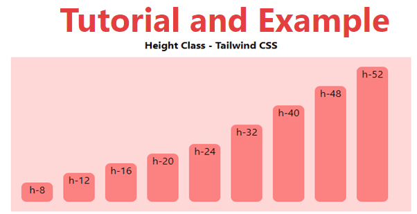
Tailwind CSS Height

h-auto

This class allows the browser to determine the element's height.

Syntax:

<element class="h-auto">...</element>

Example

Example is as follows:

<!DOCTYPE html>
<head>
    <link href=
"https://unpkg.com/tailwindcss@^1.0/dist/tailwind.min.css"
          rel="stylesheet">
</head>
<body class="text-center mx-4 space-y-2">
    <h1 class="text-red-600 text-5xl font-bold">
       Tutorial and Example
    </h1>
    <b>Height Class - Tailwind CSS </b>
    <div class="mx-48 bg-red-200 p-8">
        <div class="h-auto bg-red-400
                    rounded-lg">h-auto</div>
    </div>
</body>
</html>

Output:
Tailwind CSS Height

h-screen

This class is used to make an element fill the viewport's entire height.

Syntax is:

<element class="h-screen">...</element>

Example

Example is as follows:

<!DOCTYPE html>
<head>
    <link href=
"https://unpkg.com/tailwindcss@^1.0/dist/tailwind.min.css"
          rel="stylesheet">
</head>
<body class="text-center mx-4 space-y-2">
    <h1 class="text-red-600 text-5xl font-bold">
       Tutorial and Example
    </h1>
    <b>Height Class - Tailwind CSS </b>
    <div class="mx-48 bg-red-200 p-8">
        <div class="h-screen bg-red-400
                    rounded-lg">h-screen</div>
    </div>
</body>
</html>

Output:
Tailwind CSS Height

h-full

As long as the parent has a defined height, this class sets an element's height to 100% of its parent.

Syntax:

<element class="h-full">...</element>

Example

Example is as follows:

<!DOCTYPE html>
<head>
    <link href=
"https://unpkg.com/tailwindcss@^1.0/dist/tailwind.min.css"
          rel="stylesheet">
</head>
<body class="text-center mx-4 space-y-2">
    <h1 class="text-red-600 text-5xl font-bold">
       Tutorial and Example
    </h1>
    <b>Height Class - Tailwind CSS </b>
    <div class="mx-48 h-48 bg-red-200 p-8">
        <div class="h-full bg-red-400
                    rounded-lg">h-full</div>
    </div>
</body>
</html>

Output:
Tailwind CSS Height

Related Topics

Tailwind CSS Installation

Here, we will discuss the installation method of Tailwind CSS using two strategies discussed as follows: Strategy 1: Install Tailwind through npm Step 1: npm init - y Step 2: npm install tailwindcss Step...

2 minutes read.

Tailwind CSS Flex Grow

CSS flexbox is an important element for frontend development; there are two flex-grow options in Tailwind CSS, and all attributes are covered in class form. It is an alternative to...

3 minutes read.

Tailwind CSS Opacity

This class accepts a lot of value, and all of the properties are covered in class form. We can change the opacity of any element by using this class. The...

1 minute read.

Tailwind CSS Float

The float class acknowledges more than one worth (value) in tailwind CSS. It is an option in contrast to the CSS float property. The float class characterizes the progression of...

4 minutes read.

Tailwind CSS Justify Self

The class form goes over the various properties. It's a replacement for the CSS justify-self attribute. This class is used to describe the alignment of content’s position in a CSS...

4 minutes read.

Tailwind CSS Stroke Width

In tailwind CSS, this class takes a large number of values and all of the properties are covered in the form. It is used to specify the width of an...

1 minute read.

Tailwind CSS Top / Right / Bottom / Left

In tailwind CSS, these classes take a variety of values and cover all of the characteristics in the class form. These are the CSS Top/Right/Bottom/Left properties' replacements. These classes are...

4 minutes read.

Tailwind CSS Grid Auto Columns

The Grid Auto Columns class accepts multiple values, and all of the properties are covered in class form. It's a replacement for the CSS grid-auto-columns property. The size of the...

5 minutes read.

Tailwind CSS Align Content

In Tailwind CSS, this class accepts a wide range of values. It's a replacement for the CSS Align Content feature. This class is used to modify the flex-wrap property's behavior....

5 minutes read.

Tailwind CSS Grid Auto Rows

In tailwind CSS, this class takes multiple values and covers all of the properties in class form. It's a replacement for the grid-auto-rows CSS attribute. The size of the rows...

6 minutes read.

Tailwind CSS Z-index

The tailwind CSS framework is a CSS utility framework that provides classes for managing HTML content with CSS. Tailwind CSS simplifies our design process and makes it responsive across numerous...

4 minutes read.

Tailwind CSS Fill

The CSS Fill class accepts a lot of value, and all of the properties are covered in class form. It is a presentation attribute that controls how an SVG shape's...

1 minute read.

Tailwind CSS Align Items

In tailwind CSS, this class accepts a wide range of values. It's a replacement for the CSS Align Items attribute. This class is used to align things within the flexible...

5 minutes read.

Tailwind CSS Grid Template Columns

In tailwind CSS, this class accepts multiple values, and all of the properties are covered in class form. It's the CSS grid-template-columns property's replacement. It's used to specify the number...

2 minutes read.

Tailwind CSS Flex Wrap

CSS flexbox is an important component for frontend development. It is a front-end development alternative to the CSS flex-wrap Property. Note: You must include the flex class in your element before...

4 minutes read.

Tailwind CSS Place Items

This class accepts a wide range of values. It's a replacement for the CSS Place Items property. This class is used to manage how things are justified while still being...

4 minutes read.

Tailwind CSS Width

The tailwind CSS width class accepts a large number of values, and all of the properties are covered in class form. It's a replacement for the CSS Width Property. This...

3 minutes read.

Tailwind CSS Place Content

This class accepts a wide range of values. It's a replacement for the CSS Place Content property. This class is used to manage how information is justified while still being...

5 minutes read.

Tailwind CSS Flex Shrink

CSS flexbox is an important element for frontend development. There are two flex-shrink options in Tailwind CSS, and all properties are covered in class form. For quick front-end development, it's...

3 minutes read.

Tailwind CSS Min-Width

In tailwind CSS, this class accepts a large number of values, and all of the properties are covered in class form. It's a replacement for the CSS min-width property. This...

1 minute read.