Tailwind CSS Width
The tailwind CSS width class accepts a large number of values, and all of the properties are covered in class form. It's a replacement for the CSS Width Property. This class is used to specify the text and image widths. Text and pictures can be given widths in pixels (px), percentages (%), centimeters (cm), and other units.
Width Classes
The various width classes are as follows:
- w-0: This class indicates that the width is zero.
- w-auto: This class indicates that the width is determined by the content.
- w-1/2: This class indicates that the window's width is set to half.
- w-1/3: This class indicates that the width of the window is set to one-third of the whole width.
- w-1/4: This class indicates that the width of the window is set to one-fourth of the total width.
- w-1/5: This class indicates that the window's width is set to one-fifth of its original size.
- w-1/6: This class indicates that the width of the window is set to one-sixth of the whole width.
- w-1/12: This class specifies that the width of the window is one-twelfth of the whole width.
- w-full: This class indicates that the width has been set to 100%.
- w-screen: This class indicates that the width is set to the width of the screen.
- w-min: The min-width is defined by this class.
- w-max: The max-width is defined by this class.
Note: You can adjust the number or set the percentage value by using the valid "rem" values.
Syntax:
<element class="w-0">...</element>
Example:
Consider the below code:
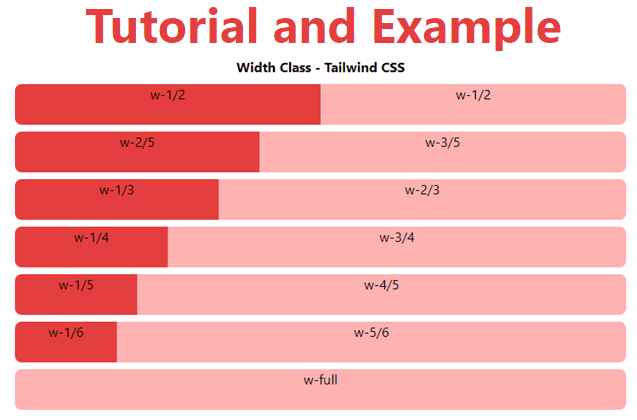
<!DOCTYPE html>
<head>
    <link href=
"https://unpkg.com/tailwindcss@^1.0/dist/tailwind.min.css"
          rel="stylesheet">
</head>
<body class="text-center mx-4 space-y-2">
    <h1 class="text-red-600 text-5xl font-bold">
        Tutorial and Example
    </h1>
    <b>Width Class - Tailwind CSS </b>
    <div class="flex">
        <div class="w-1/2 bg-red-600 h-12 rounded-l-lg">
          w-1/2
        </div>
        <div class="w-1/2 bg-red-300 h-12 rounded-r-lg">
          w-1/2
        </div>
    </div>
    <div class="flex ...">
      <div class="w-2/5 bg-red-600 h-12 rounded-l-lg">
          w-2/5
      </div>
      <div class="w-3/5 bg-red-300 h-12 rounded-r-lg">
          w-3/5
      </div>
    </div>
    <div class="flex ...">
      <div class="w-1/3 bg-red-600 h-12 rounded-l-lg">
          w-1/3
      </div>
      <div class="w-2/3 bg-red-300 h-12 rounded-r-lg">
          w-2/3
      </div>
    </div>
    <div class="flex ...">
      <div class="w-1/4 bg-red-600 h-12 rounded-l-lg">
          w-1/4
      </div>
      <div class="w-3/4 bg-red-300 h-12 rounded-r-lg">
          w-3/4
      </div>
    </div>
    <div class="flex ...">
      <div class="w-1/5 bg-red-600 h-12 rounded-l-lg">
          w-1/5
      </div>
      <div class="w-4/5 bg-red-300 h-12 rounded-r-lg">
          w-4/5
      </div>
    </div>
    <div class="flex ...">
      <div class="w-1/6 bg-red-600 h-12 rounded-l-lg">
          w-1/6
      </div>
      <div class="w-5/6 bg-red-300 h-12 rounded-r-lg">
          w-5/6
      </div>
    </div>
    <div class="w-full bg-red-300 h-12 rounded-lg">
          w-full
    </div>
</body>
</html>
Output: