
×

Tailwind CSS Top / Right / Bottom / Left

In tailwind CSS, these classes take a variety of values and cover all of the characteristics in the class form. These are the CSS Top/Right/Bottom/Left properties' replacements. These classes are used to determine how a positioned element is aligned. Remember that these properties can only be applied to positioned elements.

Top/Right/Bottom/Left classes

The various types of Top/Right/Bottom/Left classes are listed below:

  • .inset-0
  • .inset-y-0
  • .inset-x-0
  • .top-0
  • .right-0
  • .bottom-0
  • .left-0
    • In Tailwind, the top/right/bottom/left/inset utilities have default values of 0 and auto.
    • You can replace "0" with any of the allowed "rem" values.

inset-0

It's used to provide the top/right/bottom/left properties of an element a 0px value.

Syntax:

<element class="inset-0">...</element>

Example:

<!DOCTYPE html>
<html>
<head>
<link href=
"https://unpkg.com/tailwindcss@^2/dist/tailwind.min.css" 
rel="stylesheet">
</head>
<body>
<div class="text-red-600 font-bold m-4">
<h1 class="text-3xl my-4" > Tutorial and Example</h1>
<p class=" text-2xl">Tailwind CSS Top/Right/Bottom/Left</p>


</div>
<div class="relative h-24 w-24 bg-red-400 m-4">
<div class="absolute inset-0 bg-red-800"></div>
</div>
</body>
</html>

Output:
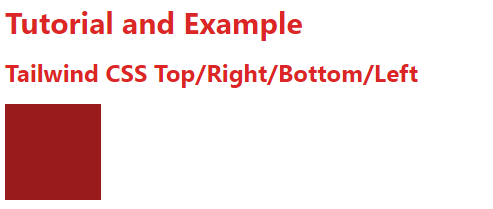
Tailwind CSS Top Right Bottom Left

inset-y-0

It's used to give the element's top and bottom properties a value of 0px.

Syntax:

<element class="inset-y-0">...</element>

Example:

<!DOCTYPE html>
<html>
<head>
<link href=
"https://unpkg.com/tailwindcss@^2/dist/tailwind.min.css" 
rel="stylesheet">
</head>
<body>
<div class="text-red-600 font-bold m-4">
<h1 class="text-3xl my-4" > Tutorial and Example</h1>
<p class=" text-2xl">Tailwind CSS Top/Right/Bottom/Left</p>


</div>
<div class="relative h-28 w-28 bg-red-400 m-4">
<div class="absolute inset-y-0 
w-16 bg-red-800">
</div>
</div>
</body>
</html>

Output:
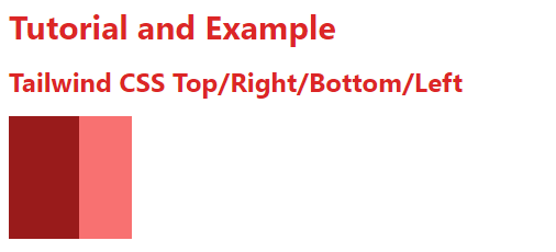
Tailwind CSS Top Right Bottom Left

inset-x-0

It's used to give the element's right and left properties a value of 0px.

Syntax:

<element class="inset-x-0">...</element>

Example:

<!DOCTYPE html>
<html>
<head>
<link href=
"https://unpkg.com/tailwindcss@^2/dist/tailwind.min.css" 
rel="stylesheet">
</head>
<body>
<div class="text-red-600 font-bold m-4">
<h1 class="text-3xl my-4" > Tutorial and Example</h1>
<p class=" text-2xl">Tailwind CSS Top/Right/Bottom/Left</p>


</div>
<div class="relative h-28 w-28 bg-red-400 m-4">
<div class="absolute inset-x-0 
h-9 bg-red-800">
</div>
</div>
</body>
</html>

Output:
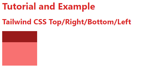
Tailwind CSS Top Right Bottom Left

top-0

It's used to give the element's top property the value 0px.

Syntax:

<element class="top-0">...</element> 

left-0

It's used to give the element's left property the value 0px.

Syntax:

<element class="left-0">...</element>

The left-0 and top-0 classes are used in this example.

Example:

<!DOCTYPE html>
<html>
<head>
<link href=
"https://unpkg.com/tailwindcss@^2/dist/tailwind.min.css" 
rel="stylesheet">
</head>
<body>
<div class="text-red-600 font-bold m-4">
<h1 class="text-3xl my-4" > Tutorial and Example </h1>
<p class=" text-2xl">Tailwind CSS Top/Right/Bottom/Left</p>


</div>
<div class="relative h-36 w-36 bg-red-400 m-4">
<div class="absolute left-0 top-0 
w-16 h-16 bg-red-800">
</div>
</div>
</body>
</html>

Output:
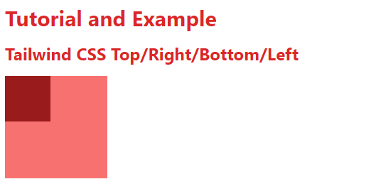
Tailwind CSS Top Right Bottom Left

right-0

It's used to give the element's right property the value 0px.

Syntax:

<element class="right-0">...</element> 

bottom-0

It's used to give the element's bottom property the value 0px.

Syntax:

<element class="bottom-0">...</element> 

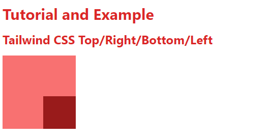
The right-0 and bottom-0 classes are used in this example.

Example:

<!DOCTYPE html>
<html>
<head>
<link href=
"https://unpkg.com/tailwindcss@^2/dist/tailwind.min.css" 
rel="stylesheet">
</head>
<body>
<div class="text-red-600 font-bold m-4">
<h1 class="text-3xl my-4" >Tutorial and Example</h1>
<p class=" text-2xl">Tailwind CSS Top/Right/Bottom/Left</p>


</div>
<div class="relative h-36 w-36 bg-red-400 m-4">
<div class="absolute right-0 bottom-0 
w-16 h-16 bg-red-800">
</div>
</div>
</body>
</html>

Output:
Tailwind CSS Top Right Bottom Left

Related Topics

Tailwind CSS Min-Height

In tailwind CSS, this class accepts a large number of values, and all of the properties are covered in class form. It's a replacement for the CSS Min-Height Property. It...

2 minutes read.

Tailwind CSS Opacity

This class accepts a lot of value, and all of the properties are covered in class form. We can change the opacity of any element by using this class. The...

1 minute read.

Tailwind CSS Clear

This class acknowledges more than one worth in tailwind CSS. Every one of the properties is canvassed as in class form. It is an option in contrast to the CSS...

5 minutes read.

Tailwind CSS Min-Width

In tailwind CSS, this class accepts a large number of values, and all of the properties are covered in class form. It's a replacement for the CSS min-width property. This...

1 minute read.

Tailwind CSS Flex Grow

CSS flexbox is an important element for frontend development; there are two flex-grow options in Tailwind CSS, and all attributes are covered in class form. It is an alternative to...

3 minutes read.

Tailwind CSS Float

The float class acknowledges more than one worth (value) in tailwind CSS. It is an option in contrast to the CSS float property. The float class characterizes the progression of...

4 minutes read.

Tailwind CSS Object Position

It acknowledges more than one value in tailwind CSS. Every one of the properties is covered as in class form. It is the option in contrast to the CSS object-position...

2 minutes read.

Tailwind CSS Margin

The margin class accepts a large number of values, and all of the properties are covered in the same way they are in the class form. It's a replacement for...

6 minutes read.

Tailwind CSS Align Self

This class accepts a wide range of values. It's a replacement for the CSS Align Self attribute. This class is used to control how a flex or grid item is...

4 minutes read.

Tailwind CSS Width

The tailwind CSS width class accepts a large number of values, and all of the properties are covered in class form. It's a replacement for the CSS Width Property. This...

3 minutes read.

Tailwind CSS Gap

In tailwind CSS, this class accepts multiple values, and all of the properties are covered in class form. It's a replacement for the CSS gap attribute. This class is used...

4 minutes read.

Tailwind CSS Grid Auto Columns

The Grid Auto Columns class accepts multiple values, and all of the properties are covered in class form. It's a replacement for the CSS grid-auto-columns property. The size of the...

5 minutes read.

Tailwind CSS Position

The position class acknowledges more than one value in tailwind CSS. It is an option in contrast to the CSS Position property. This class is utilized for controlling how an...

5 minutes read.

Tailwind CSS Align Items

In tailwind CSS, this class accepts a wide range of values. It's a replacement for the CSS Align Items attribute. This class is used to align things within the flexible...

5 minutes read.

Tailwind CSS Max-Height

This class accepts a large number of values, and all of the properties are covered in class form. It's a replacement for the CSS Max-Height attribute. It is used to...

3 minutes read.

Tailwind CSS Order

One of the best features of Tailwind CSS is the Order class, which allows us to order flex and grid objects according to our needs. There are several different order...

2 minutes read.

Tailwind CSS Grid Template Columns

In tailwind CSS, this class accepts multiple values, and all of the properties are covered in class form. It's the CSS grid-template-columns property's replacement. It's used to specify the number...

2 minutes read.

Tailwind CSS Flex

CSS flexbox is an important component for frontend development. There are four flex options in Tailwind CSS, and all of the attributes are covered in class form. It's a front-end...

6 minutes read.

Tailwind CSS Stroke Width

In tailwind CSS, this class takes a large number of values and all of the properties are covered in the form. It is used to specify the width of an...

1 minute read.

Tailwind CSS Container

In Tailwind CSS, a compartment is utilized to fix the maximum width (max-width) of a component to match the min-width of the breakpoint. It comes exceptionally convenient when content must...

2 minutes read.