Tailwind CSS Flex Grow
CSS flexbox is an important element for frontend development; there are two flex-grow options in Tailwind CSS, and all attributes are covered in class form. It is an alternative to the CSS flex expand Property for rapid front-end development. This class determines how much the item will expand in comparison to other objects in the container. In other terms, it refers to an item's ability to grow in comparison to other items in the same container.
Flex Grow
The Flex Grow classes are classified as:
- flex-grow-0
- flex-grow
flex-grow-0
This class limits the ability of an item to grow in comparison to the content contained within the same container.
Syntax:
<element class="flex-grow-0"> Contents... </element>
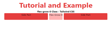
The example for flex-grow-0 is as follows:
<!DOCTYPE html>
<html>
<head>
    <title>flex-grow-0 Class - Tailwind </title>
    <link href=
"https://unpkg.com/tailwindcss@^1.0/dist/tailwind.min.css"
          rel="stylesheet">
</head>
<body class="text-center">
    <h1 class="text-red-600 text-5xl font-bold">
        Tutorial and Example
    </h1>
    <b>flex-grow-0 Class - Tailwind CSS </b>
    <div id="main" class="flex justify-evenly space-x-2 ml-12 mr-12">
        <div class="rounded bg-red-600 flex-grow h-12 ">
            Side Part</div>
        <div class="rounded bg-red-300 flex-grow-0 h-12">
            Flex-Grow-0
        </div>
        <div class="rounded bg-red-600 flex-grow h-12 mr-12">
            Side Part</div>
    </div>
</body>
</html>
Output:
flex-grow
This class does not restrict the growing feature. It allows an item to grow in proportion to the available screen area.
Syntax:
<element class="flex-grow"> Contents... </element>
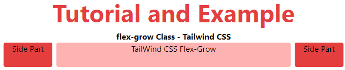
The example for flex-grow is as follows:
<!DOCTYPE html>
<html>

<head>
    <title>flex-grow Class of Tailwind </title>
    <link href=
"https://unpkg.com/tailwindcss@^1.0/dist/tailwind.min.css"
          rel="stylesheet">
</head>
<body class="text-center">
    <h1 class="text-red-600 text-5xl font-bold">
        Tutorial and Example
    </h1>
    <b>flex-grow Class - Tailwind CSS </b>
    <div id="main" class="flex justify-evenly space-x-2 ml-12 mr-12">
        <div class="rounded bg-red-600  w-24 h-12 ">Side Part</div>
        <div class="rounded bg-red-300 flex-grow h-12">
            TailWind CSS Flex-Grow
        </div>
        <div class="rounded bg-red-600  w-24 h-12 mr-12">Side Part</div>
    </div>
</body>
</html>
Output: