Tailwind CSS Flex Wrap
CSS flexbox is an important component for frontend development. It is a front-end development alternative to the CSS flex-wrap Property.
Note: You must include the flex class in your element before the flex-wrap class to activate the flex-wrap.
Flex Wrap
The classes are classified as:
- flex-wrap
- flex-nowrap
- flex-wrap-revers
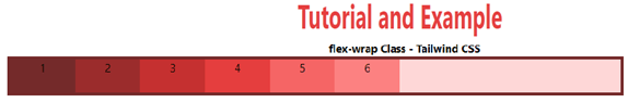
flex-wrap
This class breaks the flex item into numerous lines. It causes flex objects to wrap to several lines based on their width.
Syntax
<element class="flex flex-wrap"> Contents... </element>
Example
The code is as follows:
<!DOCTYPE html>
<html>
<head>
    <title>flex-wrap Class of Tailwind </title>
    <link href=
"https://unpkg.com/tailwindcss@^1.0/dist/tailwind.min.css"
          rel="stylesheet">
</head>
<body class="text-center">
    <h1 class="text-red-600 text-5xl font-bold">
        Tutorial and Example
    </h1>
    <b>flex-wrap Class - Tailwind CSS </b>
    <div id="main" class="ml-24 h-28 w-2/3 flex flex-wrap
                          bg-red-200 border-solid border-4
                          border-red-900">
        <div class="bg-red-900 w-24 h-12">1</div>
        <div class="bg-red-800 w-24 h-12">2</div>
        <div class="bg-red-700 w-24 h-12">3</div>
        <div class="bg-red-600 w-24 h-12">4</div>
        <div class="bg-red-500 w-24 h-12">5</div>
        <div class="bg-red-400 w-24 h-12">6</div>
    </div>
</body>
</html>
Output:
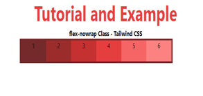
flex-nowrap
Wrap-default flex's value is nowrap. It's used to indicate that the object doesn't have any wrapping. It wraps the item in a single line.
Syntax
<element class="flex flex-nowrap"> Contents... </element>
Example
The code is as follows:
<!DOCTYPE html>
<html>
<head>
    <title>flex-nowrap Class of Tailwind </title>
    <link href=
"https://unpkg.com/tailwindcss@^1.0/dist/tailwind.min.css"
          rel="stylesheet">
</head>
<body class="text-center">
    <h1 class="text-red-600 text-5xl font-bold">
        Tutorial and Example
    </h1>
    <b>flex-nowrap Class - Tailwind CSS </b>
    <div id="main" class="ml-24 h-28 w-2/3 flex flex-nowrap
                          bg-red-200 border-solid border-4
                          border-red-900">
        <div class="bg-red-900 w-24 h-12">1</div>
        <div class="bg-red-800 w-24 h-12">2</div>
        <div class="bg-red-700 w-24 h-12">3</div>
        <div class="bg-red-600 w-24 h-12">4</div>
        <div class="bg-red-500 w-24 h-12">5</div>
        <div class="bg-red-400 w-24 h-12">6</div>
    </div>
</body>
</html>
Output:
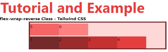
flex-wrap-reverse
When flex items wrap to new lines, this class is used to reverse the flow of the flex items.
Syntax
<element class="flex flex-wrap-reverse"> Contents... </element>
Example
The code is as follows:
<!DOCTYPE html>
<html>
<head>
    <title>flex-wrap-reverse Class of Tailwind </title>
    <link href=
"https://unpkg.com/tailwindcss@^1.0/dist/tailwind.min.css"
          rel="stylesheet">
</head>
<body class="text-center">
    <h1 class="text-red-600 text-5xl font-bold">
        Tutorial and Example
    </h1>
    <b>flex-wrap-reverse Class - Tailwind CSS </b>
    <div id="main" class="ml-24 h-28 w-2/3 flex
        flex-wrap-reverse bg-red-200 border-solid
        border-4 border-red-900">
        <div class="bg-red-900 w-24 h-12">1</div>
        <div class="bg-red-800 w-24 h-12">2</div>
        <div class="bg-red-700 w-24 h-12">3</div>
        <div class="bg-red-600 w-24 h-12">4</div>
        <div class="bg-red-500 w-24 h-12">5</div>
        <div class="bg-red-400 w-24 h-12">6</div>
    </div>
</body>
</html>
Output: