Tailwind CSS Place Self
The tailwind CSS Place self class accepts a wide range of values. It's a replacement for the CSS Place Items property. This class is used to manage how a single item is justified and aligned simultaneously. You can set several class values in a single class with this class.
Place Self Classes
- place-self-auto
- place-self-start
- place-self-end
- place-self-center
- place-self-stretch
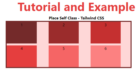
place-self-auto
If the items don't have a parent, place-self-auto is utilized. The absolute location of the objects is defined by this class.
Syntax:
<element class="place-self-auto">...</element>
Example:
<!DOCTYPE html>
<head>
    <link href=
"https://unpkg.com/tailwindcss@^1.0/dist/tailwind.min.css"
          rel="stylesheet">
</head>
<body class="text-center">
    <h1 class="text-red-600 text-5xl font-bold">
        Tutorial and Example
    </h1>
    <b>Place Self Class - Tailwind CSS </b>
    <div id="main" class="ml-24 h-48 w-2/3 grid grid-cols-3 gap-2
                          place-items-stretch
                          h-48 bg-red-200 border-solid border-4
                          border-red-900">
        <div class="bg-red-900 w-3/4">1</div>
        <div class="bg-red-800 place-self-auto w-3/4">2</div>
        <div class="bg-red-700 w-3/4">3</div>
        <div class="bg-red-600 w-3/4">4</div>
        <div class="bg-red-500 w-3/4">5</div>
        <div class="bg-red-400 w-3/4">6</div>
    </div>
</body>
</html>
Output:
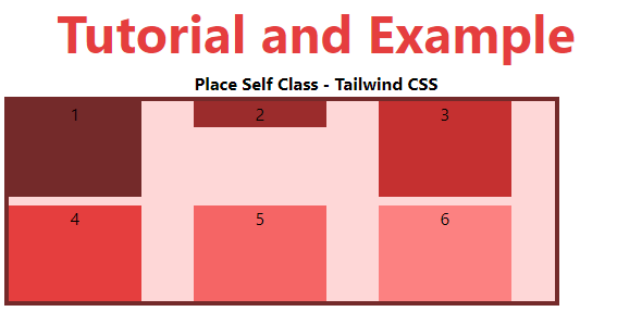
place-self-start
The lines at the start of the flex container are displayed using this class.
Syntax:
<element class="place-self-start">...</element>
Example:
<!DOCTYPE html>
<head>
    <link href=
"https://unpkg.com/tailwindcss@^1.0/dist/tailwind.min.css"
          rel="stylesheet">
</head>
<body class="text-center">
    <h1 class="text-red-600 text-5xl font-bold">
       Tutorial and Example
    </h1>
    <b>Place Self Class - Tailwind CSS </b>
    <div id="main" class="ml-24 h-48 w-2/3 grid grid-cols-3 gap-2
                          place-items-stretch
                          h-48 bg-red-200 border-solid border-4
                          border-red-900">
        <div class="bg-red-900 w-3/4">1</div>
        <div class="bg-red-800 place-self-start w-3/4">2</div>
        <div class="bg-red-700 w-3/4">3</div>
        <div class="bg-red-600 w-3/4">4</div>
        <div class="bg-red-500 w-3/4">5</div>
        <div class="bg-red-400 w-3/4">6</div>
    </div>
</body>
</html>
Output:
place-self-end
The flex lines at the end of the flex container are displayed using this class.
Syntax:
<element class="place-self-end">...</element>
Example:
<!DOCTYPE html>
<head>
    <link href=
"https://unpkg.com/tailwindcss@^1.0/dist/tailwind.min.css"
          rel="stylesheet">
</head>
<body class="text-center">
    <h1 class="text-red-600 text-5xl font-bold">
       Tutorial and Example
    </h1>
    <b>Place Self Class - Tailwind CSS </b>
    <div id="main" class="ml-24 h-48 w-2/3 grid grid-cols-3 gap-2
                          place-items-stretch
                          h-48 bg-red-200 border-solid border-4
                          border-red-900">
        <div class="bg-red-900 w-3/4">1</div>
        <div class="bg-red-800 place-self-end w-3/4">2</div>
        <div class="bg-red-700 w-3/4">3</div>
        <div class="bg-red-600 w-3/4">4</div>
        <div class="bg-red-500 w-3/4">5</div>
        <div class="bg-red-400 w-3/4">6</div>
    </div>
</body>
</html>
Output:
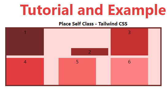
place-self-center
The place-self-center class is used to align flex elements to the container's center.
Syntax:
<element class="place-self-center">...</element>
Example:
<!DOCTYPE html>
<head>
    <link href=
"https://unpkg.com/tailwindcss@^1.0/dist/tailwind.min.css"
          rel="stylesheet">
</head>
<body class="text-center">
    <h1 class="text-red-600 text-5xl font-bold">
       Tutorial and Example
    </h1>
    <b>Place Self Class - Tailwind CSS </b>
    <div id="main" class="ml-24 h-48 w-2/3 grid grid-cols-3 gap-2
                          place-items-stretch
                          h-48 bg-red-200 border-solid border-4
                          border-red-900">
        <div class="bg-red-900 w-3/4">1</div>
        <div class="bg-red-800 place-self-center w-3/4">2</div>
        <div class="bg-red-700 w-3/4">3</div>
        <div class="bg-red-600 w-3/4">4</div>
        <div class="bg-red-500 w-3/4">5</div>
        <div class="bg-red-400 w-3/4">6</div>
    </div>
</body>
</html>
Output:
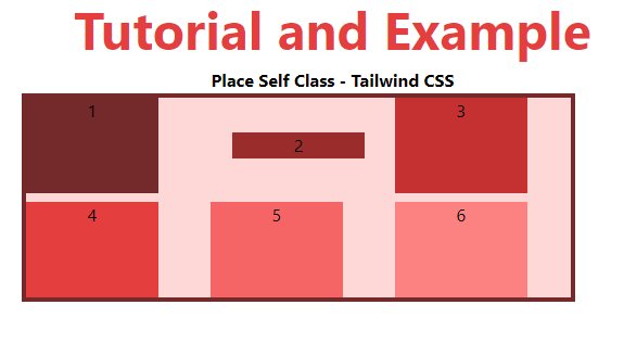
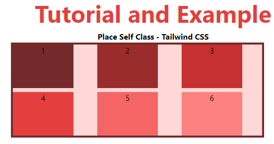
place-self-stretch
This class defines a line that is stretched to fill the flex container's remaining space. It's the default setting.
Syntax:
<element class="place-self-stretch">...</element>
Example:
<!DOCTYPE html>
<head>
    <link href=
"https://unpkg.com/tailwindcss@^1.0/dist/tailwind.min.css"
          rel="stylesheet">
</head>
<body class="text-center">
    <h1 class="text-red-600 text-5xl font-bold">
       Tutorial and Example
    </h1>
    <b>Place Self Class - Tailwind CSS </b>
    <div id="main" class="ml-24 h-48 w-2/3 grid grid-cols-3 gap-2
                          place-items-stretch
                          h-48 bg-red-200 border-solid border-4
                          border-red-900">
        <div class="bg-red-900 w-3/4">1</div>
        <div class="bg-red-800 place-self-stretch w-3/4">2</div>
        <div class="bg-red-700 w-3/4">3</div>
        <div class="bg-red-600 w-3/4">4</div>
        <div class="bg-red-500 w-3/4">5</div>
        <div class="bg-red-400 w-3/4">6</div>
    </div>
</body>
</html>
Output: