Tailwind CSS Justify Content
In tailwind CSS, this class accepts two values. It's a replacement for CSS's justify-content attribute. This class is used to describe the flexible box container's alignment. Along the main axis of a flex container, it contains the space between and surrounding content components. It is used to regulate how flex and grid objects are positioned along the main axis of a container.
Justify Content classes
The classes are listed as follows:
- justify-start
- justify-end
- justify-center
- justify-between
- justify-around
- justify-evenly
justify-start
It is used to align flex components from the beginning of the container.
Syntax:
<element class="justify-start">...</element>Example:
<!DOCTYPE html>
<head>
    <link href=
"https://unpkg.com/tailwindcss@^1.0/dist/tailwind.min.css"
          rel="stylesheet">
</head>

<body class="text-center">
    <h1 class="text-red-600 text-5xl font-bold">
        Javatpoint
    </h1>
    <b>Justify Content Class - Tailwind CSS </b>
    <div id="main" class="flex justify-start flex-row">
        <div class="bg-red-700 w-24 h-12">1</div>
        <div class="bg-red-600 w-24 h-12">2</div>
        <div class="bg-red-500 w-24 h-12">3</div>
        <div class="bg-red-400 w-24 h-12">4</div>
    </div>
</body>
</html>
Output:

justify-end
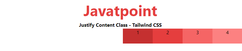
This property is used to align flex components from the container's end.
Syntax:
<element class="justify-end">...</element>Example:
<!DOCTYPE html>
<head>
    <link href=
"https://unpkg.com/tailwindcss@^1.0/dist/tailwind.min.css"
          rel="stylesheet">
</head>

<body class="text-center">
    <h1 class="text-red-600 text-5xl font-bold">
        Javatpoint
    </h1>
    <b>Justify Content Class - Tailwind CSS </b>
    <div id="main" class="flex justify-end flex-row">
        <div class="bg-red-700 w-24 h-12">1</div>
        <div class="bg-red-600 w-24 h-12">2</div>
        <div class="bg-red-500 w-24 h-12">3</div>
        <div class="bg-red-400 w-24 h-12">4</div>
    </div>
</body>
</html>
Output:
justify-center
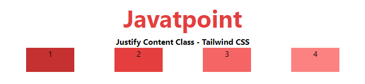
The justify-center property is used to align flex components from the container's center.
Syntax:
<element class="justify-center">...</element>Example:
<!DOCTYPE html>
<head>
    <link href=
"https://unpkg.com/tailwindcss@^1.0/dist/tailwind.min.css"
          rel="stylesheet">
</head>

<body class="text-center">
    <h1 class="text-red-600 text-5xl font-bold">
        Javatpoint
    </h1>
    <b>Justify Content Class - Tailwind CSS </b>
    <div id="main" class="flex justify-center flex-row">
        <div class="bg-red-700 w-24 h-12">1</div>
        <div class="bg-red-600 w-24 h-12">2</div>
        <div class="bg-red-500 w-24 h-12">3</div>
        <div class="bg-red-400 w-24 h-12">4</div>
    </div>
</body>
</html>
Output:

justify-between
The flex elements are spaced evenly, with the first item pushed to the left and the last item pushed to the right.
Syntax:
<element class="justify-between">...</element>Example:
<!DOCTYPE html>
<head>
    <link href=
"https://unpkg.com/tailwindcss@^1.0/dist/tailwind.min.css"
          rel="stylesheet">
</head>

<body class="text-center">
    <h1 class="text-red-600 text-5xl font-bold">
        Javatpoint
    </h1>
    <b>Justify Content Class - Tailwind CSS </b>
    <div id="main" class="flex justify-between flex-row">
        <div class="bg-red-700 w-24 h-12">1</div>
        <div class="bg-red-600 w-24 h-12">2</div>
        <div class="bg-red-500 w-24 h-12">3</div>
        <div class="bg-red-400 w-24 h-12">4</div>
    </div>
</body>
</html>
Output:

justify-around
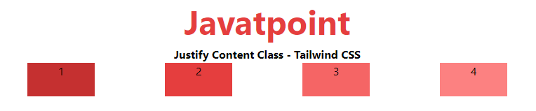
The corners are where the flex elements are placed, with equal spacing between them.
Syntax:
<element class="justify-around">...</element>Example:
<!DOCTYPE html>
<head>
    <link href=
"https://unpkg.com/tailwindcss@^1.0/dist/tailwind.min.css"
          rel="stylesheet">
</head>

<body class="text-center">
    <h1 class="text-red-600 text-5xl font-bold">
        Javatpoint
    </h1>
    <b>Justify Content Class - Tailwind CSS </b>
    <div id="main" class="flex justify-around flex-row">
        <div class="bg-red-700 w-24 h-12">1</div>
        <div class="bg-red-600 w-24 h-12">2</div>
        <div class="bg-red-500 w-24 h-12">3</div>
        <div class="bg-red-400 w-24 h-12">4</div>
    </div>
</body>
</html>
Output:
justify-evenly
The objects are spaced evenly between them, although the spacing from the corners varies.
Syntax:
<element class="justify-evenly">...</element>Example:
<!DOCTYPE html>
<head>
    <link href=
"https://unpkg.com/tailwindcss@^1.0/dist/tailwind.min.css"
          rel="stylesheet">
</head>

<body class="text-center">
    <h1 class="text-red-600 text-5xl font-bold">
        Javatpoint
    </h1>
    <b>Justify Content Class - Tailwind CSS </b>
    <div id="main" class="flex justify-evenly flex-row">
        <div class="bg-red-700 w-24 h-12">1</div>
        <div class="bg-red-600 w-24 h-12">2</div>
        <div class="bg-red-500 w-24 h-12">3</div>
        <div class="bg-red-400 w-24 h-12">4</div>
    </div>
</body>
</html>
Output: