Tailwind CSS Box Shadow
The Tailwind CSS Box Shadow class accepts a lot of value, and all of the properties are covered in class form. We may control the box-shadow of an element by using this class. We implement this in CSS by using the box-shadow CSS Shadow Effect attributes.
Box Shadow Classes
The various box shadow classes are as follows:
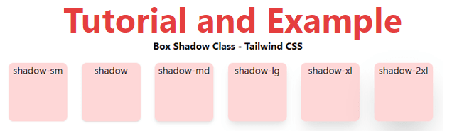
- shadow-sm: This class is intended to make the box have a faded or small shadow effect.
- shadow: This class is used to provide the box with a regular shadow effect.
- shadow-md: The box md effects are created with this class.
- shadow-lg: This class is used to create a large shadow effect for the box.
- shadow-xl: This class creates an xl shadow effect for the box.
- shadow-2xl: This class creates a 2xl shadow effect for the box.
- shadow-inner: This class is used to create shadows on the box's inside.
- shadow-none: The shadow effects are diluted using this class.
Syntax is:
<element class="shadow-{shadow-depth}">...</element>
Example
Code is as follows:
<!DOCTYPE html>
<head>
    <link href=
"https://unpkg.com/tailwindcss@^1.0/dist/tailwind.min.css"
        rel="stylesheet">
</head>
<body class="text-center mx-4 space-y-2">
    <h1 class="text-red-600 text-5xl font-bold">
        Tutorial and Example
    </h1>
    <b>Box Shadow Class - Tailwind CSS </b>
    <div class="grid grid-flow-col text-center p-2">
        <div class="shadow-sm w-24 h-24 bg-red-200
                    rounded-lg">shadow-sm
        </div>
        <div class="shadow w-24 h-24 bg-red-200
                    rounded-lg">shadow
        </div>
        <div class="shadow-md w-24 h-24 bg-red-200
                    rounded-lg">shadow-md
        </div>
        <div class="shadow-lg w-24 h-24 bg-red-200
                    rounded-lg">shadow-lg
        </div>
        <div class="shadow-xl w-24 h-24 bg-red-200
                    rounded-lg">shadow-xl
        </div>
        <div class="shadow-2xl w-24 h-24 bg-red-200
                    rounded-lg">shadow-2xl
        </div>
    </div>
</body>
</html>
Output: