
Tailwind CSS Z-index
The tailwind CSS framework is a CSS utility framework that provides classes for managing HTML content with CSS. Tailwind CSS simplifies our design process and makes it responsive across numerous platforms. The z-Index utility is used to control an element's stack order. It's a replacement for the CSS z-index property. As seen in the examples below, this class is used to describe the z-index along the three-dimensional plane.
Tailwind CSS z-index classes
The Tailwind CSS z-index classes are as follows:
- z-0
- z-10
- z-20
- z-30
- z-40
- z-50
- z-auto
Note: In the abovementioned class, z-0 is the same as the CSS property z-index:0 and so on.
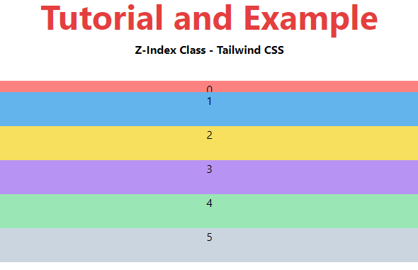
z-0
It is used to give the element a z-index of zero.
Syntax
<element class="z-0">....</element>
Example:
<!DOCTYPE html>
<head>
    <link
    rel="stylesheet"
    href="https://unpkg.com/tailwindcss@^1.0/dist/tailwind.min.css">
</head>
<body class="text-center">
    <h1 class="text-red-600 text-5xl font-bold">
        Tutorial and Example
    </h1>
    <b>Z-Index Class - Tailwind CSS </b>
    <div class="flex-column">
        <div class="relative z-0 w-full
                    h-12 bg-red-400"
              style="top: 32px;">0</div>
        <div class="relative z-10 w-full
                    h-12 bg-blue-400">1</div>
        <div class="relative z-20 w-full
                    h-12 bg-yellow-400">2</div>
        <div class="relative z-30 w-full
                    h-12 bg-purple-400">3</div>
        <div class="relative z-40 w-full
                    h-12 bg-green-300">4</div>
        <div class="relative z-50 w-full
                    h-12 bg-gray-400">5</div>
    </div>
</body>
  </html>
Output:
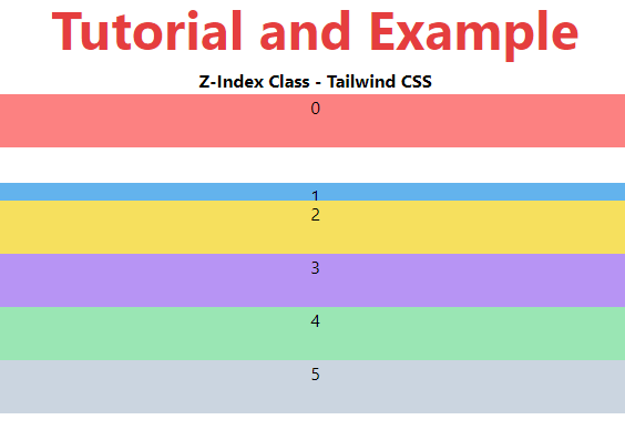
z-10
It is used to give the element a z-index 10. Along the z-axis, the items seem 10px upside down.
Syntax
<element class="z-10">....</element>
Example:
<!DOCTYPE html>
<head>
    <link
    rel="stylesheet"
    href="https://unpkg.com/tailwindcss@^1.0/dist/tailwind.min.css">
</head>
<body class="text-center">
    <h1 class="text-red-600 text-5xl font-bold">
        Tutorial and Example
    </h1>
    <b>Z-Index Class - Tailwind CSS </b>
    <div class="flex-column">
        <div class="relative z-0 w-full
                    h-12 bg-red-400" >0</div>
        <div class="relative z-10 w-full
                    h-12 bg-blue-400" style="top: 32px;">1</div>
        <div class="relative z-20 w-full
                    h-12 bg-yellow-400">2</div>
        <div class="relative z-30 w-full
                    h-12 bg-purple-400">3</div>
        <div class="relative z-40 w-full
                    h-12 bg-green-300">4</div>
        <div class="relative z-50 w-full
                    h-12 bg-gray-400">5</div>
    </div>
</body>
 </html>
Output:
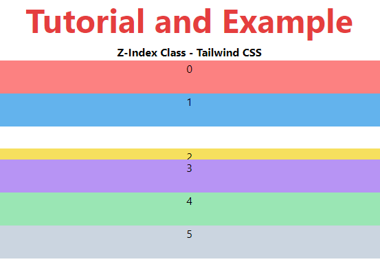
z-20
It is used to give the element a z-index of 20. Along the z-axis, the items are 20px upside down.
Syntax
<element class="z-20">....</element>
Example:
<!DOCTYPE html>
<head>
    <link
    rel="stylesheet"
    href="https://unpkg.com/tailwindcss@^1.0/dist/tailwind.min.css">
</head>
<body class="text-center">
    <h1 class="text-red-600 text-5xl font-bold">
        Tutorial and Example
    </h1>
    <b>Z-Index Class - Tailwind CSS </b>
    <div class="flex-column">
        <div class="relative z-0 w-full
                    h-12 bg-red-400" >0</div>
        <div class="relative z-10 w-full
                    h-12 bg-blue-400">1</div>
        <div class="relative z-20 w-full
                    h-12 bg-yellow-400" style="top: 32px;">2</div>
        <div class="relative z-30 w-full
                    h-12 bg-purple-400">3</div>
        <div class="relative z-40 w-full
                    h-12 bg-green-300">4</div>
        <div class="relative z-50 w-full
                    h-12 bg-gray-400">5</div>
    </div>
</body>
 </html>
Output:
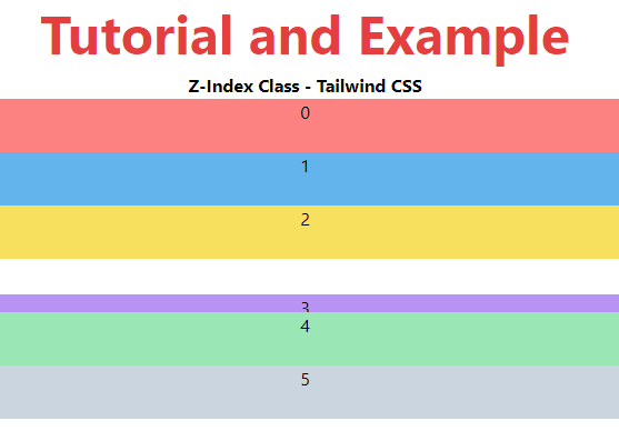
z-30
It is used to give the element a z-index of 30. Along the z-axis, the items are 30px upside down.
Syntax
<element class="z-30">....</element>
Example:
<!DOCTYPE html>
<head>
    <link
    rel="stylesheet"
    href="https://unpkg.com/tailwindcss@^1.0/dist/tailwind.min.css">
</head>
<body class="text-center">
    <h1 class="text-red-600 text-5xl font-bold">
       Tutorial and Example
    </h1>
    <b>Z-Index Class - Tailwind CSS </b>
    <div class="flex-column">
        <div class="relative z-0 w-full
                    h-12 bg-red-400" >0</div>
        <div class="relative z-10 w-full
                    h-12 bg-blue-400">1</div>
        <div class="relative z-20 w-full
                    h-12 bg-yellow-400">2</div>
        <div class="relative z-30 w-full
                    h-12 bg-purple-400" style="top: 32px;">3</div>
        <div class="relative z-40 w-full
                    h-12 bg-green-300">4</div>
        <div class="relative z-50 w-full
                    h-12 bg-gray-400">5</div>
    </div>
</body>
</html>
Output:
z-40
It is used to give the element a z-index of 40. Along the z-axis, the elements are 40px upside down.
Syntax
<element class="z-40">....</element>
z-50
It is used to give the element a z-index of 50. Along the z-axis, the elements are 50px upside down.
Syntax
<element class="z-50">....</element>