Tailwind CSS Grid Auto Columns
The Grid Auto Columns class accepts multiple values, and all of the properties are covered in class form. It's a replacement for the CSS grid-auto-columns property. The size of the columns of implicitly produced grid containers is specified using this class. This class is used to adjust the size of grid columns that are formed implicitly.
Grid Auto columns classes
- auto-cols-auto
- auto-cols-min
- auto-cols-max
- auto-cols-fr
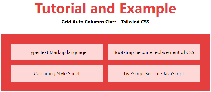
auto-cols-aut
It is the default value. The size is implicitly determined by the container's dimensions.
Syntax:
<element class="auto-cols-auto">..</element>
Example:
<!DOCTYPE html>
<html>
    <head>
    <link href=
"https://unpkg.com/tailwindcss@^1.0/dist/tailwind.min.css"
        rel="stylesheet">
</head>
<body class="text-center">
    <h1 class="text-red-600 text-5xl font-bold">
        Tutorial and Example
    </h1>
    <b>Grid Auto Columns Class - Tailwind CSS </b>
        <div class ="m-8 p-8 grid bg-red-600 grid-rows-2
                     grid-flow-col gap-4 auto-cols-auto">
            <div class = "p-4 bg-red-200">
                Bootstrap become replacement of CSS
            </div>
            <div class = "p-4 bg-red-200">
                Cascading Style Sheet
            </div>
            <div class = "p-4 bg-red-200">
                LiveScript Become JavaScript
            </div>
            <div class = "p-4 bg-red-200">
                HyperText Markup language
            </div>
        </div>
    </body>
</html>
Output:
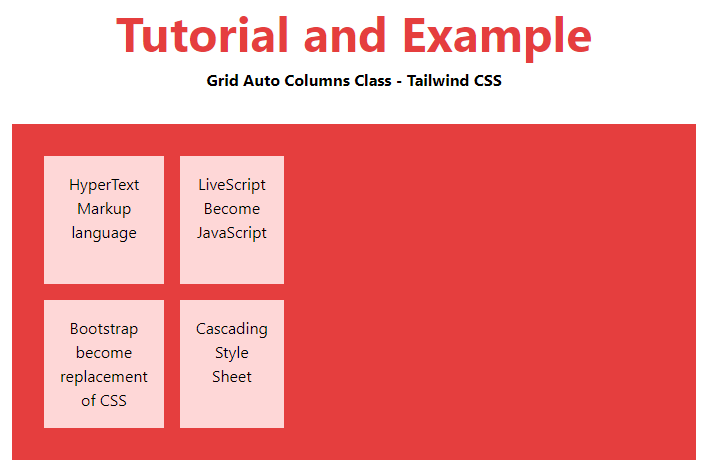
auto-cols-min
This depends upon the size based on the container's smallest item.
Syntax:
<element class="auto-cols-min">..</element>
Example:
<!DOCTYPE html>
<html>
    <head>
    <link href=
"https://unpkg.com/tailwindcss@^1.0/dist/tailwind.min.css"
        rel="stylesheet">
</head>
<body class="text-center">
    <h1 class="text-red-600 text-5xl font-bold">
        Tutorial and Example
    </h1>
    <b>Grid Auto Columns Class - Tailwind CSS </b>
        <div class ="m-8 p-8 grid bg-red-600 grid-rows-2
                     grid-flow-col gap-4 auto-cols-min">
            <div class = "p-4 bg-red-200">
                HyperText Markup language
            </div>
            <div class = "p-4 bg-red-200">
                Bootstrap become replacement of CSS
            </div>
            <div class = "p-4 bg-red-200">
                LiveScript Become JavaScript
            </div>
            <div class = "p-4 bg-red-200">
                Cascading Style Sheet
            </div>
        </div>
    </body>
</html>
Output:
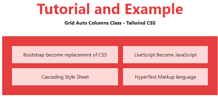
auto-cols-max
It determines the size based on the container's largest item.
Syntax
<element class="auto-cols-max">..</element>
Example:
<!DOCTYPE html>
<html>
    <head>
    <link href=
"https://unpkg.com/tailwindcss@^1.0/dist/tailwind.min.css"
        rel="stylesheet">
</head>
<body class="text-center">
    <h1 class="text-red-600 text-5xl font-bold">
        Tutorial and Example
    </h1>
    <b>Grid Auto Columns Class - Tailwind CSS </b>
        <div class ="m-8 p-8 grid bg-red-600 grid-rows-2
                     grid-flow-col gap-4 auto-cols-max">
            <div class = "p-4 bg-red-200">
                LiveScript Become JavaScript
            </div>
            <div class = "p-4 bg-red-200">
                Bootstrap become replacement of CSS
            </div>
            <div class = "p-4 bg-red-200">
                HyperText Markup language
            </div>
            <div class = "p-4 bg-red-200">
                Cascading Style Sheet
            </div>
        </div>
    </body>
</html>
Output:
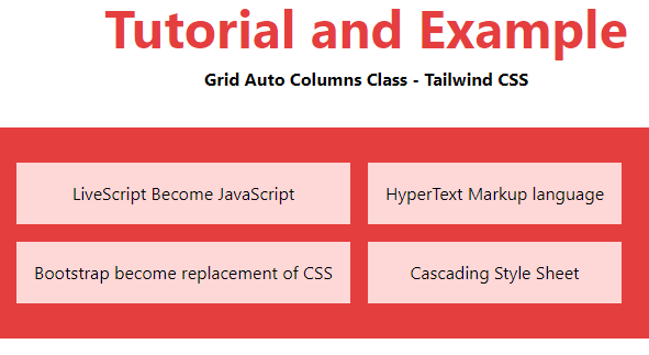
auto-cols-fr
It defines a size that is larger than or equal to min and less than or equal to the max in the range [min, max].
Syntax:
<element class="auto-cols-fr">..</element>
Example:
<!DOCTYPE html>
<html>
    <head>
    <link href=
"https://unpkg.com/tailwindcss@^1.0/dist/tailwind.min.css"
        rel="stylesheet">
</head>
<body class="text-center">
    <h1 class="text-red-600 text-5xl font-bold">
        Tutorial and Example
    </h1>
    <b>Grid Auto Columns Class - Tailwind CSS </b>
        <div class ="m-8 p-8 grid bg-red-600 grid-rows-2
                     grid-flow-col gap-4 auto-cols-fr">
            <div class = "p-4 bg-red-200">
                HyperText Markup language
            </div>
            <div class = "p-4 bg-red-200">
                Cascading Style Sheet
            </div>
            <div class = "p-4 bg-red-200">
                Bootstrap become replacement of CSS
            </div>
            <div class = "p-4 bg-red-200">
                LiveScript Become JavaScript
            </div>
        </div>
    </body>
</html>
Output: