
×

Tailwind CSS Object Fit

It acknowledges more than one value in tailwind CSS. Every one of its properties is covered as in class form. It is the option in contrast to the CSS object-fit property. The object fit class is utilized to indicate how a picture (image) or video ought to be resized to accommodate its content box for controlling a supplanted element's content resizing.

Object fit Classes

There object fit classes are classified as:

  • object-contain
  • object-cover
  • object-fill
  • object-none
  • object-scale-down
  1. object-contain

This class supplanted image preserves the perspective proportion of the original image while fitting inside the content box. It resizes an element's content to remain held inside its container.

Syntax:

<element class="object-contain">...</element>

Example:

Example for object-contain class is as follows:

<!DOCTYPE html>
<head>
<link href=
"https://unpkg.com/tailwindcss@^1.0/dist/tailwind.min.css"
rel="stylesheet">
</head>

<body class="text-center">
<center>
<h1 class="text-red-600 text-5xl font-bold">
Tutorial and Example
</h1>
<b>object Class - Tailwind CSS </b>
<div class="bg-red-300 w-full h-full">
<img class="object-contain h-48 w-full"
src=
"javatpoint logo_image.png">

</center>
</body>

</html>

Output:
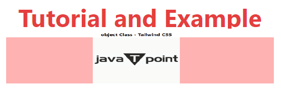
Tailwind CSS Object Fit
  1. object-cover

It protects the aspect ratio of the original image as the supplanted image while fitting in the content box. Sometimes it is cut to fit when the aspect ratio of the original picture doesn't coordinate with the aspect ratio of the content box. It resizes an element's content to cover its container utilizing this class.

Syntax:

<element class="object-cover">...</element>

Example:

Example for object-cover class is as follows:

<!DOCTYPE html>
<head>
<link href=
"https://unpkg.com/tailwindcss@^1.0/dist/tailwind.min.css"
rel="stylesheet">
</head>

<body class="text-center">
<center>
<h1 class="text-red-600 text-5xl font-bold">
Tutorial and Example
</h1>
<b>object Class - Tailwind CSS </b>
<div class="bg-red-300 w-full h-full">
<img class="object-cover h-48 w-full"
src=
"javatpoint logo_image.png">

</center>
</body>
</html>

Output:

Tailwind CSS Object Fit
  1. object-fill

This class supplanted image is extended to fit the content box. The supplanted image will totally fill the box unnecessary of its aspect ratio. Stretch an element’s content to accommodate its container utilizing the class.

Syntax:

<element class="object-fill">...</element>

Example:

Example for object-fill class is as follows:

<!DOCTYPE html>
<head>
<link href=
"https://unpkg.com/tailwindcss@^1.0/dist/tailwind.min.css"
rel="stylesheet">
</head>

<body class="text-center">
<center>
<h1 class="text-red-600 text-5xl font-bold">
Tutorial and Example
</h1>
<b>object Class - Tailwind CSS </b>
<div class="bg-red-300 w-full h-full">
<img class="object-fill h-48 w-full"
src=
"javatpoint logo_image.png">

</center>
</body>
</html>

Output:
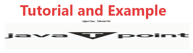
Tailwind CSS Object Fit
  1. object-none

In this class, the supplanted image will overlook the aspect ratio of the original picture. Subsequently, it isn't resized. The class shows an element's content at its original size overlooking the container size.

Syntax:

<element class="object-none">...</element>

Example:

Example for object-none class is as follows:

<!DOCTYPE html>
<head>
<link href=
"https://unpkg.com/tailwindcss@^1.0/dist/tailwind.min.css"
rel="stylesheet">
</head>

<body class="text-center">
<center>
<h1 class="text-red-600 text-5xl font-bold">
Tutorial and Example
</h1>
<b>object Class - Tailwind CSS </b>
<div class="bg-red-300 w-full h-full">
<img class="object-none h-48 w-full"
src=
"javatpoint logo_image.png">

</center>
</body>

</html>

Output:
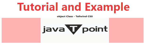
Tailwind CSS Object Fit
  1. object-scale-down

This class supplanted image is resized as though none or contain were indicated and brings about the littlest object size. The class shows an element's content at its original size yet scales it down to accommodate its container.

Syntax:

<element class="object-scale-down">...</element>

Example:

Example for object- scale-down class is as follows:

<!DOCTYPE html>
<head>
<link href=
"https://unpkg.com/tailwindcss@^1.0/dist/tailwind.min.css"
rel="stylesheet">
</head>

<body class="text-center">
<center>
<h1 class="text-red-600 text-5xl font-bold">
Tutorial and Example
</h1>
<b>object Class - Tailwind CSS </b>
<div class="bg-red-300 w-full h-full">
<img class="object-scale-down h-48 w-full"
src=
"javatpoint logo_image.png">

</center>
</body>

</html>

Output:
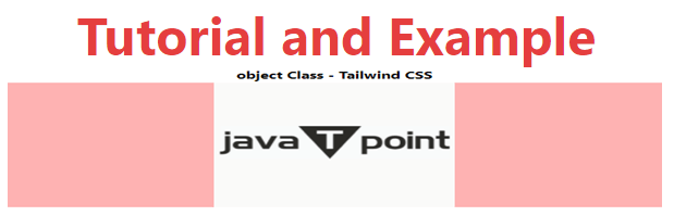
Tailwind CSS Object Fit

Related Topics

Tailwind CSS Justify Content

In tailwind CSS, this class accepts two values. It's a replacement for CSS's justify-content attribute. This class is used to describe the flexible box container's alignment. Along the main axis...

4 minutes read.

Tailwind CSS Grid Row Start / End

In tailwind CSS, this class takes several values. All of the attributes are covered in the form of a class. In CSS, it's an alternative to the grid-row attribute. It's...

4 minutes read.

Tailwind CSS Fill

The CSS Fill class accepts a lot of value, and all of the properties are covered in class form. It is a presentation attribute that controls how an SVG shape's...

1 minute read.

Tailwind CSS Grid Auto Rows

In tailwind CSS, this class takes multiple values and covers all of the properties in class form. It's a replacement for the grid-auto-rows CSS attribute. The size of the rows...

6 minutes read.

Tailwind CSS Place Self

The tailwind CSS Place self class accepts a wide range of values. It's a replacement for the CSS Place Items property. This class is used to manage how a single...

4 minutes read.

Tailwind CSS Grid Auto Flow

In tailwind CSS, this class accepts multiple values, and all of the properties are covered in class form. It is a CSS alternative. The grid-auto-flow property is used in Tailwind...

4 minutes read.

Tailwind CSS Flex Direction

CSS flexbox is an important element for frontend development. CSS has four directions, therefore in tailwind CSS, all of the properties are covered in class form. It's a front-end development...

5 minutes read.

Tailwind CSS Opacity

This class accepts a lot of value, and all of the properties are covered in class form. We can change the opacity of any element by using this class. The...

1 minute read.

Tailwind CSS Visibility

In tailwind CSS, this class accepts two values. It's a replacement for the CSS visibility property. This class specifies whether an element in a web document is visible or not,...

2 minutes read.

Tailwind CSS tutorial

Tailwind CSS can be utilized to make sites in the quickest and the least demanding way. Tailwind CSS is the most famous utility-first CSS structure on the planet for quickly...

4 minutes read.

Tailwind CSS Min-Height

In tailwind CSS, this class accepts a large number of values, and all of the properties are covered in class form. It's a replacement for the CSS Min-Height Property. It...

2 minutes read.

Tailwind CSS Place Content

This class accepts a wide range of values. It's a replacement for the CSS Place Content property. This class is used to manage how information is justified while still being...

5 minutes read.

Tailwind CSS Padding

This class accepts a large number of values, and all of the properties are covered in class form. It's a replacement for the CSS Padding Property. This class is used...

4 minutes read.

Tailwind CSS Order

One of the best features of Tailwind CSS is the Order class, which allows us to order flex and grid objects according to our needs. There are several different order...

2 minutes read.

Tailwind CSS Display

It acknowledges more than one worth in tailwind CSS. Every one of the properties is shrouded as in class structure. It is an option in contrast to the CSS display...

5 minutes read.

Tailwind CSS Box Shadow

The Tailwind CSS Box Shadow class accepts a lot of value, and all of the properties are covered in class form. We may control the box-shadow of an element by...

2 minutes read.

Tailwind CSS Flex

CSS flexbox is an important component for frontend development. There are four flex options in Tailwind CSS, and all of the attributes are covered in class form. It's a front-end...

6 minutes read.

Tailwind CSS Container

In Tailwind CSS, a compartment is utilized to fix the maximum width (max-width) of a component to match the min-width of the breakpoint. It comes exceptionally convenient when content must...

2 minutes read.

Tailwind CSS Flex Wrap

CSS flexbox is an important component for frontend development. It is a front-end development alternative to the CSS flex-wrap Property. Note: You must include the flex class in your element before...

4 minutes read.

Tailwind CSS Top / Right / Bottom / Left

In tailwind CSS, these classes take a variety of values and cover all of the characteristics in the class form. These are the CSS Top/Right/Bottom/Left properties' replacements. These classes are...

4 minutes read.