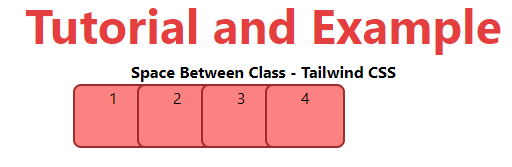
Tailwind CSS Space Between
In tailwind CSS, this class accepts a large number of values, and all of the properties are covered in class form. It's a replacement for the CSS Space Between property. The space between child items is controlled by this class.
Space Between classes
- space-y-0
- space-y-reverse
- -space-y-0
- space-x-0
- space-x-reverse
- -space-x-0
Note: You can replace "0" with any of the allowed "rem" values.
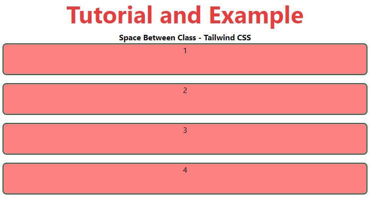
space-y-0
This class is used to conduct space operations on the y-axis.
Syntax:
<element class="space-y-0">...</element>
Example:
<!DOCTYPE html>
<head>
    <link href=
"https://unpkg.com/tailwindcss@^1.0/dist/tailwind.min.css"
          rel="stylesheet">
</head>
<body class="text-center">
    <h1 class="text-red-600 text-5xl font-bold">
       Tutorial and Example
    </h1>
    <b>Space Between Class - Tailwind CSS </b>
    <div class="mx-4 space-y-4">
        <div class="bg-red-400 h-16 rounded-lg
                    border-2 border-green-800">1</div>
        <div class="bg-red-400 h-16 rounded-lg
                    border-2 border-green-800">2</div>
        <div class="bg-red-400 h-16 rounded-lg
                    border-2 border-green-800">3</div>
        <div class="bg-red-400 h-16 rounded-lg
                    border-2 border-green-800">4</div>
    </div>
</body>
</html>
Output:
space-y-reverse
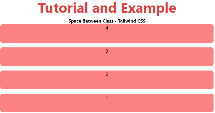
This class is used to execute reverse spacing on the y-axis, but it must be used before the flex-reverse class.
Syntax:
<element class="space-y-reverse">...</element>
Example:
<!DOCTYPE html>
<head>
    <link href=
"https://unpkg.com/tailwindcss@^1.0/dist/tailwind.min.css"
          rel="stylesheet">
</head>
<body class="text-center">
    <h1 class="text-red-600 text-5xl font-bold">
       Tutorial and Example
    </h1>
    <b>Space Between Class - Tailwind CSS </b>
    <div class="mx-4 flex flex-col-reverse space-y-4
                space-y-reverse">
        <div class="bg-red-400 h-16 rounded-lg">1</div>
        <div class="bg-red-400 h-16 rounded-lg">2</div>
        <div class="bg-red-400 h-16 rounded-lg">3</div>
        <div class="bg-red-400 h-16 rounded-lg">4</div>
    </div>
</body>
</html>
Output:
space-y-0
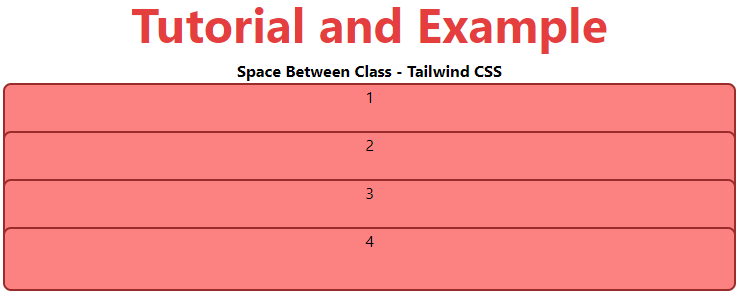
This class is used to create negative x-axis spacing. We can nest one element inside another by using this class.
Syntax:
<element class="-space-y-0">...</element>
Example:
<!DOCTYPE html>
<head>
    <link href=
"https://unpkg.com/tailwindcss@^1.0/dist/tailwind.min.css"
          rel="stylesheet">
</head>
<body class="text-center">
    <h1 class="text-red-600 text-5xl font-bold">
       Tutorial and Example
    </h1>
    <b>Space Between Class - Tailwind CSS </b>
    <div class="mx-4 -space-y-4">
        <div class="bg-red-400 h-16 rounded-lg
                    border-2 border-red-800">1</div>
        <div class="bg-red-400 h-16 rounded-lg
                    border-2 border-red-800">2</div>
        <div class="bg-red-400 h-16 rounded-lg
                    border-2 border-red-800">3</div>
        <div class="bg-red-400 h-16 rounded-lg
                    border-2 border-red-800">4</div>
    </div>
</body>
</html>
Output:
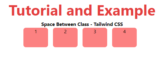
space-x-0
This class is used to conduct space operations on the x-axis.
Syntax:
<element class="space-x-0">...</element>
Example:
<!DOCTYPE html>
<head>
    <link href=
"https://unpkg.com/tailwindcss@^1.0/dist/tailwind.min.css"
          rel="stylesheet">
</head>
<body class="text-center">
    <h1 class="text-red-600 text-5xl font-bold">
       Tutorial and Example
    </h1>
    <b>Space Between Class - Tailwind CSS </b>
    <div class="ml-48 flex space-x-4">
        <div class="bg-red-400 w-20 h-16 rounded-lg">1</div>
        <div class="bg-red-400 w-20 h-16 rounded-lg">2</div>
        <div class="bg-red-400 w-20 h-16 rounded-lg">3</div>
        <div class="bg-red-400 w-20 h-16 rounded-lg">4</div>
    </div>
</body>
</html>
Output:
space-x-reverse
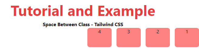
This class is used to execute reverse spacing on the x-axis, but it must be used before the flex-reverse class.
Syntax:
<element class="space-x-reverse">...</element>
Example:
<!DOCTYPE html>
<head>
    <link href=
"https://unpkg.com/tailwindcss@^1.0/dist/tailwind.min.css"
          rel="stylesheet">
</head>
<body class="text-center">
    <h1 class="text-red-600 text-5xl font-bold">
       Tutorial and Example
    </h1>
    <b>Space Between Class - Tailwind CSS </b>
    <div class="ml-48 flex flex-row-reverse space-x-4
                space-x-reverse">
        <div class="bg-red-400 w-20 h-16 rounded-lg">1</div>
        <div class="bg-red-400 w-20 h-16 rounded-lg">2</div>
        <div class="bg-red-400 w-20 h-16 rounded-lg">3</div>
        <div class="bg-red-400 w-20 h-16 rounded-lg">4</div>
    </div>
</body>
</html>
Output:
space-x-0
This class is used for negative x-axis spacing. We can use this class to nest one element inside another.
Syntax:
<element class="-space-x-0">...</element>
Example:
<!DOCTYPE html>
<head>
    <link href=
"https://unpkg.com/tailwindcss@^1.0/dist/tailwind.min.css"
          rel="stylesheet">
</head>
<body class="text-center">
    <h1 class="text-red-600 text-5xl font-bold">
        Tutorial and Example
    </h1>
    <b>Space Between Class - Tailwind CSS </b>
    <div class="ml-48 flex -space-x-4">
        <div class="bg-red-400 w-20 h-16 rounded-lg
                    border-2 border-red-800">1</div>
        <div class="bg-red-400 w-20 h-16 rounded-lg
                    border-2 border-red-800">2</div>
        <div class="bg-red-400 w-20 h-16 rounded-lg
                    border-2 border-red-800">3</div>
        <div class="bg-red-400 w-20 h-16 rounded-lg
                    border-2 border-red-800">4</div>
    </div>
</body>
</html>
Output: