Tailwind CSS Max-Height
This class accepts a large number of values, and all of the properties are covered in class form. It's a replacement for the CSS Max-Height attribute. It is used to specify an element's maximum height. If the element's content exceeds the provided maximum height, the content will overflow; otherwise, it will have no impact. If the element's content is too little, it has no effect. The max-height class can override the height class value.
Max-Height classes
- max-h-0
- max-h-px
- max-h-full
- max-h-screen
Note: The number can be changed using the valid "rem" values.
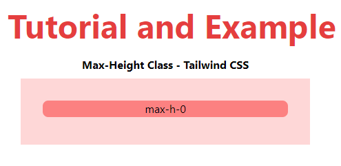
max-h-0
This class is used to specify the element's maximum particular height.
Syntax is:
<element class="max-h-0">...</element>
Example
Example is as follows:
<!DOCTYPE html>
<head>
    <link href=
"https://unpkg.com/tailwindcss@^1.0/dist/tailwind.min.css"
          rel="stylesheet">
</head>
<body class="text-center mx-4 space-y-2">
    <h1 class="text-red-600 text-5xl font-bold">
        Tutorial and Example
    </h1>
    <b>Max-Height Class - Tailwind CSS </b>
    <div class="mx-48 h-24 bg-red-200 p-8">
        <div class="max-h-0 bg-red-400
                    rounded-lg">max-h-0</div>
    </div>
</body>
</html>
Output is:
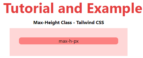
max-h-px
This class is used to give any element a 1px specific height.
Syntax is:
<element class="max-h-px">...</element>
Example
Example is as follows:
<!DOCTYPE html>
<head>
    <link href=
"https://unpkg.com/tailwindcss@^1.0/dist/tailwind.min.css"
          rel="stylesheet">
</head>
<body class="text-center mx-4 space-y-2">
    <h1 class="text-red-600 text-5xl font-bold">
       Tutorial and Example
    </h1>
    <b>Max-Height Class - Tailwind CSS </b>
    <div class="mx-48 h-24 bg-red-200 p-8">
        <div class="max-h-px bg-red-400
                    rounded-lg">max-h-px</div>
    </div>
</body>
</html>
Output is:
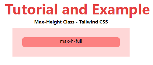
max-h-full
Depending on the parent element, this class is used to set the maximum height of a complete element.
Syntax is:
<element class="max-h-full">...</element>
Example
Example is as follows:
<!DOCTYPE html>
<head>
    <link href=
"https://unpkg.com/tailwindcss@^1.0/dist/tailwind.min.css"
          rel="stylesheet">
</head>
<body class="text-center mx-4 space-y-2">
    <h1 class="text-red-600 text-5xl font-bold">
       Tutorial and Example
    </h1>
    <b>Max-Height Class - Tailwind CSS </b>
    <div class="mx-48 h-24 bg-red-200 p-8">
        <div class="h-48 max-h-full bg-red-400
                    rounded-lg">max-h-full</div>
    </div>
</body>
</html>
Output is:
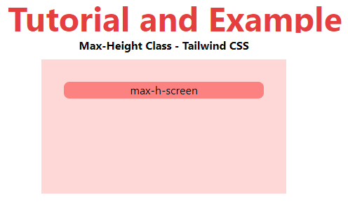
max-h-screen
This class makes an element stretch the entire height of the viewport to the fullest extent possible. Add a "screen" prefix to any existing max-height utility to control the element's max-height at a certain breakpoint.
Syntax is:
<element class="max-h-screen">...</element>
Example
Example is as follows:
<!DOCTYPE html>
<head>
    <link href=
"https://unpkg.com/tailwindcss@^1.0/dist/tailwind.min.css"
          rel="stylesheet">
</head>
<body class="text-center mx-4 space-y-2">
    <h1 class="text-red-600 text-5xl font-bold">
       Tutorial and Example
    </h1>
    <b>Max-Height Class - Tailwind CSS </b>
    <div class="mx-48 h-48 bg-red-200 p-8">
        <div class="max-h-screen bg-red-400
                    rounded-lg">max-h-screen</div>
    </div>
</body>
</html>
Output: