
×

Tailwind CSS Object Position

It acknowledges more than one value in tailwind CSS. Every one of the properties is covered as in class form. It is the option in contrast to the CSS object-position property. This class is utilized to indicate, how a picture (image) or video element is situated/positioned with x/y coordinates inside the box of its contents. It additionally controls the substitution of the element's content situating inside its container.

Object Position Classes

  • object-left-top: It is situated at the left top of the picture (image) or video.
  • object-top: It is situated at the (highest) top of the picture or video.
  • object-right-top: It is situated at the right top of the picture or video.
  • object-left: It is situated on the left of the picture or video.
  • object-center: It is situated at the centre point of the picture or video.
  • object-right: It is situated to the right of the picture or video.
  • object-left-bottom: It is situated at the left lower part of the picture or video.
  • object-bottom: It is situated at the lower part of the picture or video.
  • object-right-bottom: It is situated at the right-lower/bottom part of the picture or video.

All classes are utilized in the underneath example:

Code:

<!DOCTYPE html>
<html>
<head>
<link
href="https://unpkg.com/tailwindcss@^1.0/dist/tailwind.min.css"
rel="stylesheet">
</head>

<body class="text-center">
<h1 class="text-red-600 text-5xl font-bold">
Tutorial and Example
</h1>
<b>Object Position Class - Tailwind CSS </b>
<div class="bg-red-300
mx-16
space-y-4
p-2
justify-between
grid grid-rows-3
grid-flow-col">
<img
title="object-left-top"
class="object-none object-left-top bg-red-200 w-24 h-24 border-4 my-4"
src=
"javatpoint logo_image.png">
<img
title="object-left"
class="object-none object-left bg-red-200 w-24 h-24 border-4"
src=
"javatpoint logo_image.png">
<img
title="object-left-bottom"
class="object-none object-left-bottom bg-red-200 w-24 h-24 border-4"
src=
"javatpoint logo_image.png">

<img
title="object-top"
class="object-none object-top bg-red-200 w-24 h-24 border-4"
src=
"javatpoint logo_image.png">
<img
title="object-center"
class="object-none object-center bg-red-200 w-24 h-24 border-4"
src=
"javatpoint logo_image.png">
<img
title="object-bottom"
class="object-none object-bottom bg-red-200 w-24 h-24 border-4"
src=
"javatpoint logo_image.png">

<img
title="object-right-top"
class="object-none object-right-top bg-red-200 w-24 h-24 border-4"
src=
"javatpoint logo_image.png">
<img
title="object-right"
class="object-none object-right bg-red-200 w-24 h-24 border-4"
src=
"javatpoint logo_image.png">

<img
title="object-right-bottom"
class="object-none object-right-bottom bg-red-200 w-24 h-24 border-4"
src=
"javatpoint logo_image.png">
</div>
</body>
</html>

Output:
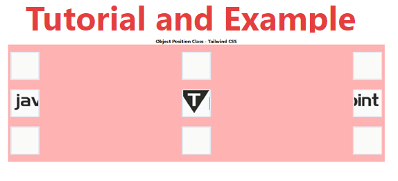
Tailwind CSS Object Position

Related Topics

Tailwind CSS Flex Shrink

CSS flexbox is an important element for frontend development. There are two flex-shrink options in Tailwind CSS, and all properties are covered in class form. For quick front-end development, it's...

3 minutes read.

Tailwind CSS Display

It acknowledges more than one worth in tailwind CSS. Every one of the properties is shrouded as in class structure. It is an option in contrast to the CSS display...

5 minutes read.

Tailwind CSS Width

The tailwind CSS width class accepts a large number of values, and all of the properties are covered in class form. It's a replacement for the CSS Width Property. This...

3 minutes read.

Tailwind CSS Max-Width

In tailwind CSS, this class accepts a large number of values, and all of the properties are covered in class form. It's a replacement for the CSS max-width property. This...

3 minutes read.

Tailwind CSS Installation

Here, we will discuss the installation method of Tailwind CSS using two strategies discussed as follows: Strategy 1: Install Tailwind through npm Step 1: npm init - y Step 2: npm install tailwindcss Step...

2 minutes read.

Tailwind CSS Justify Items

It is a replacement for the CSS justify-items attribute. This class is used to regulate the alignment of grid objects along their inline axis. Justify Item It is classified as: justify-items-auto justify-items-start justify-items-end justify-items-center justify-items-stretch justify-items-auto The justify-items-auto class...

4 minutes read.

Tailwind CSS Overflow

The overflow class acknowledges more than one value in Tailwind CSS. It is an option in contrast to the CSS Overflow property. This overflow is for controlling how element content...

9 minutes read.

Tailwind CSS Z-index

The tailwind CSS framework is a CSS utility framework that provides classes for managing HTML content with CSS. Tailwind CSS simplifies our design process and makes it responsive across numerous...

4 minutes read.

Tailwind CSS Grid Template Columns

In tailwind CSS, this class accepts multiple values, and all of the properties are covered in class form. It's the CSS grid-template-columns property's replacement. It's used to specify the number...

2 minutes read.

Tailwind CSS Grid Column Start / End

This class accepts multiple values, and all of the properties are covered in class form. It was used as a replacement to the CSS grid-column property in CSS to express...

3 minutes read.

Tailwind CSS Float

The float class acknowledges more than one worth (value) in tailwind CSS. It is an option in contrast to the CSS float property. The float class characterizes the progression of...

4 minutes read.

Tailwind CSS tutorial

Tailwind CSS can be utilized to make sites in the quickest and the least demanding way. Tailwind CSS is the most famous utility-first CSS structure on the planet for quickly...

4 minutes read.

Tailwind CSS Min-Height

In tailwind CSS, this class accepts a large number of values, and all of the properties are covered in class form. It's a replacement for the CSS Min-Height Property. It...

2 minutes read.

Tailwind CSS Flex Wrap

CSS flexbox is an important component for frontend development. It is a front-end development alternative to the CSS flex-wrap Property. Note: You must include the flex class in your element before...

4 minutes read.

Tailwind CSS Flex Direction

CSS flexbox is an important element for frontend development. CSS has four directions, therefore in tailwind CSS, all of the properties are covered in class form. It's a front-end development...

5 minutes read.

Tailwind CSS Min-Width

In tailwind CSS, this class accepts a large number of values, and all of the properties are covered in class form. It's a replacement for the CSS min-width property. This...

1 minute read.

Tailwind CSS Flex Grow

CSS flexbox is an important element for frontend development; there are two flex-grow options in Tailwind CSS, and all attributes are covered in class form. It is an alternative to...

3 minutes read.

Tailwind CSS Margin

The margin class accepts a large number of values, and all of the properties are covered in the same way they are in the class form. It's a replacement for...

6 minutes read.

Tailwind CSS Visibility

In tailwind CSS, this class accepts two values. It's a replacement for the CSS visibility property. This class specifies whether an element in a web document is visible or not,...

2 minutes read.

Tailwind CSS Box Sizing

Tailwind CSS Box sizing class acknowledges more than one worth in tailwind CSS. Each property is shrouded as a class structure. It is an option in contrast to the CSS...

2 minutes read.