Tailwind CSS Align Items
In tailwind CSS, this class accepts a wide range of values. It's a replacement for the CSS Align Items attribute. This class is used to align things within the flexible container or within the specified window. The flex items are aligned across the axis. To override the align-items class, use the align-self class.
Align Items Classes
- items-start
- items-end
- items-center
- items-baseline
- items-stretch
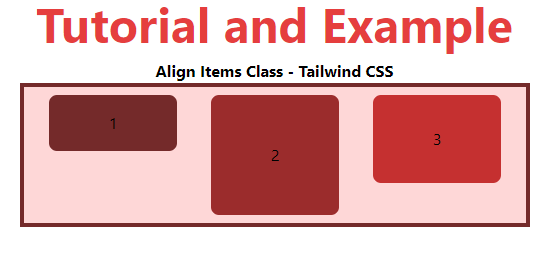
items-start
The items will be placed at the start of the container.
Syntax:
<element class="items-start">...</element>
Example:
<!DOCTYPE html>

<head>

    <link href=

"https://unpkg.com/tailwindcss@^1.0/dist/tailwind.min.css"

          rel="stylesheet">

</head>

<body class="text-center">

    <h1 class="text-red-600 text-5xl font-bold">

        Tutorial and Example

    </h1>

    <b>Align Items Class - Tailwind CSS </b>

    <div id="main" class="p-2 justify-around ml-32 h-26 w-2/3 flex

                          items-start

                          bg-red-200 border-solid border-4

                          border-red-900">

        <div class="bg-red-900 rounded-lg py-4 w-32">1</div>

        <div class="bg-red-800 rounded-lg py-12 w-32">2</div>

        <div class="bg-red-700 rounded-lg py-8 w-32">3</div>

    </div>

</body>

</html>
Output:
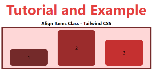
items-end
Items will be placed at the container's end.
Syntax:
<element class="items-end">...</element>
Example:
<!DOCTYPE html>

<head>

    <link href=

"https://unpkg.com/tailwindcss@^1.0/dist/tailwind.min.css"

          rel="stylesheet">

</head>

<body class="text-center">

    <h1 class="text-red-600 text-5xl font-bold">

        Tutorial and Example

    </h1>

    <b>Align Items Class - Tailwind CSS </b>

    <div id="main" class="p-2 justify-around ml-32 h-26 w-2/3 flex

                          items-end

                          bg-red-200 border-solid border-4

                          border-red-900">

        <div class="bg-red-900 rounded-lg py-4 w-32">1</div>

        <div class="bg-red-800 rounded-lg py-12 w-32">2</div>

        <div class="bg-red-700 rounded-lg py-8 w-32">3</div>

    </div>

</body>

</html>
Output:
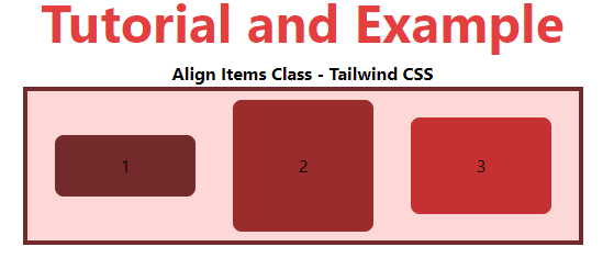
items-center
Items should be placed in the vertical center of the container.
Syntax:
<element class="items-center">...</element>
Example:
<!DOCTYPE html>

<head>

    <link href=

"https://unpkg.com/tailwindcss@^1.0/dist/tailwind.min.css"

          rel="stylesheet">

</head>

<body class="text-center">

    <h1 class="text-red-600 text-5xl font-bold">

        Tutorial and Example

    </h1>

    <b>Align Items Class - Tailwind CSS </b>

    <div id="main" class="p-2 justify-around ml-32 h-26 w-2/3 flex

                          items-center

                          bg-red-200 border-solid border-4

                          border-red-900">

        <div class="bg-red-900 rounded-lg py-4 w-32">1</div>

        <div class="bg-red-800 rounded-lg py-12 w-32">2</div>

        <div class="bg-red-700 rounded-lg py-8 w-32">3</div>

    </div>

</body>

</html>
Output:
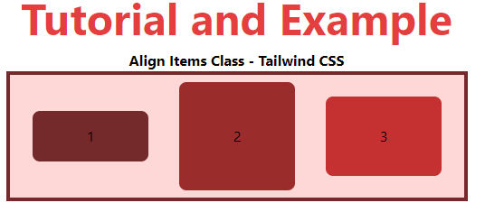
items-baseline
Items will be placed at the container's baseline.
Syntax:
<element class="items-baseline">...</element>
Example:
<!DOCTYPE html>

<head>

    <link href=

"https://unpkg.com/tailwindcss@^1.0/dist/tailwind.min.css"

          rel="stylesheet">

</head>

<body class="text-center">

    <h1 class="text-red-600 text-5xl font-bold">

        Tutorial and Example

    </h1>

    <b>Align Items Class - Tailwind CSS </b>

    <div id="main" class="p-2 justify-around ml-32 h-26 w-2/3 flex

                          items-baseline

                          bg-red-200 border-solid border-4

                          border-red-900">

        <div class="bg-red-900 rounded-lg py-4 w-32">1</div>

        <div class="bg-red-800 rounded-lg py-12 w-32">2</div>

        <div class="bg-red-700 rounded-lg py-8 w-32">3</div>

    </div>

</body>

</html>
Output:
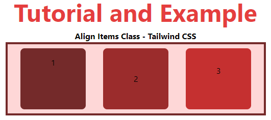
items-stretch
This is the default value, and it stretches items to fit the container.
Syntax:
<element class="items-stretch">...</element>
Example:
<!DOCTYPE html>

<head>

    <link href=

"https://unpkg.com/tailwindcss@^1.0/dist/tailwind.min.css"

          rel="stylesheet">

</head>

<body class="text-center">

    <h1 class="text-red-600 text-5xl font-bold">

        Tutorial and Example

    </h1>

    <b>Align Items Class - Tailwind CSS </b>

    <div id="main" class="p-2 justify-around ml-32 h-26 w-2/3 flex

                          items-stretch

                          bg-red-200 border-solid border-4

                          border-red-900">

        <div class="bg-red-900 rounded-lg py-4 w-32">1</div>

        <div class="bg-red-800 rounded-lg py-12 w-32">2</div>

        <div class="bg-red-700 rounded-lg py-8 w-32">3</div>

    </div>

</body>

</html>
Output: