Tailwind CSS Grid Auto Flow
In tailwind CSS, this class accepts multiple values, and all of the properties are covered in class form. It is a CSS alternative. The grid-auto-flow property is used in Tailwind CSS to indicate how auto-placed items are routed into grid elements.
Grid Auto Flow
The Grid Auto Flow classes are listed as follows:
- grid-flow-row
- grid-flow-col
- grid-flow-row-dense
- grid-flow-col-dense
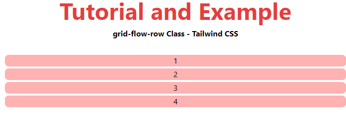
grid-flow-row
The items are placed using an auto-placement method that fills each row in turn, adding new rows as needed.
Syntax
<element class="grid-flow-row"> Contents... </element>
Example:
<!DOCTYPE html>
<html>
<head>
    <title>grid-flow-row Class of Tailwind </title>
    <link href=
"https://unpkg.com/tailwindcss@^1.0/dist/tailwind.min.css"
          rel="stylesheet">
</head>
<body class="text-center">
    <h1 class="text-red-600 text-5xl font-bold">
        Tutorial and Example
    </h1>
    <b>grid-flow-row Class - Tailwind CSS </b>
    <div class = "m-8 grid grid-flow-row gap-1">
        <div class = "bg-red-300 rounded-lg">1</div>
        <div class = "bg-red-300 rounded-lg">2</div>
        <div class = "bg-red-300 rounded-lg">3</div>
        <div class = "bg-red-300 rounded-lg">4</div>
    </div>
</body>
</html>
Output:
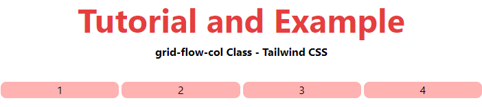
grid-flow-col
The items are placed using an auto-placement method that fills each column in turn, adding new columns as needed.
Syntax
<element class="grid-flow-col"> Contents... </element>
Example:
<!DOCTYPE html>
<html>
<head>
    <title>grid-flow-col Class of Tailwind </title>
    <link href=
"https://unpkg.com/tailwindcss@^1.0/dist/tailwind.min.css"
          rel="stylesheet">
</head>
<body class="text-center">
    <h1 class="text-red-600 text-5xl font-bold">
        Tutorial and Example
    </h1>
    <b>grid-flow-col Class - Tailwind CSS </b>
    <div class = "m-8 grid grid-flow-col gap-1">
        <div class = "bg-red-300 rounded-lg">1</div>
        <div class = "bg-red-300 rounded-lg">2</div>
        <div class = "bg-red-300 rounded-lg">3</div>
        <div class = "bg-red-300 rounded-lg">4</div>
    </div>
</body>
</html>
Output:
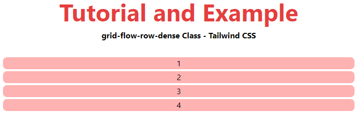
grid-flow-row-dense
It indicates that the auto-placement method for the column utilizes a "dense" packing algorithm.
Syntax
<element class="grid-flow-row-dense"> Contents... </element>
Example:
<!DOCTYPE html>
<html>
<head>
    <title>grid-flow-row-dense Class of Tailwind </title>
    <link href=
"https://unpkg.com/tailwindcss@^1.0/dist/tailwind.min.css"
          rel="stylesheet">
</head>
<body class="text-center">
    <h1 class="text-red-600 text-5xl font-bold">
        Tutorial and Example
    </h1>
    <b>grid-flow-row-dense Class - Tailwind CSS </b>
    <div class = "m-8 grid grid-flow-row-dense gap-1">
        <div class = "bg-red-300 rounded-lg">1</div>
        <div class = "bg-red-300 rounded-lg">2</div>
        <div class = "bg-red-300 rounded-lg">3</div>
        <div class = "bg-red-300 rounded-lg">4</div>
    </div>
</body>

</html>
Output:
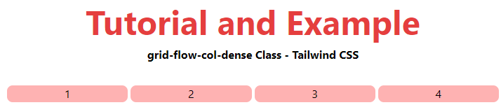
grid-flow-col-dense
It indicates that the auto-placement algorithm utilizes a "dense" packing strategy for rows in the auto-placement algorithm.
Syntax
<element class="grid-flow-col-dense">..</element>
Example:
<!DOCTYPE html>
<html>
<head>
    <title>grid-flow-col-dense Class of Tailwind </title>
    <link href=
"https://unpkg.com/tailwindcss@^1.0/dist/tailwind.min.css"
          rel="stylesheet">
</head>
<body class="text-center">
    <h1 class="text-red-600 text-5xl font-bold">
        Tutorial and Example
    </h1>
    <b>grid-flow-col-dense Class - Tailwind CSS </b>
    <div class = "m-8 grid grid-flow-col-dense gap-1">
        <div class = "bg-red-300 rounded-lg">1</div>
        <div class = "bg-red-300 rounded-lg">2</div>
        <div class = "bg-red-300 rounded-lg">3</div>
        <div class = "bg-red-300 rounded-lg">4</div>
    </div>
</body>
</html>
Output: