
Bootstrap Searchable Dropdown Menu
Searchable Dropdown Menu
When we click on the dropdown button/arrow in this dropdown menu, an input field will pop up with all the dropdown items listing inside. If we type in any character, the corresponding items are searched out at once, and then we can click the needed option from the list.
How to make a searchable dropdown menu using Bootstrap?
Any button (class = “btn”) can be turned into a dropdown toggle with some markup changes. We have to add an input field of text type with the button to make it searchable. Some JavaScript functionalities are also added, as shown below in the examples:
Example:
<!DOCTYPE html>
<html>
<head>
    <link rel="stylesheet" href="https://cdn.jsdelivr.net/npm/bootstrap@5.1.1/dist/css/bootstrap.min.css" integrity="sha384-F3w7mX95PdgyTmZZMECAngseQB83DfGTowi0iMjiWaeVhAn4FJkqJByhZMI3AhiU" crossorigin="anonymous">

<style>
body{
    background-color: #dfe4ea;
}
.btn {

  color: white;


  font-size: 16px;
  border: none;
  cursor: arrow;
}


.dropbtn:hover, .dropbtn:focus {
  background-color: rgb(78, 6, 18);
}


#myInput {
  box-sizing: border-box;
  background-image: url('searchicon.png');
  background-position: 14px 12px;
  background-repeat: no-repeat;
  font-size: 16px;
  padding: 14px 20px 12px 45px;
  border: none;
  border-bottom: 1px solid #ddd;
}


#myInput:focus {outline: 3px solid #ddd;}


.dropdown {
  position: relative;
  display: inline-block;
}


.dropdown-content {
  display: none;
  position: absolute;
  background-color: #f6f6f6;
  min-width: 230px;
  overflow: auto;
  border: 1px solid #ddd;
  z-index: 1;
}


.dropdown-content a {
  color: black;
  padding: 12px 16px;
  text-decoration: none;
  display: block;
}


.dropdown a:hover {background-color: #ddd;}


.show {display: block;}
</style>
<title>Bootstrap Searchable Dropdown</title>
</head>
<body>
<div class="container">
<div class="row">
<h2>This is an example to demonstrate a Searchable Dropdown Menu</h2>
<p>Click on the button below to see the dropdown menu. Type any character in the input field to search for a specific country.</p>
<div class="dropdown">
  <button onclick="myFunction()"  class="btn btn-danger dropdown-toggle" data-bs-toggle="dropdown" aria-expanded="false">Default Dropdown Button</button>
  <div id="myDropdownmenu" class="dropdown-content">
    <input type="text" placeholder="Search.." id="myInput" onkeyup="filterFunction()">
        <a class="dropdown-item" href="#">Argentina</a>
        <a class="dropdown-item" href="#">Afganistan</a>
        <a class="dropdown-item" href="#">Brazil</a>
        <a class="dropdown-item" href="#">Sri Lanka</a>
        <a class="dropdown-item" href="#">Nepal</a>
        <a class="dropdown-item" href="#">India</a>
        <a class="dropdown-item" href="#">Japan</a>
        <a class="dropdown-item" href="#">Germany</a>
        <a class="dropdown-item" href="#">Switzerland</a>
        <a class="dropdown-item" href="#">Greece</a>
        <a class="dropdown-item" href="#">South Africa</a>
        <a class="dropdown-item" href="#">France</a>
        <a class="dropdown-item" href="#">Russia</a>
        <hr class="dropdown-divider">
        <a class="dropdown-item" href="#">Others</a>
  </div>
</div>
</div>
<script>
function myFunction() {
  document.getElementById("myDropdownmenu").classList.toggle("show");
}
function filterFunction() {
  var input, filter, ul, li, a, i;
  input = document.getElementById("myInput");
  filter = input.value.toUpperCase();
  div = document.getElementById("myDropdownmenu");
  a = div.getElementsByTagName("a");
  for (i = 0; i < a.length; i++) {
    txtValue = a[i].textContent || a[i].innerText;
    if (txtValue.toUpperCase().indexOf(filter) > -1) {
      a[i].style.display = "";
    } else {
      a[i].style.display = "none";
    }
  }
}
</script>
</body>
</html>
Output:
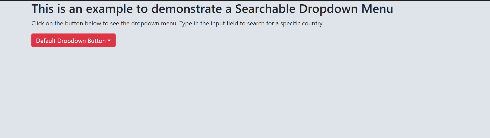
On selecting the dropdown menu, it appears like the following:

How to make a split searchable dropdown menu?
Consider the following code.
Example:
<!DOCTYPE html>
<html>
<head>
    <link rel="stylesheet" href="https://cdn.jsdelivr.net/npm/bootstrap@5.1.1/dist/css/bootstrap.min.css" integrity="sha384-F3w7mX95PdgyTmZZMECAngseQB83DfGTowi0iMjiWaeVhAn4FJkqJByhZMI3AhiU" crossorigin="anonymous">

<style>
body{
    background-color: #f1efe3;
}
.btn {

  color: black;

  font-size: 16px;
  border: none;
  cursor: arrow;
}


.dropbtn:hover, .dropbtn:focus {
  background-color: rgb(226, 183, 89);
}


#myInput {
  box-sizing: border-box;
  background-image: url('searchicon.png');
  background-position: 14px 12px;
  background-repeat: no-repeat;
  font-size: 16px;
  padding: 14px 20px 12px 45px;
  border: none;
  border-bottom: 1px solid #ddd;
}


#myInput:focus {outline: 3px solid #ddd;}


.dropdown {
  position: relative;
  display: inline-block;
}


.dropdown-content {
  display: none;
  position: absolute;
  background-color: #f6f6f6;
  min-width: 230px;
  overflow: auto;
  border: 1px solid #ddd;
  z-index: 1;
}


.dropdown-content a {
  color: black;
  padding: 12px 16px;
  text-decoration: none;
  display: block;
}


.dropdown a:hover {background-color: #ddd;}


.show {display: block;}
</style>
<title>Bootstrap Searchable Dropdown</title>
</head>
<body>
<div class="container">
<div class="row">

<h2>This is an example to demonstrate a Split Searchable Dropdown Menu:</h2>
<p>Click on the toggle button below to see the dropdown menu. Type any character in the input field to search for a specific country.</p>


<div class="dropdown">
    <div class="btn-group"></div>
    <button type="button" class="btn btn-warning">Split Dropdown Button</button>
    <button type="button" onclick="myFunction()" class="btn btn-warning dropdown-toggle dropdown-toggle-split" data-bs-toggle="dropdown" aria-expanded="false">
      <span class="visually-hidden">Toggle Dropdown</span>
    </button>
    <div id="myDropdownmenu" class="dropdown-content">
    <input type="text" placeholder="Search.." id="myInput" onkeyup="filterFunction()">

        <a class="dropdown-item" href="#">Argentina</a>
        <a class="dropdown-item" href="#">Afganistan</a>
        <a class="dropdown-item" href="#">Brazil</a>
        <a class="dropdown-item" href="#">Sri Lanka</a>
        <a class="dropdown-item" href="#">Nepal</a>
        <a class="dropdown-item" href="#">India</a>
        <a class="dropdown-item" href="#">Japan</a>
        <a class="dropdown-item" href="#">Germany</a>
        <a class="dropdown-item" href="#">Switzerland</a>
        <a class="dropdown-item" href="#">Greece</a>
        <a class="dropdown-item" href="#">South Africa</a>
        <a class="dropdown-item" href="#">France</a>
        <a class="dropdown-item" href="#">Russia</a>
        <hr class="dropdown-divider">
        <a class="dropdown-item" href="#">Others</a>

  </div>
</div>


</div>
</div>
<script>


function myFunction() {
  document.getElementById("myDropdownmenu").classList.toggle("show");
}


function filterFunction() {
  var input, filter, ul, li, a, i;
  input = document.getElementById("myInput");
  filter = input.value.toUpperCase();
  div = document.getElementById("myDropdownmenu");
  a = div.getElementsByTagName("a");
  for (i = 0; i < a.length; i++) {
    txtValue = a[i].textContent || a[i].innerText;
    if (txtValue.toUpperCase().indexOf(filter) > -1) {
      a[i].style.display = "";
    } else {
      a[i].style.display = "none";
    }
  }
}
</script>


</body>
</html>
Output:

After selecting the toggle button, the menu looks like this,
