Bootstrap Grid System Example
Bootstrap Grid System Example
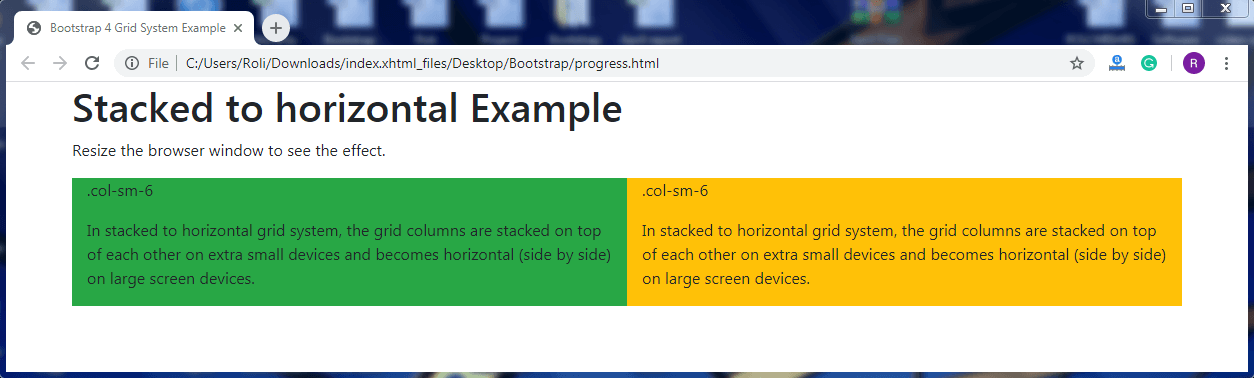
Stacked to horizontal – In stacked to the horizontal grid system, the grid columns are stacked on top of each other on extra small devices and becomes horizontal (side by side) on large screen devices.
Note: The sum of the number of columns you span should not exceed more than 12.
Example
In this example, the Bootstrap grid layout is divided into two columns, which means each column obtains 50% of the screen's width. But in extra small devices, the columns are stacked on top of each other and obtain full width of the screen.
Example:
<!DOCTYPE html>
<html lang="en">
<head>
  <title>Bootstrap 4 Grid System Example</title>
  <meta charset="utf-8">
  <meta name="viewport" content="width=device-width, initial-scale=1">
  <link rel="stylesheet" href="https://maxcdn.bootstrapcdn.com/bootstrap/4.4.1/css/bootstrap.min.css">
  <link rel="stylesheet" href="https://use.fontawesome.com/releases/v5.6.3/css/all.css" integrity="sha384-UHRtZLI+pbxtHCWp1t77Bi1L4ZtiqrqD80Kn4Z8NTSRyMA2Fd33n5dQ8lWUE00s/" crossorigin="anonymous">
  <script src="https://ajax.googleapis.com/ajax/libs/jquery/3.5.1/jquery.min.js"></script>
  <script src="https://cdnjs.cloudflare.com/ajax/libs/popper.js/1.16.0/umd/popper.min.js"></script>
  <script src="https://maxcdn.bootstrapcdn.com/bootstrap/4.4.1/js/bootstrap.min.js"></script>
  </head>
<body>
  <div class="container">
  <h1>Stacked to horizontal Example</h1>
  <p>Resize the browser window to see the effect.</p>
  <div class="container">
    <div class="row">
      <div class="col-sm-6 bg-success">
        <p>.col-sm-6</p>
        <p>In stacked to horizontal grid system, the grid columns are stacked on top of each other on extra small devices and becomes horizontal (side by side) on large screen devices.</p>
      </div>
      <div class="col-sm-6 bg-warning">
        <p>.col-sm-6</p>
        <p>In stacked to horizontal grid system, the grid columns are stacked on top of each other on extra small devices and becomes horizontal (side by side) on large screen devices.</p>
      </div>
    </div>
  </div>
</div>
</body>
</html>
Output
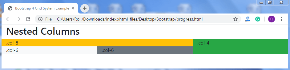
Nested Columns –You can also create the nested columns, which means column inside the column.
Example
<!DOCTYPE html>
<html lang="en">
<head>
  <title>Bootstrap 4 Grid System Example</title>
  <meta charset="utf-8">
  <meta name="viewport" content="width=device-width, initial-scale=1">
  <link rel="stylesheet" href="https://maxcdn.bootstrapcdn.com/bootstrap/4.4.1/css/bootstrap.min.css">
  <script src="https://ajax.googleapis.com/ajax/libs/jquery/3.5.1/jquery.min.js"></script>
  <script src="https://cdnjs.cloudflare.com/ajax/libs/popper.js/1.16.0/umd/popper.min.js"></script>
  <script src="https://maxcdn.bootstrapcdn.com/bootstrap/4.4.1/js/bootstrap.min.js"></script>
  </head>
<body>
<div class="container-fluid">
  <h2>Nested Columns</h2>
</div>
<div class="container-fluid">
  <div class="row">
    <div class="col-8 bg-warning">
      .col-8
      <div class="row">
        <div class="col-6 bg-light">.col-6</div>
        <div class="col-6 bg-secondary">.col-6</div>
      </div>
    </div>
    <div class="col-4 bg-success">.col-4</div>
  </div>
</div>
</body>
</html>
Output
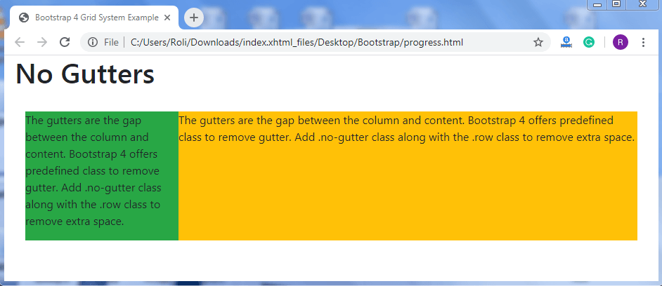
No Gutter – The gutters are the gap between the column and content. Bootstrap 4 offers a predefined class to remove gutter. Add .no-gutter class along with the .row class to remove extra space.
Example
<!DOCTYPE html>
<html lang="en">
<head>
  <title>Bootstrap 4 Grid System Example</title>
  <meta charset="utf-8">
  <meta name="viewport" content="width=device-width, initial-scale=1">
  <link rel="stylesheet" href="https://maxcdn.bootstrapcdn.com/bootstrap/4.4.1/css/bootstrap.min.css">
  <script src="https://ajax.googleapis.com/ajax/libs/jquery/3.5.1/jquery.min.js"></script>
  <script src="https://cdnjs.cloudflare.com/ajax/libs/popper.js/1.16.0/umd/popper.min.js"></script>
  <script src="https://maxcdn.bootstrapcdn.com/bootstrap/4.4.1/js/bootstrap.min.js"></script>
  </head>
<body>
<div class="container-fluid">
  <h1>No Gutters</h1><br>
  <div class="container-fluid">
    <div class="row no-gutters">
      <div class="col-3 bg-success">
        <p>The gutters are the gap between the column and content. Bootstrap 4 offers predefined class to remove gutter. Add .no-gutter class along with the .row class to remove extra space.</p>
      </div>
      <div class="col-9 bg-warning">
        <p>The gutters are the gap between the column and content. Bootstrap 4 offers predefined class to remove gutter. Add .no-gutter class along with the .row class to remove extra space.</p>
      </div>
    </div>
  </div>
</div>
</body>
</html>
Output
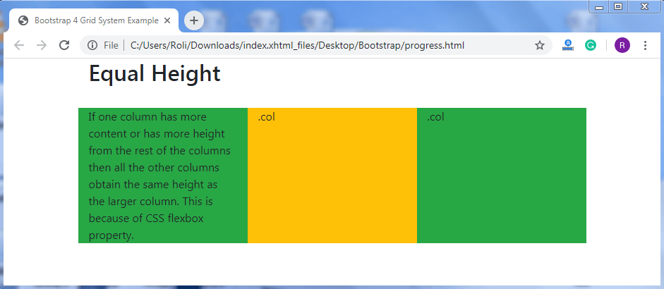
Equal Height – If one column has more content or has more height from the rest of the columns, then all other columns obtain the same height as the larger column. This is because of CSS flexbox property.
Example
<!DOCTYPE html>
<html lang="en">
<head>
  <title>Bootstrap 4 Grid System Example</title>
  <meta charset="utf-8">
  <meta name="viewport" content="width=device-width, initial-scale=1">
  <link rel="stylesheet" href="https://maxcdn.bootstrapcdn.com/bootstrap/4.4.1/css/bootstrap.min.css">
  <script src="https://ajax.googleapis.com/ajax/libs/jquery/3.5.1/jquery.min.js"></script>
  <script src="https://cdnjs.cloudflare.com/ajax/libs/popper.js/1.16.0/umd/popper.min.js"></script>
  <script src="https://maxcdn.bootstrapcdn.com/bootstrap/4.4.1/js/bootstrap.min.js"></script>
  </head>
<body>
<div class="container">
  <h2>Equal Height</h2>
</div>
<br>
<div class="container">
  <div class="row">
    <div class="col bg-success">If one column has more content or has more height from the rest of the columns then all the other columns obtain the same height as the larger column. This is because of CSS flexbox property.</div>
    <div class="col bg-warning">.col</div>
    <div class="col bg-success">.col</div>
  </div>
</div>
</body>
</html>
Output
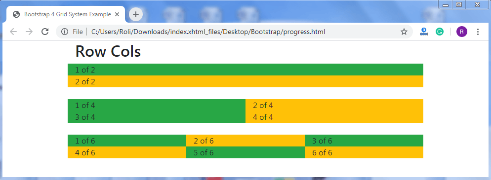
Row Cols – Bootstrap 4 allows you to decide how many columns will appear in a row irrespective of the number of columns present in a row. For this, add .row-cols-* class along with the .row class to the <div> element.
Example
<!DOCTYPE html>
<html lang="en">
<head>
  <title>Bootstrap 4 Grid System Example</title>
  <meta charset="utf-8">
  <meta name="viewport" content="width=device-width, initial-scale=1">
  <link rel="stylesheet" href="https://maxcdn.bootstrapcdn.com/bootstrap/4.4.1/css/bootstrap.min.css">
  <script src="https://ajax.googleapis.com/ajax/libs/jquery/3.5.1/jquery.min.js"></script>
  <script src="https://cdnjs.cloudflare.com/ajax/libs/popper.js/1.16.0/umd/popper.min.js"></script>
  <script src="https://maxcdn.bootstrapcdn.com/bootstrap/4.4.1/js/bootstrap.min.js"></script>
  </head>
<body>
  <div class="container">
  <h2>Row Cols</h2>
  <div class="row row-cols-1">
    <div class="col bg-success">1 of 2</div>
    <div class="col bg-warning">2 of 2</div>
  </div>
  <br>
  <div class="row row-cols-2">
    <div class="col bg-success">1 of 4</div>
    <div class="col bg-warning">2 of 4</div>
    <div class="col bg-success">3 of 4</div>
    <div class="col bg-warning">4 of 4</div>
  </div>
  <br>
  <div class="row row-cols-3">
    <div class="col bg-success">1 of 6</div>
    <div class="col bg-warning">2 of 6</div>
    <div class="col bg-success">3 of 6</div>
    <div class="col bg-warning">4 of 6</div>
    <div class="col bg-success">5 of 6</div>
    <div class="col bg-warning">6 of 6</div>
  </div>
</div>
</body>
</html>
Output