
Bootstrap 4 Flex
Bootstrap 4 Flex
Flex is a Bootstrap 4 component used to manage the layout, navigation bar, grid columns, sizing, alignment, and other components. The flexbox or flex utility is the replacement of float and positions, which is commonly used in Bootstrap 3. The flex utilities allow you to align and adjust the size of the element horizontally or vertically.
Flexbox – The flexbox is used to create a responsive layout easily without using the float or positioning. To create a flexbox, add class .d-flex to the parent element. This class converts the immediate child into the flex item.
Example
<!DOCTYPE html>
<html lang="en">
<head>
  <title>Bootstrap 4 Flex Example</title>
  <meta charset="utf-8">
  <meta name="viewport" content="width=device-width, initial-scale=1">
  <link rel="stylesheet" href="https://maxcdn.bootstrapcdn.com/bootstrap/4.4.1/css/bootstrap.min.css">
  <script src="https://ajax.googleapis.com/ajax/libs/jquery/3.5.1/jquery.min.js"></script>
  <script src="https://cdnjs.cloudflare.com/ajax/libs/popper.js/1.16.0/umd/popper.min.js"></script>
  <script src="https://maxcdn.bootstrapcdn.com/bootstrap/4.4.1/js/bootstrap.min.js"></script>
</head>
<body>
<div class="container mt-3">
  <h2>Flex</h2>
  <div class="d-flex p-3 bg-secondary text-white">
    <div class="p-2 bg-info">Flex item 1</div>
    <div class="p-2 bg-warning">Flex item 2</div>
    <div class="p-2 bg-primary">Flex item 3</div>
  </div>
</div>
</body>
</html>
Output

You can also convert the inline elements into the flex container with the help of flex utility. To create the inline element into a flex container, add .d-inline-flex class to the parent element.
Example
<!DOCTYPE html>
<html lang="en">
<head>
  <title>Bootstrap 4 Flex Example</title>
  <meta charset="utf-8">
  <meta name="viewport" content="width=device-width, initial-scale=1">
  <link rel="stylesheet" href="https://maxcdn.bootstrapcdn.com/bootstrap/4.4.1/css/bootstrap.min.css">
  <script src="https://ajax.googleapis.com/ajax/libs/jquery/3.5.1/jquery.min.js"></script>
  <script src="https://cdnjs.cloudflare.com/ajax/libs/popper.js/1.16.0/umd/popper.min.js"></script>
  <script src="https://maxcdn.bootstrapcdn.com/bootstrap/4.4.1/js/bootstrap.min.js"></script>
</head>
<body>
<div class="container mt-3">
  <h2>Inline Flex</h2>
  <div class="d-inline-flex p-3 bg-secondary text-white">
    <div class="p-2 bg-info">Flex item 1</div>
    <div class="p-2 bg-warning">Flex item 2</div>
    <div class="p-2 bg-primary">Flex item 3</div>
  </div>
</div>
</body>
</html>
Output

Horizontal Direction – Bootstrap 4 allows you to set the direction of the flex item into the flex container by using direction utilities. The horizontal direction is the default direction. To display flex item horizontally or side by side, add .flex-row class along with the .d-flex class to the wrapper element.
Example
<!DOCTYPE html>
<html lang="en">
<head>
  <title>Bootstrap 4 Flex Example</title>
  <meta charset="utf-8">
  <meta name="viewport" content="width=device-width, initial-scale=1">
  <link rel="stylesheet" href="https://maxcdn.bootstrapcdn.com/bootstrap/4.4.1/css/bootstrap.min.css">
  <script src="https://ajax.googleapis.com/ajax/libs/jquery/3.5.1/jquery.min.js"></script>
  <script src="https://cdnjs.cloudflare.com/ajax/libs/popper.js/1.16.0/umd/popper.min.js"></script>
  <script src="https://maxcdn.bootstrapcdn.com/bootstrap/4.4.1/js/bootstrap.min.js"></script>
</head>
<body>
<div class="container mt-3">
  <h2>Horizontal Direction</h2>
  <div class="d-flex flex-row bg-secondary mb-3">
    <div class="p-2 bg-info">Flex item 1</div>
    <div class="p-2 bg-warning">Flex item 2</div>
    <div class="p-2 bg-primary">Flex item 3</div>
  </div><br>
  <h2>Horizontal Reverse Direction</h2>
  <div class="d-flex flex-row-reverse bg-secondary">
    <div class="p-2 bg-info">Flex item 1</div>
    <div class="p-2 bg-warning">Flex item 2</div>
    <div class="p-2 bg-primary">Flex item 3</div>
  </div>
</div>
</body>
</html>
Output

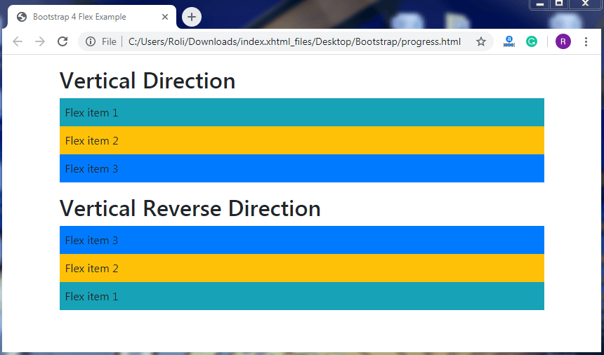
Vertical Direction – You can also display your content vertically. To display the content vertically add .flex-column class to the <div> element. Flex utilities also allow you to reverse the order of the vertically align content with the help of .flex-column-reverse class to the <div> element.
Example
<!DOCTYPE html>
<html lang="en">
<head>
  <title>Bootstrap 4 Flex Example</title>
  <meta charset="utf-8">
  <meta name="viewport" content="width=device-width, initial-scale=1">
  <link rel="stylesheet" href="https://maxcdn.bootstrapcdn.com/bootstrap/4.4.1/css/bootstrap.min.css">
  <script src="https://ajax.googleapis.com/ajax/libs/jquery/3.5.1/jquery.min.js"></script>
  <script src="https://cdnjs.cloudflare.com/ajax/libs/popper.js/1.16.0/umd/popper.min.js"></script>
  <script src="https://maxcdn.bootstrapcdn.com/bootstrap/4.4.1/js/bootstrap.min.js"></script>
</head>
<body>
<div class="container mt-3">
  <h2>Vertical Direction</h2>
  <div class="d-flex flex-column mb-3">
    <div class="p-2 bg-info">Flex item 1</div>
    <div class="p-2 bg-warning">Flex item 2</div>
    <div class="p-2 bg-primary">Flex item 3</div>
  </div>
  <h2>Vertical Reverse Direction</h2>
  <div class="d-flex flex-column-reverse">
    <div class="p-2 bg-info">Flex item 1</div>
    <div class="p-2 bg-warning">Flex item 2</div>
    <div class="p-2 bg-primary">Flex item 3</div>
  </div>
</div>
</body>
</html>
Output
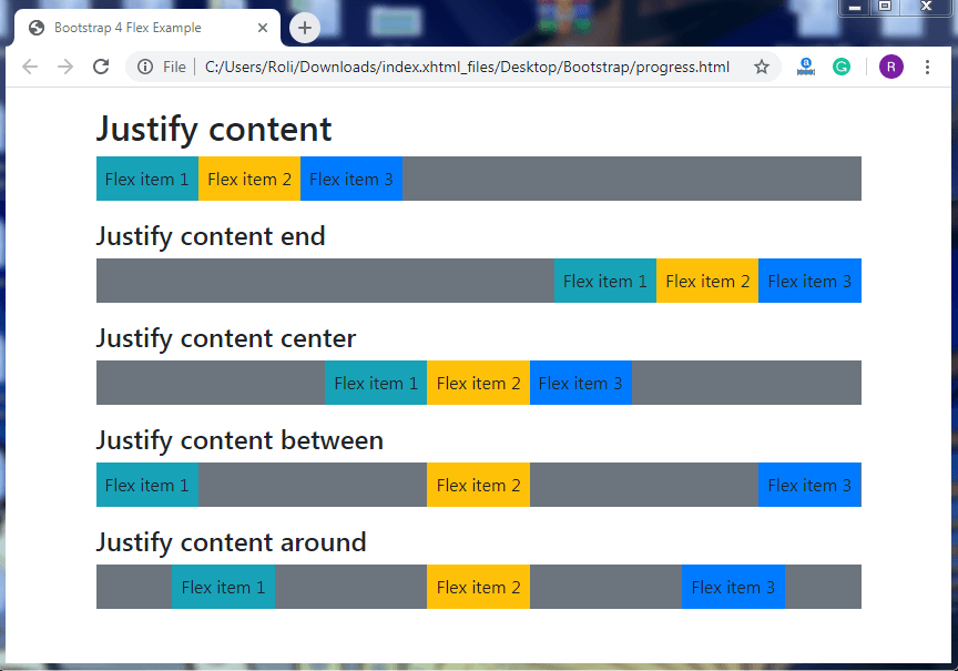
Justify Content – The justify content is used to set the alignment of the flex item in the flex container. To change the alignment, add the .justify-content-* class to the <div> element.
Where, * = start, end, center, between, and around.
Example
<!DOCTYPE html>
<html lang="en">
<head>
  <title>Bootstrap 4 Flex Example</title>
  <meta charset="utf-8">
  <meta name="viewport" content="width=device-width, initial-scale=1">
  <link rel="stylesheet" href="https://maxcdn.bootstrapcdn.com/bootstrap/4.4.1/css/bootstrap.min.css">
  <script src="https://ajax.googleapis.com/ajax/libs/jquery/3.5.1/jquery.min.js"></script>
  <script src="https://cdnjs.cloudflare.com/ajax/libs/popper.js/1.16.0/umd/popper.min.js"></script>
  <script src="https://maxcdn.bootstrapcdn.com/bootstrap/4.4.1/js/bootstrap.min.js"></script>
</head>
<body>
<div class="container mt-3">
  <h2>Justify content</h2>
  <div class="d-flex justify-content-start bg-secondary mb-3">
    <div class="p-2 bg-info">Flex item 1</div>
    <div class="p-2 bg-warning">Flex item 2</div>
    <div class="p-2 bg-primary">Flex item 3</div>
  </div>
  <h4>Justify content end</h4>
  <div class="d-flex justify-content-end bg-secondary mb-3">
    <div class="p-2 bg-info">Flex item 1</div>
    <div class="p-2 bg-warning">Flex item 2</div>
    <div class="p-2 bg-primary">Flex item 3</div>
  </div>
  <h4>Justify content center</h4>
  <div class="d-flex justify-content-center bg-secondary mb-3">
    <div class="p-2 bg-info">Flex item 1</div>
    <div class="p-2 bg-warning">Flex item 2</div>
    <div class="p-2 bg-primary">Flex item 3</div>
  </div>
  <h4>Justify content between</h4>
  <div class="d-flex justify-content-between bg-secondary mb-3">
    <div class="p-2 bg-info">Flex item 1</div>
    <div class="p-2 bg-warning">Flex item 2</div>
    <div class="p-2 bg-primary">Flex item 3</div>
  </div>
  <h4>Justify content around</h4>
  <div class="d-flex justify-content-around bg-secondary mb-3">
    <div class="p-2 bg-info">Flex item 1</div>
    <div class="p-2 bg-warning">Flex item 2</div>
    <div class="p-2 bg-primary">Flex item 3</div>
  </div>
</div>
</body>
</html>
Output
Fill / Equal Widths – The fill or equal widths allows the flex items to acquire equal widths. Add the .flex-fill class to the child element to create the flex items of equal width.
Example
<!DOCTYPE html>
<html lang="en">
<head>
  <title>Bootstrap 4 Flex Example</title>
  <meta charset="utf-8">
  <meta name="viewport" content="width=device-width, initial-scale=1">
  <link rel="stylesheet" href="https://maxcdn.bootstrapcdn.com/bootstrap/4.4.1/css/bootstrap.min.css">
  <script src="https://ajax.googleapis.com/ajax/libs/jquery/3.5.1/jquery.min.js"></script>
  <script src="https://cdnjs.cloudflare.com/ajax/libs/popper.js/1.16.0/umd/popper.min.js"></script>
  <script src="https://maxcdn.bootstrapcdn.com/bootstrap/4.4.1/js/bootstrap.min.js"></script>
</head>
<body>
<div class="container mt-3">
  <h2>Fill / Equal Widths</h2>
  <div class="d-flex mb-3">
    <div class="p-2 flex-fill bg-info">Flex item 1</div>
    <div class="p-2 flex-fill bg-warning">Flex item 2</div>
    <div class="p-2 flex-fill bg-primary">Flex item 3</div>
  </div>
  <p>Without .flex-fill</p>
  <div class="d-flex mb-3 bg-secondary">
    <div class="p-2 bg-info">Flex item 1</div>
    <div class="p-2 bg-warning">Flex item 2</div>
    <div class="p-2 bg-primary">Flex item 3</div>
  </div>
</div>
</body>
</html>
Output

Grow and Shrink – The grow utility allows the flex item to acquire all the available space. To make this kind of flex item, add .flex-grow-* class to the element which you want to grow.
Add the .flex-shrink-* class to shrink the flex item.
Example
<!DOCTYPE html>
<html lang="en">
<head>
  <title>Bootstrap 4 Flex Example</title>
  <meta charset="utf-8">
  <meta name="viewport" content="width=device-width, initial-scale=1">
  <link rel="stylesheet" href="https://maxcdn.bootstrapcdn.com/bootstrap/4.4.1/css/bootstrap.min.css">
  <script src="https://ajax.googleapis.com/ajax/libs/jquery/3.5.1/jquery.min.js"></script>
  <script src="https://cdnjs.cloudflare.com/ajax/libs/popper.js/1.16.0/umd/popper.min.js"></script>
  <script src="https://maxcdn.bootstrapcdn.com/bootstrap/4.4.1/js/bootstrap.min.js"></script>
</head>
<body>
<div class="container mt-3">
  <h2>Grow</h2>
  <div class="d-flex mb-3">
    <div class="p-2 bg-info">Flex item 1</div>
    <div class="p-2 bg-warning">Flex item 2</div>
    <div class="p-2 flex-grow-1 bg-primary">Flex item 3</div>
  </div>
  <h2>Shrink</h2>
    <div class = "d-flex bg-info">
        <div class = "p-2 w-100 bg-info">Item 1</div>
        <div class = "p-2 flex-shrink-1 bg-warning">Item 2</div>
    </div>
</div>
</body>
</html>
Output

Order – Bootstrap 4 allows you to change or set the order of the flex items with the help of order utilities. The order class applies for a maximum of 12 items, which means that you can set the order of 12 items at a time as per the choice. In order utility, the lowest number has the highest priority. To change the visual order of the flex items, add .order-* (* = 1 to 12) class to the flex item element.
Example
<!DOCTYPE html>
<html lang="en">
<head>
  <title>Bootstrap 4 Flex Example</title>
  <meta charset="utf-8">
  <meta name="viewport" content="width=device-width, initial-scale=1">
  <link rel="stylesheet" href="https://maxcdn.bootstrapcdn.com/bootstrap/4.4.1/css/bootstrap.min.css">
  <script src="https://ajax.googleapis.com/ajax/libs/jquery/3.5.1/jquery.min.js"></script>
  <script src="https://cdnjs.cloudflare.com/ajax/libs/popper.js/1.16.0/umd/popper.min.js"></script>
  <script src="https://maxcdn.bootstrapcdn.com/bootstrap/4.4.1/js/bootstrap.min.js"></script>
</head>
<body>
<div class="container mt-3">
  <h2>Order</h2>
  <div class="d-flex mb-3">
    <div class="p-2 order-3 bg-info">Flex item 1</div>
    <div class="p-2 order-2 bg-warning">Flex item 2</div>
    <div class="p-2 order-1 bg-primary">Flex item 3</div>
  </div>
</div>
</body>
</html>
Output

Auto Margins – There are some classes of Bootstrap 4 that provides us some amazing feature and auto margins is one of them. It has classes that automatically provide the margin to the flex items. To provide the left margin to the flex items, add .ml-auto class to the flex item element. To provide the right margin to the flex item, add .mr-auto class to the flex item element.
Example
<!DOCTYPE html>
<html lang="en">
<head>
  <title>Bootstrap 4 Flex Example</title>
  <meta charset="utf-8">
  <meta name="viewport" content="width=device-width, initial-scale=1">
  <link rel="stylesheet" href="https://maxcdn.bootstrapcdn.com/bootstrap/4.4.1/css/bootstrap.min.css">
  <script src="https://ajax.googleapis.com/ajax/libs/jquery/3.5.1/jquery.min.js"></script>
  <script src="https://cdnjs.cloudflare.com/ajax/libs/popper.js/1.16.0/umd/popper.min.js"></script>
  <script src="https://maxcdn.bootstrapcdn.com/bootstrap/4.4.1/js/bootstrap.min.js"></script>
</head>
<body>
<div class="container mt-3">
  <h2>Auto Margins</h2>
  <h4>.mr-auto</h4>
  <div class="d-flex mb-3 bg-secondary">
    <div class="p-2 mr-auto bg-info">Flex item 1</div>
    <div class="p-2 bg-warning">Flex item 2</div>
    <div class="p-2 bg-primary">Flex item 3</div>
  </div>
  <h4>.ml-auto</h4>
  <div class="d-flex mb-3 bg-secondary">
    <div class="p-2  bg-info">Flex item 1</div>
    <div class="p-2 bg-warning">Flex item 2</div>
    <div class="p-2 ml-auto bg-primary">Flex item 3</div>
  </div>
</div>
</body>
</html>
Output

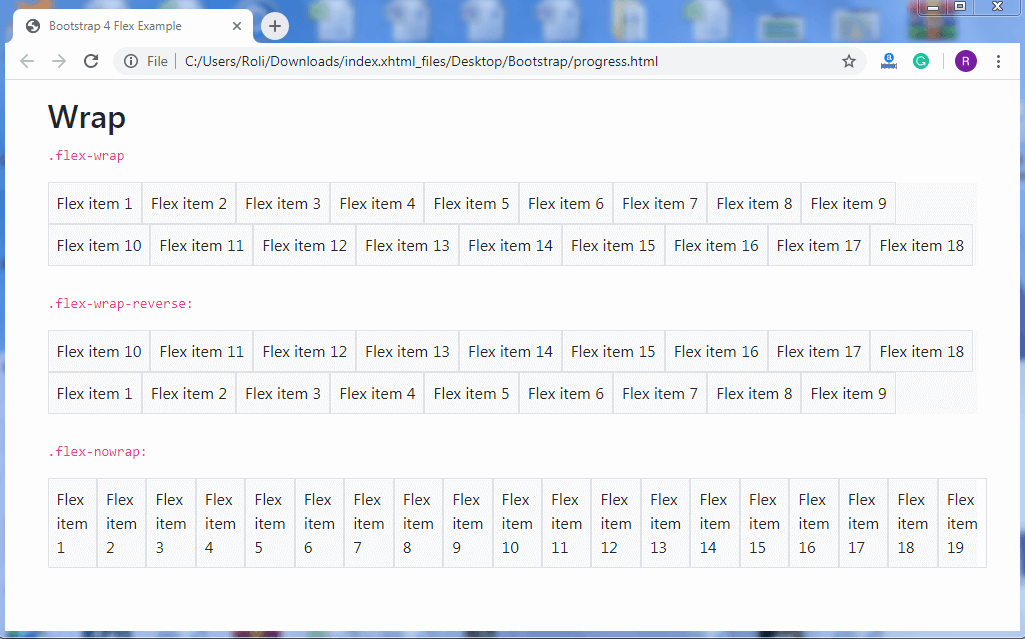
Wrap – You can also control the wrapping of flex items in a flex container. There is three wrapping class which is offered by bootstrap, these are:
- .flex-nowrap – This is a browser’s default class.
- .flex-wrap – This class is used to wrap flex items in a flex container.
- .flex-wrap-reverse – This class is also used to wrap flex items in a flex container but in reverse order.
Example
<!DOCTYPE html>
<html lang="en">
<head>
  <title>Bootstrap 4 Flex Example</title>
  <meta charset="utf-8">
  <meta name="viewport" content="width=device-width, initial-scale=1">
  <link rel="stylesheet" href="https://maxcdn.bootstrapcdn.com/bootstrap/4.4.1/css/bootstrap.min.css">
  <script src="https://ajax.googleapis.com/ajax/libs/jquery/3.5.1/jquery.min.js"></script>
  <script src="https://cdnjs.cloudflare.com/ajax/libs/popper.js/1.16.0/umd/popper.min.js"></script>
  <script src="https://maxcdn.bootstrapcdn.com/bootstrap/4.4.1/js/bootstrap.min.js"></script>
</head>
<body>
<div class="container mt-3">
  <h2>Wrap</h2>
  <p><code>.flex-wrap</code></p>
  <div class="d-flex flex-wrap bg-light">
    <div class="p-2 border">Flex item 1</div>
    <div class="p-2 border">Flex item 2</div>
    <div class="p-2 border">Flex item 3</div>
    <div class="p-2 border">Flex item 4</div>
    <div class="p-2 border">Flex item 5</div>
    <div class="p-2 border">Flex item 6</div>
    <div class="p-2 border">Flex item 7</div>
    <div class="p-2 border">Flex item 8</div>
    <div class="p-2 border">Flex item 9</div>
    <div class="p-2 border">Flex item 10</div>
    <div class="p-2 border">Flex item 11</div>
    <div class="p-2 border">Flex item 12</div>
    <div class="p-2 border">Flex item 13 </div>
    <div class="p-2 border">Flex item 14</div>
    <div class="p-2 border">Flex item 15</div>
    <div class="p-2 border">Flex item 16</div>
    <div class="p-2 border">Flex item 17</div>
    <div class="p-2 border">Flex item 18</div>
  </div>
  <br>
  <p><code>.flex-wrap-reverse:</code></p>
  <div class="d-flex flex-wrap-reverse bg-light">
    <div class="p-2 border">Flex item 1</div>
    <div class="p-2 border">Flex item 2</div>
    <div class="p-2 border">Flex item 3</div>
    <div class="p-2 border">Flex item 4</div>
    <div class="p-2 border">Flex item 5</div>
    <div class="p-2 border">Flex item 6</div>
    <div class="p-2 border">Flex item 7</div>
    <div class="p-2 border">Flex item 8</div>
    <div class="p-2 border">Flex item 9</div>
    <div class="p-2 border">Flex item 10</div>
    <div class="p-2 border">Flex item 11</div>
    <div class="p-2 border">Flex item 12</div>
    <div class="p-2 border">Flex item 13 </div>
    <div class="p-2 border">Flex item 14</div>
    <div class="p-2 border">Flex item 15</div>
    <div class="p-2 border">Flex item 16</div>
    <div class="p-2 border">Flex item 17</div>
    <div class="p-2 border">Flex item 18</div>
   </div>
  <br>
  <p><code>.flex-nowrap:</code></p>
  <div class="d-flex flex-nowrap bg-light">
    <div class="p-2 border">Flex item 1</div>
    <div class="p-2 border">Flex item 2</div>
    <div class="p-2 border">Flex item 3</div>
    <div class="p-2 border">Flex item 4</div>
    <div class="p-2 border">Flex item 5</div>
    <div class="p-2 border">Flex item 6</div>
    <div class="p-2 border">Flex item 7</div>
    <div class="p-2 border">Flex item 8</div>
    <div class="p-2 border">Flex item 9</div>
    <div class="p-2 border">Flex item 10</div>
    <div class="p-2 border">Flex item 11</div>
    <div class="p-2 border">Flex item 12</div>
    <div class="p-2 border">Flex item 13 </div>
    <div class="p-2 border">Flex item 14</div>
    <div class="p-2 border">Flex item 15</div>
    <div class="p-2 border">Flex item 16</div>
    <div class="p-2 border">Flex item 17</div>
    <div class="p-2 border">Flex item 18</div>
    <div class="p-2 border">Flex item 19</div>
  </div>
  <br>
</div>
</body>
</html>
Output
Align Content – You can control the vertical alignment of the flex items in the flex container by using align content utilities. The classes of align content are: .align-content-start class which is default class, .align-content-end, .align-content-center, .align-content-between, .align-content-around, and .align-content-stretch.
Note – These classes are not applicable to the single row items.
Example
<!DOCTYPE html>
<html lang="en">
<head>
  <title>Bootstrap 4 Flex Example</title>
  <meta charset="utf-8">
  <meta name="viewport" content="width=device-width, initial-scale=1">
  <link rel="stylesheet" href="https://maxcdn.bootstrapcdn.com/bootstrap/4.4.1/css/bootstrap.min.css">
  <script src="https://ajax.googleapis.com/ajax/libs/jquery/3.5.1/jquery.min.js"></script>
  <script src="https://cdnjs.cloudflare.com/ajax/libs/popper.js/1.16.0/umd/popper.min.js"></script>
  <script src="https://maxcdn.bootstrapcdn.com/bootstrap/4.4.1/js/bootstrap.min.js"></script>
</head>
<body>
<div class="container mt-3">
  <h2>Align Content</h2>
  <div class="d-flex flex-wrap align-content-start bg-light" style="height:120px">
    <div class="p-2 border">Flex item 1</div>
    <div class="p-2 border">Flex item 2</div>
    <div class="p-2 border">Flex item 3</div>
    <div class="p-2 border">Flex item 4</div>
    <div class="p-2 border">Flex item 5</div>
    <div class="p-2 border">Flex item 6</div>
    <div class="p-2 border">Flex item 7</div>
    <div class="p-2 border">Flex item 8</div>
    <div class="p-2 border">Flex item 9</div>
    <div class="p-2 border">Flex item 10</div>
    <div class="p-2 border">Flex item 11</div>
    <div class="p-2 border">Flex item 12</div>
    <div class="p-2 border">Flex item 13 </div>
    <div class="p-2 border">Flex item 14</div>
    <div class="p-2 border">Flex item 15</div>
  </div>
  <br>
  <p>.align-content-end:</p>
  <div class="d-flex flex-wrap align-content-end bg-light" style="height: 150px">
    <div class="p-2 border">Flex item 1</div>
    <div class="p-2 border">Flex item 2</div>
    <div class="p-2 border">Flex item 3</div>
    <div class="p-2 border">Flex item 4</div>
    <div class="p-2 border">Flex item 5</div>
    <div class="p-2 border">Flex item 6</div>
    <div class="p-2 border">Flex item 7</div>
    <div class="p-2 border">Flex item 8</div>
    <div class="p-2 border">Flex item 9</div>
    <div class="p-2 border">Flex item 10</div>
    <div class="p-2 border">Flex item 11</div>
    <div class="p-2 border">Flex item 12</div>
    <div class="p-2 border">Flex item 13</div>
    <div class="p-2 border">Flex item 14</div>
    <div class="p-2 border">Flex item 15</div>
  </div>
  <br>
  <p>.align-content-center:</p>
  <div class="d-flex flex-wrap align-content-center bg-light" style="height: 160px">
    <div class="p-2 border">Flex item 1</div>
    <div class="p-2 border">Flex item 2</div>
    <div class="p-2 border">Flex item 3</div>
    <div class="p-2 border">Flex item 4</div>
    <div class="p-2 border">Flex item 5</div>
    <div class="p-2 border">Flex item 6</div>
    <div class="p-2 border">Flex item 7</div>
    <div class="p-2 border">Flex item 8</div>
    <div class="p-2 border">Flex item 9</div>
    <div class="p-2 border">Flex item 10</div>
    <div class="p-2 border">Flex item 11</div>
    <div class="p-2 border">Flex item 12</div>
    <div class="p-2 border">Flex item 13</div>
    <div class="p-2 border">Flex item 14</div>
    <div class="p-2 border">Flex item 15</div>
  </div>
  <br>
  <p>.align-content-around:</p>
  <div class="d-flex flex-wrap align-content-around bg-light" style="height: 150px">
    <div class="p-2 border">Flex item 1</div>
    <div class="p-2 border">Flex item 2</div>
    <div class="p-2 border">Flex item 3</div>
    <div class="p-2 border">Flex item 4</div>
    <div class="p-2 border">Flex item 5</div>
    <div class="p-2 border">Flex item 6</div>
    <div class="p-2 border">Flex item 7</div>
    <div class="p-2 border">Flex item 8</div>
    <div class="p-2 border">Flex item 9</div>
    <div class="p-2 border">Flex item 10</div>
    <div class="p-2 border">Flex item 11</div>
    <div class="p-2 border">Flex item 12</div>
    <div class="p-2 border">Flex item 13</div>
    <div class="p-2 border">Flex item 14</div>
    <div class="p-2 border">Flex item 15</div>
  </div>
  <br>
  <p>.align-content-stretch:</p>
  <div class="d-flex flex-wrap align-content-stretch bg-light" style="height:300px">
    <div class="p-2 border">Flex item 1</div>
    <div class="p-2 border">Flex item 2</div>
    <div class="p-2 border">Flex item 3</div>
    <div class="p-2 border">Flex item 4</div>
    <div class="p-2 border">Flex item 5</div>
    <div class="p-2 border">Flex item 6</div>
    <div class="p-2 border">Flex item 7</div>
    <div class="p-2 border">Flex item 8</div>
    <div class="p-2 border">Flex item 9</div>
    <div class="p-2 border">Flex item 10</div>
    <div class="p-2 border">Flex item 11</div>
    <div class="p-2 border">Flex item 12</div>
    <div class="p-2 border">Flex item 13 </div>
    <div class="p-2 border">Flex item 14</div>
    <div class="p-2 border">Flex item 15</div>
  </div>
  <br>
</div>
</body>
</html>
Output


Align Items – The align item class is used to control the alignment of flex items in a flex container. The .align-items-* class is only applicable on single row. The classes of aligned item are: .align-items-start, .align-items-end, .align-items-center, .align-items-baseline, and .align-items-stretch.
Example
<!DOCTYPE html>
<html lang="en">
<head>
  <title>Bootstrap 4 Flex Example</title>
  <meta charset="utf-8">
  <meta name="viewport" content="width=device-width, initial-scale=1">
  <link rel="stylesheet" href="https://maxcdn.bootstrapcdn.com/bootstrap/4.4.1/css/bootstrap.min.css">
  <script src="https://ajax.googleapis.com/ajax/libs/jquery/3.5.1/jquery.min.js"></script>
  <script src="https://cdnjs.cloudflare.com/ajax/libs/popper.js/1.16.0/umd/popper.min.js"></script>
  <script src="https://maxcdn.bootstrapcdn.com/bootstrap/4.4.1/js/bootstrap.min.js"></script>
</head>
<body>
<div class="container mt-3">
  <h2>Align Items</h2>
  <h5>.align-items-start:</h5>
  <div class="d-flex align-items-start bg-light" style="height:80px">
    <div class="p-2 border">Flex item 1</div>
    <div class="p-2 border">Flex item 2</div>
    <div class="p-2 border">Flex item 3</div>
  </div>
  <br>
  <h5>.align-items-end</h5>
  <div class="d-flex align-items-end bg-light" style="height: 80px">
    <div class="p-2 border">Flex item 1</div>
    <div class="p-2 border">Flex item 2</div>
    <div class="p-2 border">Flex item 3</div>
  </div>
  <br>
  <h5>.align-items-center:</h5>
  <div class="d-flex align-items-center bg-light" style="height:100px">
    <div class="p-2 border">Flex item 1</div>
    <div class="p-2 border">Flex item 2</div>
    <div class="p-2 border">Flex item 3</div>
  </div>
  <br>
  <h5>.align-items-baseline:</h5>
  <div class="d-flex align-items-baseline bg-light" style="height:150px">
    <div class="p-2 border">Flex item 1</div>
    <div class="p-2 border">Flex item 2</div>
    <div class="p-2 border">Flex item 3</div>
  </div>
  <br>
  <h5>.align-items-stretch (default):</h5>
  <div class="d-flex align-items-stretch bg-light" style="height:150px">
    <div class="p-2 border">Flex item 1</div>
    <div class="p-2 border">Flex item 2</div>
    <div class="p-2 border">Flex item 3</div>
  </div>
  <br>
</div>
</body>
</html>
Output


Align Self – Align-self is used to change the alignment of individual flex items in a flex container. To align individual flex items, add the .align-self- * class to the flex item.
Where, * = start, end, center, baseline, and stretch.
Example
<!DOCTYPE html>
<html lang="en">
<head>
  <title>Bootstrap 4 Flex Example</title>
  <meta charset="utf-8">
  <meta name="viewport" content="width=device-width, initial-scale=1">
  <link rel="stylesheet" href="https://maxcdn.bootstrapcdn.com/bootstrap/4.4.1/css/bootstrap.min.css">
  <script src="https://ajax.googleapis.com/ajax/libs/jquery/3.5.1/jquery.min.js"></script>
  <script src="https://cdnjs.cloudflare.com/ajax/libs/popper.js/1.16.0/umd/popper.min.js"></script>
  <script src="https://maxcdn.bootstrapcdn.com/bootstrap/4.4.1/js/bootstrap.min.js"></script>
</head>
<body>
<div class="container mt-3">
  <h2>Align Self</h2>
  <h5>.align-self-start:</h5>
  <div class="d-flex bg-light" style="height:100px">
    <div class="p-2 border">Flex item 1</div>
    <div class="p-2 border align-self-start">Flex item 2</div>
    <div class="p-2 border">Flex item 3</div>
  </div>
  <br>
  <h5>.align-self-end:</h5>
  <div class="d-flex bg-light" style="height:100px">
    <div class="p-2 border">Flex item 1</div>
    <div class="p-2 border align-self-end">Flex item 2</div>
    <div class="p-2 border">Flex item 3</div>
  </div>
  <br>
  <h5>.align-self-center:</h5>
  <div class="d-flex bg-light" style="height:100px">
    <div class="p-2 border">Flex item 1</div>
    <div class="p-2 border align-self-center">Flex item 2</div>
    <div class="p-2 border">Flex item 3</div>
  </div>
  <br>
  <h5>.align-self-baseline:</h5>
  <div class="d-flex bg-light" style="height:100px">
    <div class="p-2 border">Flex item 1</div>
    <div class="p-2 border align-self-baseline">Flex item 2</div>
    <div class="p-2 border">Flex item 3</div>
  </div>
  <br>
  <h5>.align-self-stretch (default):</h5>
  <div class="d-flex bg-light" style="height:100px">
    <div class="p-2 border">Flex item 1</div>
    <div class="p-2 border align-self-stretch">Flex item 2</div>
    <div class="p-2 border">Flex item 3</div>
  </div>
  <br>
</div>
</body>
</html>
Output

