Bootstrap 4 Inputs
Bootstrap Inputs
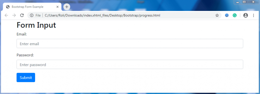
Bootstrap Form Inputs – Several pre-defined input types are available in HTML and Bootstrap. These input types help in styling the forms. When an input type is specified in the form, it means that the user will enter only the specific type of content/data. Otherwise, the error message or notification will be displayed on the screen.
Example – If the developer specifies an input “type=email” in an input field. Then the user will need to enter a valid email address to that field. Otherwise, the error message or notification will be displayed on the screen.
There are many input types available in bootstrap, and these are text, password, datetime, datetime-local, date, month, time, week, number, email, url, search, tel, and color.
Example
<!DOCTYPE html>
 <html lang="en">
 <head>
   <title>Bootstrap Form Input Example</title>
   <meta charset="utf-8">
   <meta name="viewport" content="width=device-width, initial-scale=1">
   <link rel="stylesheet" href="https://maxcdn.bootstrapcdn.com/bootstrap/4.4.1/css/bootstrap.min.css">
 </head>
 <body>
   <div class="container">
   <h2>Form Input</h2>
   <form action="/action_page.php">
     <div class="form-group">
       <label for="usr">Email:</label>
       <input type="email" class="form-control" id="email" name="email" placeholder="Enter email">
     </div>
     <div class="form-group">
       <label for="pwd">Password:</label>
       <input type="password" class="form-control" id="pwd" name="password" placeholder="Enter password">
     </div>
     <button type="submit" class="btn btn-primary">Submit</button>
   </form>
 </div>
   <script src="https://ajax.googleapis.com/ajax/libs/jquery/3.4.1/jquery.min.js"></script>
   <script src="https://cdnjs.cloudflare.com/ajax/libs/popper.js/1.16.0/umd/popper.min.js"></script>
   <script src="https://maxcdn.bootstrapcdn.com/bootstrap/4.4.1/js/bootstrap.min.js"></script>
 </body>
 </html>
Output
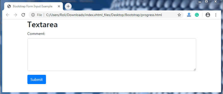
Bootstrap Textarea – The textarea is a large text box that is used when you want to allow the user to enter multi-line text. You can also adjust the height of the text area by specifying the number of rows as per the requirement.
For specifying the rows of the textarea,
- Add the row=”*” attribute to the <textarea> element for specifying the number of rows. Where* = 1,2,3……….. .. etc.
Example
<!DOCTYPE html>
 <html lang="en">
 <head>
   <title>Bootstrap Form Input Example</title>
   <meta charset="utf-8">
   <meta name="viewport" content="width=device-width, initial-scale=1">
   <link rel="stylesheet" href="https://maxcdn.bootstrapcdn.com/bootstrap/4.4.1/css/bootstrap.min.css">
 </head>
 <body>
   <div class="container">
   <h2>Textarea</h2>
   <form action="/action_page.php">
     <div class="form-group">
       <label for="comment">Comment:</label>
       <textarea class="form-control" rows="5" id="comment" name="text"></textarea>
     </div>
     <button type="submit" class="btn btn-primary">Submit</button>
   </form>
 </div>
   <script src="https://ajax.googleapis.com/ajax/libs/jquery/3.4.1/jquery.min.js"></script>
   <script src="https://cdnjs.cloudflare.com/ajax/libs/popper.js/1.16.0/umd/popper.min.js"></script>
   <script src="https://maxcdn.bootstrapcdn.com/bootstrap/4.4.1/js/bootstrap.min.js"></script>
 </body>
 </html>
Output
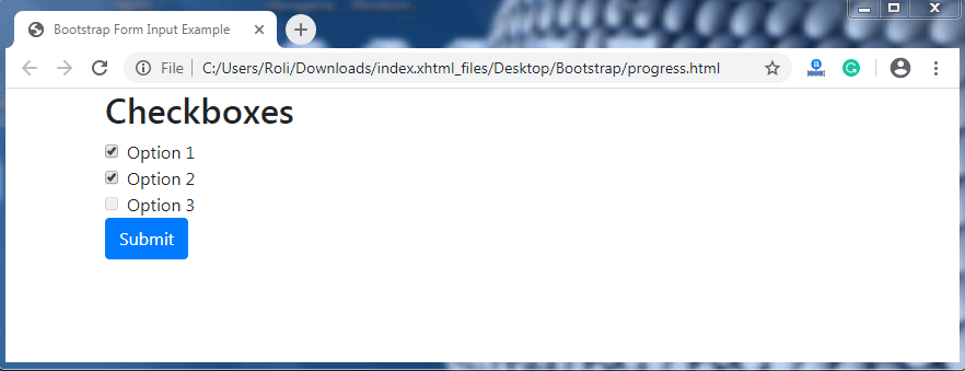
Bootstrap Checkboxes - The checkbox is used when you want to allow the user to select more than one option from the given list. The user has to click on the box just before the list item to select the options.
Steps for creating checkboxes
- Add the <div> element as a wrapper element with the .form-check class to provide proper margin to the labels and checkboxes.
- Add the .form-check-label class to the <label> element.
- Add .form-check-input class to the <input> element.
Example
<!DOCTYPE html>
 <html lang="en">
 <head>
   <title>Bootstrap Form Input Example</title>
   <meta charset="utf-8">
   <meta name="viewport" content="width=device-width, initial-scale=1">
   <link rel="stylesheet" href="https://maxcdn.bootstrapcdn.com/bootstrap/4.4.1/css/bootstrap.min.css">
 </head>
 <body>
   <div class="container">
   <h2>Checkboxes</h2>
   <form action="/action_page.php">
     <div class="form-check">
       <label class="form-check-label" for="check1">
         <input type="checkbox" class="form-check-input" id="check1" name="option1" value="something" checked>Option 1
       </label>
     </div>
     <div class="form-check">
       <label class="form-check-label" for="check2">
         <input type="checkbox" class="form-check-input" id="check2" name="option2" value="something">Option 2
       </label>
     </div>
     <div class="form-check">
       <label class="form-check-label">
         <input type="checkbox" class="form-check-input" disabled>Option 3
       </label>
     </div>
     <button type="submit" class="btn btn-primary">Submit</button>
   </form>
 </div>
   <script src="https://ajax.googleapis.com/ajax/libs/jquery/3.4.1/jquery.min.js"></script>
   <script src="https://cdnjs.cloudflare.com/ajax/libs/popper.js/1.16.0/umd/popper.min.js"></script>
   <script src="https://maxcdn.bootstrapcdn.com/bootstrap/4.4.1/js/bootstrap.min.js"></script>
 </body>
 </html>
Output
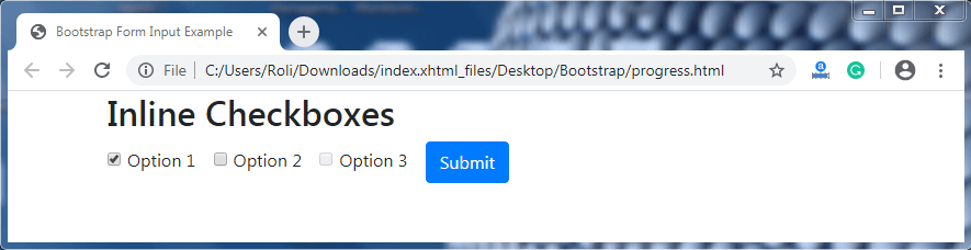
Inline Checkboxes – When you want the checkbox to appear horizontal (in a row) instead of vertical, then use the inline checkbox. To create an inline checkboxes you have to add the .form-check-inline class to the wrapper element.
Example
<!DOCTYPE html>
 <html lang="en">
 <head>
   <title>Bootstrap Form Input Example</title>
   <meta charset="utf-8">
   <meta name="viewport" content="width=device-width, initial-scale=1">
   <link rel="stylesheet" href="https://maxcdn.bootstrapcdn.com/bootstrap/4.4.1/css/bootstrap.min.css">
 </head>
 <body>
   <div class="container">
   <h2>Inline Checkboxes</h2>
   <form action="/action_page.php">
     <div class="form-check-inline">
       <label class="form-check-label" for="check1">
         <input type="checkbox" class="form-check-input" id="check1" name="vehicle1" value="something" checked>Option 1
       </label>
     </div>
     <div class="form-check-inline">
       <label class="form-check-label" for="check2">
         <input type="checkbox" class="form-check-input" id="check2" name="vehicle2" value="something">Option 2
       </label>
     </div>
     <div class="form-check-inline">
       <label class="form-check-label">
         <input type="checkbox" class="form-check-input" disabled>Option 3
       </label>
     </div>
     <button type="submit" class="btn btn-primary">Submit</button>
   </form>
 </div>
   <script src="https://ajax.googleapis.com/ajax/libs/jquery/3.4.1/jquery.min.js"></script>
   <script src="https://cdnjs.cloudflare.com/ajax/libs/popper.js/1.16.0/umd/popper.min.js"></script>
   <script src="https://maxcdn.bootstrapcdn.com/bootstrap/4.4.1/js/bootstrap.min.js"></script>
 </body>
 </html>
Output
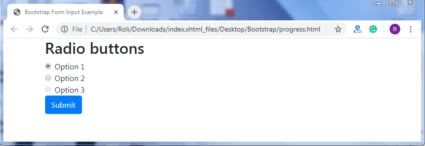
Bootstrap Radio Buttons – Radio buttons are used when you want to restrict the user limit. The user can select only one option from the given list at the same time. The radio buttons are small circles that appear filled or highlighted when selected.
Note: The value of the name attribute in the <input> element will always be same when you create radio buttons.
You can also make the radio button disabled by adding disable property to the <input> element.
Example
<!DOCTYPE html>
 <html lang="en">
 <head>
   <title>Bootstrap Form Input Example</title>
   <meta charset="utf-8">
   <meta name="viewport" content="width=device-width, initial-scale=1">
   <link rel="stylesheet" href="https://maxcdn.bootstrapcdn.com/bootstrap/4.4.1/css/bootstrap.min.css">
 </head>
 <body>
   <div class="container">
   <h2>Radio buttons</h2>
   <form action="/action_page.php">
     <div class="form-check">
       <label class="form-check-label" for="radio1">
         <input type="radio" class="form-check-input" id="radio1" name="optradio" value="option1" checked>Option 1
       </label>
     </div>
     <div class="form-check">
       <label class="form-check-label" for="radio2">
         <input type="radio" class="form-check-input" id="radio2" name="optradio" value="option2">Option 2
       </label>
     </div>
     <div class="form-check">
       <label class="form-check-label">
         <input type="radio" class="form-check-input" disabled>Option 3
       </label>
     </div>
     <button type="submit" class="btn btn-primary">Submit</button>
   </form>
 </div>
   <script src="https://ajax.googleapis.com/ajax/libs/jquery/3.4.1/jquery.min.js"></script>
   <script src="https://cdnjs.cloudflare.com/ajax/libs/popper.js/1.16.0/umd/popper.min.js"></script>
   <script src="https://maxcdn.bootstrapcdn.com/bootstrap/4.4.1/js/bootstrap.min.js"></script>
 </body>
 </html>
Output
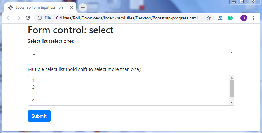
Bootstrap Select List – The bootstrap select list is similar to dropdowns. In dropdown, the list items are visible when you click on the caret/ arrow but in bootstrap select list, all the options are visible to the user. You can also select multiple options from the bootstrap select list by holding ctrl + shift and drag the mouse to the list items.
Example
<!DOCTYPE html>
 <html lang="en">
 <head>
   <title>Bootstrap Form Input Example</title>
   <meta charset="utf-8">
   <meta name="viewport" content="width=device-width, initial-scale=1">
   <link rel="stylesheet" href="https://maxcdn.bootstrapcdn.com/bootstrap/4.4.1/css/bootstrap.min.css">
 </head>
 <body>
 <div class="container">
   <h2>Form control: select</h2>
   <form action="/action_page.php">
     <div class="form-group">
       <label for="sel1">Select list (select one):</label>
       <select class="form-control" id="sel1" name="sellist1">
         <option>1</option>
         <option>2</option>
         <option>3</option>
         <option>4</option>
       </select>
       <br>
       <label for="sel2">Mutiple select list (hold shift to select more than one):</label>
       <select multiple class="form-control" id="sel2" name="sellist2">
         <option>1</option>
         <option>2</option>
         <option>3</option>
         <option>4</option>
         <option>5</option>
       </select>
     </div>
     <button type="submit" class="btn btn-primary">Submit</button>
   </form>
 </div>
   <script src="https://ajax.googleapis.com/ajax/libs/jquery/3.4.1/jquery.min.js"></script>
   <script src="https://cdnjs.cloudflare.com/ajax/libs/popper.js/1.16.0/umd/popper.min.js"></script>
   <script src="https://maxcdn.bootstrapcdn.com/bootstrap/4.4.1/js/bootstrap.min.js"></script>
 </body>
 </html>
Output
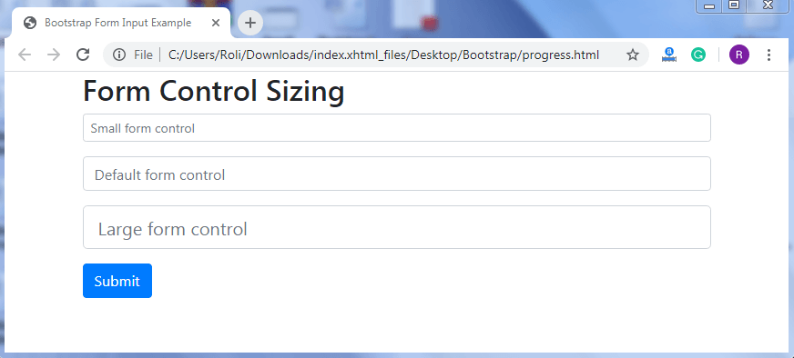
Form Control Sizing – Bootstrap offers some pre-defined classes that helps in customizing the height of input field. The .form-control-lg class is used to set the height of the input field larger (wide) than default height. The .form-control-sm class is used to set the height of the input field smaller (narrow) than the default height.
Example
<!DOCTYPE html>
 <html lang="en">
 <head>
   <title>Bootstrap Form Input Example</title>
   <meta charset="utf-8">
   <meta name="viewport" content="width=device-width, initial-scale=1">
   <link rel="stylesheet" href="https://maxcdn.bootstrapcdn.com/bootstrap/4.4.1/css/bootstrap.min.css">
 </head>
 <body>
 <div class="container">
   <h2>Form Control Sizing</h2>
   <form action="/action_page.php">
     <div class="form-group">
       <input type="text" class="form-control form-control-sm" placeholder="Small form control" name="text1">
     </div>
     <div class="form-group">
       <input type="text" class="form-control" placeholder="Default form control" name="text2">
     </div>
     <div class="form-group">
       <input type="text" class="form-control form-control-lg" placeholder="Large form control" name="text3">
     </div>
     <button type="submit" class="btn btn-primary">Submit</button>
   </form>
 </div>
   <script src="https://ajax.googleapis.com/ajax/libs/jquery/3.4.1/jquery.min.js"></script>
   <script src="https://cdnjs.cloudflare.com/ajax/libs/popper.js/1.16.0/umd/popper.min.js"></script>
   <script src="https://maxcdn.bootstrapcdn.com/bootstrap/4.4.1/js/bootstrap.min.js"></script>
 </body>
 </html>
Output
Form Control with Plain Text – The control with plain text is used when you want to add plain text and read only text. The .form-control-plaintext class is used when you want to remove the input field and make the text visible.
Example
<!DOCTYPE html>
 <html lang="en">
 <head>
   <title>Bootstrap Form Input Example</title>
   <meta charset="utf-8">
   <meta name="viewport" content="width=device-width, initial-scale=1">
   <link rel="stylesheet" href="https://maxcdn.bootstrapcdn.com/bootstrap/4.4.1/css/bootstrap.min.css">
 </head>
 <body>
 <div class="container">
   <h2>Form Control Plain Text</h2>
   <form action="/action_page.php">
     <div class="form-group">
       <input type="text" class="form-control" placeholder="Default form control" name="text1">
     </div>
     <div class="form-group">
       <input type="text" class="form-control-plaintext" placeholder="Form control with plain text" name="text2">
     </div>
     <button type="submit" class="btn btn-primary">Submit</button>
   </form>
 </div>
   <script src="https://ajax.googleapis.com/ajax/libs/jquery/3.4.1/jquery.min.js"></script>
   <script src="https://cdnjs.cloudflare.com/ajax/libs/popper.js/1.16.0/umd/popper.min.js"></script>
   <script src="https://maxcdn.bootstrapcdn.com/bootstrap/4.4.1/js/bootstrap.min.js"></script>
 </body>
 </html>
Output
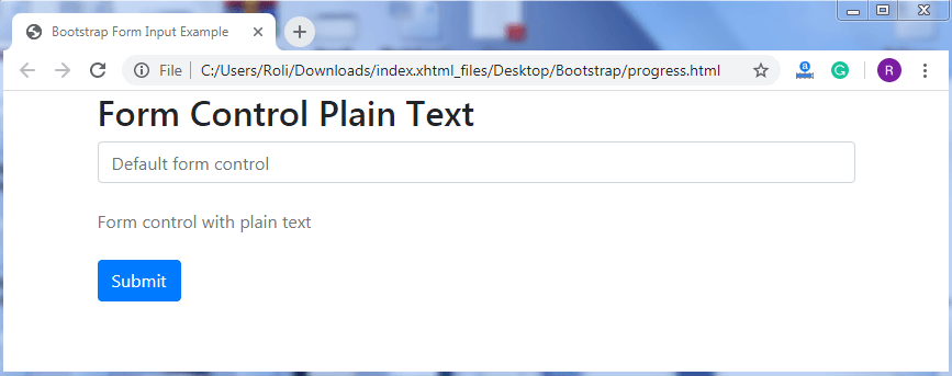
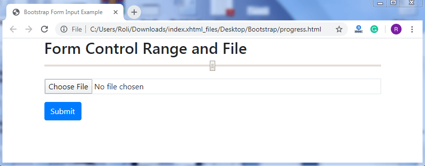
Form Control File and Range – You can provide the “file” feature in the form that helps the user to upload any file or document. To create a file field, add the .form-control-file class and type=”file” attribute to the <input> element.
The range is used to specify an approx value instead of precise value.ult value of range slider is in between 0 to 100. To create a range, add the .form-control-range class with the type=”range” attribute to the <input> element.
Example
<!DOCTYPE html>
 <html lang="en">
 <head>
   <title>Bootstrap Form Input Example</title>
   <meta charset="utf-8">
   <meta name="viewport" content="width=device-width, initial-scale=1">
   <link rel="stylesheet" href="https://maxcdn.bootstrapcdn.com/bootstrap/4.4.1/css/bootstrap.min.css">
 </head>
 <body>
 <div class="container">
   <h2>Form Control Range and File</h2>
   <form action="/action_page.php">
     <div class="form-group">
       <input type="range" class="form-control-range" name="range">
     </div>
     <div class="form-group">
       <input type="file" class="form-control-file border" name="file">
     </div>
     <button type="submit" class="btn btn-primary">Submit</button>
   </form>
 </div>
   <script src="https://ajax.googleapis.com/ajax/libs/jquery/3.4.1/jquery.min.js"></script>
   <script src="https://cdnjs.cloudflare.com/ajax/libs/popper.js/1.16.0/umd/popper.min.js"></script>
   <script src="https://maxcdn.bootstrapcdn.com/bootstrap/4.4.1/js/bootstrap.min.js"></script>
 </body>
 </html>
Output