Bootstrap 4 Pagination
Bootstrap 4 Pagination
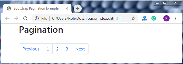
Bootstrap pagination is used to show the existence of a series of web pages of the website. It allows navigation on multiple pages of a website.
In pagination, there is a block of connected links that are easily scalable. Pagination is created with the help of an HTML element List so that the users can see the number of available links.
Example
Almost every search engine uses pagination to show the number of search results on the web pages.

Steps for creating basic pagination
- Use wrapping element <nav> for specifying navigation section.
- Add unordered list <ul> element with .pagination class.
- Add list item <li> element with .page-item class.
- Add .page-link class within the <a> element to provide link
- Add <a> element with .page-link class inside the <li> element.
Syntax
<nav>
     <ul class="pagination">
              <li class="page-item"><a class="page-link" href="#">Previous</a></li>
       </ul>
   </nav>
Example
<!DOCTYPE html>
 <html lang="en">
 <head>
   <title>Bootstrap Pagination Example</title>
   <meta charset="utf-8">
   <meta name="viewport" content="width=device-width, initial-scale=1">
   <link rel="stylesheet" href="https://maxcdn.bootstrapcdn.com/bootstrap/4.4.1/css/bootstrap.min.css">
 </head>
 <div class="container">
   <h2>Pagination</h2>
   <nav>
    <ul class="pagination">
     <li class="page-item"><a class="page-link" href="#">Previous</a></li>
     <li class="page-item"><a class="page-link" href="#">1</a></li>
     <li class="page-item"><a class="page-link" href="#">2</a></li>
     <li class="page-item"><a class="page-link" href="#">3</a></li>
     <li class="page-item"><a class="page-link" href="#">Next</a></li>
    </ul>
   </nav>
 </div>
   <script src="https://ajax.googleapis.com/ajax/libs/jquery/3.4.1/jquery.min.js"></script>
   <script src="https://cdnjs.cloudflare.com/ajax/libs/popper.js/1.16.0/umd/popper.min.js"></script>
   <script src="https://maxcdn.bootstrapcdn.com/bootstrap/4.4.1/js/bootstrap.min.js"></script>
 </body>
 </html>
Output
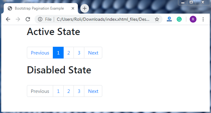
Active and Disabled state - We can customize the pagination links as per the requirement. Pagination offers two classes for customizing links, these classes are .active class and .disable class.
The .disable class is used when we want to make our link un-clickable. This class uses CSS property “pointer-events: none;” to disable the functionality of links of <a> elements. Although, this property only disables mouse clicking. Users can still click on the disabled link with the help of keyboard keys. To make the link fully disabled we have to use the attribute tabindex = “ -1” and some custom javascript.
The .active class is used to show or highlight the current page.
Example
<!DOCTYPE html>
 <html lang="en">
 <head>
   <title>Bootstrap Pagination Example</title>
   <meta charset="utf-8">
   <meta name="viewport" content="width=device-width, initial-scale=1">
   <link rel="stylesheet" href="https://maxcdn.bootstrapcdn.com/bootstrap/4.4.1/css/bootstrap.min.css">
 </head>
 <div class="container">
   <h2>Active State</h2><br>
   <ul class="pagination">
     <li class="page-item"><a class="page-link" href="#">Previous</a></li>
     <li class="page-item active"><a class="page-link" href="#">1</a></li>
     <li class="page-item"><a class="page-link" href="#">2</a></li>
     <li class="page-item"><a class="page-link" href="#">3</a></li>
     <li class="page-item"><a class="page-link" href="#">Next</a></li>
   </ul>
   <h2>Disabled State</h2><br>
   <ul class="pagination">
     <li class="page-item disabled"><a class="page-link" href="#">Previous</a></li>
     <li class="page-item"><a class="page-link" href="#">1</a></li>
     <li class="page-item"><a class="page-link" href="#">2</a></li>
     <li class="page-item"><a class="page-link" href="#">3</a></li>
     <li class="page-item"><a class="page-link" href="#">Next</a></li>
   </ul>
 </div>
   <script src="https://ajax.googleapis.com/ajax/libs/jquery/3.4.1/jquery.min.js"></script>
   <script src="https://cdnjs.cloudflare.com/ajax/libs/popper.js/1.16.0/umd/popper.min.js"></script>
   <script src="https://maxcdn.bootstrapcdn.com/bootstrap/4.4.1/js/bootstrap.min.js"></script>
 </body>
 </html>
Output
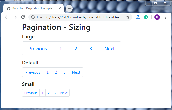
Pagination Sizing – Like other components of bootstrap 4, we can also customize the pagination size. There are two classes for resizing the pagination are given below.
- The .pagination-lg class is used to make the pagination size bigger than the default size.
- The .pagination-sm class is used to make the pagination size smaller than the default size.
Example
<!DOCTYPE html>
 <html lang="en">
 <head>
   <title>Bootstrap Pagination Example</title>
   <meta charset="utf-8">
   <meta name="viewport" content="width=device-width, initial-scale=1">
   <link rel="stylesheet" href="https://maxcdn.bootstrapcdn.com/bootstrap/4.4.1/css/bootstrap.min.css">
 </head>
 <div class="container">
   <h2>Pagination - Sizing</h2>
   <h5>Large</h5>
   <ul class="pagination pagination-lg">
     <li class="page-item"><a class="page-link" href="#">Previous</a></li>
     <li class="page-item"><a class="page-link" href="#">1</a></li>
     <li class="page-item"><a class="page-link" href="#">2</a></li>
     <li class="page-item"><a class="page-link" href="#">3</a></li>
     <li class="page-item"><a class="page-link" href="#">Next</a></li>
   </ul>
   <h5>Default</h5>
   <ul class="pagination">
     <li class="page-item"><a class="page-link" href="#">Previous</a></li>
     <li class="page-item"><a class="page-link" href="#">1</a></li>
     <li class="page-item"><a class="page-link" href="#">2</a></li>
     <li class="page-item"><a class="page-link" href="#">3</a></li>
     <li class="page-item"><a class="page-link" href="#">Next</a></li>
   </ul>
   <h5>Small</h5>
   <ul class="pagination pagination-sm">
     <li class="page-item"><a class="page-link" href="#">Previous</a></li>
     <li class="page-item"><a class="page-link" href="#">1</a></li>
     <li class="page-item"><a class="page-link" href="#">2</a></li>
     <li class="page-item"><a class="page-link" href="#">3</a></li>
     <li class="page-item"><a class="page-link" href="#">Next</a></li>
   </ul>
 </div>
   <script src="https://ajax.googleapis.com/ajax/libs/jquery/3.4.1/jquery.min.js"></script>
   <script src="https://cdnjs.cloudflare.com/ajax/libs/popper.js/1.16.0/umd/popper.min.js"></script>
   <script src="https://maxcdn.bootstrapcdn.com/bootstrap/4.4.1/js/bootstrap.min.js"></script>
 </body>
 </html>
Output
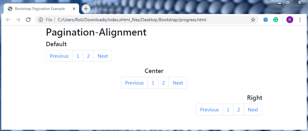
Pagination Alignment – The default alignment of the pagination component is left. By using some flexbox utilities we can also change the alignment of the pagination to the right or center.
- Add the .justify-content-center class with the <ul> element to set the alignment of the pagination to the center.
- Add the .justify-content-end class with the <ul> element to set the alignment of the pagination to the right.
Example
<!DOCTYPE html>
 <html lang="en">
 <head>
   <title>Bootstrap Pagination Example</title>
   <meta charset="utf-8">
   <meta name="viewport" content="width=device-width, initial-scale=1">
   <link rel="stylesheet" href="https://maxcdn.bootstrapcdn.com/bootstrap/4.4.1/css/bootstrap.min.css">
 </head>
 <div class="container">
   <h2>Pagination-Alignment</h2>
   <h5>Default</h5>
   <ul class="pagination">
     <li class="page-item"><a class="page-link" href="javascript:void(0);">Previous</a></li>
     <li class="page-item"><a class="page-link" href="javascript:void(0);">1</a></li>
     <li class="page-item"><a class="page-link" href="javascript:void(0);">2</a></li>
     <li class="page-item"><a class="page-link" href="javascript:void(0);">Next</a></li>
   </ul>
   <h5 style="text-align: center;">Center</h5>
   <ul class="pagination justify-content-center">
     <li class="page-item"><a class="page-link" href="javascript:void(0);">Previous</a></li>
     <li class="page-item"><a class="page-link" href="javascript:void(0);">1</a></li>
     <li class="page-item"><a class="page-link" href="javascript:void(0);">2</a></li>
     <li class="page-item"><a class="page-link" href="javascript:void(0);">Next</a></li>
   </ul>
   <h5 style="text-align: right;">Right</h5>
   <ul class="pagination justify-content-end">
     <li class="page-item"><a class="page-link" href="javascript:void(0);">Previous</a></li>
     <li class="page-item"><a class="page-link" href="javascript:void(0);">1</a></li>
     <li class="page-item"><a class="page-link" href="javascript:void(0);">2</a></li>
     <li class="page-item"><a class="page-link" href="javascript:void(0);">Next</a></li>
   </ul>
 </div>
   <script src="https://ajax.googleapis.com/ajax/libs/jquery/3.4.1/jquery.min.js"></script>
   <script src="https://cdnjs.cloudflare.com/ajax/libs/popper.js/1.16.0/umd/popper.min.js"></script>
   <script src="https://maxcdn.bootstrapcdn.com/bootstrap/4.4.1/js/bootstrap.min.js"></script>
 </body>
 </html>
Output