Bootstrap 4 Form
Bootstrap 4 Forms
Bootstrap 4 provides forms, which are one of the essential components for web pages and web applications. It is an input-based component, used to collect user data with the help of input fields, checkboxes, etc.
Bootstrap 4 provides some classes with the help of which we can easily customize forms. We can also make changes in styling and alignment of the form controls (such as labels, inputs, select boxes, text areas, etc.) with the help of bootstrap utilities.
How to create forms
- To create a form, you have to place all the elements within the <form> element.
- Add the class .form-group class each <div> element for providing structure. The .form-group class helps in maintaining the sequence of elements and also provides margin-bottom to the group.
- Add the .form-control class to the <input> element. This class covers the whole width of its parent.
Example
This example shows how to create the basic bootstrap form.
<!DOCTYPE html>
 <html lang="en">
 <head>
   <title>Bootstrap Form Example</title>
   <meta charset="utf-8">
   <meta name="viewport" content="width=device-width, initial-scale=1">
   <link rel="stylesheet" href="https://maxcdn.bootstrapcdn.com/bootstrap/4.4.1/css/bootstrap.min.css">
 </head>
 <div class="container">
   <h2>Forms</h2>
   <form action="/action_page.php">
     <div class="form-group">
       <label for="email"><strong>Email:</strong></label>
       <input type="email" class="form-control" id="email" placeholder="Enter email" name="email">
     </div>
     <div class="form-group">
       <label for="pwd"><strong>Password:</strong></label>
       <input type="password" class="form-control" id="pwd" placeholder="Enter password" name="pswd">
     </div>
     <div class="form-group form-check">
       <label class="form-check-label">
         <input class="form-check-input" type="checkbox" name="remember"> Remember me
       </label>
     </div>
     <button type="submit" class="btn btn-primary">Submit</button>
   </form>
 </div>
   <script src="https://ajax.googleapis.com/ajax/libs/jquery/3.4.1/jquery.min.js"></script>
   <script src="https://cdnjs.cloudflare.com/ajax/libs/popper.js/1.16.0/umd/popper.min.js"></script>
   <script src="https://maxcdn.bootstrapcdn.com/bootstrap/4.4.1/js/bootstrap.min.js"></script>
 </body>
 </html>
Output
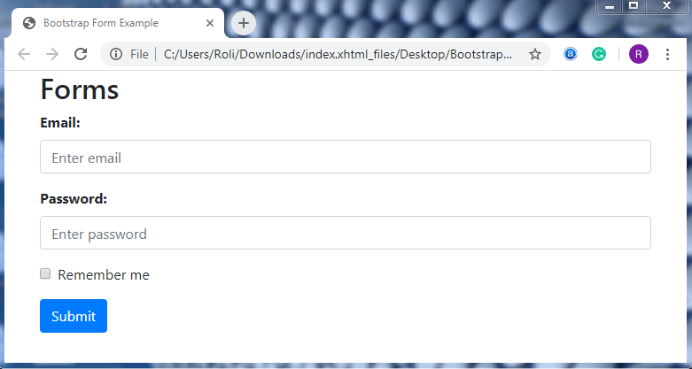
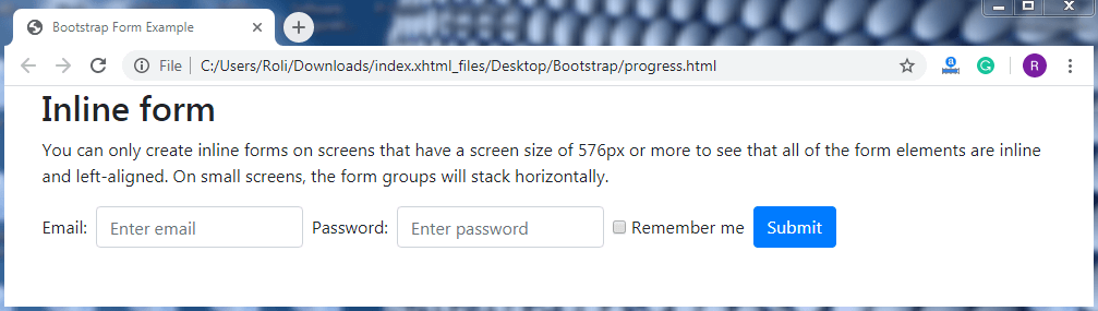
Inline Forms - Bootstrap 4 offers some predefined class that helps you to create forms in a single row. In the inline forms, all the labels and input fields are in a single row and left-aligned. To create an inline form, you have to add .form-inline class to the <form> element.
Note: You can only create inline forms on screens that have a screen size of 576px or more. Otherwise, this will look like a basic form.
Example
This example shows how to create inline form.
<!DOCTYPE html>
 <html lang="en">
 <head>
   <title>Bootstrap Form Example</title>
   <meta charset="utf-8">
   <meta name="viewport" content="width=device-width, initial-scale=1">
   <link rel="stylesheet" href="https://maxcdn.bootstrapcdn.com/bootstrap/4.4.1/css/bootstrap.min.css">
 </head>
 <div class="container">
   <h2>Inline form</h2>
   <p>You can only create inline forms on screens that have a screen size of 576px or more to see that all of the form elements are inline and left-aligned. On small screens, the form groups will stack horizontally.</p>
   <form class="form-inline" action="/action_page.php">
     <label for="email2" class="mb-2 mr-sm-2">Email:</label>
     <input type="text" class="form-control mb-2 mr-sm-2" id="email2" placeholder="Enter email" name="email">
     <label for="pwd2" class="mb-2 mr-sm-2">Password:</label>
     <input type="text" class="form-control mb-2 mr-sm-2" id="pwd2" placeholder="Enter password" name="pswd">
     <div class="form-check mb-2 mr-sm-2">
       <label class="form-check-label">
         <input type="checkbox" class="form-check-input" name="remember"> Remember me
       </label>
     </div>
     <button type="submit" class="btn btn-primary mb-2">Submit</button>
   </form>
 </div>
   <script src="https://ajax.googleapis.com/ajax/libs/jquery/3.4.1/jquery.min.js"></script>
   <script src="https://cdnjs.cloudflare.com/ajax/libs/popper.js/1.16.0/umd/popper.min.js"></script>
   <script src="https://maxcdn.bootstrapcdn.com/bootstrap/4.4.1/js/bootstrap.min.js"></script>
 </body>
 </html>
Output
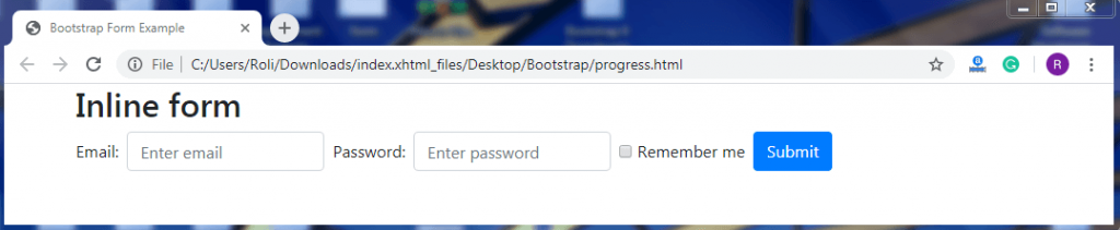
Inline Forms with Utilities – In the inline forms, there is no default spacing. So, bootstrap 4 provides some utilities that are used for spacing the elements within the form.
- Add the .mr-sm-2 class to give the right margin to each input and to every screen size.
- Add the .mb2 class to give the margin-bottom to each input field.
Example
<!DOCTYPE html>
 <html lang="en">
 <head>
   <title>Bootstrap Form Example</title>
   <meta charset="utf-8">
   <meta name="viewport" content="width=device-width, initial-scale=1">
   <link rel="stylesheet" href="https://maxcdn.bootstrapcdn.com/bootstrap/4.4.1/css/bootstrap.min.css">
 </head>
 <div class="container">
   <h2>Inline form</h2>
   <form class="form-inline" action="/action_page.php">
     <label for="email2" class="mb-2 mr-sm-2">Email:</label>
     <input type="text" class="form-control mb-2 mr-sm-2" id="email2" placeholder="Enter email" name="email">
     <label for="pwd2" class="mb-2 mr-sm-2">Password:</label>
     <input type="text" class="form-control mb-2 mr-sm-2" id="pwd2" placeholder="Enter password" name="pswd">
     <div class="form-check mb-2 mr-sm-2">
       <label class="form-check-label">
         <input type="checkbox" class="form-check-input" name="remember"> Remember me
       </label>
     </div>
     <button type="submit" class="btn btn-primary mb-2">Submit</button>
   </form>
 </div>
  <script src="https://ajax.googleapis.com/ajax/libs/jquery/3.4.1/jquery.min.js"></script>
   <script src="https://cdnjs.cloudflare.com/ajax/libs/popper.js/1.16.0/umd/popper.min.js"></script>
   <script src="https://maxcdn.bootstrapcdn.com/bootstrap/4.4.1/js/bootstrap.min.js"></script>
 </body>
 </html>
Output
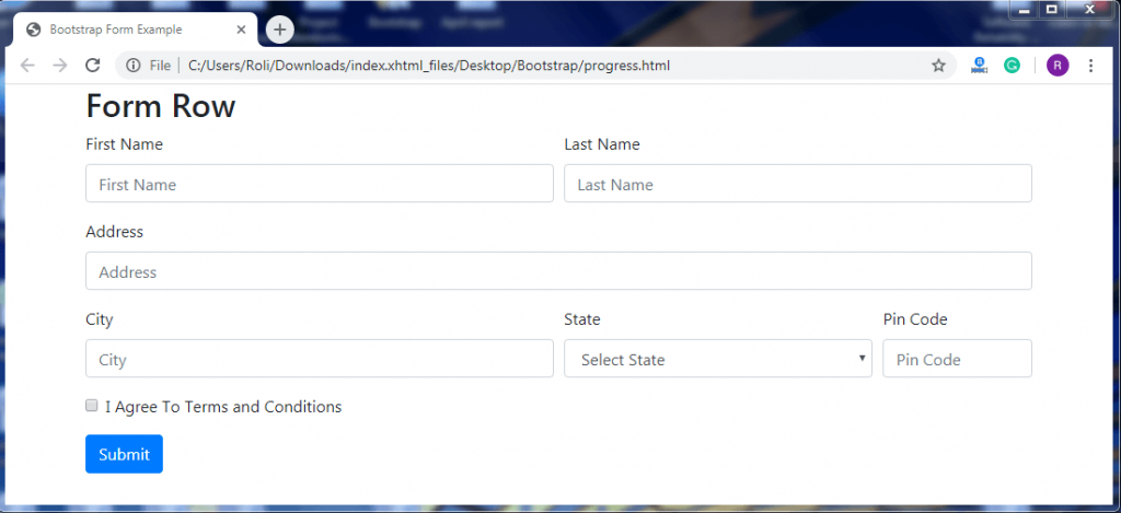
Form Grid with row – Bootstrap 4 offers some predefined classes that are used to design form grid or complex forms. The complex forms are those whose layout consists of several columns, such that each column has a different width and different alignment.
To create a form group,
- You have to add the .row class to the <div> element.
- Add the .col class to the <div> element inside the .row class.
The .col class is used to control the form width and alignment of form inputs without using spacing utilities.
Example
<!DOCTYPE html>
 <html lang="en">
 <head>
   <title>Bootstrap Form Example</title>
   <meta charset="utf-8">
   <meta name="viewport" content="width=device-width, initial-scale=1">
   <link rel="stylesheet" href="https://maxcdn.bootstrapcdn.com/bootstrap/4.4.1/css/bootstrap.min.css">
 </head>
 <body>
       <div class = "container">
          <form>
             <h2>Form Row</h2>
             <div class = "form-row">
                <div class = "form-group col-md-6">
                   <label for = "inputEmail4">First Name</label>
                   <input type = "text" class =" form-control"
                      id = "inputEmail4" placeholder = "First Name">
                </div>
                <div class = "form-group col-md-6">
                   <label for = "inputPassword4">Last Name</label>
                   <input type = "text" class = "form-control"
                      id = "inputPassword4" placeholder = "Last Name">
                </div>
             </div>
             <div class = "form-group">
                <label for = "inputAddress">Address</label>
                <input type = "text" class = "form-control" id = "inputAddress"
                   placeholder = "Address">
             </div>
             <div class = "form-row">
                <div class = "form-group col-md-6">
                   <label for = "inputCity">City</label>
                   <input type = "text" class = "form-control" placeholder = "City"
                      id = "inputCity">
                </div>
                <div class = "form-group col-md-4">
                   <label for = "inputState">State</label>
                   <select id = "inputState" class = "form-control">
                      <option selected disabled>Select State</option>
                      <option>Uttar Pradesh</option>
                      <option>Uttrakhand</option>
                   </select>
                </div>
                <div class = "form-group col-md-2">
                   <label for = "inputZip">Pin Code</label>
                   <input type = "text" class = "form-control" id = "inputZip"
                      placeholder = "Pin Code">
                </div>
             </div>
             <div class = "form-group">
                <div class = "form-check">
                   <input class = "form-check-input" type = "checkbox" id = "gridCheck" >
                   <label class = "form-check-label" for = "gridCheck">
                      I Agree To Terms and Conditions
                   </label>
                </div>
             </div>
             <button type = "submit" class = "btn btn-primary">Submit</button>
          </form>
       </div>
   <script src="https://ajax.googleapis.com/ajax/libs/jquery/3.4.1/jquery.min.js"></script>
   <script src="https://cdnjs.cloudflare.com/ajax/libs/popper.js/1.16.0/umd/popper.min.js"></script>
   <script src="https://maxcdn.bootstrapcdn.com/bootstrap/4.4.1/js/bootstrap.min.js"></script>
 </body>
 </html>
Output
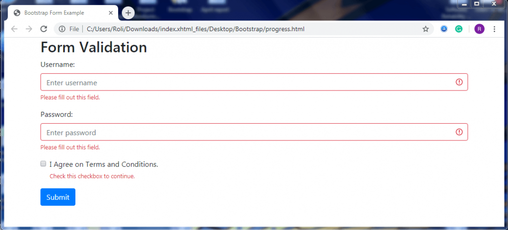
Form Validation – You can easily validate the form on the client-side. Form validation is used to give valuable feedback or implement custom messages to the users.
Steps to implement the form validation using bootstrap are given below:
Add the .was-validated class to the <form> element if you want to provide feedback notification before form submission.
Or
Add the .needs-validation class to the <form> element if you want to provide feedback notification after the form submission.
If there are some fields that are necessary to be filled by the user before form submission. In that case, you can use the .valid-feedback class or .invalid-feedback class. These classes provide a message to the user about the fields that are necessary to be filled. The valid fields appear green, or the invalid or empty fields appear red.
Example
This example shows form validation using .was-validated class.
<!DOCTYPE html>
 <html lang="en">
 <head>
   <title>Bootstrap Form Example</title>
   <meta charset="utf-8">
   <meta name="viewport" content="width=device-width, initial-scale=1">
   <link rel="stylesheet" href="https://maxcdn.bootstrapcdn.com/bootstrap/4.4.1/css/bootstrap.min.css">
 </head>
 <body>
      <div class="container">
   <h2>Form Validation</h2>
   <form action="/action_page.php" class="was-validated">
     <div class="form-group">
       <label for="uname">Username:</label>
       <input type="text" class="form-control" id="uname" placeholder="Enter username" name="uname" required>
       <div class="valid-feedback">Valid.</div>
       <div class="invalid-feedback">Please fill out this field.</div>
     </div>
     <div class="form-group">
       <label for="pwd">Password:</label>
       <input type="password" class="form-control" id="pwd" placeholder="Enter password" name="pswd" required>
       <div class="valid-feedback">Valid.</div>
       <div class="invalid-feedback">Please fill out this field.</div>
     </div>
     <div class="form-group form-check">
       <label class="form-check-label">
         <input class="form-check-input" type="checkbox" name="remember" required> I Agree on Terms and Conditions.
         <div class="valid-feedback">Valid.</div>
         <div class="invalid-feedback">Check this checkbox to continue.</div>
       </label>
     </div>
     <button type="submit" class="btn btn-primary">Submit</button>
   </form>
 </div>
   <script src="https://ajax.googleapis.com/ajax/libs/jquery/3.4.1/jquery.min.js"></script>
   <script src="https://cdnjs.cloudflare.com/ajax/libs/popper.js/1.16.0/umd/popper.min.js"></script>
   <script src="https://maxcdn.bootstrapcdn.com/bootstrap/4.4.1/js/bootstrap.min.js"></script>
 </body>
 </html>
Output