Bootstrap 4 Layout
Containers
Containers are the essential elements of the bootstrap layout. It is required when we are using a bootstrap grid system. Containers can also be nested, but most layouts do not need nested containers.
Bootstrap has two classes of containers
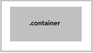
- .container
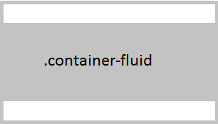
- .container-fluid
.container class – This class is used to create a responsive and fixed-width container. There is a fixed margin in the left and right of this class, and it does not completely cover its parent, screen, or Viewport.
Example
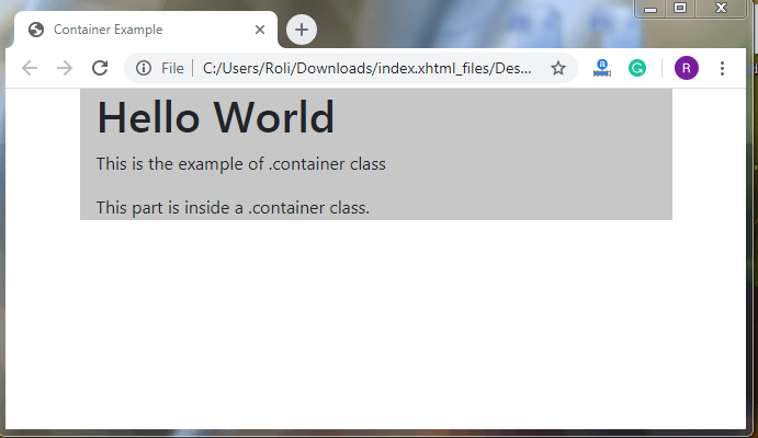
<!DOCTYPE html>
 <html lang="en">
 <head>
   <title>Container Example</title>
   <meta charset="utf-8">
   <meta name="viewport" content="width=device-width, initial-scale=1">
   <link rel="stylesheet" href="https://maxcdn.bootstrapcdn.com/bootstrap/4.4.1/css/bootstrap.min.css">
 </head>
 <body>
   <div class="container" style="background-color: #c7c7c7">
   <h1>Hello World</h1>
   <p>This is the example of .container class</p>
   <p>This part is inside a .container class.</p>
 </div>
  <script src="https://ajax.googleapis.com/ajax/libs/jquery/3.4.1/jquery.min.js"></script>
  <script src="https://cdnjs.cloudflare.com/ajax/libs/popper.js/1.16.0/umd/popper.min.js"></script>
  <script src="https://maxcdn.bootstrapcdn.com/bootstrap/4.4.1/js/bootstrap.min.js"></script>
 </body>
 </html>
Output
.container-fluid class – Container-fluid class covers the full width of the screen.
Example
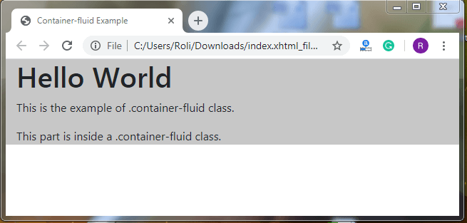
<!DOCTYPE html>
 <html lang="en">
 <head>
   <title>Container-fluid Example</title>
   <meta charset="utf-8">
   <meta name="viewport" content="width=device-width, initial-scale=1">
   <link rel="stylesheet" href="https://maxcdn.bootstrapcdn.com/bootstrap/4.4.1/css/bootstrap.min.css">
 </head>
 <body>
 <div class="container-fluid" style="background-color: #c7c7c7">
   <h1>Hello World</h1>
   <p>This is the example of .container-fluid class.</p>
   <p>This part is inside a .container-fluid class.</p>
 </div>
  <script src="https://ajax.googleapis.com/ajax/libs/jquery/3.4.1/jquery.min.js"></script>
  <script src="https://cdnjs.cloudflare.com/ajax/libs/popper.js/1.16.0/umd/popper.min.js"></script>
  <script src="https://maxcdn.bootstrapcdn.com/bootstrap/4.4.1/js/bootstrap.min.js"></script>
 </body>
 </html>
Output
Responsive Containers
The responsive containers automatically adjust themselves (in terms of height and width) according to their parent element. The max-width of the container varies at different scream size.
| Extra small <576px | Small >=576px | Medium >=768px | Large >=992px | Extra-large >=1200px | |
| .container | 100% | 540px | 720px | 960px | 1140px |
| .container-sm | 100% | 540px | 720px | 960px | 1140px |
| .container-md | 100% | 100% | 720px | 960px | 1140px |
| .container-lg | 100% | 100% | 100% | 960px | 1140px |
| .container-xl | 100% | 100% | 100% | 100% | 1140px |
| .container-fluid | 100% | 100% | 100% | 100% | 100% |