Bootstrap 4 Buttons
Bootstrap Buttons
Bootstrap provides many custom button styles. These buttons are used in forms and dialog boxes for actions. Bootstrap offers various predefined classes for providing styles to buttons.
There are many classes that are used to provide style to the buttons, are give below:-
- .btn-default
- .btn-primary
- .btn-success
- .btn-info
- .btn-warning
- .btn-danger
- .btn-link
Syntax
<!DOCTYPE html>
 <html lang="en">
 <head>
   <title>Bootstrap Buttons Example</title>
   <meta charset="utf-8">
   <meta name="viewport" content="width=device-width, initial-scale=1">
   <link rel="stylesheet" href="https://maxcdn.bootstrapcdn.com/bootstrap/4.4.1/css/bootstrap.min.css">
 </head>
 <body>
 <div class="container">
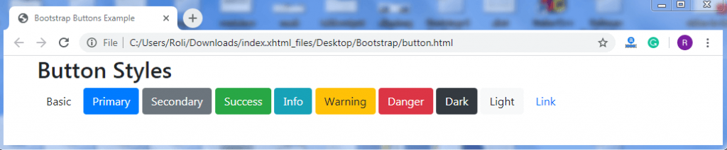
   <h2>Button Styles</h2>
   <button type="button" class="btn">Basic</button>
   <button type="button" class="btn btn-primary">Primary</button>
   <button type="button" class="btn btn-secondary">Secondary</button>
   <button type="button" class="btn btn-success">Success</button>
   <button type="button" class="btn btn-info">Info</button>
   <button type="button" class="btn btn-warning">Warning</button>
   <button type="button" class="btn btn-danger">Danger</button>
   <button type="button" class="btn btn-dark">Dark</button>
   <button type="button" class="btn btn-light">Light</button>
   <button type="button" class="btn btn-link">Link</button>
 </div>
   <script src="https://ajax.googleapis.com/ajax/libs/jquery/3.4.1/jquery.min.js"></script>
   <script src="https://cdnjs.cloudflare.com/ajax/libs/popper.js/1.16.0/umd/popper.min.js"></script>
   <script src="https://maxcdn.bootstrapcdn.com/bootstrap/4.4.1/js/bootstrap.min.js"></script>
 </body>
 </html>
Output
Button Elements
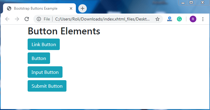
We can also use the button classes on multiple HTML elements such as anchor (<a>) tag, button (<button>) tag, and input (<input>) tag.
Syntax
<!DOCTYPE html>
 <html lang="en">
 <head>
   <title>Bootstrap Buttons Example</title>
   <meta charset="utf-8">
   <meta name="viewport" content="width=device-width, initial-scale=1">
   <link rel="stylesheet" href="https://maxcdn.bootstrapcdn.com/bootstrap/4.4.1/css/bootstrap.min.css">
 </head>
 <body>
 <div class="container">
   <h2>Button Elements</h2>
   <h4><a href="#" class="btn btn-info" role="button">Link Button</a></h4>
   <h4><button type="button" class="btn btn-info">Button</button></h4>
   <h4><input type="button" class="btn btn-info" value="Input Button"></h4>
   <h4><input type="submit" class="btn btn-info" value="Submit Button"></h4>
 </div>
 <script src="https://ajax.googleapis.com/ajax/libs/jquery/3.4.1/jquery.min.js"></script>
   <script src="https://cdnjs.cloudflare.com/ajax/libs/popper.js/1.16.0/umd/popper.min.js"></script>
   <script src="https://maxcdn.bootstrapcdn.com/bootstrap/4.4.1/js/bootstrap.min.js"></script>
 </body>
 </html>
Output
Button Outline
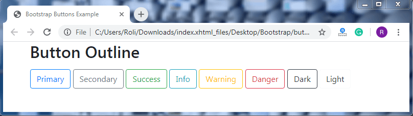
This type of buttons has a colored outline without any background color and background image. The .btn-outline-* class is used to create a button outline.
Syntax
<!DOCTYPE html>
 <html lang="en">
 <head>
   <title>Bootstrap Buttons Example</title>
   <meta charset="utf-8">
   <meta name="viewport" content="width=device-width, initial-scale=1">
   <link rel="stylesheet" href="https://maxcdn.bootstrapcdn.com/bootstrap/4.4.1/css/bootstrap.min.css">
 </head>
 <body>
 <div class="container">
   <h2>Button Outline</h2>
   <button type="button" class="btn btn-outline-primary">Primary</button>
   <button type="button" class="btn btn-outline-secondary">Secondary</button>
   <button type="button" class="btn btn-outline-success">Success</button>
   <button type="button" class="btn btn-outline-info">Info</button>
   <button type="button" class="btn btn-outline-warning">Warning</button>
   <button type="button" class="btn btn-outline-danger">Danger</button>
   <button type="button" class="btn btn-outline-dark">Dark</button>
   <button type="button" class="btn btn-outline-light text-dark">Light</button>
 </div>
   <script src="https://ajax.googleapis.com/ajax/libs/jquery/3.4.1/jquery.min.js"></script>
   <script src="https://cdnjs.cloudflare.com/ajax/libs/popper.js/1.16.0/umd/popper.min.js"></script>
   <script src="https://maxcdn.bootstrapcdn.com/bootstrap/4.4.1/js/bootstrap.min.js"></script>
 </body>
 </html>
Output
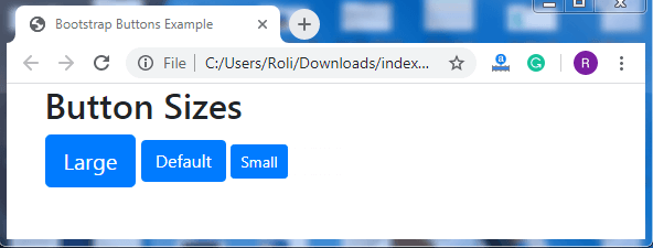
Button Sizes
The .btn-lg class is used to create buttons that are larger in size than the default size. The .btn-sm class is used to create that are smaller in size than the default size.
Syntax
<!DOCTYPE html>
 <html lang="en">
 <head>
   <title>Bootstrap Buttons Example</title>
   <meta charset="utf-8">
   <meta name="viewport" content="width=device-width, initial-scale=1">
   <link rel="stylesheet" href="https://maxcdn.bootstrapcdn.com/bootstrap/4.4.1/css/bootstrap.min.css">
 </head>
 <body>
 <div class="container">
   <h2>Button Sizes</h2>
   <button type="button" class="btn btn-primary btn-lg">Large</button>
   <button type="button" class="btn btn-primary btn-md">Default</button>
   <button type="button" class="btn btn-primary btn-sm">Small</button>
 </div>
 <script src="https://ajax.googleapis.com/ajax/libs/jquery/3.4.1/jquery.min.js"></script>
   <script src="https://cdnjs.cloudflare.com/ajax/libs/popper.js/1.16.0/umd/popper.min.js"></script>
   <script src="https://maxcdn.bootstrapcdn.com/bootstrap/4.4.1/js/bootstrap.min.js"></script>
 </body>
 </html>
Output
Block Level Buttons
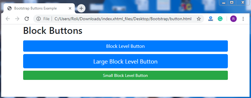
Block level buttons cover the full width of the screen or parent element. The .btn-block class is used to create block-level buttons.
Syntax
<!DOCTYPE html>
 <html lang="en">
 <head>
   <title>Bootstrap Buttons Example</title>
   <meta charset="utf-8">
   <meta name="viewport" content="width=device-width, initial-scale=1">
   <link rel="stylesheet" href="https://maxcdn.bootstrapcdn.com/bootstrap/4.4.1/css/bootstrap.min.css">
 </head>
 <body>
 <div class="container">
   <h2>Block Buttons</h2>
   <button type="button" class="btn btn-primary btn-block">Block Level Button</button>
   <button type="button" class="btn btn-primary btn-lg btn-block">Large Block Level Button</button>
   <button type="button" class="btn btn-success btn-sm btn-block">Small Block Level Button</button>
 </div>
   <script src="https://ajax.googleapis.com/ajax/libs/jquery/3.4.1/jquery.min.js"></script>
   <script src="https://cdnjs.cloudflare.com/ajax/libs/popper.js/1.16.0/umd/popper.min.js"></script>
   <script src="https://maxcdn.bootstrapcdn.com/bootstrap/4.4.1/js/bootstrap.min.js"></script>
 </body>
 </html>
Output
Active/Disabled Buttons
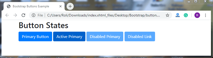
Bootstrap 4 offers classes that allow us to create active or pressed buttons and disabled-buttons. The .active class is used to create active buttons, and by adding a disabled attribute, the active button will get disabled.
Syntax
<!DOCTYPE html>
 <html lang="en">
 <head>
   <title>Bootstrap Buttons Example</title>
   <meta charset="utf-8">
   <meta name="viewport" content="width=device-width, initial-scale=1">
   <link rel="stylesheet" href="https://maxcdn.bootstrapcdn.com/bootstrap/4.4.1/css/bootstrap.min.css">
 </head>
 <body>
 <div class="container">
   <h2>Button States</h2>
   <button type="button" class="btn btn-primary">Primary Button</button>
   <button type="button" class="btn btn-primary active">Active Primary</button>
   <button type="button" class="btn btn-primary" disabled>Disabled Primary</button>
   <a href="#" class="btn btn-primary disabled">Disabled Link</a>
 </div>
   <script src="https://ajax.googleapis.com/ajax/libs/jquery/3.4.1/jquery.min.js"></script>
   <script src="https://cdnjs.cloudflare.com/ajax/libs/popper.js/1.16.0/umd/popper.min.js"></script>
   <script src="https://maxcdn.bootstrapcdn.com/bootstrap/4.4.1/js/bootstrap.min.js"></script>
 </body>
 </html>
Output