
Bootstrap 4 Jumbotron

Bootstrap 4 Jumbotron

Bootstrap offers Jumbotron, which is used to get more attention to specific content or information on the web page. It provides a gray background-color to the content to make that content notable/eye-catching.

All the HTML elements and other Bootstrap classes are valid inside the Jumbotron.

A jumbotron is created using .jumbotron class in the <div>  tag.

Example

<!DOCTYPE html>
 <html lang="en"> 
 <head>
   <title>Bootstrap Jumbotron Example</title>
   <meta charset="utf-8">
   <meta name="viewport" content="width=device-width, initial-scale=1">
   <link rel="stylesheet" href="https://maxcdn.bootstrapcdn.com/bootstrap/4.4.1/css/bootstrap.min.css">
 </head>
 <body>
 <div class="container"> 
   <div class="jumbotron">
     <h1>Bootstrap Jumotron</h1>      
     <p>This text is inside the Bootstrap Jumbotron.</p>
   </div>
   <p>This text is outside the bootstrap jumbotron</p>      
 </div>
   <script src="https://ajax.googleapis.com/ajax/libs/jquery/3.4.1/jquery.min.js"></script>
   <script src="https://cdnjs.cloudflare.com/ajax/libs/popper.js/1.16.0/umd/popper.min.js"></script> 
   <script src="https://maxcdn.bootstrapcdn.com/bootstrap/4.4.1/js/bootstrap.min.js"></script>
 </body>
 </html> 

Output
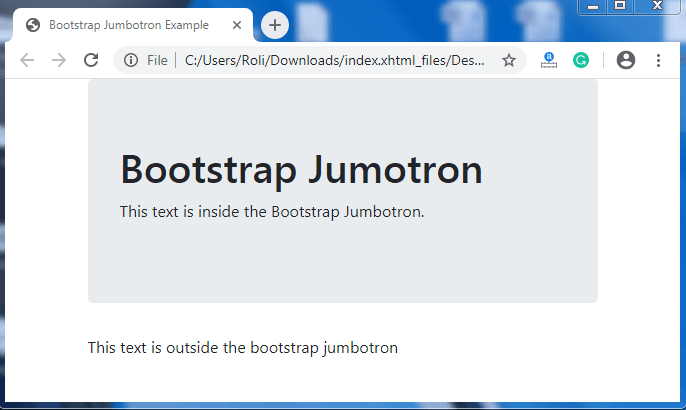
Bootstrap 4 Jumbotron

Full-width Jumbotron

Full-width jumbotron covers the full width of the screen or viewport. To make the full-width jumbotron, you have to use .jumbotron-fluid class and either .container  class or .container-fluid class inside the jumbotron.

Example

<!DOCTYPE html>
 <html lang="en">
 <head>
   <title>Bootstrap Jumbotron Example</title>
   <meta charset="utf-8">
   <meta name="viewport" content="width=device-width, initial-scale=1"> 
   <link rel="stylesheet" href="https://maxcdn.bootstrapcdn.com/bootstrap/4.4.1/css/bootstrap.min.css">
 </head>
 <body>
 <div class="jumbotron jumbotron-fluid">
   <div class="container">
     <h1>Bootstrap Jumotron</h1>       
     <p>This text is inside the Bootstrap Jumbotron.</p>
   </div>
 </div>
 <div class="container">
   <p>This text is outside the bootstrap jumbotron</p>
 </div>
   <script src="https://ajax.googleapis.com/ajax/libs/jquery/3.4.1/jquery.min.js"></script>
   <script src="https://cdnjs.cloudflare.com/ajax/libs/popper.js/1.16.0/umd/popper.min.js"></script> 
   <script src="https://maxcdn.bootstrapcdn.com/bootstrap/4.4.1/js/bootstrap.min.js"></script>
 </body>
 </html> 

Output
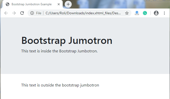
Bootstrap 4 Jumbotron

Related Topics

Bootstrap 4 Utilities

Bootstrap 4 Utilities Bootstrap 4 utilities also known as helper classes that are used to add more style to the components. Utilities are used to make the website or webpage more stylish or elegant....

10 minutes read.

Bootstrap 4 Spinners

Bootstrap 4 offers spinner is a loading indicator that is used to display the loading state of any component or web page. The spinner is also known as a loader...

7 minutes read.

Bootstrap First Example

1) Add HTML5 doctype Before starting the example of Bootstrap, we should know about the some basic rules of Bootstrap. We have to add HTML5 doctype with lang element and CSS properties. <!DOCTYPE html>   <html lang="en">     <head>       <meta charset="utf-8">      </head>   </html> 2) Bootstrap...

2 minutes read.

Bootstrap 4 List Groups

Bootstrap 4 List Groups Bootstrap 4 offers List Group component, which is used to display a series of content in an organized way. The most common list group is an unordered...

13 minutes read.

Bootstrap 4 Grid Classes

Bootstrap 4 Grid Classes Extra-small Grid – In the extra-small grid system class, when you create the grid (columns), the columns will not be stacked on top of each other on...

8 minutes read.

Bootstrap 4 Grid System

Bootstrap 4 Grid Systems Bootstrap offers a responsive and mobile-first grid system with the help of which we can divide the screen of the web browser into 12 horizontal parts. It has predefined classes...

4 minutes read.

Bootstrap List group

Bootstrap list group provides a group of a list of items. The most basic list is an unordered list. We can use <ul> element with .list-group class and <li> element with .lsit-group-item. Let us see...

3 minutes read.

Bootstrap Validation Example

Validation We can provide valuable and actionable feedback to the users through an HTML form validation. It happens via custom styles or behaviors of default browsers and JavaScript. How does validation work...

4 minutes read.

Bootstrap 4 Dropdowns

Bootstrap Dropdowns Bootstrap 4 provides a dropdown component, which is a toggle and contextual layout, used to display a predefined list of links. It allows the user to select a value from the dropdown...

15 minutes read.

Bootstrap With CSS

← Prev Next → ...

1 minute read.

Bootstrap 4 Colors

Bootstrap 4 Colors Bootstrap 4 consists of classes that are used to set colors according to the context of the element, and with the help of these classes, we can read...

2 minutes read.

Bootstrap Searchable Dropdown Menu

Searchable Dropdown Menu When we click on the dropdown button/arrow in this dropdown menu, an input field will pop up with all the dropdown items listing inside. If we type in...

5 minutes read.

Bootstrap Time Picker Example

What is a Bootstrap Time picker? It is used to display the time in hours, minutes and seconds from a dropdown menu. In this section, we will create an example to...

4 minutes read.

Bootstrap 4 Tooltip

Bootstrap 4 Tooltip Tooltip Bootstrap 4 offers a tooltip component, a small popup box that appears when you move the cursor over an element such as buttons or any highlighted element. It...

3 minutes read.

Bootstrap 4 Collapse

Bootstrap 4 Collapse Collapse is a bootstrap component that is similar to the dropdown button. Collapse is used to hide or show the content such as paragraphs, sentences, etc.  When we click on a...

4 minutes read.

Bootstrap 4 Carousel

Bootstrap 4 Carousel Bootstrap 4 offers a carousel component, which is also known as a slider or slideshow. The carousel is used for the dynamic representation of content using images with...

7 minutes read.

Bootstrap 4 Buttons

Bootstrap Buttons Bootstrap provides many custom button styles. These buttons are used in forms and dialog boxes for actions. Bootstrap offers various predefined classes for providing styles to buttons. There are many classes that are used...

7 minutes read.

Bootstrap Glyphicons

Bootstrap Glyphicon is used to create different type of glyphicons It is used in the web project. It provides 260 Glyphicons from the Glyphivons Halflings set. There are various examples of...

1 minute read.

Bootstrap Notification Bubble

What is a notification bubble? Bubbles are built into the Notification system. They float on top of the website or the button to indicate pending notifications. Bubbles can be expanded to reveal...

5 minutes read.

Bootstrap 4 Icons

Bootstrap 4 Icons Bootstrap 3 contains the default icon library. But in bootstrap 4, you have to include the external icon library by yourself. Many free icon libraries are available such...

2 minutes read.