Bootstrap Input groups
Bootstrap 4 Input groups
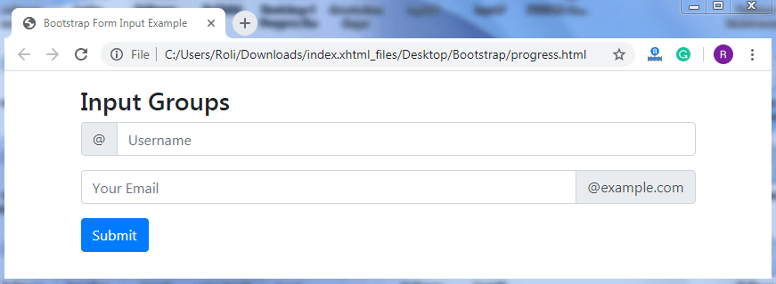
The input group is a component of Bootstrap 4, which is used to create interactive and stylish form controls. With the help of input groups, you can easily customize the input fields. It provides style to the form control by adding icon, text, buttons, and button groups at both ends of the input field.
Bootstrap offers two predefined classes that are used to add the styling components at both sides of the input fields; these classes are :
- .input-group-prepend class
- .input-group-append class
Steps for Creating Prepended and Appended Inputs
- Add the .input-group class to the <div> element. This class acts as a container and enhance the input field by adding icons, text, buttons, etc.
- Add the .input-group-prepend class to the <div> element to put the add-ons at the beginning of the input field.
OR
- Add the .input-group-append class to the <div> element to put the add-ons at the end of the input field.
- Add the .input-group-text class to the <span> element to provide the style.
Note: If you want to provide a proper bottom margin to the input groups, then use mb-3 utility.
Example
<!DOCTYPE html>
 <html lang="en">
 <head>
   <title>Bootstrap Input Groups Example</title>
   <meta charset="utf-8">
   <meta name="viewport" content="width=device-width, initial-scale=1">
   <link rel="stylesheet" href="https://maxcdn.bootstrapcdn.com/bootstrap/4.4.1/css/bootstrap.min.css">
 </head>
 <body>
 <div class="container mt-3">
   <h3>Input Groups</h3>
   <form action="/action_page.php">
     <div class="input-group mb-3">
       <div class="input-group-prepend">
         <span class="input-group-text">@</span>
       </div>
       <input type="text" class="form-control" placeholder="Username" id="usr" name="username">
     </div>
     <div class="input-group mb-3">
       <input type="text" class="form-control" placeholder="Your Email" id="mail" name="email">
       <div class="input-group-append">
         <span class="input-group-text">@example.com</span>
       </div>
     </div>
     <button type="submit" class="btn btn-primary">Submit</button>
   </form>
 </div>
   <script src="https://ajax.googleapis.com/ajax/libs/jquery/3.4.1/jquery.min.js"></script>
   <script src="https://cdnjs.cloudflare.com/ajax/libs/popper.js/1.16.0/umd/popper.min.js"></script>
   <script src="https://maxcdn.bootstrapcdn.com/bootstrap/4.4.1/js/bootstrap.min.js"></script>
 </body>
 </html>
Output
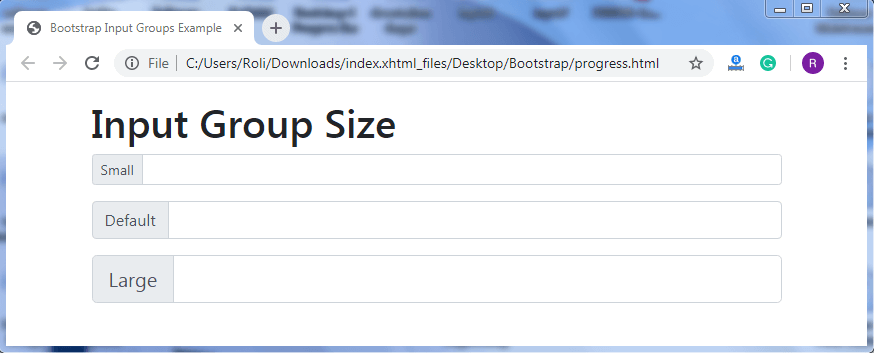
Input Group Sizing - You can also customize the size of the input groups as per the requirement. Bootstrap 4 offers two classes that are used to resize the input groups. These classes are .input-group-sm class and .input-group-lg class.
To resize the input groups,
- Add the .input-group-sm class along with the .input-group class to the <div> element to create small input groups.
- Add the .input-group-lg class along with the .input-group class to the <div> element to create large input groups.
Example
<!DOCTYPE html>
 <html lang="en">
 <head>
   <title>Bootstrap Input Groups Example</title>
   <meta charset="utf-8">
   <meta name="viewport" content="width=device-width, initial-scale=1">
   <link rel="stylesheet" href="https://maxcdn.bootstrapcdn.com/bootstrap/4.4.1/css/bootstrap.min.css">
 </head>
 <body>
 <div class="container mt-3">
   <h1>Input Group Size</h1>
   <form>
     <div class="input-group mb-3 input-group-sm">
       <div class="input-group-prepend">
         <span class="input-group-text">Small</span>
       </div>
       <input type="text" class="form-control">
     </div>
   </form>
   <form>
     <div class="input-group mb-3">
       <div class="input-group-prepend">
         <span class="input-group-text">Default</span>
       </div>
       <input type="text" class="form-control">
     </div>
   </form>
   <form>
     <div class="input-group mb-3 input-group-lg">
       <div class="input-group-prepend">
         <span class="input-group-text">Large</span>
       </div>
       <input type="text" class="form-control">
     </div>
   </form>
 </div>
   <script src="https://ajax.googleapis.com/ajax/libs/jquery/3.4.1/jquery.min.js"></script>
   <script src="https://cdnjs.cloudflare.com/ajax/libs/popper.js/1.16.0/umd/popper.min.js"></script>
   <script src="https://maxcdn.bootstrapcdn.com/bootstrap/4.4.1/js/bootstrap.min.js"></script>
 </body>
 </html>
Output
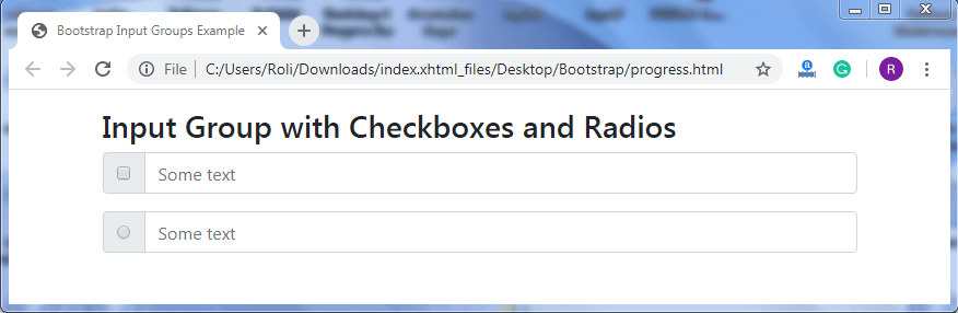
Input groups with Checkboxes and Radio Buttons – You can also place the checkboxes and radio buttons instead of icons and text at the beginning and end of the input group.
Example
<!DOCTYPE html>
 <html lang="en">
 <head>
   <title>Bootstrap Input Groups Example</title>
   <meta charset="utf-8">
   <meta name="viewport" content="width=device-width, initial-scale=1">
   <link rel="stylesheet" href="https://maxcdn.bootstrapcdn.com/bootstrap/4.4.1/css/bootstrap.min.css">
 </head>
 <body>
 <div class="container mt-3">
   <h3>Input Group with Checkboxes and Radios</h3>
   <form>
     <div class="input-group mb-3">
       <div class="input-group-prepend">
         <div class="input-group-text">
           <input type="checkbox">
         </div>
       </div>
       <input type="text" class="form-control" placeholder="Some text">
     </div>
   </form>
   <form>
     <div class="input-group mb-3">
       <div class="input-group-prepend">
         <div class="input-group-text">
           <input type="radio">
         </div>
       </div>
       <input type="text" class="form-control" placeholder="Some text">
     </div>
   </form>
 </div>
   <script src="https://ajax.googleapis.com/ajax/libs/jquery/3.4.1/jquery.min.js"></script>
   <script src="https://cdnjs.cloudflare.com/ajax/libs/popper.js/1.16.0/umd/popper.min.js"></script>
   <script src="https://maxcdn.bootstrapcdn.com/bootstrap/4.4.1/js/bootstrap.min.js"></script>
 </body>
 </html>
Output
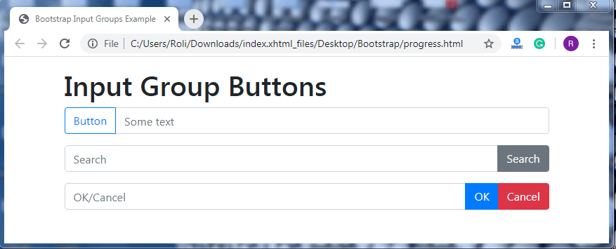
Input Group Buttons – You can also add buttons instead of text and icons at the beginning and end of the input groups as per the need.
To create the input group buttons at the beginning of the input field, you need to add the .input-group-prepend class to the <div> element. Add the .btn class along with the contextual button class to the <button> element.
To create the input group buttons at the end of the input field, you need to add the .input-group-append class to the <div> element. Add the .btn class along with the contextual button class to the <button> element.
Note: You can create more than one button at a time by just adding the <button> element along with its classes.
Example
<!DOCTYPE html>
 <html lang="en">
 <head>
   <title>Bootstrap Input Groups Example</title>
   <meta charset="utf-8">
   <meta name="viewport" content="width=device-width, initial-scale=1">
   <link rel="stylesheet" href="https://maxcdn.bootstrapcdn.com/bootstrap/4.4.1/css/bootstrap.min.css">
 </head>
 <body>
 <div class="container mt-3">
   <h1>Input Group Buttons</h1>
   <div class="input-group mb-3">
     <div class="input-group-prepend">
       <button class="btn btn-outline-primary" type="button">Button</button>
     </div>
   <div class="input-group mb-3">
     <input type="text" class="form-control" placeholder="OK/Cancel">
     <div class="input-group-append">
       <button class="btn btn-primary" type="button">OK</button>
       <button class="btn btn-danger" type="button">Cancel</button>
      </div>
   </div>
 </div>
   <script src="https://ajax.googleapis.com/ajax/libs/jquery/3.4.1/jquery.min.js"></script>
   <script src="https://cdnjs.cloudflare.com/ajax/libs/popper.js/1.16.0/umd/popper.min.js"></script>
   <script src="https://maxcdn.bootstrapcdn.com/bootstrap/4.4.1/js/bootstrap.min.js"></script>
 </body>
 </html>
Output
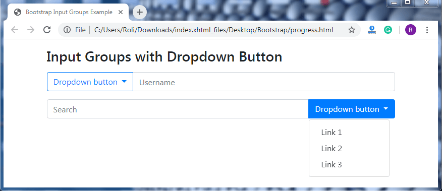
Input Group with Dropdown Button – Dropdowns buttons can also be added at any side of the input field. The dropdown is used within the input field in case you want to give option/choice to the user or you want to perform more than one task by using the button.
To create a input group with dropdown button, firstly create a button by adding the <button> element along with the .btn class and contextual button class. Then add the .dropdown-menu class to the <div> element. And add the .dropdown-item class to the <a> element for creating dropdown links.
Note: There is no need to add the .dropdown class as a wrapper class.
Example
<!DOCTYPE html>
 <html lang="en">
 <head>
   <title>Bootstrap Input Groups Example</title>
   <meta charset="utf-8">
   <meta name="viewport" content="width=device-width, initial-scale=1">
   <link rel="stylesheet" href="https://maxcdn.bootstrapcdn.com/bootstrap/4.4.1/css/bootstrap.min.css">
 </head>
 <body>
 <div class="container mt-3">
   <h3>Input Groups with Dropdown Button</h3>
   <form>
     <div class="input-group mt-3 mb-3">
       <div class="input-group-prepend">
         <button type="button" class="btn btn-outline-primary dropdown-toggle" data-toggle="dropdown">
           Dropdown button
         </button>
         <div class="dropdown-menu">
           <a class="dropdown-item" href="#">Link 1</a>
           <a class="dropdown-item" href="#">Link 2</a>
           <a class="dropdown-item" href="#">Link 3</a>
         </div>
       </div>
       <input type="text" class="form-control" placeholder="Username">
     </div>
     <div class="input-group mb-3">
       <input type="text" class="form-control" placeholder="Search">
         <div class="input-group-append">
           <button type="button" class="btn btn-outline-primary dropdown-toggle" data-toggle="dropdown">
           Dropdown button
           </button>
           <div class="dropdown-menu">
             <a class="dropdown-item" href="#">Link 1</a>
             <a class="dropdown-item" href="#">Link 2</a>
             <a class="dropdown-item" href="#">Link 3</a>
           </div>
         </div>
     </div>
   </form>
   <script src="https://ajax.googleapis.com/ajax/libs/jquery/3.4.1/jquery.min.js"></script>
   <script src="https://cdnjs.cloudflare.com/ajax/libs/popper.js/1.16.0/umd/popper.min.js"></script>
   <script src="https://maxcdn.bootstrapcdn.com/bootstrap/4.4.1/js/bootstrap.min.js"></script>
 </body>
 </html>
Output
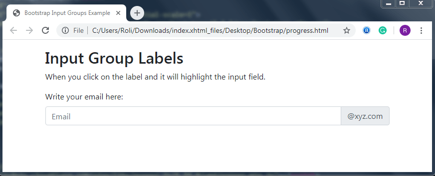
Input Group Labels – Bootstrap provides the class that helps you to add the label outside the input groups. These labels specify what the user is desired to enter in the input field.
To create the labels outside the input field, you have to add the <label> element with the for attribute.
Note: The value of the for attribute within the <label> element and the value of the id attribute within the <input> element must be the same.
Example
<!DOCTYPE html>
 <html lang="en">
 <head>
   <title>Bootstrap Input Groups Example</title>
   <meta charset="utf-8">
   <meta name="viewport" content="width=device-width, initial-scale=1">
   <link rel="stylesheet" href="https://maxcdn.bootstrapcdn.com/bootstrap/4.4.1/css/bootstrap.min.css">
 </head>
 <body>
         <span class="input-group-text">@xyz.com</span>
       </div>
     </div>
   </form>
 </div>
   <script src="https://ajax.googleapis.com/ajax/libs/jquery/3.4.1/jquery.min.js"></script>
   <script src="https://cdnjs.cloudflare.com/ajax/libs/popper.js/1.16.0/umd/popper.min.js"></script>
   <script src="https://maxcdn.bootstrapcdn.com/bootstrap/4.4.1/js/bootstrap.min.js"></script>
 </body>
 </html>
Output
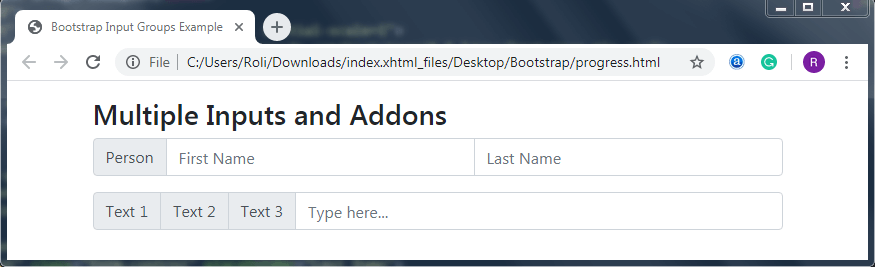
Multiple Inputs – You can also add multiple inputs (side-by-side) in a single line along with the add-ons like text, icon, button, etc.
Example
<!DOCTYPE html>
 <html lang="en">
 <head>
   <title>Bootstrap Input Groups Example</title>
   <meta charset="utf-8">
   <meta name="viewport" content="width=device-width, initial-scale=1">
   <link rel="stylesheet" href="https://maxcdn.bootstrapcdn.com/bootstrap/4.4.1/css/bootstrap.min.css">
 </head>
 <body>
 <div class="container mt-3">
   <h3>Multiple Inputs and Addons</h3>
   <form>
     <div class="input-group mb-3">
       <div class="input-group-prepend">
         <span class="input-group-text">Person</span>
       </div>
       <input type="text" class="form-control" placeholder="First Name">
       <input type="text" class="form-control" placeholder="Last Name">
     </div>
   </form>
   <form>
     <div class="input-group mb-3">
       <div class="input-group-prepend">
         <span class="input-group-text">Text 1</span>
         <span class="input-group-text">Text 2</span>
         <span class="input-group-text">Text 3</span>
       </div>
       <input type="text" class="form-control" placeholder="Type here...">
     </div>
   </form>
 </div>
   <script src="https://ajax.googleapis.com/ajax/libs/jquery/3.4.1/jquery.min.js"></script>
   <script src="https://cdnjs.cloudflare.com/ajax/libs/popper.js/1.16.0/umd/popper.min.js"></script>
   <script src="https://maxcdn.bootstrapcdn.com/bootstrap/4.4.1/js/bootstrap.min.js"></script>
 </body>
 </html>
Output