Bootstrap Buttons Groups
Bootstrap 4 Button Group
Bootstrap 4 provides a feature button group that helps in creating a series of buttons together in a group.
Basic Button Group
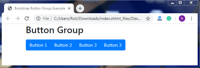
The .btn-group class is used within the <div> tag to create a button group.
Syntax
<!DOCTYPE html>
 <html lang="en">
 <head>
   <title>Bootstrap Button Group Example</title>
   <meta charset="utf-8">
   <meta name="viewport" content="width=device-width, initial-scale=1">
   <link rel="stylesheet" href="https://maxcdn.bootstrapcdn.com/bootstrap/4.4.1/css/bootstrap.min.css">
   </head>
 <body>
 <div class="container">
   <h2>Button Group</h2>
   <div class="btn-group">
     <button type="button" class="btn btn-primary">Button 1</button>
     <button type="button" class="btn btn-primary">Button 2</button>
     <button type="button" class="btn btn-primary">Button 3</button>
     <button type="button" class="btn btn-primary">Button 3</button>
   </div>
 </div>
   <script src="https://ajax.googleapis.com/ajax/libs/jquery/3.4.1/jquery.min.js"></script>
   <script src="https://cdnjs.cloudflare.com/ajax/libs/popper.js/1.16.0/umd/popper.min.js"></script>
   <script src="https://maxcdn.bootstrapcdn.com/bootstrap/4.4.1/js/bootstrap.min.js"></script>
 </body>
 </html>
Output
Sizing
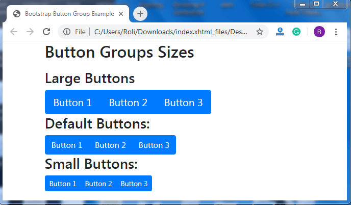
Bootstrap 4 allows you to customize the size of your button as per the requirement.
- Add the .btn-group-lg class to the <div> element to create larger group buttons than default size.
- Add the .btn-group-sm class to the <div> element to create a smaller button group than the default one.
Syntax
<!DOCTYPE html>
 <html lang="en">
 <head>
   <title>Bootstrap Button Group Example</title>
   <meta charset="utf-8">
   <meta name="viewport" content="width=device-width, initial-scale=1">
   <link rel="stylesheet" href="https://maxcdn.bootstrapcdn.com/bootstrap/4.4.1/css/bootstrap.min.css">
  </head>
 <body>
 <div class="container">
   <h2>Button Groups Sizes</h2>
   <p></p>
   <h3>Large Buttons</h3>
   <div class="btn-group btn-group-lg">
     <button type="button" class="btn btn-primary">Button 1</button>
     <button type="button" class="btn btn-primary">Button 2</button>
     <button type="button" class="btn btn-primary">Button 3</button>
   </div>
   <h3>Default Buttons</h3>
   <div class="btn-group">
     <button type="button" class="btn btn-primary">Button 1</button>
     <button type="button" class="btn btn-primary">Button 2</button>
     <button type="button" class="btn btn-primary">Button 3</button>
   </div>
   <h3>Small Buttons</h3>
   <div class="btn-group btn-group-sm">
     <button type="button" class="btn btn-primary">Button 1</button>
     <button type="button" class="btn btn-primary">Button 2</button>
     <button type="button" class="btn btn-primary">Button 3</button>
   </div>
 </div>
  <script src="https://ajax.googleapis.com/ajax/libs/jquery/3.4.1/jquery.min.js"></script>
   <script src="https://cdnjs.cloudflare.com/ajax/libs/popper.js/1.16.0/umd/popper.min.js"></script>
   <script src="https://maxcdn.bootstrapcdn.com/bootstrap/4.4.1/js/bootstrap.min.js"></script>
 </body>
 </html>
Output
Nesting
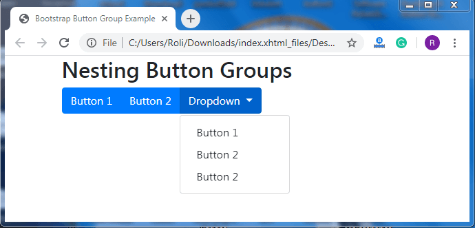
Nesting allows you to create a series of buttons within a dropdown. To create a nested button, you have to put .btn-group class within another .btn-group class.
Syntax
<!DOCTYPE html>
 <html lang="en">
 <head>
   <title>Bootstrap Button Group Example</title>
   <meta charset="utf-8">
   <meta name="viewport" content="width=device-width, initial-scale=1">
   <link rel="stylesheet" href="https://maxcdn.bootstrapcdn.com/bootstrap/4.4.1/css/bootstrap.min.css">
 </head>
 <body>
 <div class="container">
   <h2>Nesting Button Groups</h2>
   <div class="btn-group">
     <button type="button" class="btn btn-primary">Button 1</button>
     <button type="button" class="btn btn-primary">Button 2</button>
     <div class="btn-group">
       <button type="button" class="btn btn-primary dropdown-toggle" data-toggle="dropdown">
       Dropdown
       </button>
       <div class="dropdown-menu">
         <a class="dropdown-item" href="#">Button 1</a>
         <a class="dropdown-item" href="#">Button 2</a>
         <a class="dropdown-item" href="#">Button 2</a>
       </div>
     </div>
   </div>
 </div>
  <script src="https://ajax.googleapis.com/ajax/libs/jquery/3.4.1/jquery.min.js"></script>
   <script src="https://cdnjs.cloudflare.com/ajax/libs/popper.js/1.16.0/umd/popper.min.js"></script>
   <script src="https://maxcdn.bootstrapcdn.com/bootstrap/4.4.1/js/bootstrap.min.js"></script>
 </body>
 </html>
Output
Vertical Button Group with Dropdown
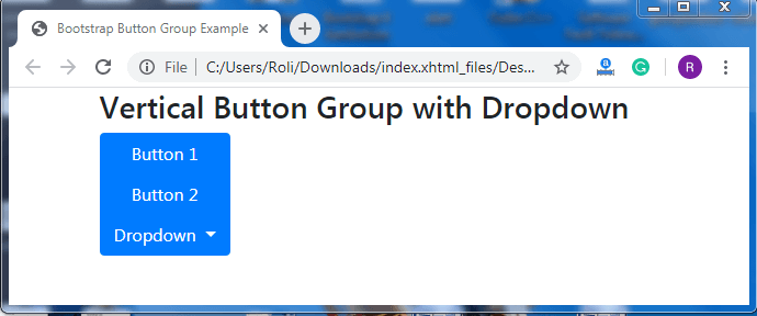
In the vertical button group, the buttons are in vertical order instead of horizontal. To create a vertical button group, add .btn-group-vertical class to the <div> element.
Syntax
<!DOCTYPE html>
 <html lang="en">
 <head>
   <title>Bootstrap Button Group Example</title>
   <meta charset="utf-8">
   <meta name="viewport" content="width=device-width, initial-scale=1">
   <link rel="stylesheet" href="https://maxcdn.bootstrapcdn.com/bootstrap/4.4.1/css/bootstrap.min.css">
 </head>
 <body>
 <div class="container">
   <h3>Vertical Button Group with Dropdown</h3>
   <div class="btn-group-vertical">
     <button type="button" class="btn btn-primary">Button 1</button>
     <button type="button" class="btn btn-primary">Button 2</button>
     <div class="btn-group">
       <button type="button" class="btn btn-primary dropdown-toggle" data-toggle="dropdown">
         Dropdown
       </button>
       <div class="dropdown-menu">
         <a class="dropdown-item" href="#">Button 1</a>
         <a class="dropdown-item" href="#">Button 2</a>
         <a class="dropdown-item" href="#">Button 3</a>
       </div>
     </div>
   </div>
 </div>
   <script src="https://ajax.googleapis.com/ajax/libs/jquery/3.4.1/jquery.min.js"></script>
   <script src="https://cdnjs.cloudflare.com/ajax/libs/popper.js/1.16.0/umd/popper.min.js"></script>
   <script src="https://maxcdn.bootstrapcdn.com/bootstrap/4.4.1/js/bootstrap.min.js"></script>
 </body>
 </html>
Output