Bootstrap 4 Carousel
Bootstrap 4 Carousel
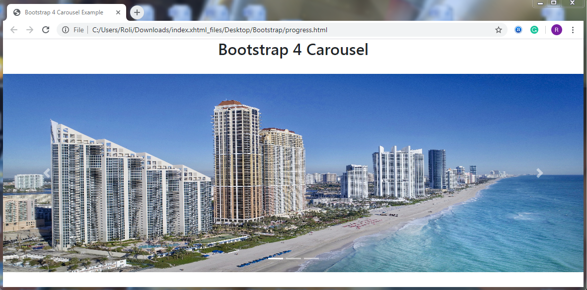
Bootstrap 4 offers a carousel component, which is also known as a slider or slideshow. The carousel is used for the dynamic representation of content using images with some text. It is used to represent a large amount of content by occupying less amount of space
Steps for creating a Carousel
- Add .carousel class along with the .slide class to the <div> element to create a carousel layout. The .slide class adds the CSS animation and transition effect
- Add .carousel-indicators class to the <div> element to add indicators to the carousel.
- Add .carousel-inner class to the <div> element to add slides to the carousel.
- Add .carousel-item class to the <div> element for specifying content of each element.
- Add .carousel-control-prev class to the <a> element for adding previous button to the carousel.
- Add .carousel-control-next class to the <a> element for adding next button to the carousel.
- Add .carousel-control-prev-icon class to the <span> element which is used with .carousel-control-prev class to add the previous button icon.
- Add .carousel-control-next-icon class to the <span> element which is used with .carousel-control-prev class to add the next button icon.
Example
<!DOCTYPE html>
<html lang="en">
<head>
  <title>Bootstrap 4 Carousel Example</title>
  <meta charset="utf-8">
  <meta name="viewport" content="width=device-width, initial-scale=1">
  <link rel="stylesheet" href="https://maxcdn.bootstrapcdn.com/bootstrap/4.4.1/css/bootstrap.min.css">
<script src="https://ajax.googleapis.com/ajax/libs/jquery/3.5.1/jquery.min.js"></script>
  <script src="https://cdnjs.cloudflare.com/ajax/libs/popper.js/1.16.0/umd/popper.min.js"></script>
  <script src="https://maxcdn.bootstrapcdn.com/bootstrap/4.4.1/js/bootstrap.min.js"></script>
  <style>
  /* Make the image fully responsive */
  .carousel-inner img {
    width: 100%;
    height: 400px;
  }
  </style>
</head>
<body>
  <h2 style="text-align: center">Bootstrap 4 Carousel</h2><br>
  <div id="demo" class="carousel slide" data-ride="carousel">
  <!-- Indicators -->
  <ul class="carousel-indicators">
    <li data-target="#demo" data-slide-to="0" class="active"></li>
    <li data-target="#demo" data-slide-to="1"></li>
    <li data-target="#demo" data-slide-to="2"></li>
  </ul>
  <!-- The slideshow -->
  <div class="carousel-inner">
    <div class="carousel-item active">
      <img src="footer.jpg" alt="Slider1" width="1100" height="500">
    </div>
    <div class="carousel-item">
      <img src="slider1.png" alt="Slider2" width="1100" height="500">
    </div>
    <div class="carousel-item">
      <img src="onepage.jpg" alt="Slider3" width="1100" height="500">
    </div>
  </div>
  <!-- Left and right controls -->
  <a class="carousel-control-prev" href="#demo" data-slide="prev">
    <span class="carousel-control-prev-icon"></span>
  </a>
  <a class="carousel-control-next" href="#demo" data-slide="next">
    <span class="carousel-control-next-icon"></span>
  </a>
</div>
</body>
</html>
Output
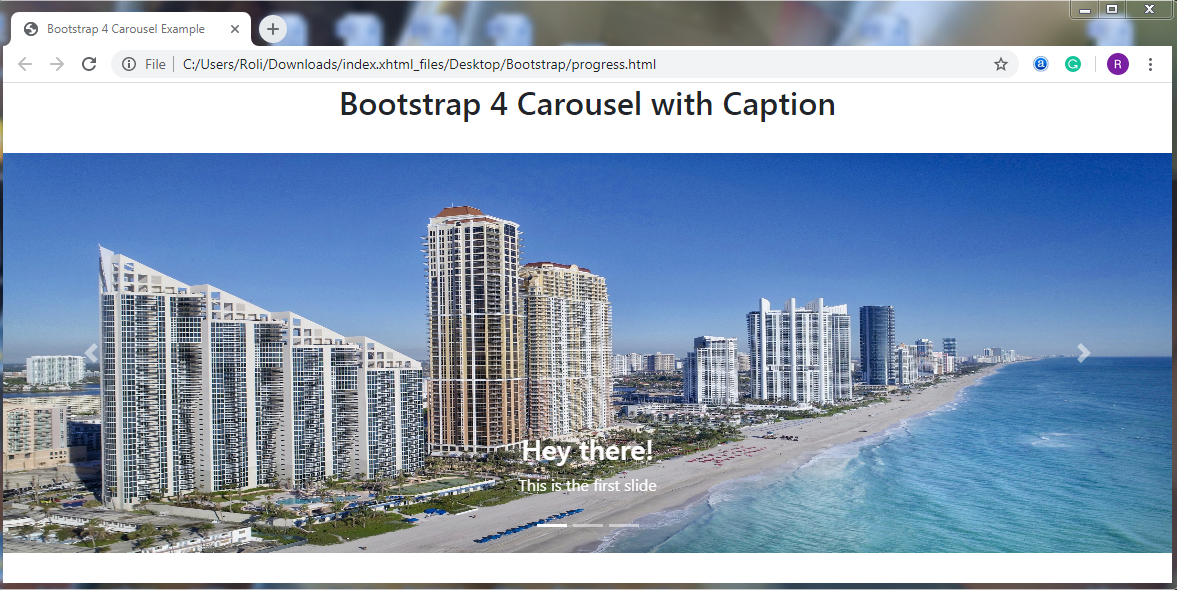
Add Captions to the Slides – Bootstrap 4 also allows you to add the text or caption to your slide.
Steps for creating Captions with the Slide
Add .carousel-caption class to the <div> element to add the caption to each slide. This class is used within the .carousel-class-item class.
Example
<!DOCTYPE html>
<html lang="en">
<head>
  <title>Bootstrap 4 Carousel Example</title>
  <meta charset="utf-8">
  <meta name="viewport" content="width=device-width, initial-scale=1">
  <link rel="stylesheet" href="https://maxcdn.bootstrapcdn.com/bootstrap/4.4.1/css/bootstrap.min.css">
 <script src="https://ajax.googleapis.com/ajax/libs/jquery/3.5.1/jquery.min.js"></script>
  <script src="https://cdnjs.cloudflare.com/ajax/libs/popper.js/1.16.0/umd/popper.min.js"></script>
  <script src="https://maxcdn.bootstrapcdn.com/bootstrap/4.4.1/js/bootstrap.min.js"></script>
  <style>
  /* Make the image fully responsive */
  .carousel-inner img {
    width: 100%;
    height: 400px;
  }
  </style>
</head>
<body>
  <h2 style="text-align: center">Bootstrap 4 Carousel with Caption</h2><br>
  <div id="demo" class="carousel slide" data-ride="carousel">
  <!-- Indicators -->
  <ul class="carousel-indicators">
    <li data-target="#demo" data-slide-to="0" class="active"></li>
    <li data-target="#demo" data-slide-to="1"></li>
    <li data-target="#demo" data-slide-to="2"></li>
  </ul>
  <!-- The slideshow -->
  <div class="carousel-inner">
    <div class="carousel-item active">
      <img src="footer.jpg" alt="Slider1" width="1100" height="500">
      <div class="carousel-caption">
        <h3>Hey there!</h3>
        <p>This is the first slide</p>
      </div>
    </div>
    <div class="carousel-item">
      <img src="slider1.png" alt="Slider2" width="1100" height="500">
      <div class="carousel-caption">
        <h3>Hey there!</h3>
        <p>This is the second slide</p>
      </div>
    </div>
    <div class="carousel-item">
      <img src="onepage.jpg" alt="Slider3" width="1100" height="500">
      <div class="carousel-caption">
        <h3>Hey there!</h3>
        <p>This is the third slide</p>
      </div>
    </div>
  </div>
  <!-- Left and right controls -->
  <a class="carousel-control-prev" href="#demo" data-slide="prev">
    <span class="carousel-control-prev-icon"></span>
  </a>
  <a class="carousel-control-next" href="#demo" data-slide="next">
    <span class="carousel-control-next-icon"></span>
  </a>
</div>
</body>
</html>
Output
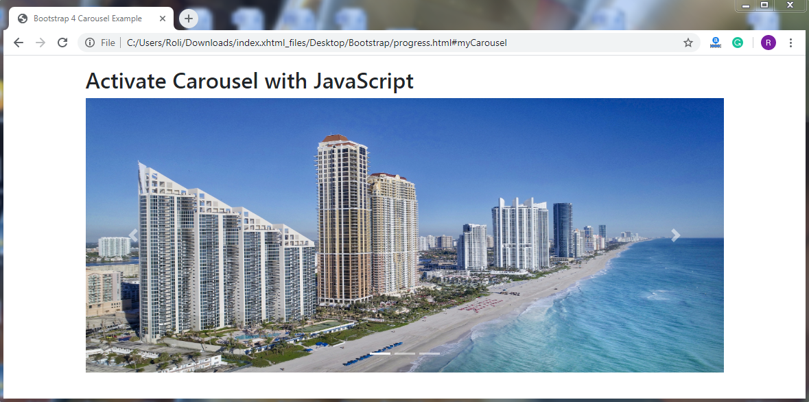
Carousel using JavaScript – You can activate the carousel manually using JavaScript.
Example
<!DOCTYPE html>
<html lang="en">
<head>
  <title>Bootstrap 4 Carousel Example</title>
  <meta charset="utf-8">
  <meta name="viewport" content="width=device-width, initial-scale=1">
  <link rel="stylesheet" href="https://maxcdn.bootstrapcdn.com/bootstrap/4.4.1/css/bootstrap.min.css">
  <script src="https://ajax.googleapis.com/ajax/libs/jquery/3.5.1/jquery.min.js"></script>
  <script src="https://cdnjs.cloudflare.com/ajax/libs/popper.js/1.16.0/umd/popper.min.js"></script>
  <script src="https://maxcdn.bootstrapcdn.com/bootstrap/4.4.1/js/bootstrap.min.js"></script>
  <style>
  /* Make the image fully responsive */
  .carousel-inner img {
    width: 100%;
    height: 400px;
  }
  </style>
</head>
<body>
<div class="container mt-3">
<h2>Activate Carousel with JavaScript</h2>
<div id="myCarousel" class="carousel slide">
  <!-- Indicators -->
  <ul class="carousel-indicators">
    <li class="item1 active"></li>
    <li class="item2"></li>
    <li class="item3"></li>
  </ul>
  <!-- The slideshow -->
  <div class="carousel-inner">
    <div class="carousel-item active">
      <img src="slider.jpg" alt="slider1" width="1100" height="500">
    </div>
    <div class="carousel-item">
      <img src="slider1.png" alt="slider2" width="1100" height="500">
    </div>
    <div class="carousel-item">
      <img src="onepage.jpg" alt="slider3" width="1100" height="500">
    </div>
  </div>
  <!-- Left and right controls -->
  <a class="carousel-control-prev" href="#myCarousel">
    <span class="carousel-control-prev-icon"></span>
  </a>
  <a class="carousel-control-next" href="#myCarousel">
    <span class="carousel-control-next-icon"></span>
  </a>
</div>
</div>
<script>
$(document).ready(function(){
  // Activate Carousel
  $("#myCarousel").carousel();
  // Enable Carousel Indicators
  $(".item1").click(function(){
    $("#myCarousel").carousel(0);
  });
  $(".item2").click(function(){
    $("#myCarousel").carousel(1);
  });
  $(".item3").click(function(){
    $("#myCarousel").carousel(2);
  });
  // Enable Carousel Controls
  $(".carousel-control-prev").click(function(){
    $("#myCarousel").carousel("prev");
  });
  $(".carousel-control-next").click(function(){
    $("#myCarousel").carousel("next");
  });
});
</script>
</body>
</html>
Output