Bootstrap 4 Dropdowns
Bootstrap Dropdowns
Bootstrap 4 provides a dropdown component, which is a toggle and contextual layout, used to display a predefined list of links. It allows the user to select a value from the dropdown list items. You have to click on the dropdown to toggle; it does not toggle by hover the cursor on the dropdown.
The dropdown is developed on Popper.js, which is a third party library that provides dynamic state and viewport detection. It is necessary to add popper.min.js CDN link before bootstrap javascript CDN link, or you can use bootstrap.bundle.min.js / bootstrap.bundle.js which has Popper.js library.
The bootstrap dropdowns are designed in such a way that can be applied in multiple situations and markup structure. In complex navigational systems, the dropdown provides the facility to place almost all the important links in the navigation bar. We can also make dropdowns that have additional inputs (search fields) and form controls (login forms.)
Basic Dropdown
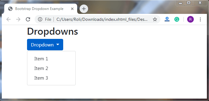
You can convert any button into a dropdown menu by making some markup changes in it.
Steps for creating a dropdown button
- Add .dropdown class to <div> element to make the dropdown menu.
- Add .btn class along with the contextual class , .dropdown-toggle class, and data-toggle=”dropdown” attribute to <button> element (immediate child of div) to open the dropdown menu.
- Add .dropdown-menu class to the <div> element for creating a list or menu.
- Add the .dropdown-item class to <a> element for list items.
Example
<!DOCTYPE html>
 <html lang="en">
 <head>
   <title>Bootstrap Dropdown Example</title>
   <meta charset="utf-8">
   <meta name="viewport" content="width=device-width, initial-scale=1">
   <link rel="stylesheet" href="https://maxcdn.bootstrapcdn.com/bootstrap/4.4.1/css/bootstrap.min.css">
 </head>
 <div class="container">
   <h2>Dropdowns</h2>
   <div class="dropdown">
     <button type="button" class="btn btn-primary dropdown-toggle" data-toggle="dropdown">
       Dropdown
     </button>
     <div class="dropdown-menu">
       <a class="dropdown-item" href="#">Item 1</a>
       <a class="dropdown-item" href="#">Item 2</a>
       <a class="dropdown-item" href="#">Item 3</a>
     </div>
   </div>
 </div>
   <script src="https://ajax.googleapis.com/ajax/libs/jquery/3.4.1/jquery.min.js"></script>
   <script src="https://cdnjs.cloudflare.com/ajax/libs/popper.js/1.16.0/umd/popper.min.js"></script>
   <script src="https://maxcdn.bootstrapcdn.com/bootstrap/4.4.1/js/bootstrap.min.js"></script>
 </body>
 </html>
Output
Split Button Dropdown
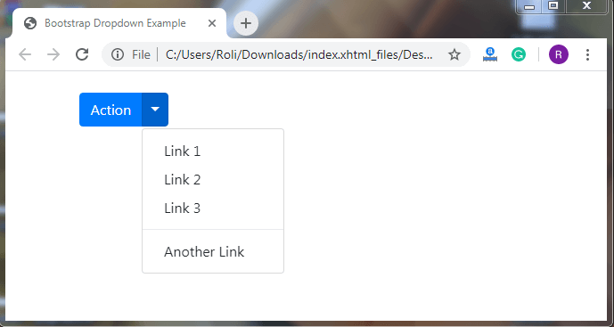
Split button dropdown comprises of proper spacing and a thin horizontal line for separatinf the links. The .dropdown-toggle-split class is used to make the split button dropdown.
Example
<!DOCTYPE html>
 <html lang="en">
 <head>
   <title>Bootstrap Dropdown Example</title>
   <meta charset="utf-8">
   <meta name="viewport" content="width=device-width, initial-scale=1">
   <link rel="stylesheet" href="https://maxcdn.bootstrapcdn.com/bootstrap/4.4.1/css/bootstrap.min.css">
 </head><br>
 <div class="container">
 <div class="btn-group">
   <button type="button" class="btn btn-primary">Action</button>
   <button type="button" class="btn btn-primary dropdown-toggle dropdown-toggle-split" data-toggle="dropdown" aria-haspopup="true" aria-expanded="false">
     <span class="sr-only">Toggle Dropdown</span>
   </button>
   <div class="dropdown-menu">
     <a class="dropdown-item" href="#">Link 1</a>
     <a class="dropdown-item" href="#">Link 2</a>
     <a class="dropdown-item" href="#">Link 3</a>
     <div class="dropdown-divider"></div>
     <a class="dropdown-item" href="#">Another Link</a>
   </div>
 </div>
 </div>
   <script src="https://ajax.googleapis.com/ajax/libs/jquery/3.4.1/jquery.min.js"></script>
   <script src="https://cdnjs.cloudflare.com/ajax/libs/popper.js/1.16.0/umd/popper.min.js"></script>
   <script src="https://maxcdn.bootstrapcdn.com/bootstrap/4.4.1/js/bootstrap.min.js"></script>
 </body>
 </html>
Output
Disabled and Active items
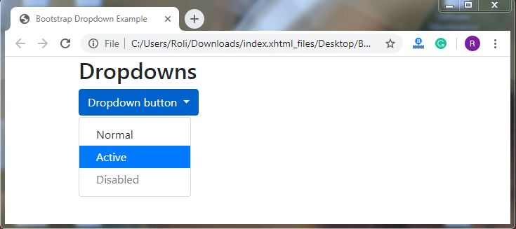
We can also customize the links or list items of the dropdown by using the two predefined classes which are .active class and .disabled class.
The .active class is used to highlight the list items. This class adds the blue background color (primary contextual color) the list items that we want to make active or highlight.
The .disabled class makes the list item disabled and it changes the text color of the list item to light gray.
Example
<!DOCTYPE html>
 <html lang="en">
 <head>
   <title>Bootstrap Dropdown Example</title>
   <meta charset="utf-8">
   <meta name="viewport" content="width=device-width, initial-scale=1">
   <link rel="stylesheet" href="https://maxcdn.bootstrapcdn.com/bootstrap/4.4.1/css/bootstrap.min.css">
 </head>
 <div class="container">
   <h2>Dropdowns</h2>
   <div class="dropdown">
     <button type="button" class="btn btn-primary dropdown-toggle" data-toggle="dropdown">
       Dropdown button
     </button>
     <div class="dropdown-menu">
       <a class="dropdown-item" href="#">Normal</a>
       <a class="dropdown-item active" href="#">Active</a>
       <a class="dropdown-item disabled" href="#">Disabled</a>
     </div>
   </div>
 </div>
 <script src="https://ajax.googleapis.com/ajax/libs/jquery/3.4.1/jquery.min.js"></script>
   <script src="https://cdnjs.cloudflare.com/ajax/libs/popper.js/1.16.0/umd/popper.min.js"></script>
   <script src="https://maxcdn.bootstrapcdn.com/bootstrap/4.4.1/js/bootstrap.min.js"></script>
 </body>
 </html>
Output
Dropdown Header – Bootstrap 4 offers a class that helps in classifying the list items by adding header or label in the dropdown menu. You can create the dropdown header by adding .dropdown-header class to the <div> element.
Example
<!DOCTYPE html>
 <html lang="en">
 <head>
   <title>Bootstrap Dropdown Example</title>
   <meta charset="utf-8">
   <meta name="viewport" content="width=device-width, initial-scale=1">
   <link rel="stylesheet" href="https://maxcdn.bootstrapcdn.com/bootstrap/4.4.1/css/bootstrap.min.css">
 </head>
 <div class="container">
   <h2>Dropdowns</h2>
   <div class="dropdown">
     <button type="button" class="btn btn-primary dropdown-toggle" data-toggle="dropdown">
       Dropdown button
     </button>
     <div class="dropdown-menu">
       <h5 class="dropdown-header">Header 1</h5>
       <a class="dropdown-item" href="#">Link 1</a>
       <a class="dropdown-item" href="#">Link 2</a>
       <a class="dropdown-item" href="#">Link 3</a>
       <h5 class="dropdown-header">Header 2</h5>
       <a class="dropdown-item" href="#">Another link</a>
     </div>
   </div>
 </div>
 <script src="https://ajax.googleapis.com/ajax/libs/jquery/3.4.1/jquery.min.js"></script>
   <script src="https://cdnjs.cloudflare.com/ajax/libs/popper.js/1.16.0/umd/popper.min.js"></script>
   <script src="https://maxcdn.bootstrapcdn.com/bootstrap/4.4.1/js/bootstrap.min.js"></script>
 </body>
 </html>
Output
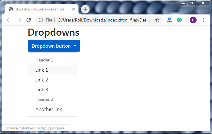
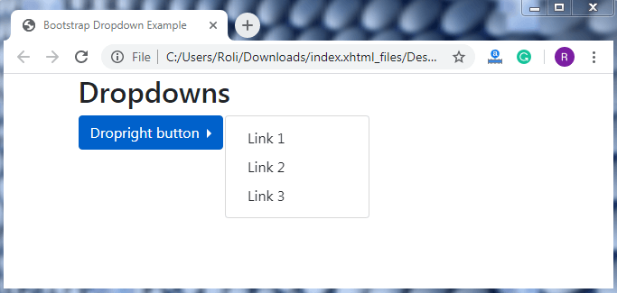
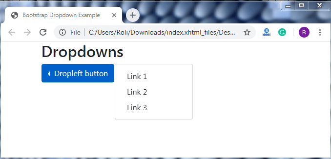
Dropdown Position – We can also set the position of the arrow/caret to the left or right as per our need. The position of the arrow/caret will automatically change according to the class but the dropdown menu will always remains on the right. If we create the dropleft menu then the arrow/caret will on the left of the dropdown button (before the text) and if we create the dropright menu then the arrow/caret will be on the right of the dropdown (after the text).
- Add the .dropright along with the .dropdown class to the <div> element then the dropdown arrow/caret will appear on the right.
- Add the .dropleft class along with the .dropdown class to the <div> element then the dropdown arrow/caret will appear on the left.
Example
This example shows the dropright arrow/caret position:
<!DOCTYPE html>
 <html lang="en">
 <head>
   <title>Bootstrap Dropdown Example</title>
   <meta charset="utf-8">
   <meta name="viewport" content="width=device-width, initial-scale=1">
   <link rel="stylesheet" href="https://maxcdn.bootstrapcdn.com/bootstrap/4.4.1/css/bootstrap.min.css">
 </head>
 <div class="container">
   <h2>Dropdowns</h2>
   <div class="dropdown dropright">
     <button type="button" class="btn btn-primary dropdown-toggle" data-toggle="dropdown">
       Dropright button
     </button>
     <div class="dropdown-menu">
       <a class="dropdown-item" href="#">Link 1</a>
       <a class="dropdown-item" href="#">Link 2</a>
       <a class="dropdown-item" href="#">Link 3</a>
     </div>
   </div>
 </div>
   <script src="https://ajax.googleapis.com/ajax/libs/jquery/3.4.1/jquery.min.js"></script>
   <script src="https://cdnjs.cloudflare.com/ajax/libs/popper.js/1.16.0/umd/popper.min.js"></script>
   <script src="https://maxcdn.bootstrapcdn.com/bootstrap/4.4.1/js/bootstrap.min.js"></script>
 </body>
 </html>
Output
This example shows dropleft arrow/caret position:
<!DOCTYPE html>
 <html lang="en">
 <head>
   <title>Bootstrap Dropdown Example</title>
   <meta charset="utf-8">
   <meta name="viewport" content="width=device-width, initial-scale=1">
   <link rel="stylesheet" href="https://maxcdn.bootstrapcdn.com/bootstrap/4.4.1/css/bootstrap.min.css">
 </head>
 <div class="container">
   <h2>Dropdowns</h2>
   <div class="dropdown dropleft">
     <button type="button" class="btn btn-primary dropdown-toggle" data-toggle="dropdown">
       Dropleft button
     </button>
     <div class="dropdown-menu">
       <a class="dropdown-item" href="#">Link 1</a>
       <a class="dropdown-item" href="#">Link 2</a>
       <a class="dropdown-item" href="#">Link 3</a>
     </div>
   </div>
 </div>
   <script src="https://ajax.googleapis.com/ajax/libs/jquery/3.4.1/jquery.min.js"></script>
   <script src="https://cdnjs.cloudflare.com/ajax/libs/popper.js/1.16.0/umd/popper.min.js"></script>
   <script src="https://maxcdn.bootstrapcdn.com/bootstrap/4.4.1/js/bootstrap.min.js"></script>
 </body>
 </html>
Output
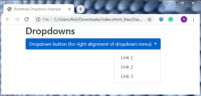
Dropdown Menu Right/Left Aligned - The dropdown menu left/right aligned is similar to the dropdown position but the difference is that the arrow/caret will always be on the right side of the dropdown button. We only change the alignment of the dropdown menu to the left or right.
- Add the .dropdown-menu-right class to align the dropdown menu on the right.
Example
<!DOCTYPE html>
 <html lang="en">
 <head>
   <title>Bootstrap Dropdown Example</title>
   <meta charset="utf-8">
   <meta name="viewport" content="width=device-width, initial-scale=1">
   <link rel="stylesheet" href="https://maxcdn.bootstrapcdn.com/bootstrap/4.4.1/css/bootstrap.min.css">
 </head>
 <div class="container">
   <h2>Dropdowns</h2>
   <div class="dropdown">
     <button type="button" class="btn btn-primary dropdown-toggle" data-toggle="dropdown">
       Dropdown button (for right alignment of dropdown menu)
     </button>
     <div class="dropdown-menu dropdown-menu-right">
       <a class="dropdown-item" href="#">Link 1</a>
       <a class="dropdown-item" href="#">Link 2</a>
       <a class="dropdown-item" href="#">Link 3</a>
     </div>
   </div>
 </div>
 <script src="https://ajax.googleapis.com/ajax/libs/jquery/3.4.1/jquery.min.js"></script>
   <script src="https://cdnjs.cloudflare.com/ajax/libs/popper.js/1.16.0/umd/popper.min.js"></script>
   <script src="https://maxcdn.bootstrapcdn.com/bootstrap/4.4.1/js/bootstrap.min.js"></script>
 </body>
 </html>
Output
- Add the .dropdown-menu-left class to align the dropdown menu on the left.
Example
<!DOCTYPE html>
 <html lang="en">
 <head>
   <title>Bootstrap Dropdown Example</title>
   <meta charset="utf-8">
   <meta name="viewport" content="width=device-width, initial-scale=1">
   <link rel="stylesheet" href="https://maxcdn.bootstrapcdn.com/bootstrap/4.4.1/css/bootstrap.min.css">
 </head>
 <div class="container">
   <h2>Dropdowns</h2>
   <div class="dropdown">
     <button type="button" class="btn btn-primary dropdown-toggle" data-toggle="dropdown">
       Dropdown button (for left alignment of dropdown menu)
     </button>
     <div class="dropdown-menu dropdown-menu-left">
       <a class="dropdown-item" href="#">Link 1</a>
       <a class="dropdown-item" href="#">Link 2</a>
       <a class="dropdown-item" href="#">Link 3</a>
     </div>
   </div>
 </div>
   <script src="https://ajax.googleapis.com/ajax/libs/jquery/3.4.1/jquery.min.js"></script>
   <script src="https://cdnjs.cloudflare.com/ajax/libs/popper.js/1.16.0/umd/popper.min.js"></script>
   <script src="https://maxcdn.bootstrapcdn.com/bootstrap/4.4.1/js/bootstrap.min.js"></script>
 </body>
 </html>
Output
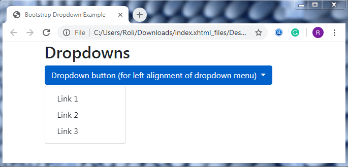
Dropup – The dropup is used when we want the dropdown menu to get open in the upward direction instead of downwards. To create a dropup we have to use the .dropup class instead of .dropdown class to the <div> element.
Example
<!DOCTYPE html>
 <html lang="en">
 <head>
   <title>Bootstrap Dropdown Example</title>
   <meta charset="utf-8">
   <meta name="viewport" content="width=device-width, initial-scale=1">
   <link rel="stylesheet" href="https://maxcdn.bootstrapcdn.com/bootstrap/4.4.1/css/bootstrap.min.css">
 </head>
 <div class="container">
   <h2>Dropdowns</h2><br><br><br><br>
   <div class="dropup">
     <button type="button" class="btn btn-primary dropdown-toggle" data-toggle="dropdown">
       Dropup button
     </button>
     <div class="dropdown-menu">
       <a class="dropdown-item" href="#">Link 1</a>
       <a class="dropdown-item" href="#">Link 2</a>
     </div>
   </div>
 </div>
   <script src="https://ajax.googleapis.com/ajax/libs/jquery/3.4.1/jquery.min.js"></script>
   <script src="https://cdnjs.cloudflare.com/ajax/libs/popper.js/1.16.0/umd/popper.min.js"></script>
   <script src="https://maxcdn.bootstrapcdn.com/bootstrap/4.4.1/js/bootstrap.min.js"></script>
 </body>
 </html>
Output
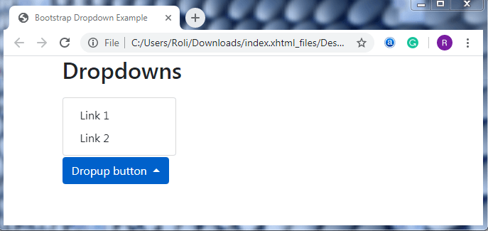
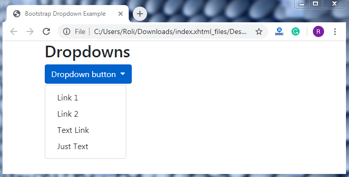
Dropdown Text – In the dropdown text, we can add simple text to the dropdown menu. We can also provide the link to the text for basic styling. The class that is used to add plain text to the dropdown menu is .dropdown-item-text.
Example
<!DOCTYPE html>
 <html lang="en">
 <head>
   <title>Bootstrap Dropdown Example</title>
   <meta charset="utf-8">
   <meta name="viewport" content="width=device-width, initial-scale=1">
   <link rel="stylesheet" href="https://maxcdn.bootstrapcdn.com/bootstrap/4.4.1/css/bootstrap.min.css">
 </head>
 <div class="container">
   <h2>Dropdowns</h2>
   <div class="dropdown">
     <button type="button" class="btn btn-primary dropdown-toggle" data-toggle="dropdown">
       Dropdown button
     </button>
   <script src="https://cdnjs.cloudflare.com/ajax/libs/popper.js/1.16.0/umd/popper.min.js"></script>
   <script src="https://maxcdn.bootstrapcdn.com/bootstrap/4.4.1/js/bootstrap.min.js"></script>
 </body>
 </html>
Output
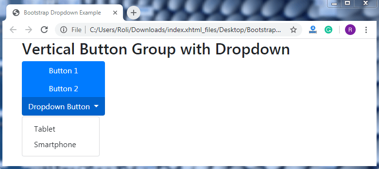
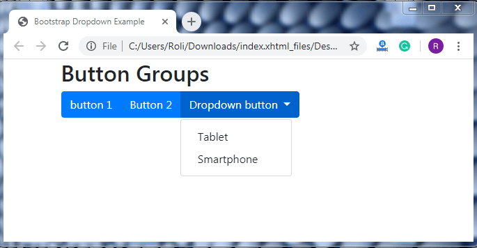
Grouped Button with Dropdown – We can create horizontal/vertical grouped buttons by adding a series of buttons along with the dropdown button. The .btn-group class is used to create the group buttons, and the .dropdown-menu class is used to create the dropdown menu.
Example – For horizontal grouped button with dropdown.
<!DOCTYPE html>
 <html lang="en">
 <head>
   <title>Bootstrap Dropdown Example</title>
   <meta charset="utf-8">
   <meta name="viewport" content="width=device-width, initial-scale=1">
   <link rel="stylesheet" href="https://maxcdn.bootstrapcdn.com/bootstrap/4.4.1/css/bootstrap.min.css">
 </head>
 <div class="container">
   <h2>Button Groups</h2>
   <div class="btn-group">
     <button type="button" class="btn btn-primary">button 1</button>
     <button type="button" class="btn btn-primary">Button 2</button>
     <div class="btn-group">
       <button type="button" class="btn btn-primary dropdown-toggle" data-toggle="dropdown">
       Dropdown button
       </button>
       <div class="dropdown-menu">
         <a class="dropdown-item" href="#">Tablet</a>
         <a class="dropdown-item" href="#">Smartphone</a>
       </div>
     </div>
   </div>
 </div>
   <script src="https://ajax.googleapis.com/ajax/libs/jquery/3.4.1/jquery.min.js"></script>
   <script src="https://cdnjs.cloudflare.com/ajax/libs/popper.js/1.16.0/umd/popper.min.js"></script>
   <script src="https://maxcdn.bootstrapcdn.com/bootstrap/4.4.1/js/bootstrap.min.js"></script>
 </body>
 </html>
Output
Example – For vertical grouped button with dropdown.
<!DOCTYPE html>
 <html lang="en">
 <head>
   <title>Bootstrap Dropdown Example</title>
   <meta charset="utf-8">
   <meta name="viewport" content="width=device-width, initial-scale=1">
   <link rel="stylesheet" href="https://maxcdn.bootstrapcdn.com/bootstrap/4.4.1/css/bootstrap.min.css">
 </head>
 <div class="container">
   <h2>Vertical Button Group with Dropdown</h2>
   <div class="btn-group-vertical">
     <button type="button" class="btn btn-primary">Button 1</button>
     <button type="button" class="btn btn-primary">Button 2</button>
     <div class="btn-group">
       <button type="button" class="btn btn-primary dropdown-toggle" data-toggle="dropdown">
         Dropdown Button
       </button>
       <div class="dropdown-menu">
         <a class="dropdown-item" href="#">Tablet</a>
         <a class="dropdown-item" href="#">Smartphone</a>
       </div>
     </div>
   </div>
 </div>
   <script src="https://ajax.googleapis.com/ajax/libs/jquery/3.4.1/jquery.min.js"></script>
   <script src="https://cdnjs.cloudflare.com/ajax/libs/popper.js/1.16.0/umd/popper.min.js"></script>
   <script src="https://maxcdn.bootstrapcdn.com/bootstrap/4.4.1/js/bootstrap.min.js"></script>
 </body>
 </html>
Output