Bootstrap Images
Bootstrap 4 Images
Bootstrap provides several classes for images to make them responsive and also helps to give some style to the images.
Image Shapes
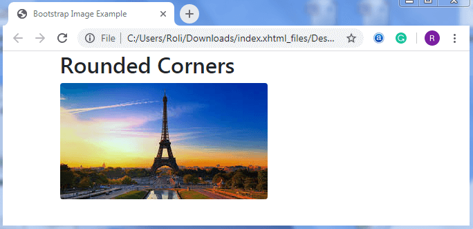
Rounded Corners
Bootstrap 4 offers .rounded class that makes the corners of the image rounded.
Example
<!DOCTYPE html>
 <html lang="en">
 <head>
   <title>Bootstrap Image Example</title>
   <meta charset="utf-8">
   <meta name="viewport" content="width=device-width, initial-scale=1">
   <link rel="stylesheet" href="https://maxcdn.bootstrapcdn.com/bootstrap/4.4.1/css/bootstrap.min.css">
  </head>
 <body>
 <div class="container">
 <h2>Rounded Corners</h2>
 <img src="download.jpg" class="rounded" alt="Scenary">
 </div>
 <script src="https://ajax.googleapis.com/ajax/libs/jquery/3.4.1/jquery.min.js"></script>
   <script src="https://cdnjs.cloudflare.com/ajax/libs/popper.js/1.16.0/umd/popper.min.js"></script>
   <script src="https://maxcdn.bootstrapcdn.com/bootstrap/4.4.1/js/bootstrap.min.js"></script>
 </body>
 </html>
Output
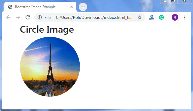
Circle
The .rounded-circle class is used to make the shape of the image circle.
Example
<!DOCTYPE html>
 <html lang="en">
 <head>
   <title>Bootstrap Image Example</title>
   <meta charset="utf-8">
   <meta name="viewport" content="width=device-width, initial-scale=1">
   <link rel="stylesheet" href="https://maxcdn.bootstrapcdn.com/bootstrap/4.4.1/css/bootstrap.min.css">
 </head>
 <body>
 <div class="container">
 <h2>Circle Image</h2>
  <img src="download.jpg" class="rounded-circle" alt="Scenary" width="200" height="200">
 </div>
   <script src="https://ajax.googleapis.com/ajax/libs/jquery/3.4.1/jquery.min.js"></script>
   <script src="https://cdnjs.cloudflare.com/ajax/libs/popper.js/1.16.0/umd/popper.min.js"></script>
   <script src="https://maxcdn.bootstrapcdn.com/bootstrap/4.4.1/js/bootstrap.min.js"></script>
 </body>
 </html>
Output
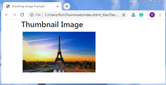
Thumbnail
Bootstrap 4 offers a .img-thumbnail class that helps to make the 1px rounded-corner border around the image.
Example
<!DOCTYPE html>
 <html lang="en">
 <head>
   <title>Bootstrap Image Example</title>
   <meta charset="utf-8">
   <meta name="viewport" content="width=device-width, initial-scale=1">
   <link rel="stylesheet" href="https://maxcdn.bootstrapcdn.com/bootstrap/4.4.1/css/bootstrap.min.css">
 </head>
 <body>
 <div class="container">
   <h2>Thumbnail Image</h2>
   <img src="download.jpg" class="img-thumbnail" alt="Scenary">
 </div>
   <script src="https://ajax.googleapis.com/ajax/libs/jquery/3.4.1/jquery.min.js"></script>
   <script src="https://cdnjs.cloudflare.com/ajax/libs/popper.js/1.16.0/umd/popper.min.js"></script>
   <script src="https://maxcdn.bootstrapcdn.com/bootstrap/4.4.1/js/bootstrap.min.js"></script>
 </body>
 </html>
Output
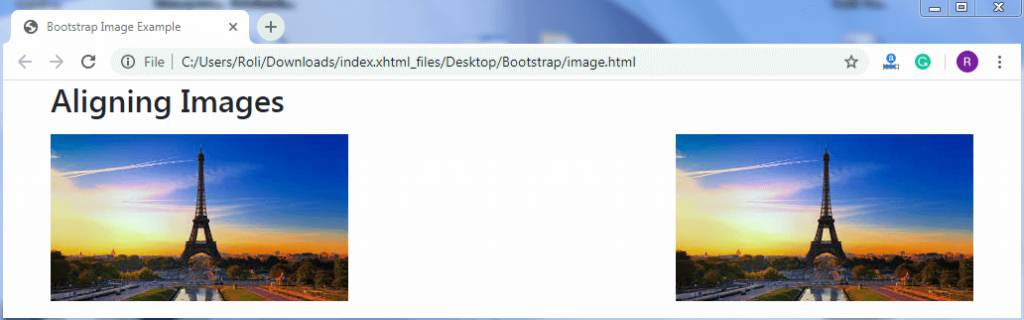
Aligning Image
Bootstrap 4 provides a "float" feature that helps to move the image left or right. The .float-right class float the image to the right, and .float-left class float the image to the left.
Example
<!DOCTYPE html> <html lang="en">
 <head>
   <title>Bootstrap Image Example</title>
   <meta charset="utf-8">
   <meta name="viewport" content="width=device-width, initial-scale=1">
   <link rel="stylesheet" href="https://maxcdn.bootstrapcdn.com/bootstrap/4.4.1/css/bootstrap.min.css">
 </head>
 <body>
 <div class="container">
   <h2>Aligning Images</h2>
   <img src="download.jpg" class="float-left" alt="Scenary">
   <img src="download.jpg" class="float-right" alt="Scenary">
 </div>
   <script src="https://ajax.googleapis.com/ajax/libs/jquery/3.4.1/jquery.min.js"></script>
   <script src="https://cdnjs.cloudflare.com/ajax/libs/popper.js/1.16.0/umd/popper.min.js"></script>
   <script src="https://maxcdn.bootstrapcdn.com/bootstrap/4.4.1/js/bootstrap.min.js"></script>
 </body>
 </html>
Output
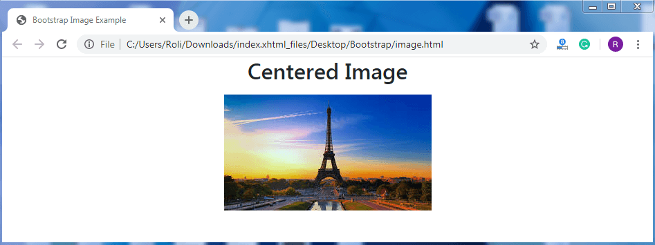
Centered Image
You can align your image to the center with the help of .mx-auto (margin: auto) class and .d-block (display: block) class. To create the centered aligned image, add the .mx-auto class along with the .d-block class to the <img> element.
Example
<!DOCTYPE html>
 <html lang="en">
 <head>
   <title>Bootstrap Image Example</title>
   <meta charset="utf-8">
   <meta name="viewport" content="width=device-width, initial-scale=1">
   <link rel="stylesheet" href="https://maxcdn.bootstrapcdn.com/bootstrap/4.4.1/css/bootstrap.min.css">
 </head>
 <body>
 <h2 class="text-center">Centered Image</h2>
 <div class="container">
   <img src="download.jpg" class="mx-auto d-block" alt="Scenary">
 </div>
   <script src="https://ajax.googleapis.com/ajax/libs/jquery/3.4.1/jquery.min.js"></script>
   <script src="https://cdnjs.cloudflare.com/ajax/libs/popper.js/1.16.0/umd/popper.min.js"></script>
   <script src="https://maxcdn.bootstrapcdn.com/bootstrap/4.4.1/js/bootstrap.min.js"></script>
 </body>
 </html>
Output
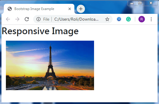
Responsive Images
A responsive image is one that does not allow itself to become bigger than its parent element when you resize the browser. Responsive images adjust itself automatically according to their parent element. To provide the responsive behavior to the image, add the .img-fluid class to the <img> element.
Example
<!DOCTYPE html>
 <html lang="en">
 <head>
   <title>Bootstrap Image Example</title>
   <meta charset="utf-8">
   <meta name="viewport" content="width=device-width, initial-scale=1">
   <link rel="stylesheet" href="https://maxcdn.bootstrapcdn.com/bootstrap/4.4.1/css/bootstrap.min.css">
   </head>
 <body>
 <h2>Responsive Image</h2>
 <div class="container">
   <img src="download.jpg" class="img-fluid" alt="Scenary">
   <script src="https://ajax.googleapis.com/ajax/libs/jquery/3.4.1/jquery.min.js"></script>
   <script src="https://cdnjs.cloudflare.com/ajax/libs/popper.js/1.16.0/umd/popper.min.js"></script>
   <script src="https://maxcdn.bootstrapcdn.com/bootstrap/4.4.1/js/bootstrap.min.js"></script>
 </body>
 </html>
 </div>
Output