Bootstrap 4 Collapse
Bootstrap 4 Collapse
Collapse is a bootstrap component that is similar to the dropdown button. Collapse is used to hide or show the content such as paragraphs, sentences, etc. When we click on a collapse button, a panel will open with a large amount of text.
How to create
The steps that are used to create collapse are given below:-
- Add the .collapse class and id = “demo” to the <div> element to show/hide the content when we click on collapse button.
- Add the CSS attribute data-toggle=”collapse” to the <a> (anchor) element or <button> element.
- Then, add CSS attribute data-target= ”#id” to the <button> element for connecting the collapse button to the content which we want to show/hide.
Note
If you use a <a> element instead of <button> element then use href attribute instead of data-target attribute.
If you want to make your content visible instead of hidden (which is the default), then use .show class.
Example
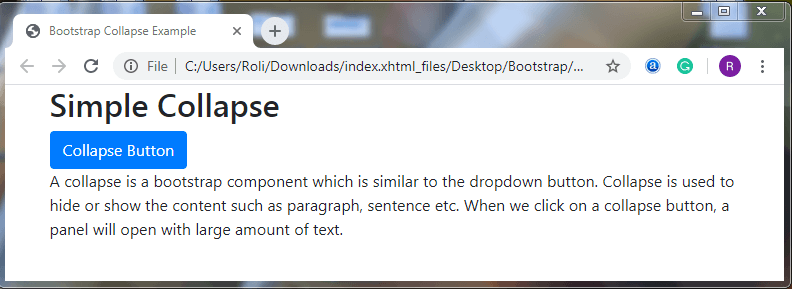
This example shows how to create collapse using <a> element.
<!DOCTYPE html>
 <html lang="en">
 <head>
   <title>Bootstrap Collapse Example</title>
   <meta charset="utf-8">
   <meta name="viewport" content="width=device-width, initial-scale=1">
   <link rel="stylesheet" href="https://maxcdn.bootstrapcdn.com/bootstrap/4.4.1/css/bootstrap.min.css">
 </head>
 <div class="container">
   <h2>Simple Collapse</h2>
   <a href="#demo" class="btn btn-primary" data-toggle="collapse">Collapse Button</a>
   <div id="demo" class="collapse">
     A collapse is a bootstrap component which is similar to the dropdown button. Collapse is used to hide or show the content such as paragraph, sentence etc. When we click on a collapse button, a panel will open with large amount of text.
   </div>
 </div>
   <script src="https://ajax.googleapis.com/ajax/libs/jquery/3.4.1/jquery.min.js"></script>
   <script src="https://cdnjs.cloudflare.com/ajax/libs/popper.js/1.16.0/umd/popper.min.js"></script>
   <script src="https://maxcdn.bootstrapcdn.com/bootstrap/4.4.1/js/bootstrap.min.js"></script>
 </body>
 </html>
Output
Example
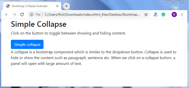
This example shows how to create a collapse using <button> element.
<!DOCTYPE html>
 <html lang="en">
 <head>
   <title>Bootstrap Collapse Example</title>
   <meta charset="utf-8">
   <meta name="viewport" content="width=device-width, initial-scale=1">
   <link rel="stylesheet" href="https://maxcdn.bootstrapcdn.com/bootstrap/4.4.1/css/bootstrap.min.css">
 </head>
 <div class="container">
   <h2>Simple Collapse</h2>
   <p>Click on the button to toggle between showing and hiding content.</p>
   <button type="button" class="btn btn-primary" data-toggle="collapse" data-target="#demo">Simple collapse</button>
   <div id="demo" class="collapse">
     A collapse is a bootstrap component which is similar to the dropdown button. Collapse is used to hide or show the content such as paragraph, sentence etc.  When we click on a collapse button, a panel will open with large amount of text.
   </div>
 </div>
   <script src="https://ajax.googleapis.com/ajax/libs/jquery/3.4.1/jquery.min.js"></script>
   <script src="https://cdnjs.cloudflare.com/ajax/libs/popper.js/1.16.0/umd/popper.min.js"></script>
   <script src="https://maxcdn.bootstrapcdn.com/bootstrap/4.4.1/js/bootstrap.min.js"></script>
 </body>
 </html>
Output
Accordion
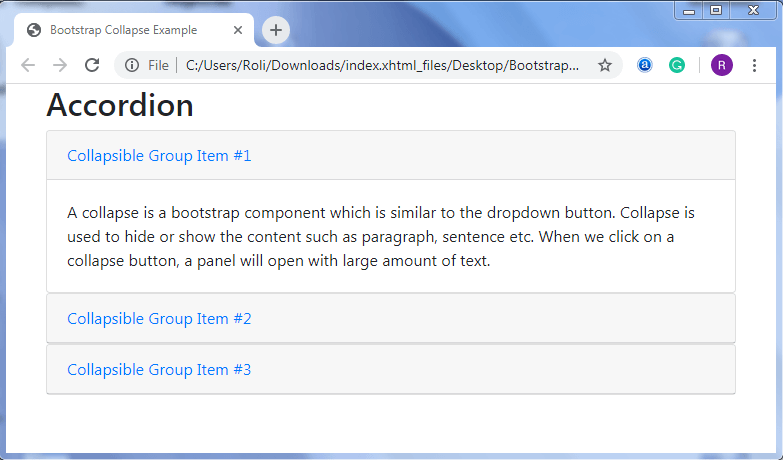
An accordion is a card component. We can create the accordion by extending collapse and adding some classes and attributes.
In accordion, the data-parent attribute is used to ensure that only one collapsible element will be visible at a time.
Example
<!DOCTYPE html>
 <html lang="en">
 <head>
   <title>Bootstrap Collapse Example</title>
   <meta charset="utf-8">
   <meta name="viewport" content="width=device-width, initial-scale=1">
   <link rel="stylesheet" href="https://maxcdn.bootstrapcdn.com/bootstrap/4.4.1/css/bootstrap.min.css">
 </head>
 <div class="container">
   <h2>Accordion</h2>
   <div id="accordion">
     <div class="card">
       <div class="card-header">
         <a class="card-link" data-toggle="collapse" href="#collapseOne">
           Collapsible Group Item #1
         </a>
       </div>
       <div id="collapseOne" class="collapse show" data-parent="#accordion">
         <div class="card-body">
           A collapse is a bootstrap component which is similar to the dropdown button. Collapse is used to hide or show the content such as paragraph, sentence etc.  When we click on a collapse button, a panel will open with large amount of text.
         </div>
       </div>
     </div>
     <div class="card">
       <div class="card-header">
         <a class="collapsed card-link" data-toggle="collapse" href="#collapseTwo">
         Collapsible Group Item #2
       </a>
       </div>
       <div id="collapseTwo" class="collapse" data-parent="#accordion">
         <div class="card-body">
           A collapse is a bootstrap component which is similar to the dropdown button. Collapse is used to hide or show the content such as paragraph, sentence etc.  When we click on a collapse button, a panel will open with large amount of text.
         </div>
       </div>
     </div>
     <div class="card">
       <div class="card-header">
         <a class="collapsed card-link" data-toggle="collapse" href="#collapseThree">
           Collapsible Group Item #3
         </a>
       </div>
       <div id="collapseThree" class="collapse" data-parent="#accordion">
         <div class="card-body">
           A collapse is a bootstrap component which is similar to the dropdown button. Collapse is used to hide or show the content such as paragraph, sentence etc.  When we click on a collapse button, a panel will open with large amount of text.
         </div>
       </div>
     </div>
   </div>
 </div>
   <script src="https://ajax.googleapis.com/ajax/libs/jquery/3.4.1/jquery.min.js"></script>
   <script src="https://cdnjs.cloudflare.com/ajax/libs/popper.js/1.16.0/umd/popper.min.js"></script>
   <script src="https://maxcdn.bootstrapcdn.com/bootstrap/4.4.1/js/bootstrap.min.js"></script>
 </body>
 </html>
Output