Bootstrap 4 Spinners
Bootstrap 4 offers spinner is a loading indicator that is used to display the loading state of any component or web page. The spinner is also known as a loader or pre-loader.
A spinner/loader is an animation tool that keeps the user entertained during the loading of any webpage. They are created using only HTML (HyperText Markup Language) and CSS (Cascading Style Sheets), and it does not require JavaScript code. However, still, some custom JavaScript is needed to toggle their visibility. We can easily change the sizing, appearance, and alignment of the spinner without using any utility class.
Default/Border Spinner
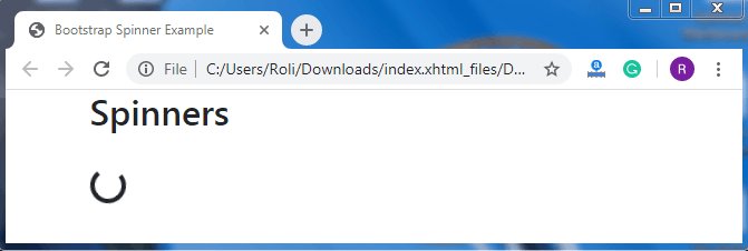
To create a spinner, add .spinner-border class along with the role =”status” attribute value pair in the parent <div> element. The .sr class is used inside the nested <span> element that makes the content visible on the screen readers.
Syntax
<div class="spinner-border" role="status">
  <span class="sr-only">Loading...</span>
</div>
Example
<!DOCTYPE html>
<html lang="en">
<head>
  <title>Bootstrap Spinner Example</title>
  <meta charset="utf-8">
  <meta name="viewport" content="width=device-width, initial-scale=1">
  <link rel="stylesheet" href="https://maxcdn.bootstrapcdn.com/bootstrap/4.4.1/css/bootstrap.min.css">
</head>
<div class="container">
  <h2>Spinners</h2> <br>
  <div class="spinner-border" role="status">
   <span class="sr-only">Loading...</span>
  </div>
</div>
  <script src="https://ajax.googleapis.com/ajax/libs/jquery/3.4.1/jquery.min.js"></script>
  <script src="https://cdnjs.cloudflare.com/ajax/libs/popper.js/1.16.0/umd/popper.min.js"></script>
  <script src="https://maxcdn.bootstrapcdn.com/bootstrap/4.4.1/js/bootstrap.min.js"></script>
</body>
</html>
Output
Colored Spinner
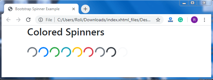
Default/border spinner uses current-color for border-color, which means you can set the color of the spinner according to your own with the help of text color utilities. For creating colored spinner, you have to add the text color class along with the .spinner-border class.
Syntax
<div class="spinner-border text-*" role="status">
<span class="sr-only">Loading</span>
  </div>
Example
<!DOCTYPE html>
<html lang="en">
<head>
  <title>Bootstrap Spinner Example</title>
  <meta charset="utf-8">
  <meta name="viewport" content="width=device-width, initial-scale=1">
  <link rel="stylesheet" href="https://maxcdn.bootstrapcdn.com/bootstrap/4.4.1/css/bootstrap.min.css">
</head>
<div class="container">
  <h2>Colored Spinners</h2>
  <div class="spinner-border text-muted">
    <span class="sr-only">Loading</span>
  </div>
  <div class="spinner-border text-primary">
    <span class="sr-only">Loading</span>
  </div>
  <div class="spinner-border text-success">
    <span class="sr-only">Loading</span>
 </div>
  <div class="spinner-border text-info">
    <span class="sr-only">Loading</span>
  </div>
  <div class="spinner-border text-warning">
    <span class="sr-only">Loading</span>
  </div>
  <div class="spinner-border text-danger">
    <span class="sr-only">Loading</span>
  </div>
  <div class="spinner-border text-secondary">
    <span class="sr-only">Loading</span>
  </div>
  <div class="spinner-border text-dark">
    <span class="sr-only">Loading</span>
  </div>
  <div class="spinner-border text-light">
    <span class="sr-only">Loading</span>
  </div>
</div
  <script src="https://ajax.googleapis.com/ajax/libs/jquery/3.4.1/jquery.min.js"></script>
  <script src="https://cdnjs.cloudflare.com/ajax/libs/popper.js/1.16.0/umd/popper.min.js"></script>
  <script src="https://maxcdn.bootstrapcdn.com/bootstrap/4.4.1/js/bootstrap.min.js"></script>
</body>
</html>
Output
Growing Spinners
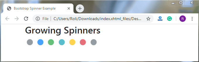
The growing spinners repeatedly fade in (grow) and then fade out instead of spinning. Like border spinners, you can also change or set the color of the growing spinner according to you with the help of text color utilities.
The .spinner grow class is used to create growing spinners.
Syntax
<div class="spinner-grow">
    <span class="sr-only">Loading</span>
  </div>
Example
<!DOCTYPE html>
<html lang="en">
<head>
  <title>Bootstrap Spinner Example</title>
  <meta charset="utf-8">
  <meta name="viewport" content="width=device-width, initial-scale=1">
  <link rel="stylesheet" href="https://maxcdn.bootstrapcdn.com/bootstrap/4.4.1/css/bootstrap.min.css">
</head>
<div class="container">
  <h2>Growing Spinners</h2>
  <div class="spinner-grow text-muted">
    <span class="sr-only">Loading</span>
  </div>
  <div class="spinner-grow text-primary">
    <span class="sr-only">Loading</span>
  </div>
  <div class="spinner-grow text-success">
    <span class="sr-only">Loading</span>
  </div>
  <div class="spinner-grow text-info">
    <span class="sr-only">Loading</span>
  </div>
  <div class="spinner-grow text-warning">
    <span class="sr-only">Loading</span>
  </div>
  <div class="spinner-grow text-danger">
    <span class="sr-only">Loading</span>
  </div>
  <div class="spinner-grow text-secondary">
    <span class="sr-only">Loading</span>
  </div>
 </div>
<script src="https://ajax.googleapis.com/ajax/libs/jquery/3.4.1/jquery.min.js"></script>
  <script src="https://cdnjs.cloudflare.com/ajax/libs/popper.js/1.16.0/umd/popper.min.js"></script>
  <script src="https://maxcdn.bootstrapcdn.com/bootstrap/4.4.1/js/bootstrap.min.js"></script>
</body>
</html>
Output
Spinner Buttons
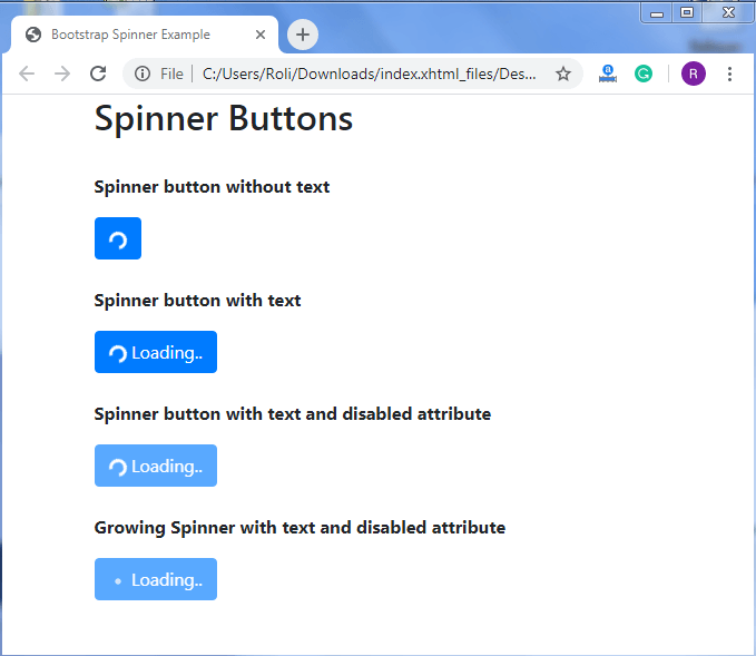
We use spinners with buttons so that we can show whether the action is still in processing or has been done. We can remove the text from the button as per our need and also disable the button by using a disable attribute within the <button> element.
Syntax
<button class="btn btn-primary">
    <span class="spinner-border spinner-border-sm"></span>
    Loading..
  </button>
Example
<!DOCTYPE html>
<html lang="en">
<head>
  <title>Bootstrap Spinner Example</title>
  <meta charset="utf-8">
  <meta name="viewport" content="width=device-width, initial-scale=1">
  <link rel="stylesheet" href="https://maxcdn.bootstrapcdn.com/bootstrap/4.4.1/css/bootstrap.min.css">
</head>
  <div class="container">
  <h2>Spinner Buttons</h2><br>
  <p><strong>Spinner button without text</strong></p>
  <button class="btn btn-primary">
    <span class="spinner-border spinner-border-sm"></span>
  </button>
<br><br>
  <p><strong>Spinner button with text</strong></p>
  <button class="btn btn-primary">
    <span class="spinner-border spinner-border-sm"></span>
    Loading..
  </button>
  <br><br>
  <p><strong>Spinner button with text and disabled attribute</strong></p>
  <button class="btn btn-primary" disabled>
    <span class="spinner-border spinner-border-sm"></span>
    Loading..
  </button>
  <br><br>
  <p><strong>Growing Spinner with text and disabled attribute</strong></p>
  <button class="btn btn-primary" disabled>
    <span class="spinner-grow spinner-grow-sm"></span>
    Loading..
  </button>
</div>
  <script src="https://ajax.googleapis.com/ajax/libs/jquery/3.4.1/jquery.min.js"></script>
  <script src="https://cdnjs.cloudflare.com/ajax/libs/popper.js/1.16.0/umd/popper.min.js"></script>
  <script src="https://maxcdn.bootstrapcdn.com/bootstrap/4.4.1/js/bootstrap.min.js"></script>
</body>
</html>
Output