Bootstrap 4 Progress Bar
Bootstrap Progress Bar
Bootstrap 4 offers progress bars that are used to represent the progress of tasks such as downloading a file, software installation, etc. on the computer. It represents the percentage of the work done and also the remaining work.
In bootstrap 4, the progress component is created by using two HTML elements, CSS, some attributes instead of using default <progress> element of HTML 5.
Bootstrap 4 has several designs of progress bars, such as stacked bars, text labels, animated backgrounds, etc.
Syntax
<div class=”progress”>
             <div class=”progress-bar” style=”width: %;”>
 </div>
 </div>
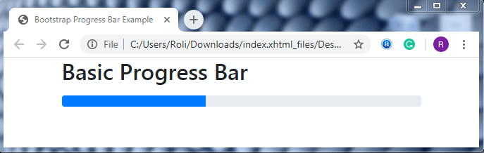
Basic Progress Bar
A basic progress bar is a simple or default progress bar that has a gray background and represents the progress of a task using primary colors.
Steps of creating Progress Bar
- Add the .progress class in the parent <div> element. This class is used as a wrapper for representing the max value of the progress bar.
- Add the .progress-bar class to the child <div> element that represents the progress of the task.
- Add the width property for setting the height of the progress bars.
Syntax
<!DOCTYPE html>
 <html lang="en">
 <head>
   <title>Bootstrap Progress Bar Example</title>
   <meta charset="utf-8">
   <meta name="viewport" content="width=device-width, initial-scale=1">
   <link rel="stylesheet" href="https://maxcdn.bootstrapcdn.com/bootstrap/4.4.1/css/bootstrap.min.css">
 </head>
 <body>
 <div class="container">
   <h2>Basic Progress Bar</h2>
   <div class="progress">
     <div class="progress-bar" style="width:40%"></div>
   </div>
 </div>
   <script src="https://ajax.googleapis.com/ajax/libs/jquery/3.4.1/jquery.min.js"></script>
   <script src="https://cdnjs.cloudflare.com/ajax/libs/popper.js/1.16.0/umd/popper.min.js"></script>
   <script src="https://maxcdn.bootstrapcdn.com/bootstrap/4.4.1/js/bootstrap.min.js"></script>
 </body>
 </html>
Output
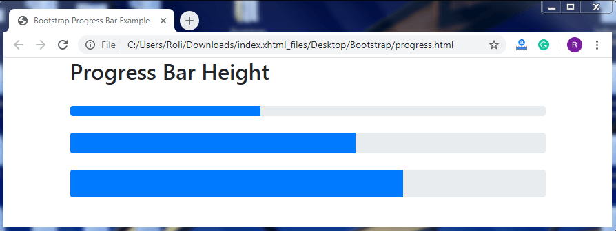
Progress Bar Height
Bootstrap supports the predefined properties of CSS that helps in setting the width of the progress bar accordingly. The default height of the progress bar is 16px. The CSS height property is used with the .progress class to set the height of the progress bar.
Note: The height of the progress bar and progress bar container should always be the same.
Syntax
<!DOCTYPE html>
 <html lang="en">
 <head>
   <title>Bootstrap Progress Bar Example</title>
   <meta charset="utf-8">
   <meta name="viewport" content="width=device-width, initial-scale=1">
   <link rel="stylesheet" href="https://maxcdn.bootstrapcdn.com/bootstrap/4.4.1/css/bootstrap.min.css">
 </head>
 <body>
 <div class="container">
   <h2>Progress Bar Height</h2>
   <div class="progress" style="height:15px">
     <div class="progress-bar" style="width:40%;height:15px"></div>
   </div>
   <br>
   <div class="progress" style="height:30px">
     <div class="progress-bar" style="width:60%;height:30px"></div>
   </div>
   <br>
   <div class="progress" style="height:40px">
     <div class="progress-bar" style="width:70%;height:40px"></div>
   </div>
 </div>
   <script src="https://ajax.googleapis.com/ajax/libs/jquery/3.4.1/jquery.min.js"></script>
   <script src="https://cdnjs.cloudflare.com/ajax/libs/popper.js/1.16.0/umd/popper.min.js"></script>
   <script src="https://maxcdn.bootstrapcdn.com/bootstrap/4.4.1/js/bootstrap.min.js"></script>
 </body>
 </html>
Output
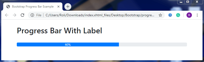
Progress Bar Labels
The progress bar label is used to add text in the progress bar, especially for representing the progress percentage of the task that has been completed.
To add the labels in the progress bar, you have to add your text just before the closing </div> tag.
Syntax
<!DOCTYPE html>
 <html lang="en">
 <head>
   <title>Bootstrap Progress Bar Example</title>
   <meta charset="utf-8">
   <meta name="viewport" content="width=device-width, initial-scale=1">
   <link rel="stylesheet" href="https://maxcdn.bootstrapcdn.com/bootstrap/4.4.1/css/bootstrap.min.css">
 </head>
 <body>
 <div class="container">
   <h2>Progress Bar With Label</h2>
   <div class="progress">
     <div class="progress-bar" style="width:60%">60%</div>
   </div>
 </div>
   <script src="https://ajax.googleapis.com/ajax/libs/jquery/3.4.1/jquery.min.js"></script>
   <script src="https://cdnjs.cloudflare.com/ajax/libs/popper.js/1.16.0/umd/popper.min.js"></script>
   <script src="https://maxcdn.bootstrapcdn.com/bootstrap/4.4.1/js/bootstrap.min.js"></script>
 </body>
 </html>
Output
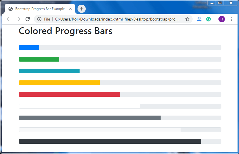
Colored Progress Bars
Just like the other components of the progress bar, you can also set the color of the progress bar according to your need. The default color of the progress bar is blue (primary). The bootstrap 4 contextual classes are used to set the color of the progress bar.
Syntax
<!DOCTYPE html>
 <html lang="en">
 <head>
   <title>Bootstrap Progress Bar Example</title>
   <meta charset="utf-8">
   <meta name="viewport" content="width=device-width, initial-scale=1">
   <link rel="stylesheet" href="https://maxcdn.bootstrapcdn.com/bootstrap/4.4.1/css/bootstrap.min.css">
 </head>
 <body>
 <div class="container">
   <h2>Colored Progress Bars</h2>
   <br>
   <!-- Blue -->
   <div class="progress">
     <div class="progress-bar" style="width:10%"></div>
   </div><br>
   <!-- Green -->
   <div class="progress">
     <div class="progress-bar bg-success" style="width:20%"></div>
   </div><br>
   <!-- Turquoise -->
   <div class="progress">
     <div class="progress-bar bg-info" style="width:30%"></div>
   </div><br>
   <!-- Orange -->
   <div class="progress">
      <div class="progress-bar bg-warning" style="width:40%"></div>
   </div><br>
   <!-- Red -->
   <div class="progress">
     <div class="progress-bar bg-danger" style="width:50%"></div>
   </div><br>
   <!-- White -->
   <div class="progress border">
     <div class="progress-bar bg-white" style="width:60%"></div>
   </div><br>
   <!-- Grey -->
   <div class="progress">
     <div class="progress-bar bg-secondary" style="width:70%"></div>
   </div><br>
   <!-- Light Grey -->
   <div class="progress border">
     <div class="progress-bar bg-light" style="width:80%"></div>
   </div><br>
   <!-- Dark Grey -->
   <div class="progress">
     <div class="progress-bar bg-dark" style="width:90%"></div>
   </div>
 </div>
   <script src="https://ajax.googleapis.com/ajax/libs/jquery/3.4.1/jquery.min.js"></script>
   <script src="https://cdnjs.cloudflare.com/ajax/libs/popper.js/1.16.0/umd/popper.min.js"></script>
   <script src="https://maxcdn.bootstrapcdn.com/bootstrap/4.4.1/js/bootstrap.min.js"></script>
 </body>
 </html>
Output
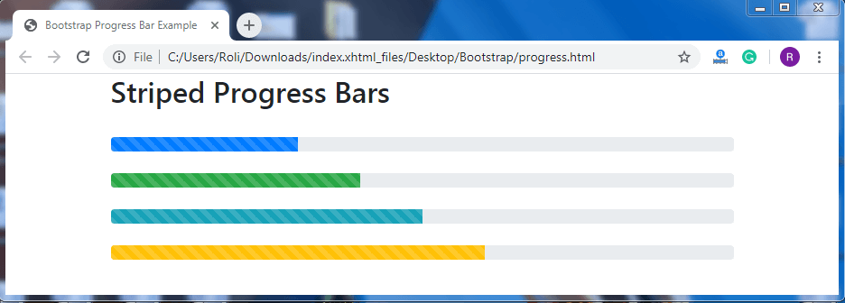
Striped Progress Bar
The progress bar that has stripes with CSS color gradient over the background color of the progress bar is known as a striped progress bar.
Add the .progress-bar-striped class along with the .progress-bar class and contextual color class for creating a striped progress bar.
Syntax
<!DOCTYPE html>
 <html lang="en">
 <head>
   <title>Bootstrap Progress Bar Example</title>
   <meta charset="utf-8">
   <meta name="viewport" content="width=device-width, initial-scale=1">
   <link rel="stylesheet" href="https://maxcdn.bootstrapcdn.com/bootstrap/4.4.1/css/bootstrap.min.css">
 </head>
 <body>
 <div class="container">
   <h2>Striped Progress Bars</h2>
   <div class="progress">
     <div class="progress-bar progress-bar-striped" style="width:30%"></div>
   </div>
   <br>
   <div class="progress">
     <div class="progress-bar bg-success progress-bar-striped" style="width:40%"></div>
   </div>
   <br>
   <div class="progress">
     <div class="progress-bar bg-info progress-bar-striped" style="width:50%"></div>
   </div>
   <br>
   <div class="progress">
     <div class="progress-bar bg-warning progress-bar-striped" style="width:60%"></div>
   </div>
   <br>
 </div>
   <script src="https://ajax.googleapis.com/ajax/libs/jquery/3.4.1/jquery.min.js"></script>
   <script src="https://cdnjs.cloudflare.com/ajax/libs/popper.js/1.16.0/umd/popper.min.js"></script>
   <script src="https://maxcdn.bootstrapcdn.com/bootstrap/4.4.1/js/bootstrap.min.js"></script>
 </body>
 </html>
Output
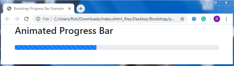
Animated Progress Bar
We can also animate the progress bar from right to left by using CSS 3 animation. For creating animated progress bar you have to add the .progress-bar-animated class along with the .progress-bar class and .progress-bar-striped class.
Note: We can only animate the striped progress bars and not the default progress bars.
Syntax
<!DOCTYPE html>
 <html lang="en">
 <head>
   <title>Bootstrap Progress Bar Example</title>
   <meta charset="utf-8">
   <meta name="viewport" content="width=device-width, initial-scale=1">
   <link rel="stylesheet" href="https://maxcdn.bootstrapcdn.com/bootstrap/4.4.1/css/bootstrap.min.css">
 </head>
 <body>
 <div class="container">
   <h2>Animated Progress Bar</h2><br>
   <div class="progress">
     <div class="progress-bar progress-bar-striped progress-bar-animated" style="width:40%"></div>
   </div>
 </div>
   <script src="https://ajax.googleapis.com/ajax/libs/jquery/3.4.1/jquery.min.js"></script>
   <script src="https://cdnjs.cloudflare.com/ajax/libs/popper.js/1.16.0/umd/popper.min.js"></script>
   <script src="https://maxcdn.bootstrapcdn.com/bootstrap/4.4.1/js/bootstrap.min.js"></script>
 </body>
 </html>
Output
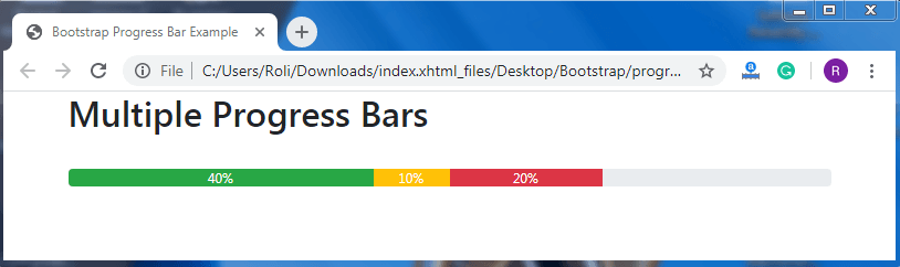
Multiple Progress Bar
Bootstrap also offers the class that helps in creating multiple progress bars in the single line. You can create more than one progress bar of different colors in a single progress bar. The multiple progress bar is created when you want to display the progress of more than one task into a single progress bar.
Syntax
<!DOCTYPE html>
 <html lang="en">
 <head>
   <title>Bootstrap Progress Bar Example</title>
   <meta charset="utf-8">
   <meta name="viewport" content="width=device-width, initial-scale=1">
   <link rel="stylesheet" href="https://maxcdn.bootstrapcdn.com/bootstrap/4.4.1/css/bootstrap.min.css">
 </head>
 <div class="container">
   <h2>Multiple Progress Bars</h2> <br>
   <div class="progress">
     <div class="progress-bar bg-success" style="width:40%">
       40%
     </div>
     <div class="progress-bar bg-warning" style="width:10%">
       10%
     </div>
     <div class="progress-bar bg-danger" style="width:20%">
       20%
     </div>
   </div>
 </div>
   <script src="https://ajax.googleapis.com/ajax/libs/jquery/3.4.1/jquery.min.js"></script>
   <script src="https://cdnjs.cloudflare.com/ajax/libs/popper.js/1.16.0/umd/popper.min.js"></script>
   <script src="https://maxcdn.bootstrapcdn.com/bootstrap/4.4.1/js/bootstrap.min.js"></script>
 </body>
 </html>
Output