Bootstrap 4 Alerts

Bootstrap 4 Alerts

Bootstrap 4 offers alerts that are used to provide feedback messages on the user’s actions. There is no boundation of text length in the alerts.

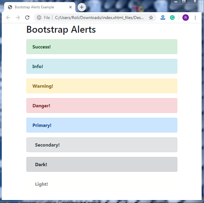
Alerts can be created by using.alertclass. In addition, there are eight contextual classes of alerts which provide style to the alerts are given below:-

  • .alert-success
  • .alert-primary
  • .alert-secondary
  • .alert-danger
  • .alert-warning
  • .alert-Info
  • .alert-light
  • .alert-dark

Example

Bootstrap Alerts

Success!
Info!
Warning!
Danger!
Primary!
Secondary!
Dark!
Light!

Output

Bootstrap 4 Alerts

Alert Links

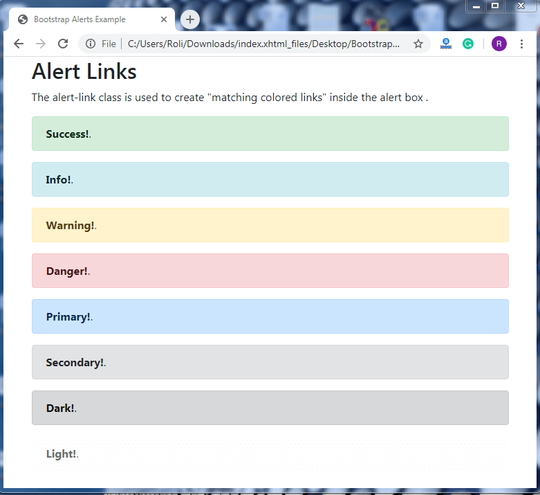
Alert links are used to create links inside the alerts box. The color of those links and the color of the alert box will be similar. The.alert-linkclass is used to create alert links.

Example

Alert Links

The alert-link class is used to create "matching colored links" inside the alert box .

Output
Bootstrap 4 Alerts

Closing Alerts

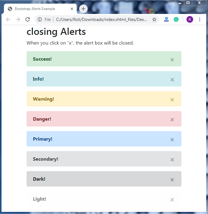
Closing alerts offer an “x” (closing button) option inside the alert box. When you click on x, it will close the alert message.

Steps for closing alert

  • Add the.alert-dismissibleclass within the alert container.
  • Addclass =”close”anddata-dismiss=”alert”into tag.

Example

01234567891011121314151617181920212223242526272829303132333435363738394041424344454647484950

Output

Bootstrap 4 Alerts

Related Topics

Bootstrap 4 Media Objects

Bootstrap 4 Media Objects Bootstrap 4 offers a media object component that aligns the media objects and the content. The media object is used to create a repetitive and complex component...

7 minutes read.

Bootstrap Contact Us page

What is a “Contact Us” page? A “Contact Us” page is a web page available on the websites of various companies, organisations etc., for its users to contact the organisation or...

5 minutes read.

Bootstrap Pager

← Prev Next → ...

1 minute read.

Bootstrap 4 Margin classes

Bootstrap 4 contains a variety of brief, responsive margin and padding utility classes to change the appearance of an element. The Bootstrap 4 margin classes use for the outer spacing of...

8 minutes read.

Bootstrap Toast Example

What are toasts? Toasts are similar to notifications, and they are lightweight and act as push notifications from mobile and desktop operating systems. They’re built using flexbox in Bootstrap. They can...

4 minutes read.

Bootstrap 4 Utilities

Bootstrap 4 Utilities Bootstrap 4 utilities also known as helper classes that are used to add more style to the components. Utilities are used to make the website or webpage more stylish or elegant....

10 minutes read.

Bootstrap Time Picker Example

What is a Bootstrap Time picker? It is used to display the time in hours, minutes and seconds from a dropdown menu. In this section, we will create an example to...

4 minutes read.

Bootstrap 4 Toast

Bootstrap 4 Toast Bootstrap 4 offers a Toast component, which is quite similar to the alert box and pushes notifications. The toast is visible on the screen for a few seconds when any...

5 minutes read.

Bootstrap 4 Card

In Bootstrap 4, a card is a bordered box with padding around its content. It has options for headers, footers, colors, content, etc. The card provides the link, title, image,...

8 minutes read.

Bootstrap With CSS

← Prev Next → ...

1 minute read.

Bootstrap Protocol (BOOTP)

In the following article, we will learn about the Bootstrap Protocol and how it maintains contracts among linked devices on webwork. What is Bootstrap Protocol? The Bootstrap Protocol is a webwork contract...

3 minutes read.

Bootstrap Navigation bar

Navigation Bars In Bootstrap, We can create navigation bar like a navigation header. It is placed at the top of the page. We can collapse or extend it according to screen...

3 minutes read.

Bootstrap 4 Grid System

Bootstrap 4 Grid System The bootstrap 4 grid system is used to create a responsive website layout. The bootstrap 4 offers a mobile-first flexbox grid system that allows you to divide...

4 minutes read.

Bootstrap 4 Form

Bootstrap 4 Forms Bootstrap 4 provides forms, which are one of the essential components for web pages and web applications. It is an input-based component, used to collect user data with the help of...

8 minutes read.

Text Shadows in CSS

Text shadows are created with the text-shadow CSS property. It takes a list of shadows separated by commas to be applied to the text and any of its styles. Each...

5 minutes read.

Bootstrap List group

Bootstrap list group provides a group of a list of items. The most basic list is an unordered list. We can use <ul> element with .list-group class and <li> element with .lsit-group-item. Let us see...

3 minutes read.

Bootstrap 4 Colors

Bootstrap 4 Colors Bootstrap 4 consists of classes that are used to set colors according to the context of the element, and with the help of these classes, we can read...

2 minutes read.

Bootstrap Input groups

Bootstrap 4 Input groups The input group is a component of Bootstrap 4, which is used to create interactive and stylish form controls. With the help of input groups, you can easily customize the input...

8 minutes read.

Bootstrap 4 Content

Typography Typography is used for styling and formatting the content. It also helps in creating customized headings, sub-headings, lists, paragraphs, etc. Headings Bootstrap 4 offers HTML heading <h1> to <h6> that has bolder...

8 minutes read.

Bootstrap Tables

We can create different types of responsive and awesome bootstrap table like: striped , border etc. Bootstrap Basic Table We can create a basic bootstrap table by using its class .table. It has...

3 minutes read.