Dropdown & Dropup

Bootstrap Dropdowns

The bootstrap dropdown menu is used to create a toggleable menu. It provides users to choose one value from a predefined list. Before creating dropdown menu, we have to know about its class, that is given below:
  • The .dropdown class is used to indicate a dropdown menu.
  • The .dropwn-menu class is used to create dropdown menu.
  • The .dropdown-toggle and data-toggle="dropdown" class is used to open the dropdown menu.
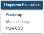
Let us see an example of Bootstrap Dropdowns:
<div class="container">  
  <h2>Example of Dropdowns</h2>  
    <div class="dropdown">  
    <button class="btn btn-primary dropdown-toggle" type="button" data-toggle="dropdown">Dropdown Example  
    <span class="caret"></span></button>  
    <ul class="dropdown-menu">  
      <li><a href="#">Bootstrap</a></li>  
      <li><a href="#">Material design</a></li>  
      <li><a href="#">Pure CSS</a></li>  
    </ul>  
  </div>  
</div>
Try Now

Bootstrap Dropdown Divider

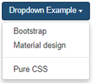
The bootstrap dropdown divider is used to separate the links inside the dropdown menu with a thin horizontal border. Let us see an example of Bootstrap Dropdown Divider:
<div class="container">  
  <h2>Example of Dropdowns</h2>  
    <div class="dropdown">  
    <button class="btn btn-primary dropdown-toggle" type="button" data-toggle="dropdown">Dropdown Example  
    <span class="caret"></span></button>  
    <ul class="dropdown-menu">  
      <li><a href="#">Bootstrap</a></li>  
      <li><a href="#">Material design</a></li>  
       <li class="divider"></li>  
      <li><a href="#">Pure CSS</a></li>  
    </ul>  
  </div>  
</div
Try Now

Bootstrap Dropdown Header

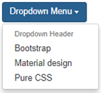
We can create dropdown header menu by using its class .dropdown-header. We can not select page header while using drowdown header menu. It is like a level that help to understand what is the work. Let us see an example of Bootstrap Dropdown Header:
<li class="dropdown-header">Dropdown header 1</li>
Try Now

Bootstrap Disable and Active Items

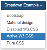
In bootstrap, we can disable and active items by using its .disabled class. Let us see an example of Bootstrap Disable and Active Items:
<li class="disabled"><a href="#">CSS</a></li>  
<li class="active"><a href="#">HTML</a></li
Try Now

Bootstrap Dropdown Position

We can add dropdown position using its class. To create right-align the dropdown, add the .dropdown-menu-right class. Let us see an example of Bootstrap Disable and Active Items:
<ul class="dropdown-menu dropdown-menu-right">

Bootstrap Dropup

In Bootstrap, we can create dropdup menu. All the dropdown menu will be show on the top of the menu. We have to change the <div> element with .dropdown class to .dropup. Let us see an example of Bootstrap Dropup:
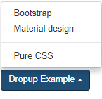
<div class="dropup">
Try Now

Related Topics

Bootstrap 4 Grid System

Bootstrap 4 Grid System The bootstrap 4 grid system is used to create a responsive website layout. The bootstrap 4 offers a mobile-first flexbox grid system that allows you to divide...

4 minutes read.

Bootstrap Navigation bar

Navigation Bars In Bootstrap, We can create navigation bar like a navigation header. It is placed at the top of the page. We can collapse or extend it according to screen...

3 minutes read.

Bootstrap 4 Margin classes

Bootstrap 4 contains a variety of brief, responsive margin and padding utility classes to change the appearance of an element. The Bootstrap 4 margin classes use for the outer spacing of...

8 minutes read.

Bootstrap First Example

1) Add HTML5 doctype Before starting the example of Bootstrap, we should know about the some basic rules of Bootstrap. We have to add HTML5 doctype with lang element and CSS properties. <!DOCTYPE html>   <html lang="en">     <head>       <meta charset="utf-8">      </head>   </html> 2) Bootstrap...

2 minutes read.

Bootstrap 4 Colors

Bootstrap 4 Colors Bootstrap 4 consists of classes that are used to set colors according to the context of the element, and with the help of these classes, we can read...

2 minutes read.

Bootstrap 4 Grid System

Bootstrap 4 Grid Systems Bootstrap offers a responsive and mobile-first grid system with the help of which we can divide the screen of the web browser into 12 horizontal parts. It has predefined classes...

4 minutes read.

Bootstrap List group

Bootstrap list group provides a group of a list of items. The most basic list is an unordered list. We can use <ul> element with .list-group class and <li> element with .lsit-group-item. Let us see...

3 minutes read.

Bootstrap 4 Inputs

Bootstrap Inputs Bootstrap Form Inputs – Several pre-defined input types are available in HTML and Bootstrap. These input types help in styling the forms. When an input type is specified in the form, it means...

10 minutes read.

Bootstrap Protocol (BOOTP)

In the following article, we will learn about the Bootstrap Protocol and how it maintains contracts among linked devices on webwork. What is Bootstrap Protocol? The Bootstrap Protocol is a webwork contract...

3 minutes read.

Bootstrap Typography

Bootstrap provides simple and easily customized typography for headings, body text, lists, and many more. Headline <h1> to <h6> By default, Bootstrap has HTML headings (<h1> to <h6>) that are given below: Example <h1>h1. Bootstrap heading</h1>   <h2>h2. Bootstrap heading</h2>   <h3>h3. Bootstrap heading</h3>   <h4>h4. Bootstrap heading</h4>   <h5>h5. Bootstrap heading</h5>   <h6>h6. Bootstrap heading</h6> Try Now ←...

1 minute read.

Bootstrap 4 Grid Classes

Bootstrap 4 Grid Classes Extra-small Grid – In the extra-small grid system class, when you create the grid (columns), the columns will not be stacked on top of each other on...

8 minutes read.

Bootstrap Grid System Example

Bootstrap Grid System Example Stacked to horizontal – In stacked to the horizontal grid system, the grid columns are stacked on top of each other on extra small devices and becomes...

7 minutes read.

Bootstrap 4 Tutorial

What is Bootstrap? Bootstrap is a CSS (Cascading Style Sheets) framework, which is used to develop a responsive website. It is an open-source and mobile-first front-end framework. It has design templates that are based...

4 minutes read.

Bootstrap 4 Buttons

Bootstrap Buttons Bootstrap provides many custom button styles. These buttons are used in forms and dialog boxes for actions. Bootstrap offers various predefined classes for providing styles to buttons. There are many classes that are used...

7 minutes read.

Bootstrap 4 Spinners

Bootstrap 4 offers spinner is a loading indicator that is used to display the loading state of any component or web page. The spinner is also known as a loader...

7 minutes read.

Bootstrap 4 Jumbotron

Bootstrap 4 Jumbotron Bootstrap offers Jumbotron, which is used to get more attention to specific content or information on the web page. It provides a gray background-color to the content to make that content...

2 minutes read.

Bootstrap Buttons Groups

Bootstrap 4 Button Group Bootstrap 4 provides a feature button group that helps in creating a series of buttons together in a group. Basic Button Group  The .btn-group class is used within the <div> tag to create a...

6 minutes read.

Bootstrap 4 Card

In Bootstrap 4, a card is a bordered box with padding around its content. It has options for headers, footers, colors, content, etc. The card provides the link, title, image,...

8 minutes read.

Text Shadows in CSS

Text shadows are created with the text-shadow CSS property. It takes a list of shadows separated by commas to be applied to the text and any of its styles. Each...

5 minutes read.

Bootstrap Tabs and Pills

Bootstrap Menus Bootstrap menu is used to create different types of menu. It can created horizontal with its .list-inlineclass. <div class="container">       <h3>Example of Bootstrap Menu</h3>       <ul class="list-inline">         <li><a href="#">Home</a></li>         <li><a href="#">About</a></li>         <li><a href="#">Contact</a></li>         <li><a href="#">services</a></li>       </ul>     </div> Try Now Bootstrap Tabs Bootstrap tabl is look like is menu but there is some difference....

4 minutes read.
